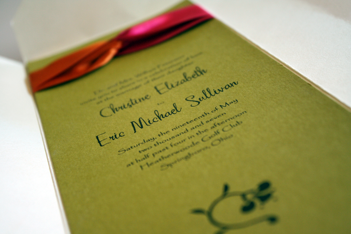
Play it safe? Not always. Sometimes with invitations you should take a risk: use a palette of citrus green, crisp tangerine and hot fuchsia; print on a bright color instead of white or ivory, and use a modern floral graphic and a non-traditional font. I love this invitation because it incorporates fresh colors into a cool folding design and draws the eye with the two-tone ribbon loop at the top of the card. The mocha ink works beautifully with these colors, and the heavy brush stroke of the script makes me actually not hate the other font, Papyrus as much.