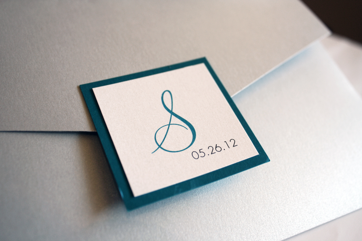
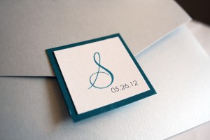
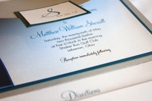
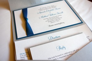
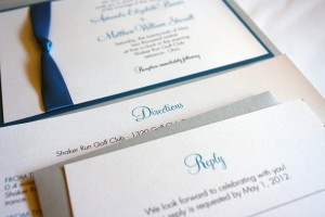
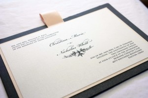
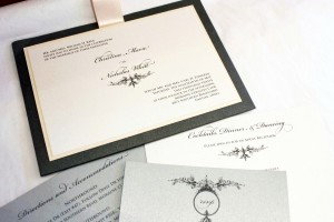
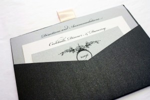
This pocket invitation has become known as the “Christina” because it became a hit almost the instant we designed it for Christina and Nick earlier this year, and at least half a dozen brides since then have seen it and said, “That’s the one.” For Christina, we chose a graphite pocket card, with shades of silver and white silk, and used a hint of blush pink as an accent layer- and since we wanted to sneak a teeny bit more pink in there to make it feel even more feminine, we added a blush satin pull tab at the top edge. This style of “pull” tab doesn’t serve a function, it merely adds another pop of color to tie in with the accent layer, and gives the invitation another dimension (and a girlish flair to boot). The front of the invitation appears traditional, but the back of the card has a hidden pocket that holds the enclosure cards. The presentation is neat and compact, without a lot of fuss.
I first met Christina and her mom several years back when we created custom invitations for her older sister Julie’s wedding, and I’ve gotten to know the ladies in this wonderful family, including their absolutely awesome mom, Patricia. The thing I noticed right away with both girls’ weddings is that the spirit of what it means to plan a wedding was not lost on them- Patricia and her daughters seemed to enjoy the process more than most of the brides I encounter. They seemed rooted in the important things (i.e. love, commitment, values) and the fun they had along the way was just an added perk.
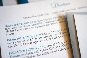
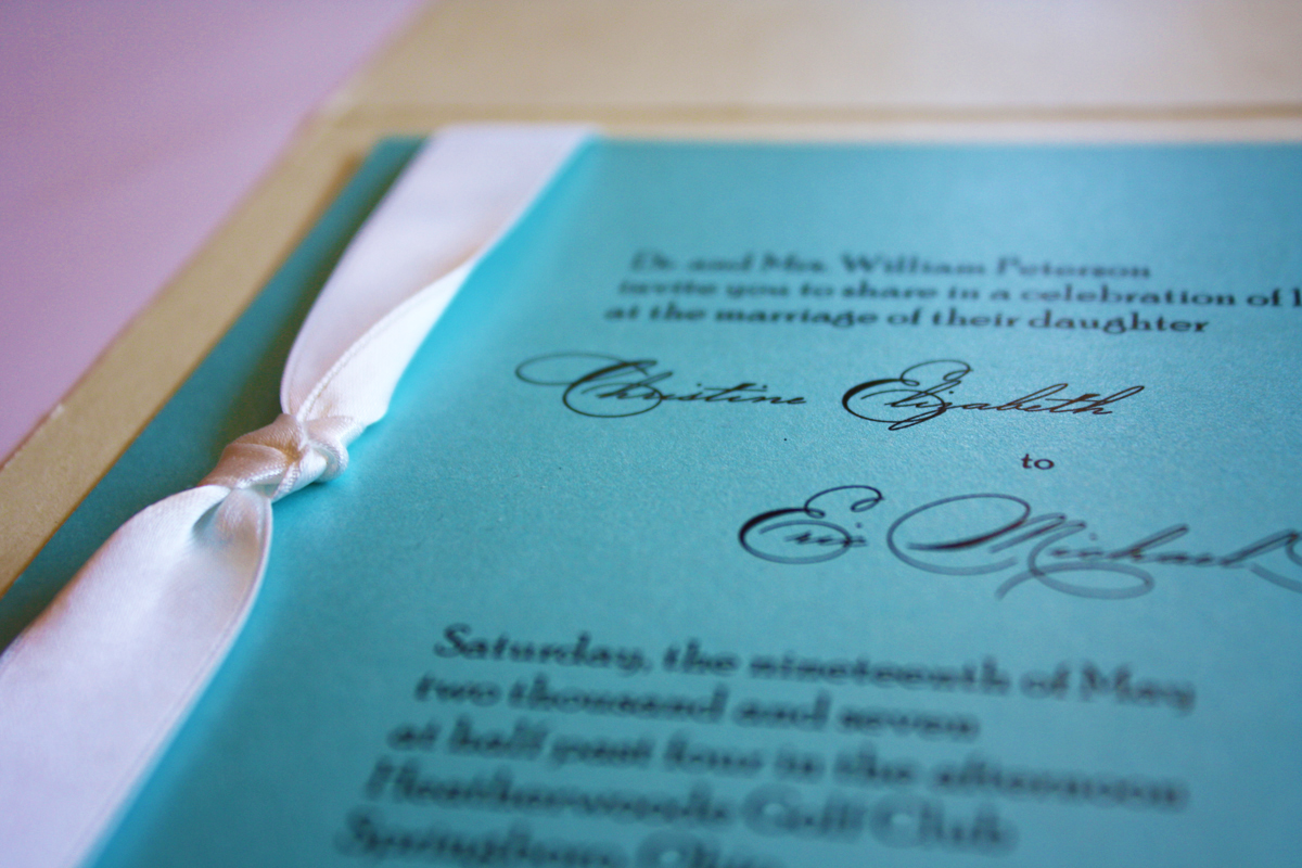
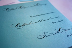
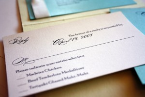
Working with Christina was easy- she knew what she wanted and placed complete confidence in us to build her perfect wedding stationery, not just for the wedding invitations but for her bridesmaids’ luncheon invites, shower and wedding thank you notes, programs and menu cards. The end result was a perfectly coordinated look that paid attention to every detail.