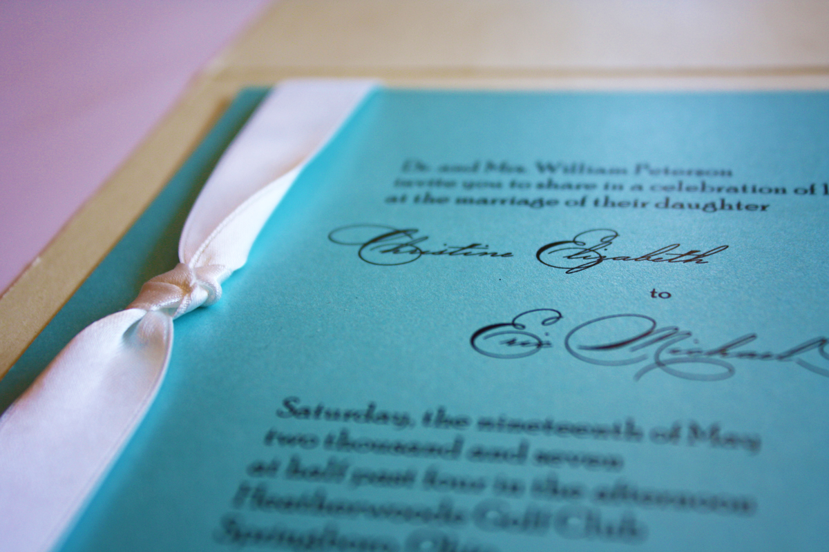
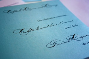
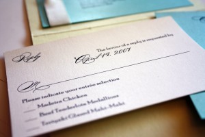
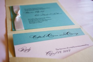
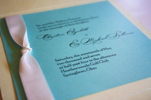
There was a short period of time in 2007 when I was really tired of Tiffany blue, however I got over it and I couldn’t be more pleased with how this invitation turned out. I really love printing on vibrant colors rather than neutral hues, mostly because I feel like it makes a huge impact. I always find that the invitations printed on bright card stock are the ones I remember the most, whether they are part of our custom studio or in an album. Color packs a punch. This invitation used Tiffany blue and a pale serpentine green, both metallic for plenty of sparkle, and added a crisp white satin ribbon and a really cool script. Bellissimo.