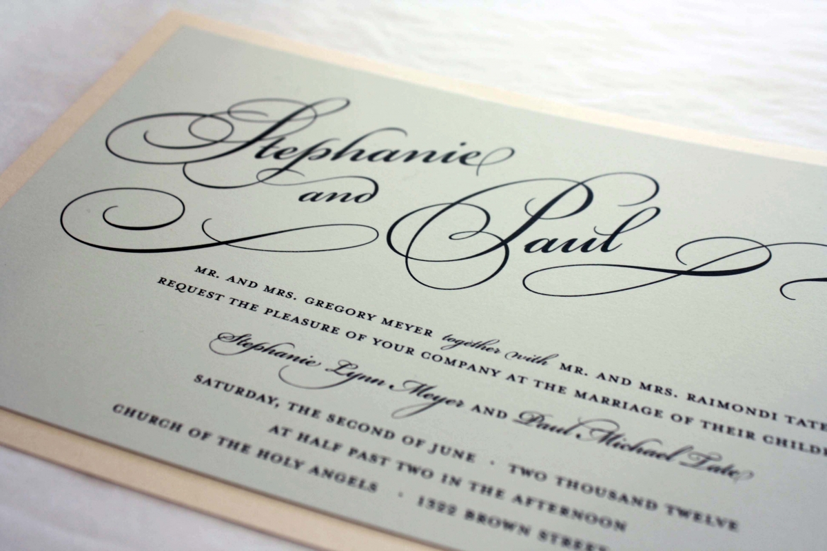
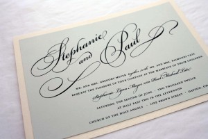
Sometimes customers bring us ideas they have seen online and ask if we can create something similar…almost always the answer is, “Yes!” Usually it’s a font or graphic that draws their attention, and there was something about the typography of a certain invitation she saw online that really grabbed Stephanie’s attention, so we made sure to incorporate that look. The most noticeable feature of the invitation is the bride and groom’s names, which are set apart in an oversized script encompassed in swashes and flourishes- in this way, the type actually becomes a graphic element, and no other graphics are needed to complete the look. We kept the overall design simple and chose a light pink for the bottom layer, topped with a light grey color called London Fog to give it a hint of romance.