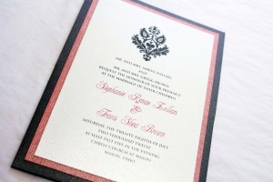
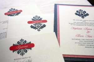
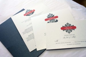
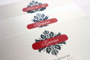
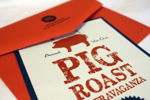
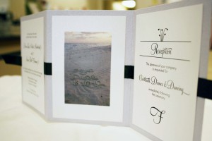
This was a classic case of a “color matching challenge”- there was a very specific shade of coral that Stephanie was trying to match and we couldn’t seem to find the right color in our custom line so she ended up bringing us 12×12 sheets of scrap-booking paper that we cut and used as her accent layer, then we matched the ink color of her headings and accent boxes to that shade as well. She went with a grey portrait pocket card for the base of the invitation, and we made sure the cards in the pocket lined up so the headings were stacked on top of one another for a seamless look.
Month: July 2012
Pig Roast Extravaganza
The Van Overs roast a pig every year and I adore that even though they live in Indiana, they call me every summer and ask for new ideas for their annual shindig. (That just gave me an idea for next year’s invitations….hmmm, “Pig Shindig”!) This year’s invitations blew the others out of the water- this was by far, the prize hog at the county fair. We used an indigo bottom layer of cardstock and a nice deep blue ink to match, coupled with a rusty red envelope and accent ink to coordinate, and printed everything on a pale grey stock called London Fog that gave it just the right amount of grit. I particularly like the “seal of approval” we used as a design element- this is one of those invitations that makes me happy just looking at it because it’s such a happy marriage of things I love…fonts, graphics, stocks, colors… it’s bacon-tacular (much like this clever site, which meat-lover computer nerds will appreciate).
Dana + Sean
Beach weddings are the most popular type of destination wedding; Dana exemplified the destination bride with her laid back attitude…from the first day we met Dana, she put the power of creative control into our hands and told us to “just do it.” She had a few ideas of her own that she wanted incorporated into her invitations, including a picture of the beach where they would be getting married, but other than that she just wanted something simple and fun to reflect her small destination wedding. We chose a tri-fold card that had a heavy texture on it, almost like seashells; to complement the shimmery silver tri-fold we used white micah printed cards and a simple black ribbon to pull it all together and make it feel less informal. The photo of their initials carved into the sand added a nice personal touch, and the overall effect was beach-elegance.
Mandy’s Good Humor Shower
Mandy, the bride-to-be, was a Good Humor ice cream girl once upon a time, and the ladies throwing her shower thought it would be fun to have an ice cream themed shower. They mentioned that humor was also an important part of Mandy’s relationship with her fiance, so the “good humor” theme was doubly appropriate. The hostesses also wanted to incorporate a photo they had gotten from Mandy’s dad (from her ice cream days) into the design. I thought it would be fun to make it look like she was back in the ice cream truck, so I put together some “cool” graphics and voila- a shower invitation unlike any other, custom made just for Mandy.