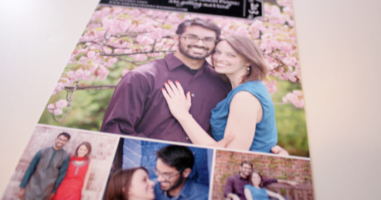
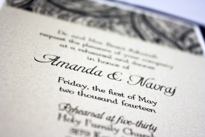
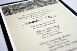
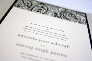
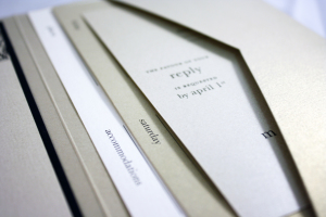
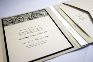
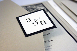
This was another of my favorites this year. The invitation was neutral and formal using a palette of black, a tiny bit of ivory, and shades of gold. We used all metallic stocks, which set an extra elegant tone. One thing that was different about this invitation suite is that it included a card that listed the dates, venues, and locations of all of the wedding events to make it easy for guests to keep track of where they were supposed to be and when. To coordinate with her invitations, we also designed programs and rehearsal dinner invitations in the same color scheme.