Category: holiday
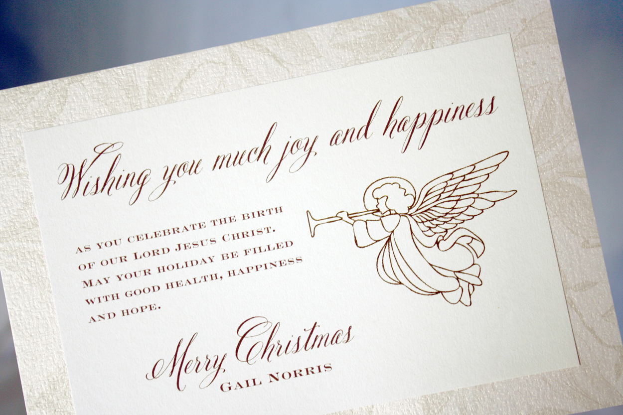
Trumpeting Angel
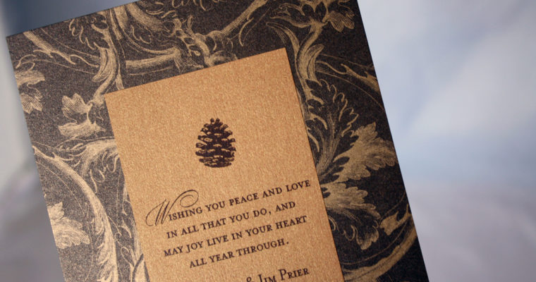
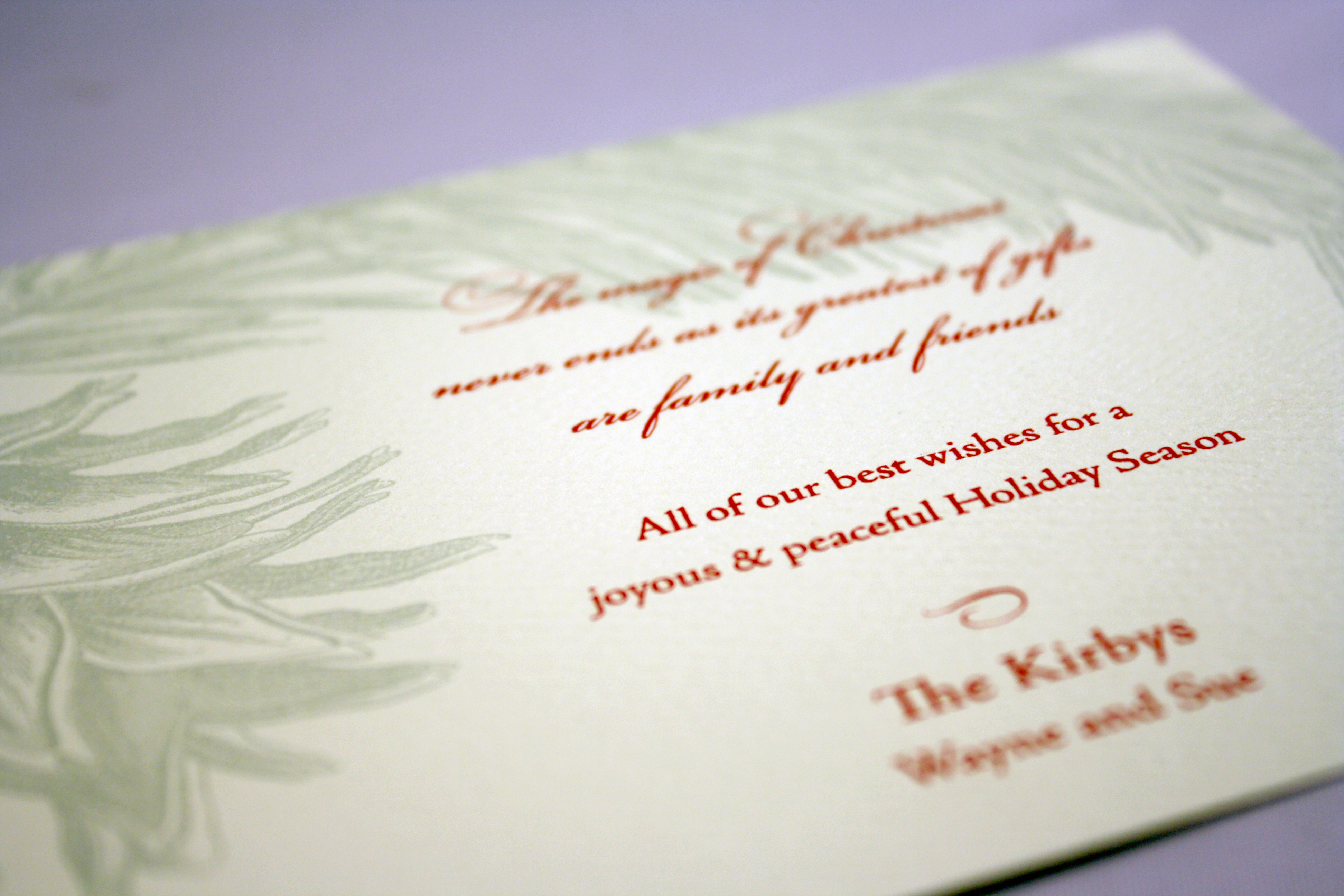
Copper Pine
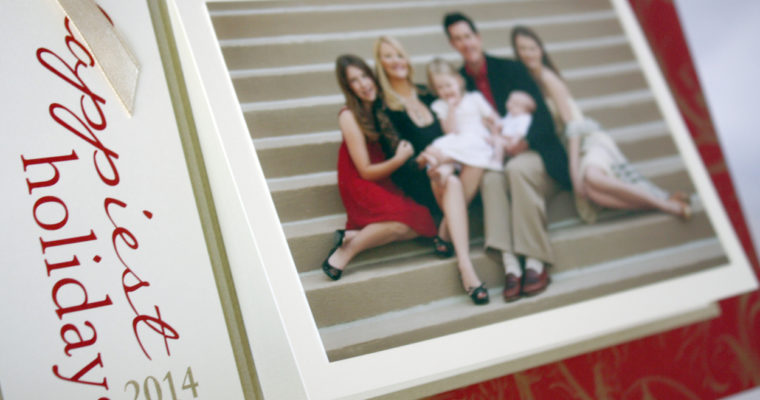
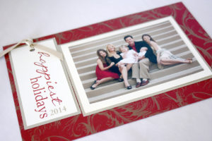
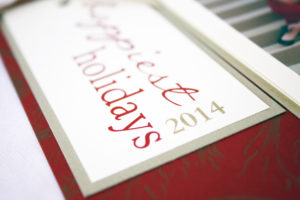
Happiest Holidays


Poinsettia
Abstract poinsettia leaves in light and dark green, red berries, and looping script combine for a beautiful holiday greeting.
Peaceful Tidings
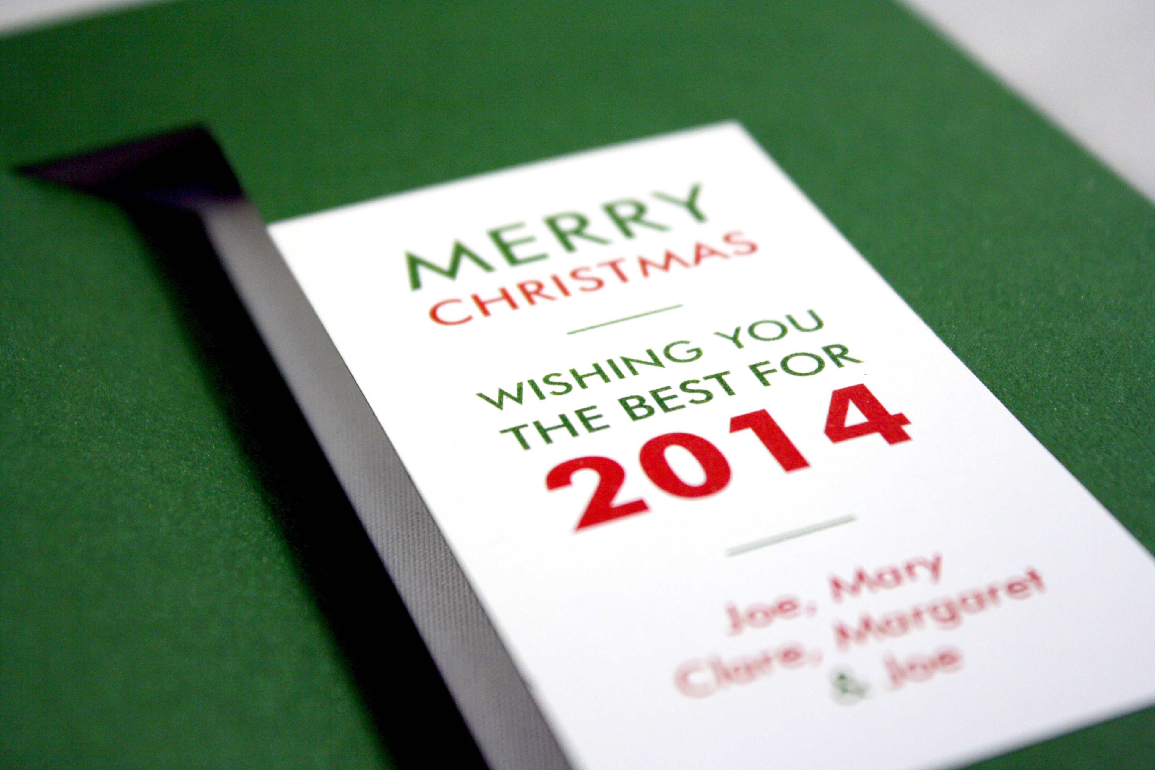
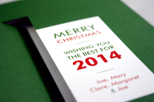
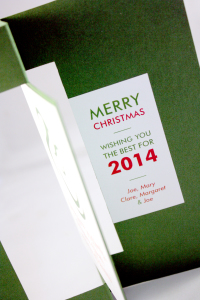
This might actually become my own holiday card this year. I love everything about it. It’s a unique style: a folded layer mounted to a single green piece, with just a minimalistic message.


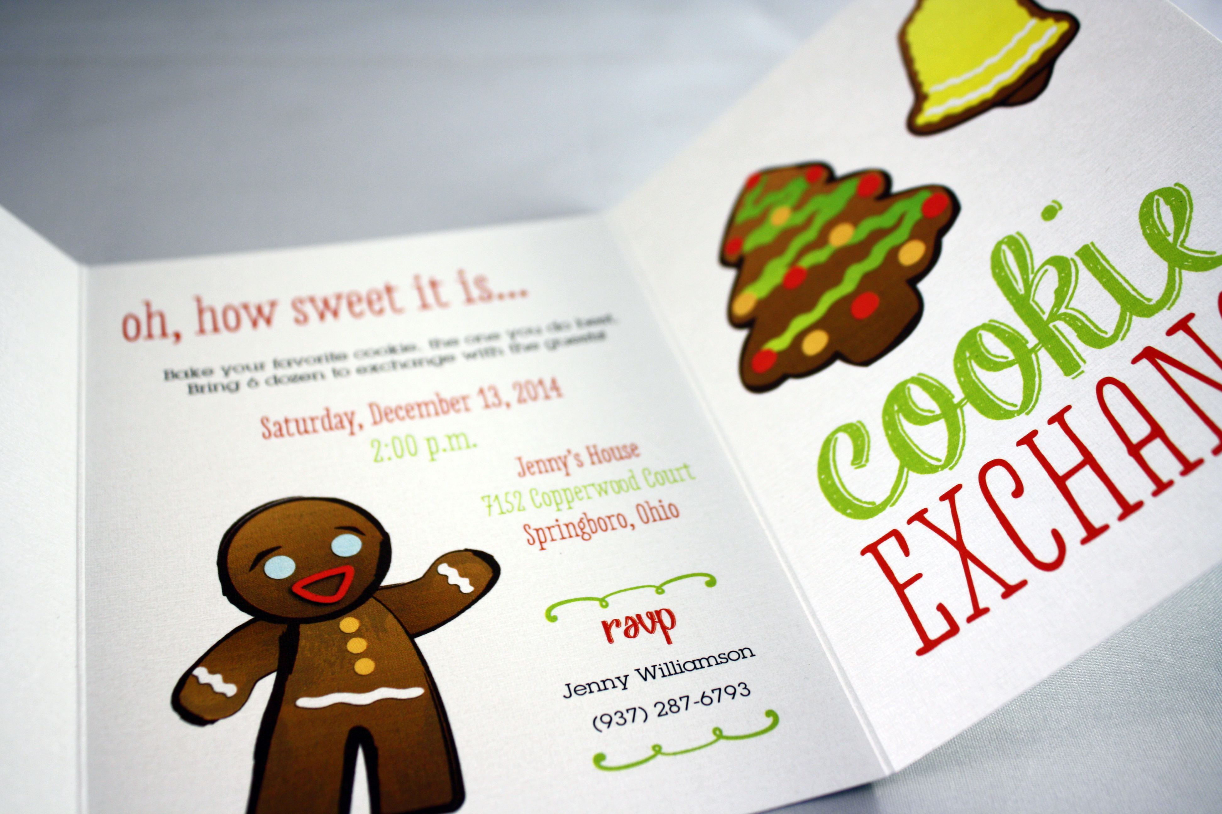
Cookie Exchange
What an easy card this was to whip up… We chose a small trifold card with a bright green damask pattern on the back, printed large cookie graphics on the white side, and threw it into a red envelope. One layer, simple layout and no assembly made this cookie exchange invitation a walk in the park.


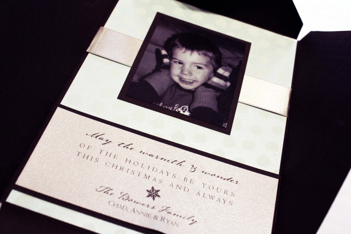
Holiday Photo Greeting
One of my favorite things about this card are the tiny candy cane striped strings that stretch out from each side of the text box in the center, giving it just a sweet, pink touch of holiday magic.
Christmas with a Twist
This green twist card has an abstract drawing of Mary on one side, and the family’s greeting on the other. They chose a modern sans serif font for the message and just a few pops of red.

Winter Landscape
If you’re a little tired of all the red and green at Christmas, a lovely alternative for a holiday greeting is to go with a winter landscape in snowy tones of blue, white and chocolate. This Tag and Co. design boasts a sort of calm tranquility and the elegant, white script at the top is a perfect complement to the rich color of the evergreen trees.
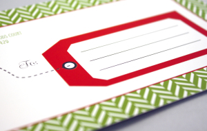
Gift Tag Post Card
If you’re looking for simple, this is the card for you. We designed a two-sided post card in a small 4×6 size with a little “gift tag” address block on the back for easy hand addressing.


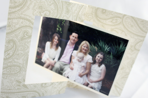
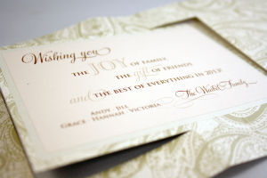
Holiday Mendhi Twist
Twist cards are a great way to include a photo and greeting on opposite sides of the same card, without actually turning the card over. Just gently pull on the left and right edges of the card and the photo twists around to reveal the greeting. They chose this color palette to coordinate with the soft shades in their clothing, with emphasis on the pale pink in baby Victoria’s dress.
Elegant Tree
The cherry on top of this one was the one, tiny rhinestone at the top of the tree. White and red ink topped this gold card for an elegant, festive greeting.
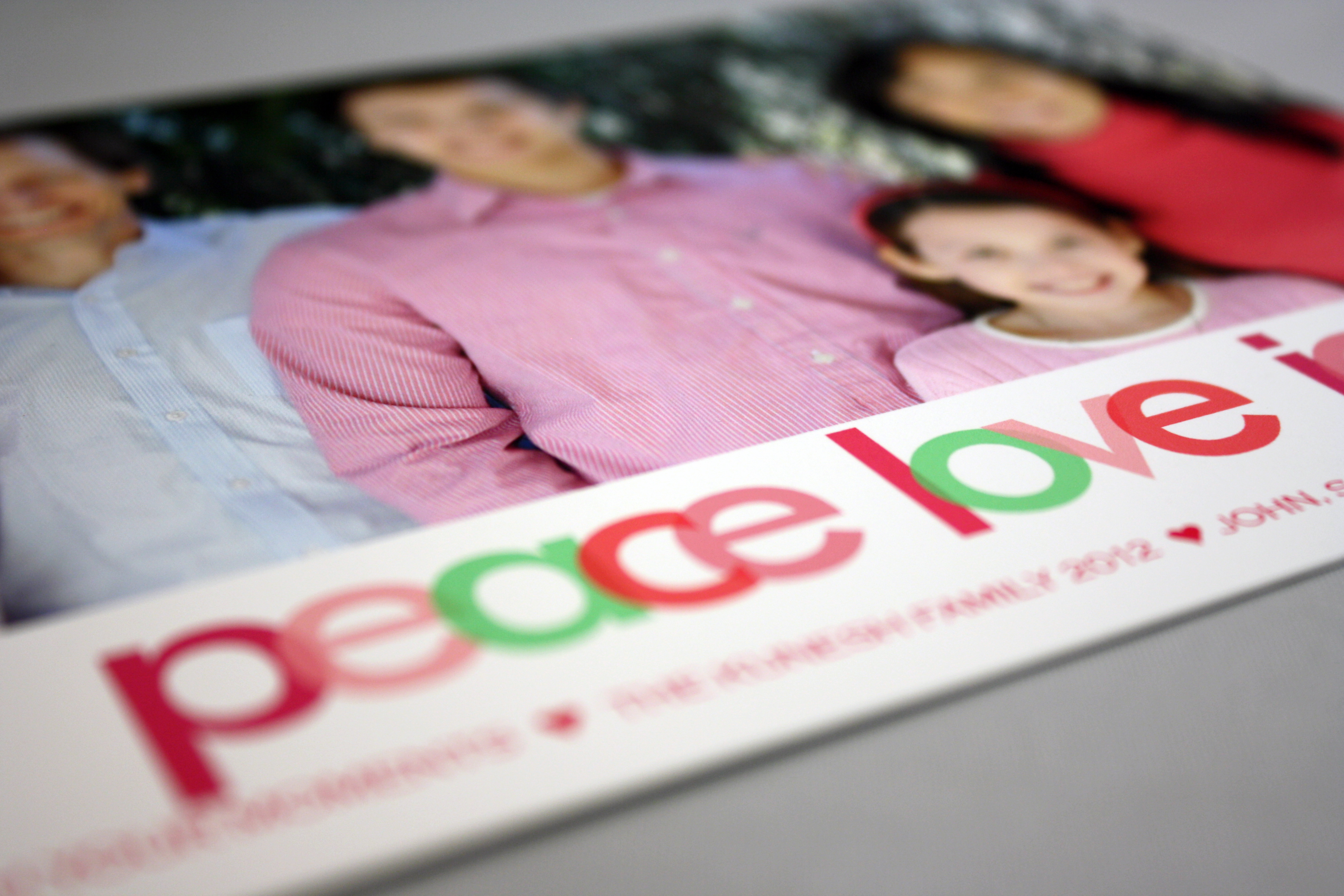
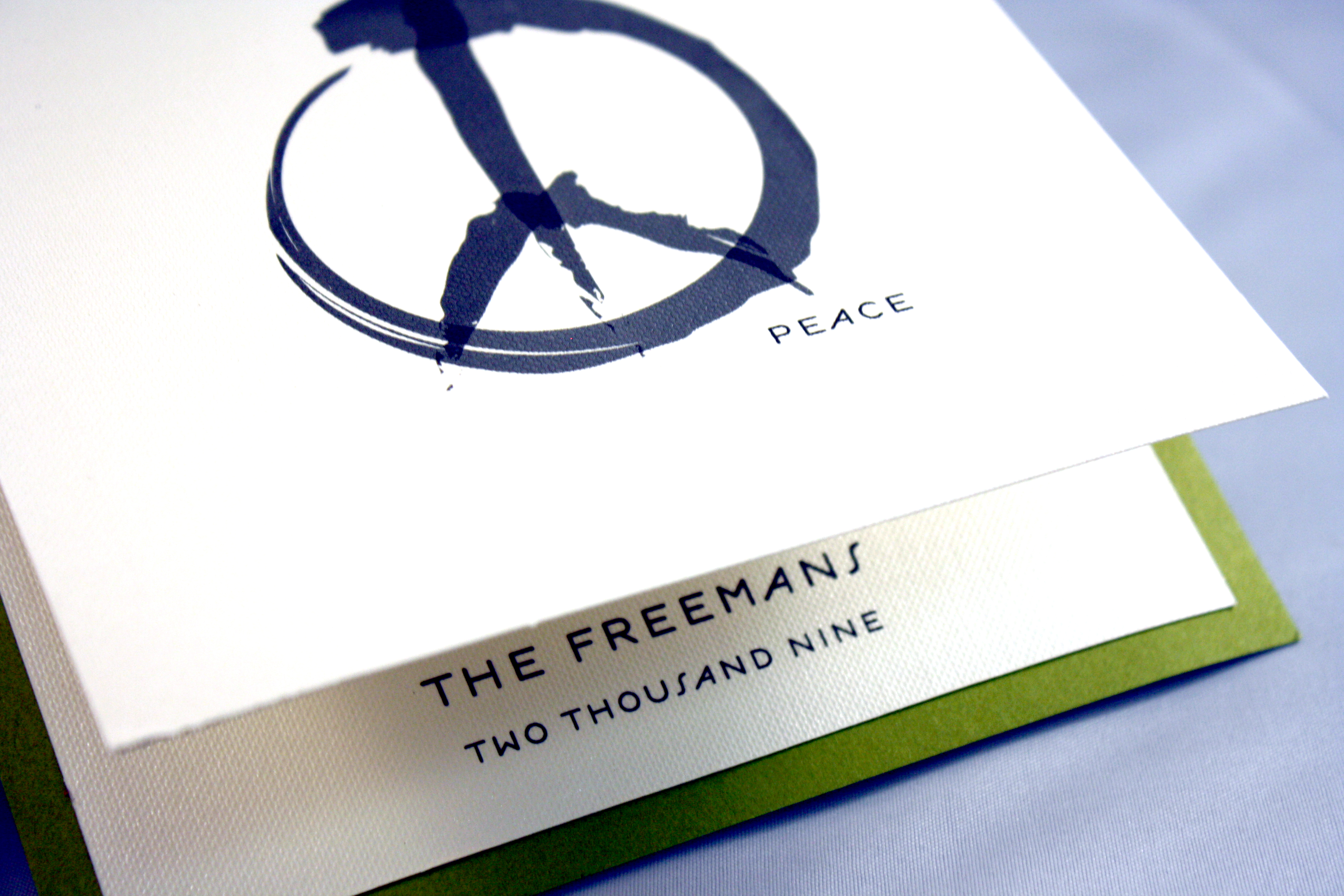
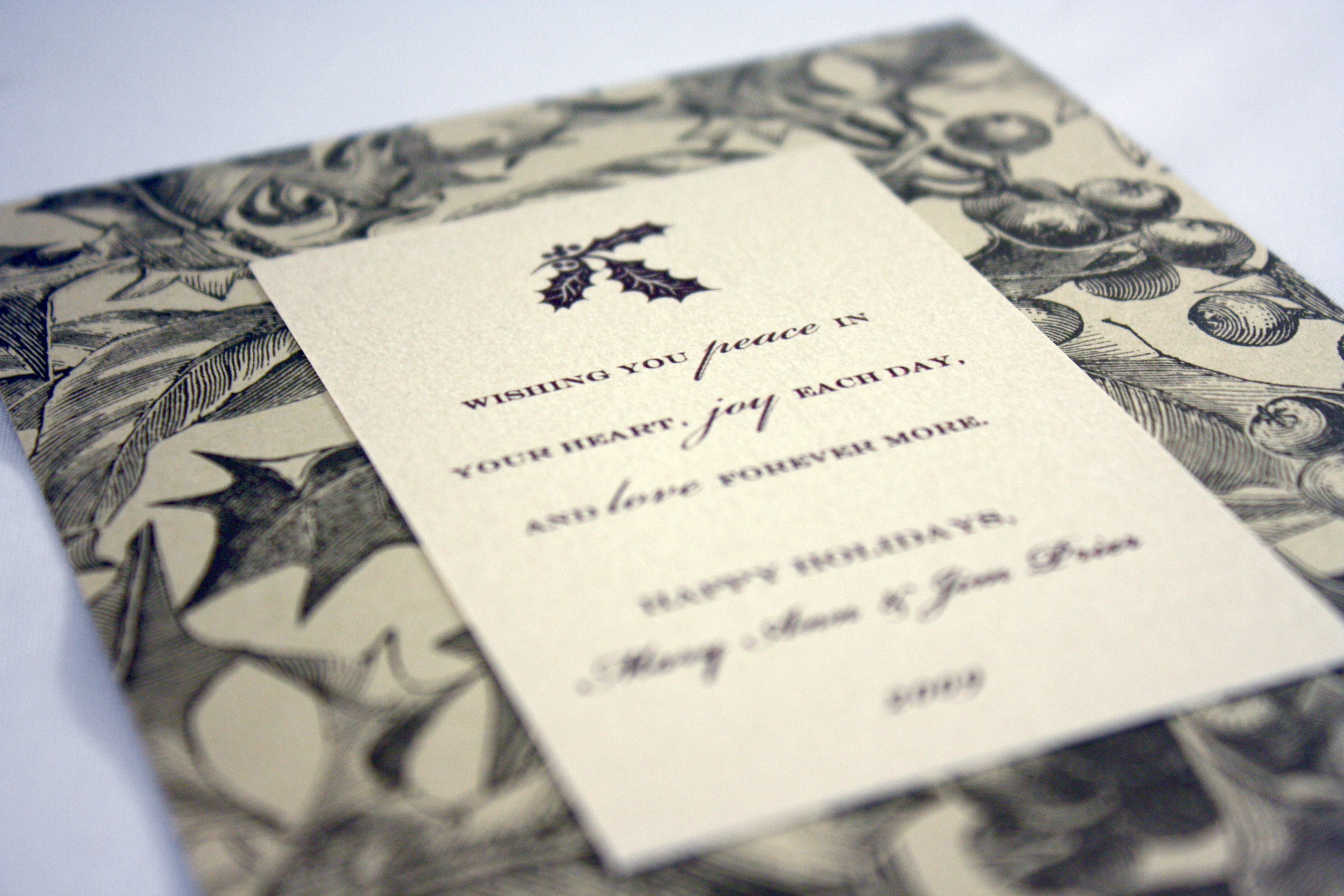
Peace
Who says you have to use traditional Christmas colors on a holiday card? This customer chose pink and green shades to coordinate with the colors they were wearing in their family photo. Also by Tag and Co., this is a more contemporary design and was a different choice from years past that was fresh and fun.
Holly Holidays
There’s just something about a few bursts of bright holiday red that is absolute perfection when paired with light blue and deep mocha. This card found the perfect balance of soft blue, vibrant red, and rich brown.
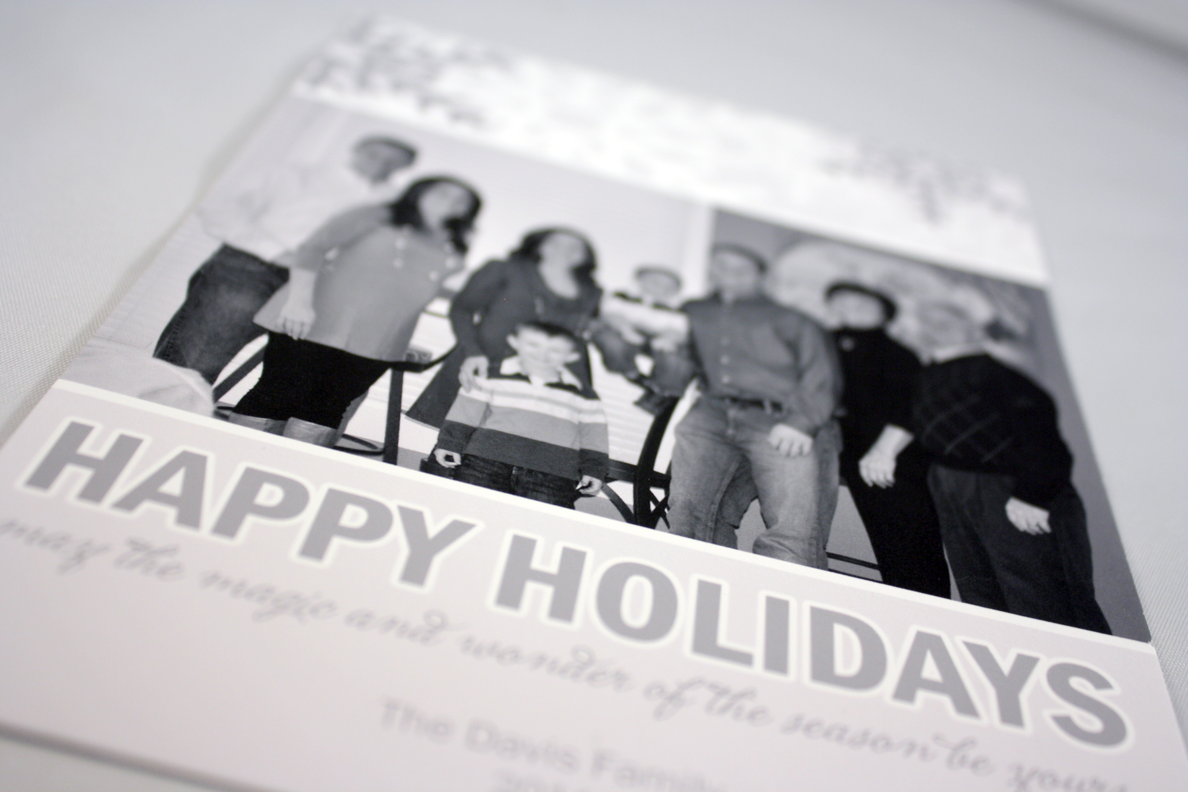
Davis Holiday Card
Tag and Company does exquisite photo printing, which is why they are a big favorite of ours for any holiday card that uses a photo. This monochromatic card stays clean and simple with a black and white photo and grey tones for the rest of the design.
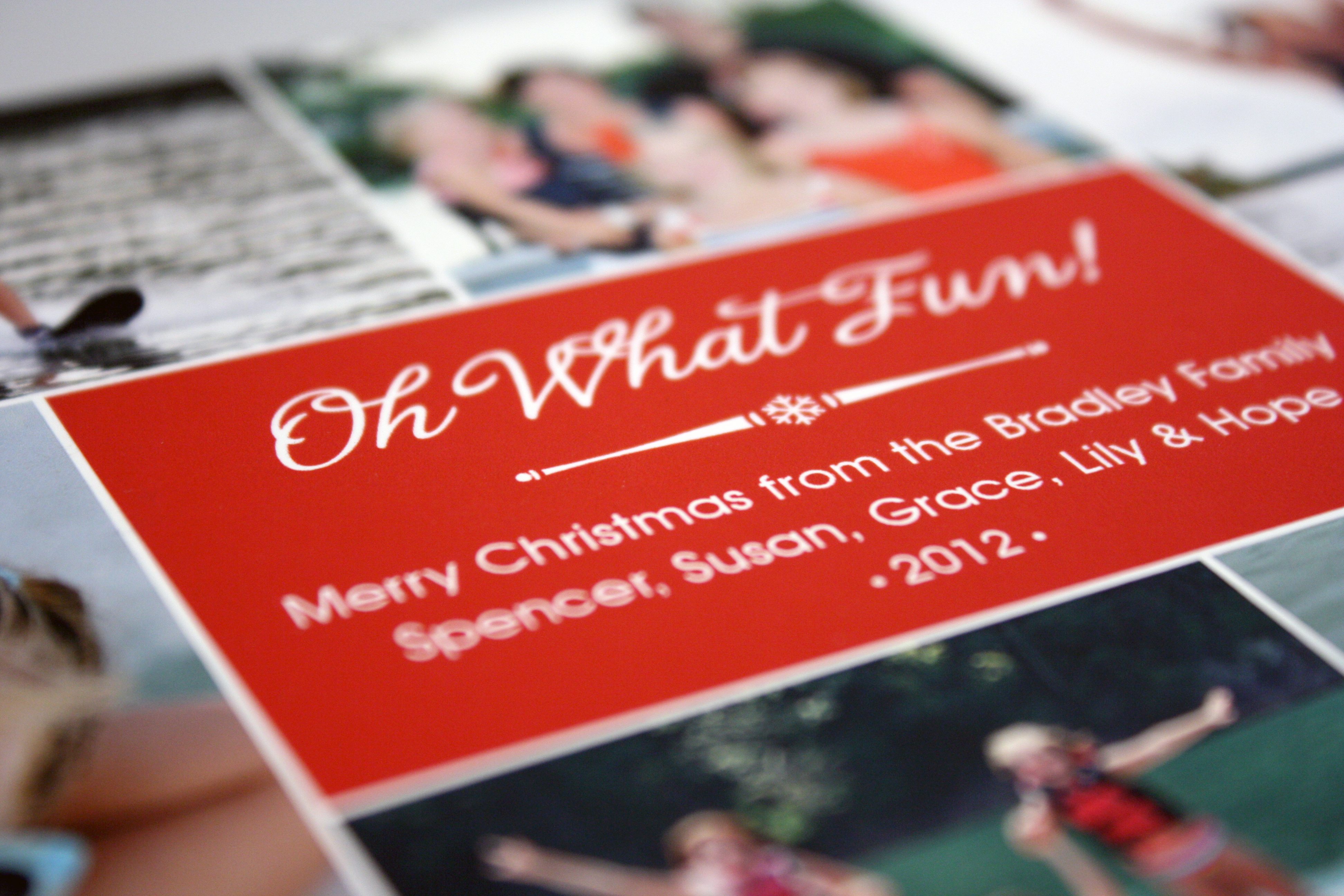
Oh What Fun!
We had Tag and Co. create another masterpiece with a selection of fun summer family photos that was sure to warm the hearts of their friends and family.
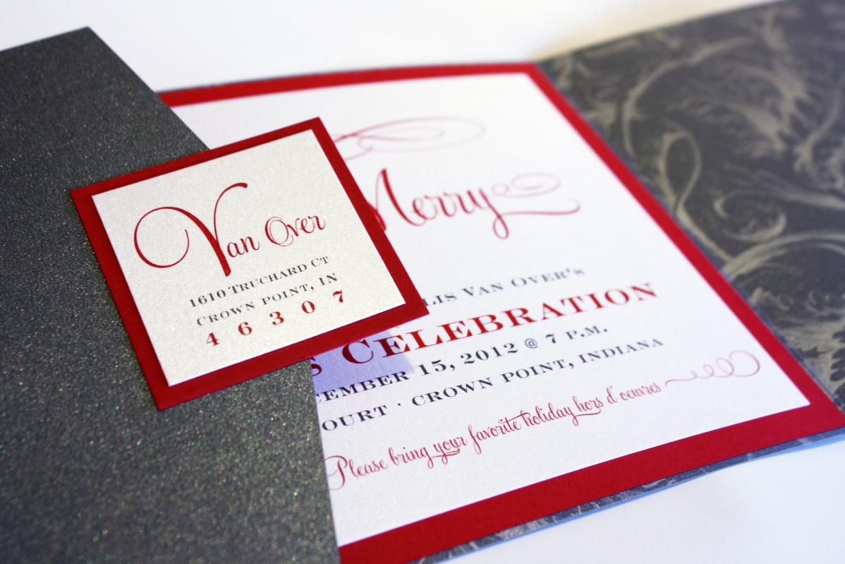
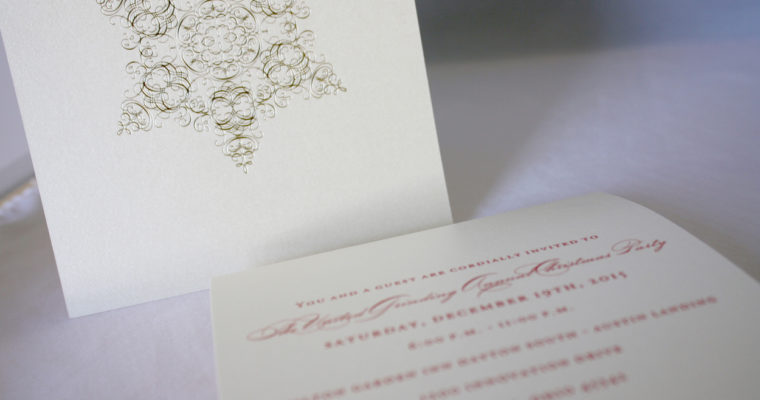
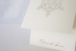
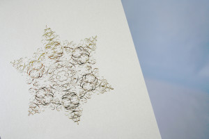
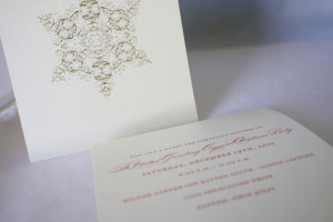
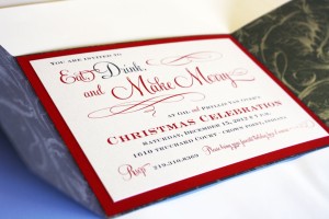
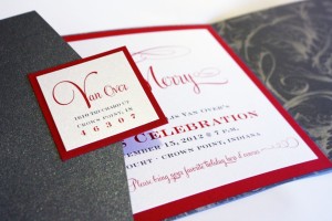
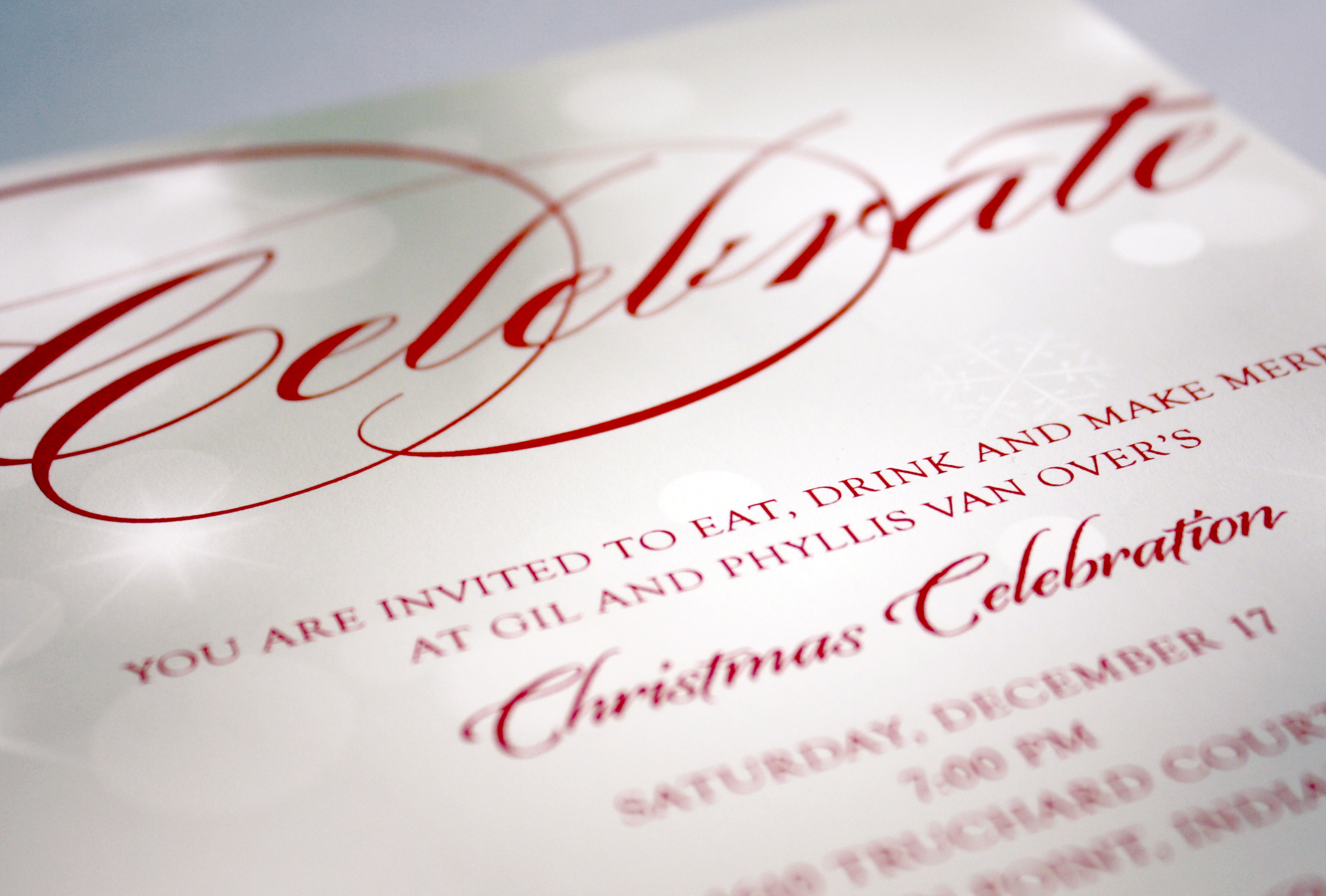
Eat, Drink & Make Merry
My famous annual pig roast customers wanted a Christmas celebration invitation that would generate a lot of excitement for the second of their yearly shindigs, having set the bar high with their summer pig roast. Phyllis and I looked at a lot of ideas and this festive gatefold style invitation won out. We used a graphite plume pattern for the bottom layer, a crisp red for the accent layer, and a shimmery white top layer reminiscent of a snowy day. To close the gatefold and add a piece of flair to the outside, we added a two-layer square seal with the return address, allowing the outer folding piece to become the “envelope.”

Evergreen Christmas
This super fun couple comes in once a year to order holiday party invitations as well as their Christmas cards, and catch up on the latest news around the shop… this was the traditional Tag and Co. design they chose to send to friends and family.
Baby, it’s cold outside
This is my baby (who isn’t a baby anymore) staying warm on a chilly Fall morning in 2007. The morning I snapped this pic he had gotten into my closet and dug out my pink slipper socks and some striped hot pink fuzzy gloves. Still in his pj’s, he brought them out into the living room, took all the cushions off the couch, put on the socks and slippers and proceeded to sit in his cushion fort watching Bob the Builder, oblivious to me taking about a dozen photos of this precious morning moment that I might not have remembered had it not been for the camera (another reason I love photography so much).
I’m one of those people who prefers candid shots over staged photos, and as soon as I started planning my Christmas card in 2007 I kept thinking of this picture of him with the fuzzy gloves, and the expression “Baby, it’s cold outside….” In the end I opted for a different sentiment and decided to tone down the hot pink by converting the photo to sepia, but this was the most elaborate holiday card I’d done to date. There were about nine layers of paper and ribbon, including a 5×7 Envelofold from Envelopments, layered with a light blue polka dot paper and rich chocolate brown accents. I went with a lustrous silver printed card and matching envelope; most of the layers were handcut from larger pieces of card stock in order to create the framed look around the photo, the “Peace” seal on the back, and the greeting itself. It was worth it- every time I look at this custom creation I remember what the holidays mean to me- embracing love and family, and appreciating those moments in life that sometimes you’re just lucky enough to capture on film.


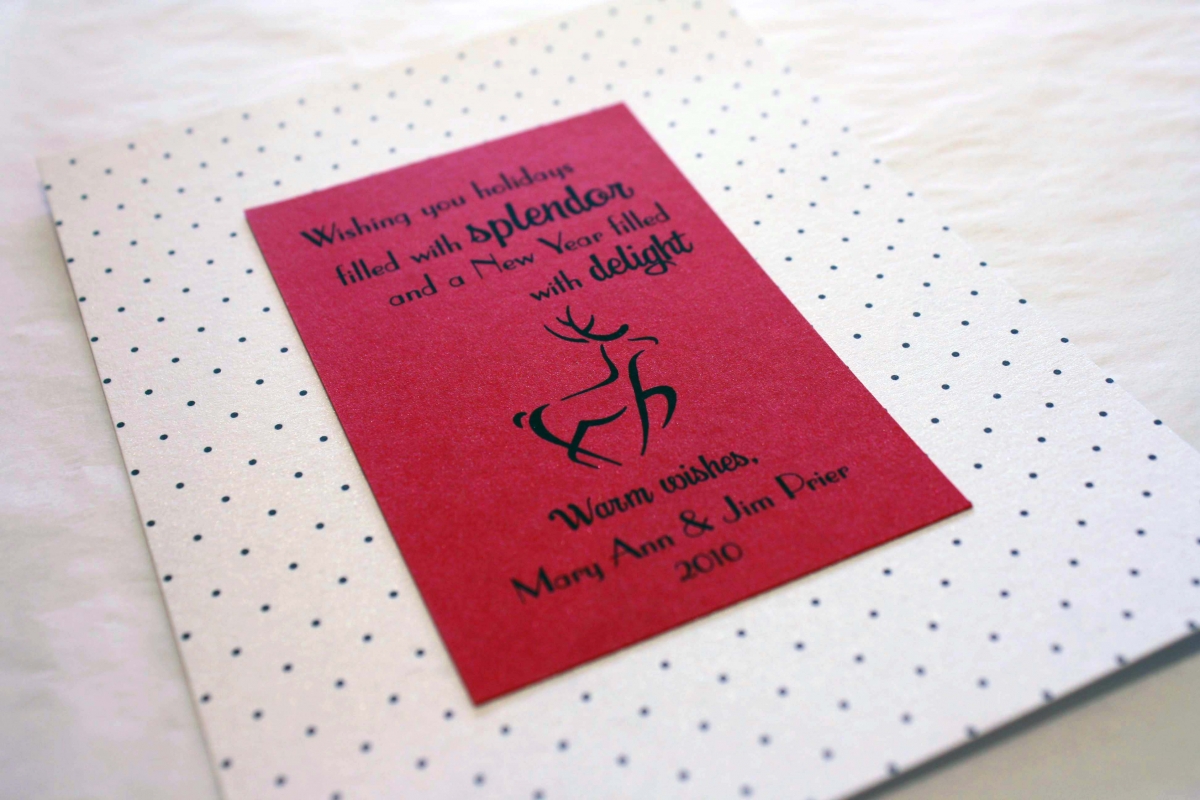
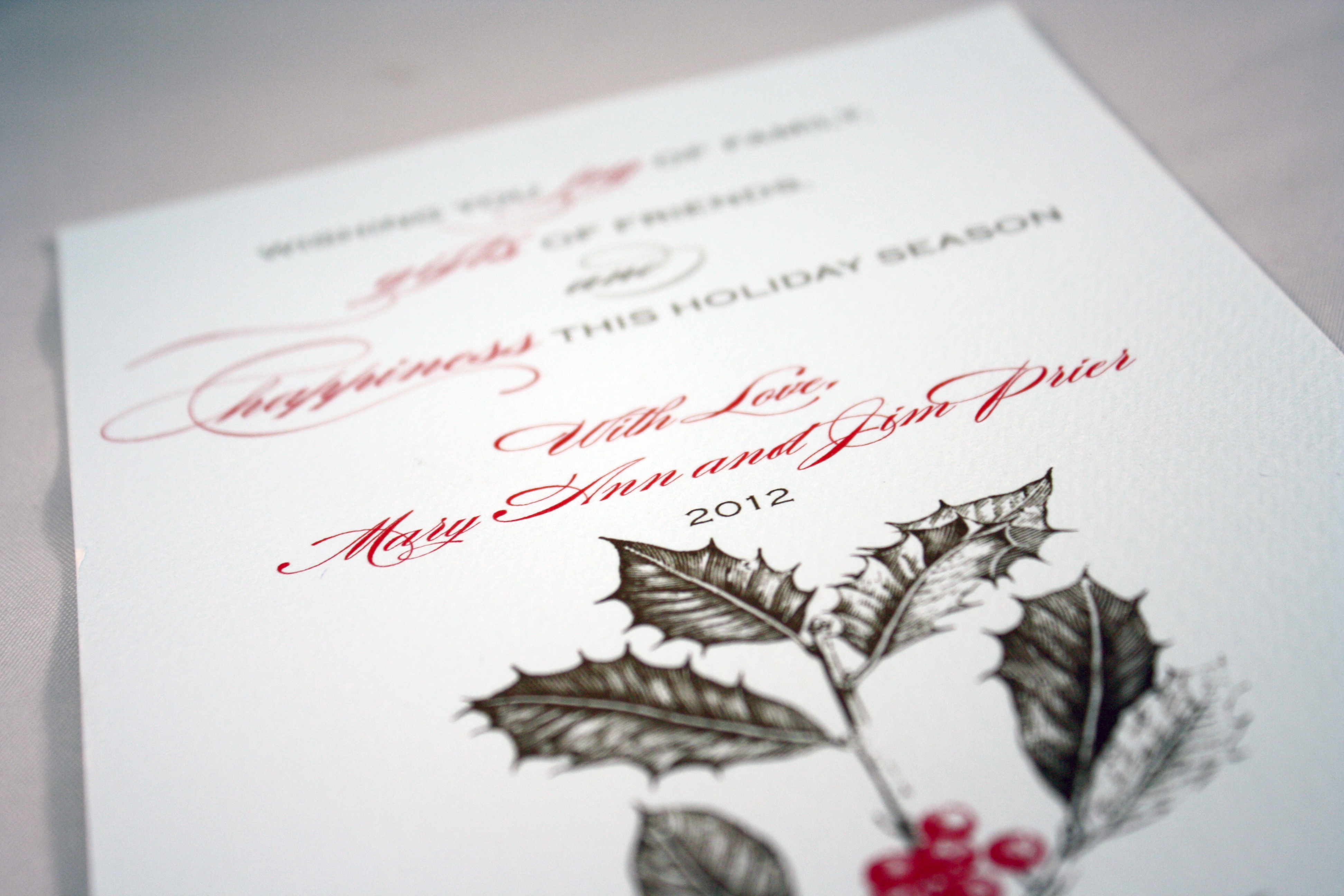
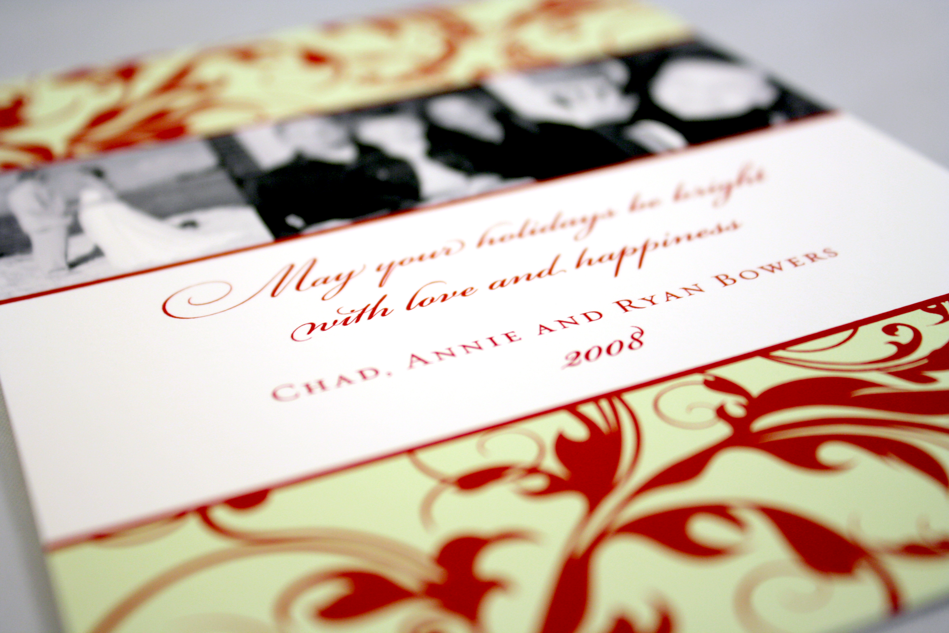
Holiday Splendor
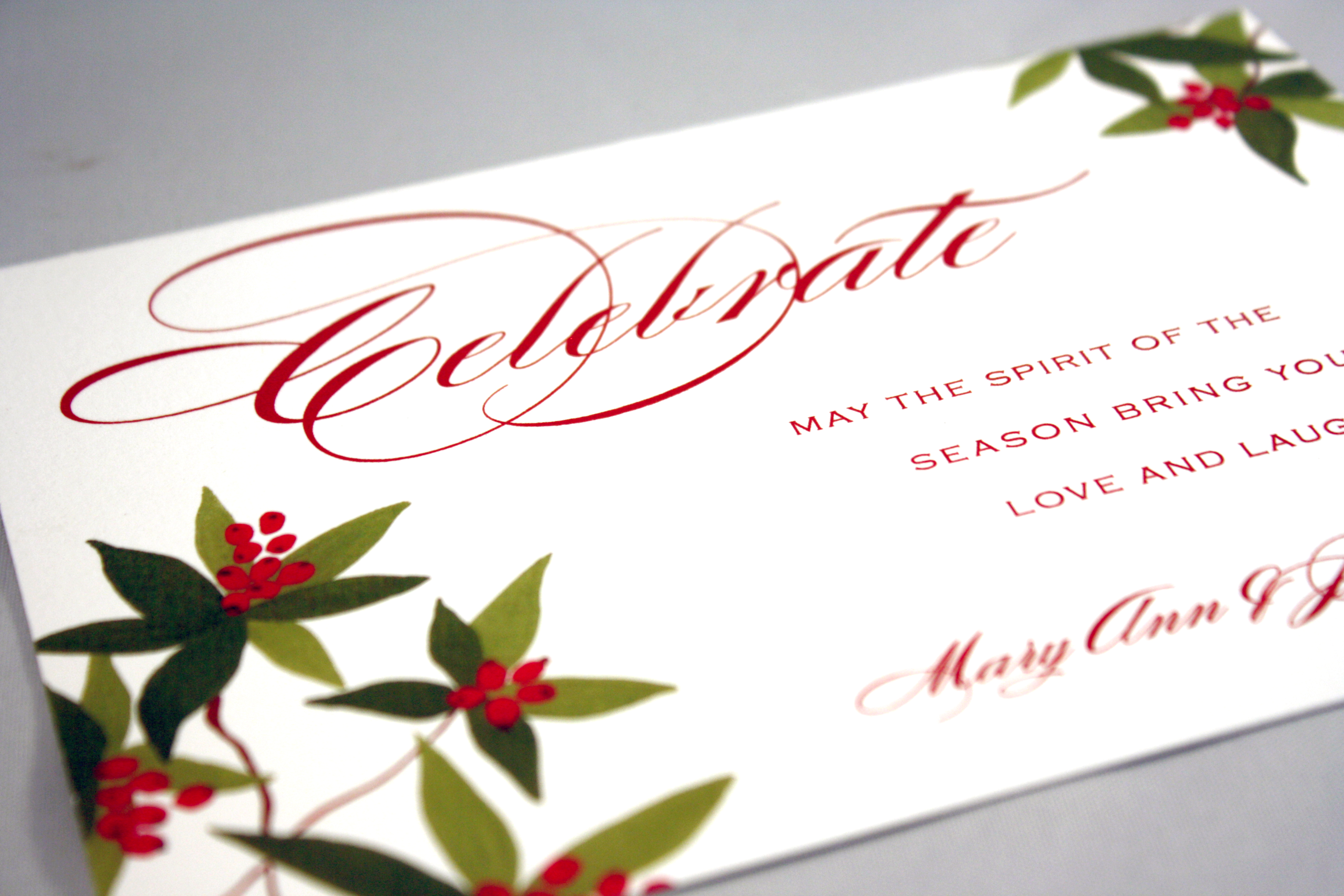
All year I look forward to my annual October-ish visit from Mary Ann…She’s one of these awesome fiery ladies with a personality that keeps me laughing almost constantly. And every year when she and her friend stop in to work on Mary Ann’s holiday cards, we are tasked with coming up with something “even better than last year’s” (which is no small accomplishment since we’ve been designing her holiday cards since we opened in 2005.) Last year’s card was a beautiful creation from Tag & Co. but in 2010, we created this whimsical dancing reindeer card. Mary Ann loves bright colors, particularly red, so that was an obvious choice as the top layer, and the tiny dot pattern adds a sweet and simple touch. The most important decision each year with her cards is the sentiment- always unique, heartfelt and sincere, it can’t be something we’ve ever used before. Mary Ann challenges me to keep reinventing her cards, and keeps me giggling well into the New Year.
Celebrate
The oversized script speaks for itself, and the subtle circles of light in the background look like stars or lights glittering in the snow.
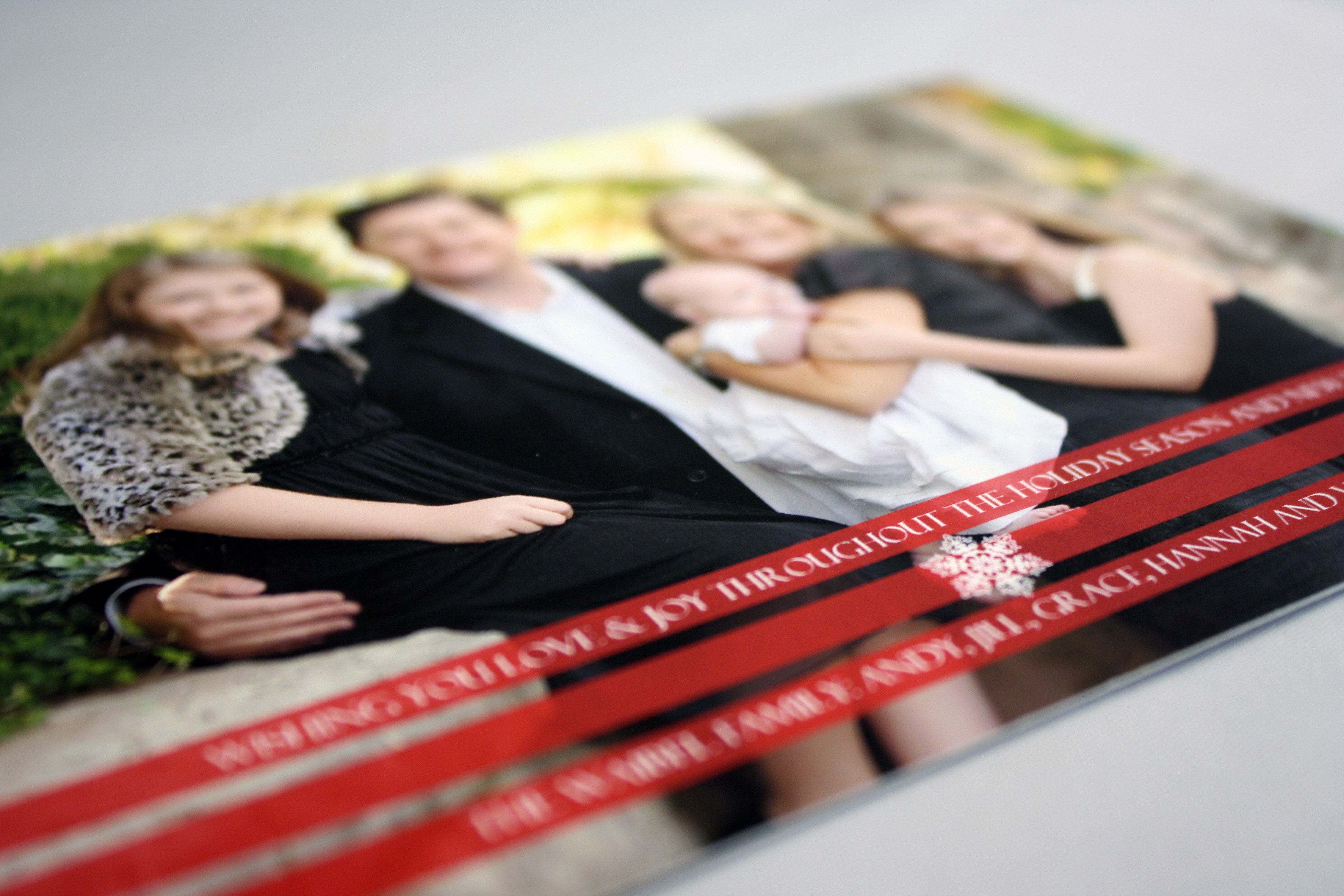
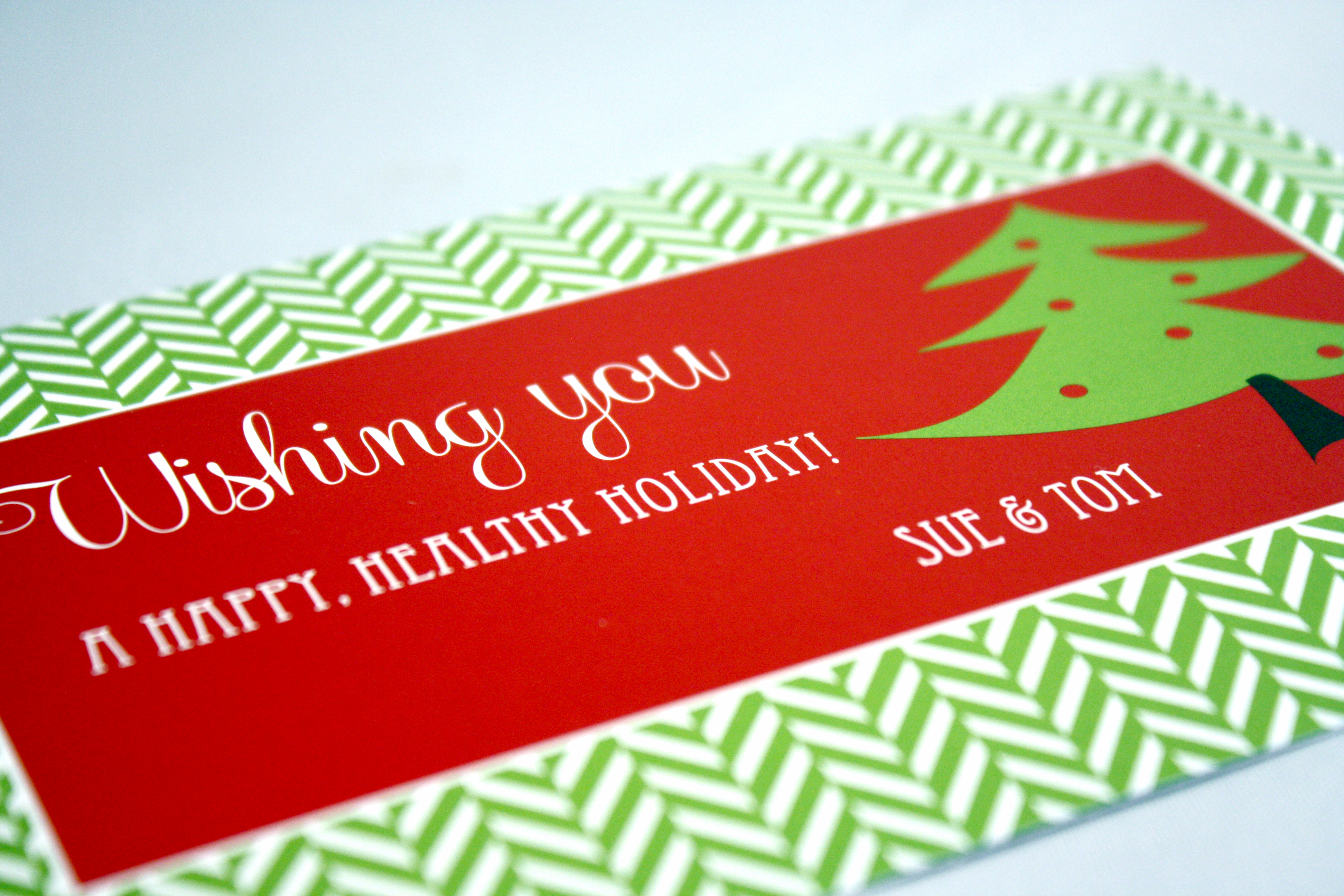
Red Stripes Photo Card
Another by Tag and Co., this holiday greeting features a full bleed photo with a few red stripes across the bottom where the text is placed in reverse type. If you have a professional quality photo, let it speak for itself by keeping the photo as the main focus.
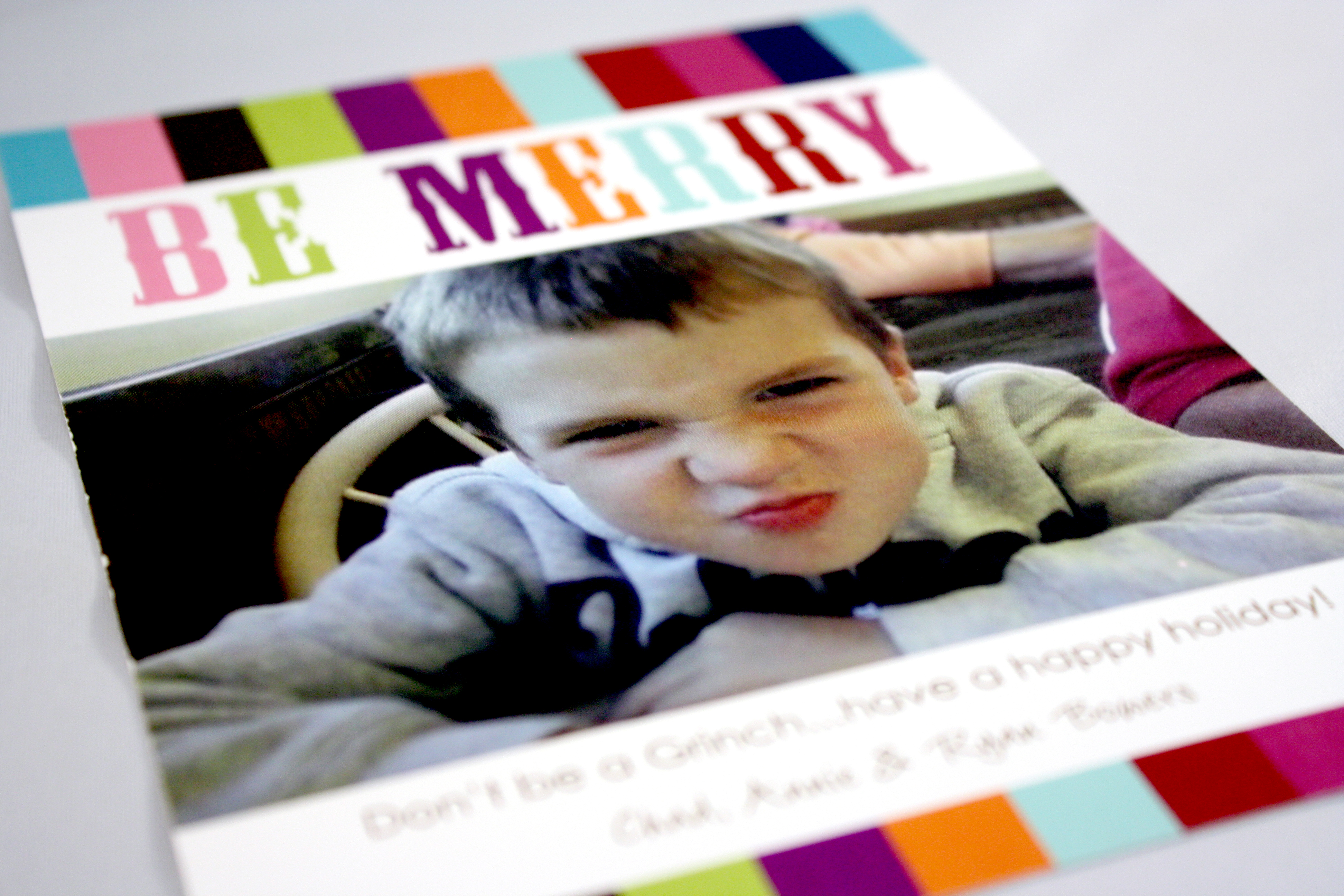
Be Merry
This was my own little grinch (pretending to be mad), and I thought it would make a great holiday card especially with an ironic message blazing across the top. Just a friendly holiday reminder not to let the stress of the season get you down…
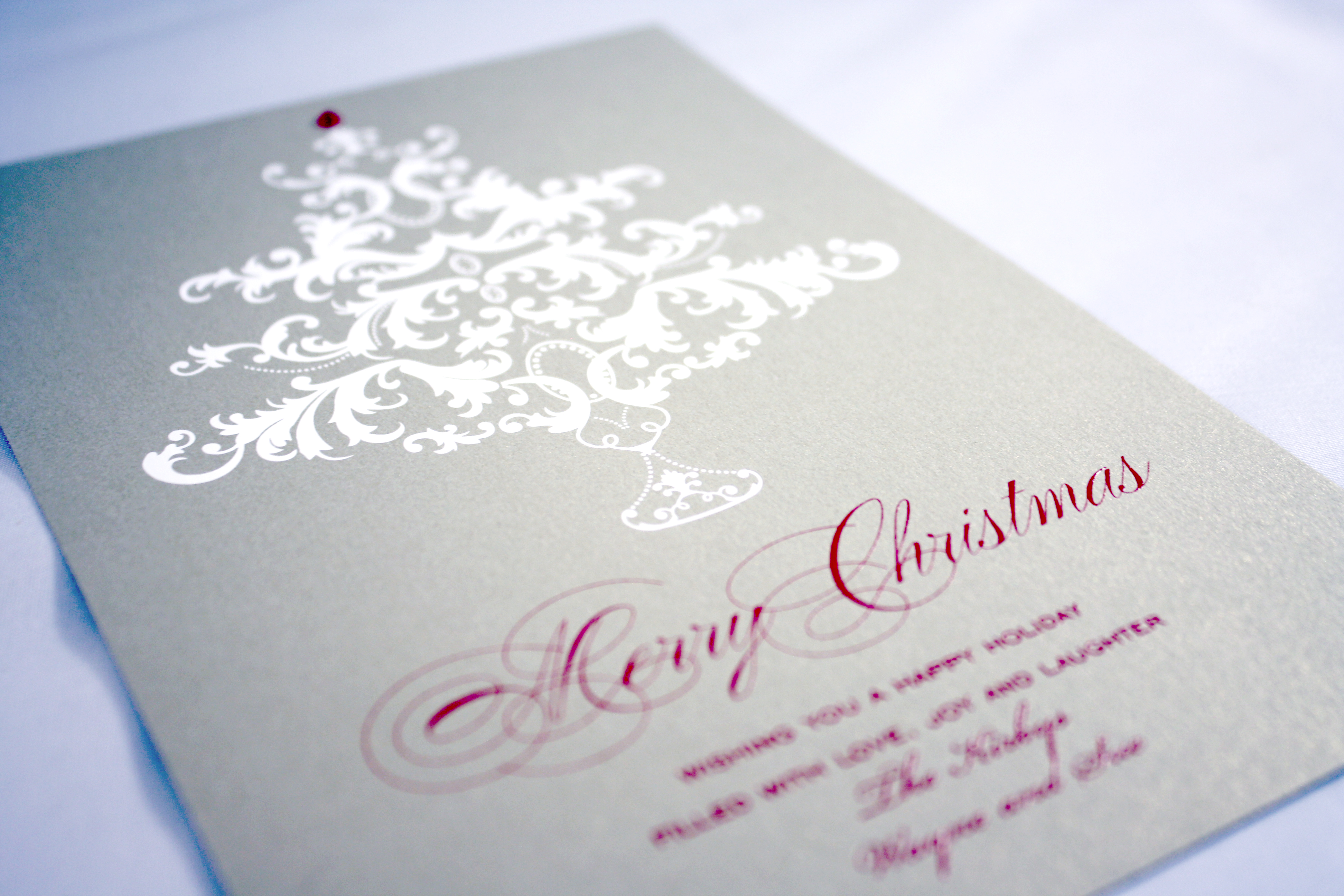
Gold Holly and Ivy
Classic. Traditional. Gold. This card reminds me of something out of a Charles Dickens novel. With the shimmery gold and deep brown graphics and text, this card practically sings its own Christmas carols.
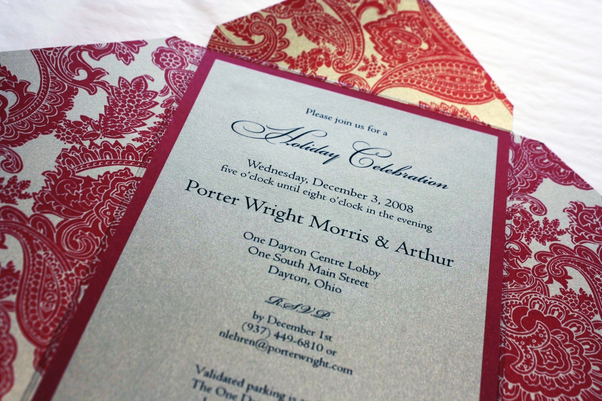
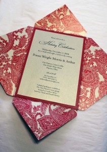
Porter Wright Holiday Party
The holidays always come faster than we’re ready for, and Porter Wright Morris & Arthur asked us to help them prepare for their annual holiday party by putting together an invitation that was festive yet professional to send to their extensive client base. This 5×7 folding invitation had a rich red paisley design on one side and a solid pale gold metallic color on the other. We printed on the same pale gold paper as the back of the folding piece, and kept the fonts basic and professional with a script accent for holiday spirit.
Red and Green Flourish
This was one of my favorites of the holiday designs Tag and Co. brought out a few years back. I love the combination of the vibrant red and green pattern contrasting with the black and white photos.
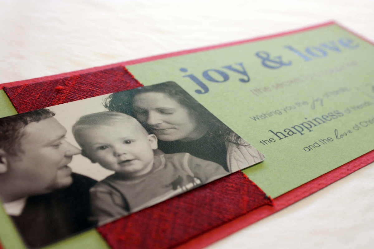
joy & love
Another lovely creation for Molly, who did the going away fiesta for her friends, was her holiday card from 2007. There are three things that stand out to me about this holiday card: first, the gorgeous photo of Molly, Chris and Truman (who now has a little sister, Tenley); the generous dupioni silk ribbon; and the words “joy & love” that express their Christmas wishes to friends and family in a bold yet simple fashion. This card was a perfect blend of texture, color, and expression.