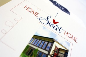
Category: social
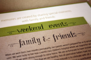
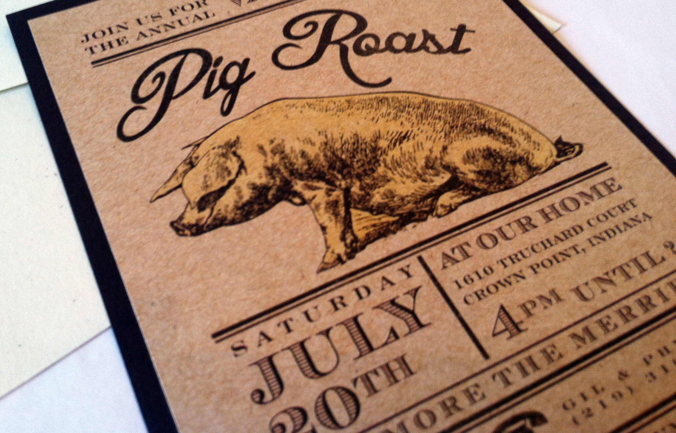
Vintage Pig Roast
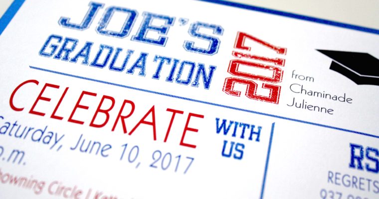
Joe’s Grad Party
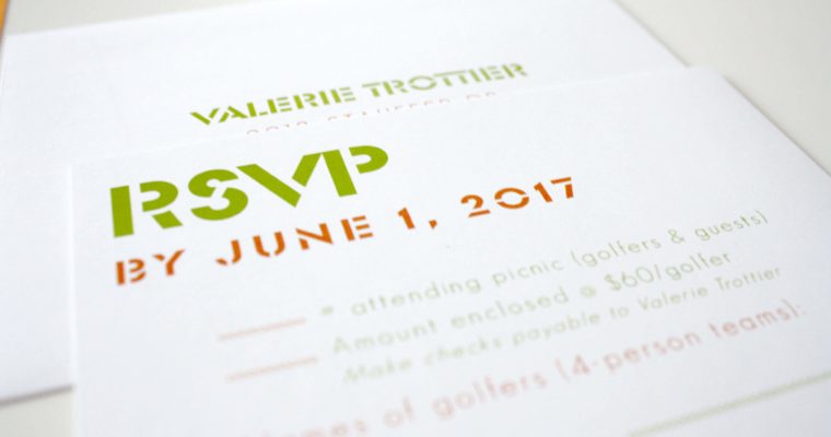
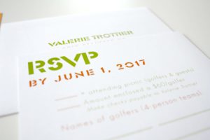
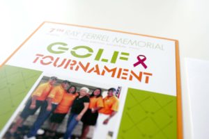
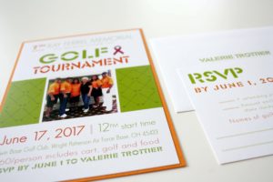
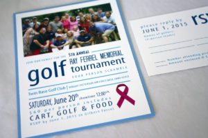
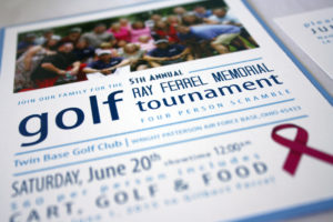
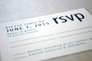
Memorial Golf Outing
Med School Grad Party
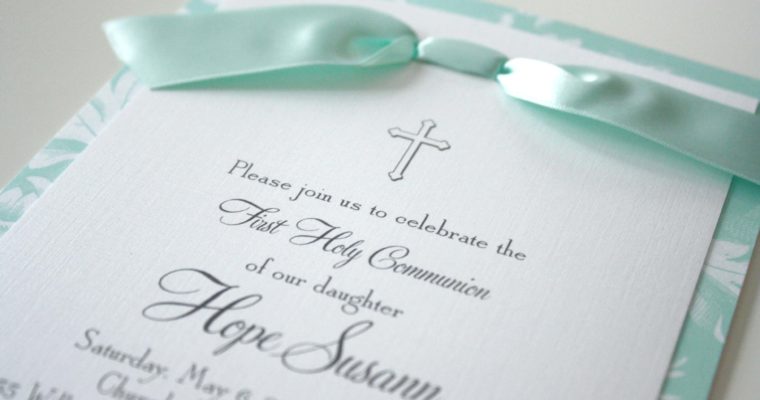
Hope’s 1st Communion
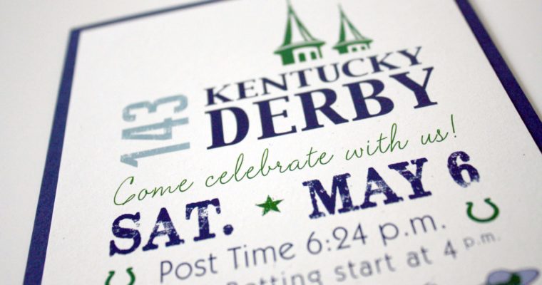
Derby Party
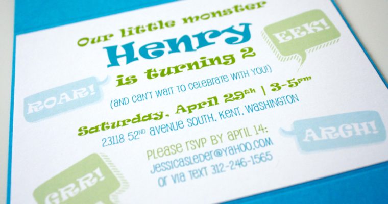
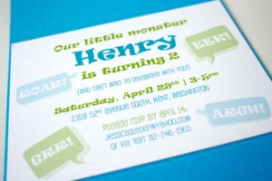
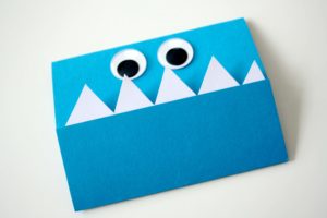
Henry’s Monster Birthday
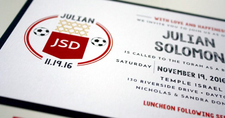
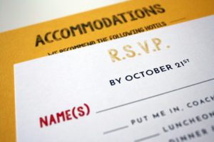
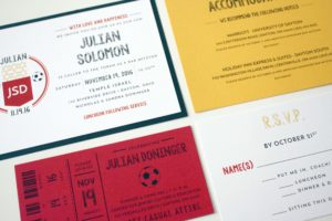
Julian’s Bar Mitzvah

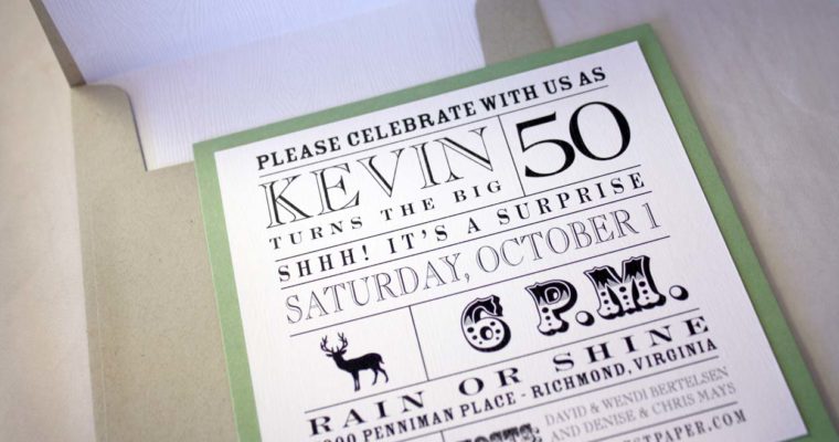
Kevin’s 50th Birthday
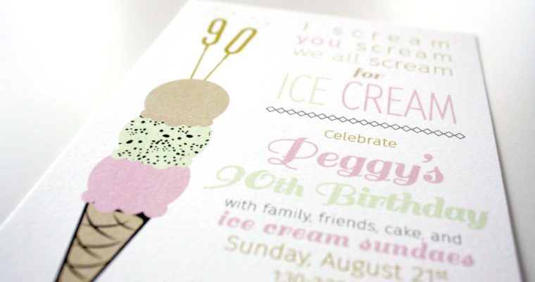
Peggy’s 90th Birthday
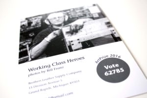
Artist Spotlight
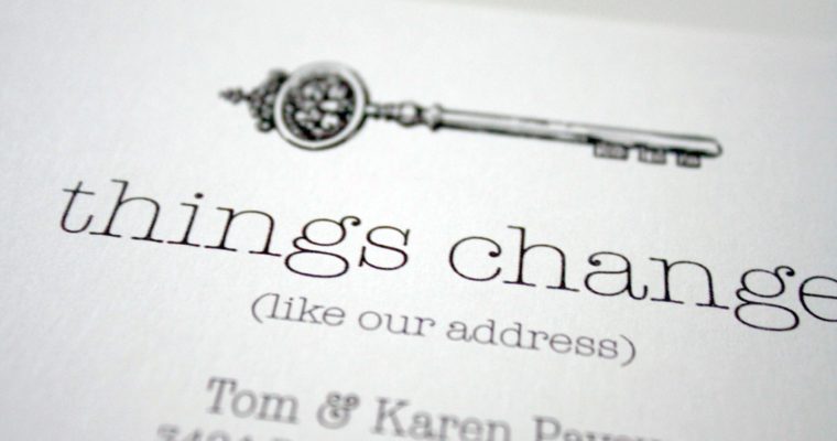
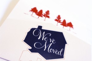
Vintage Key Moving Announcement
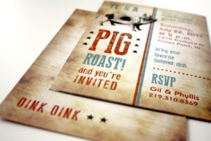
Oink Oink
Fourth of July
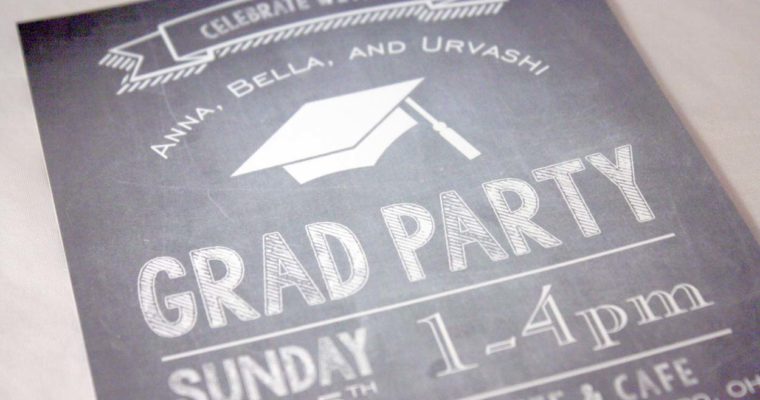
Chalkboard Grad Party
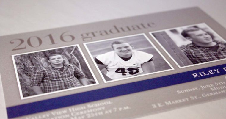
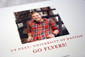
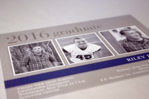
Riley’s Graduation
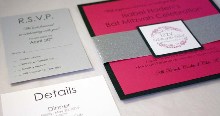
Izzy’s Bat Mitzvah
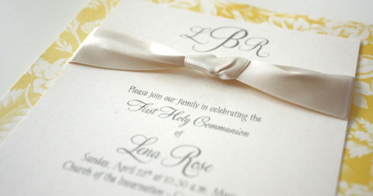
Lena’s 1st Communion
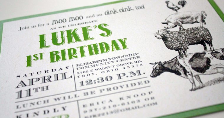
Luke’s Farm Birthday
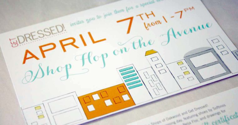
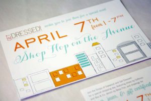
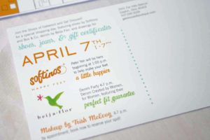
Shop Hop on the Avenue
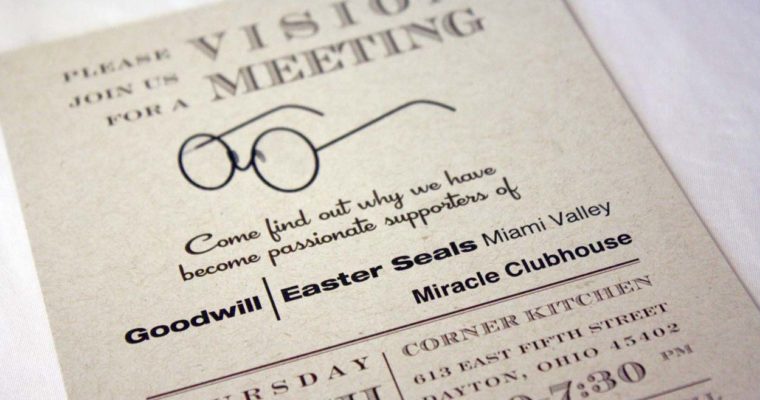
Vision Meeting
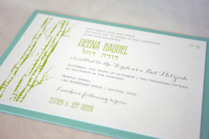
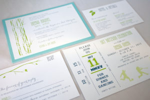
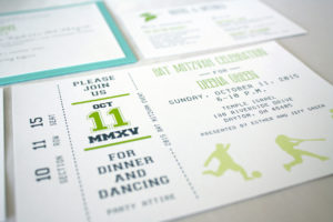
Deena Bat Mitzvah
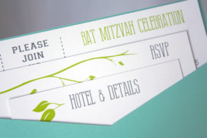
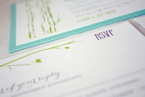
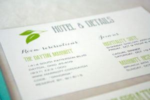
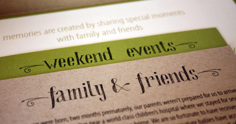
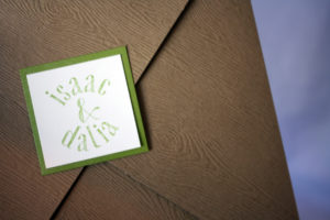
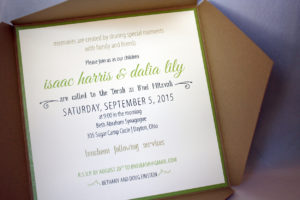
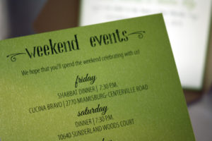
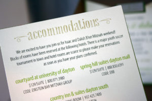
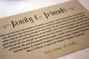
Isaac & Dalia B’nei Mitzvah
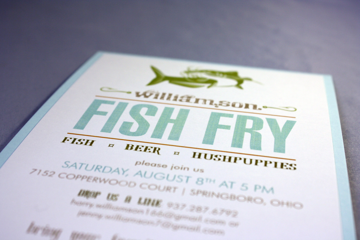
Fish Fry
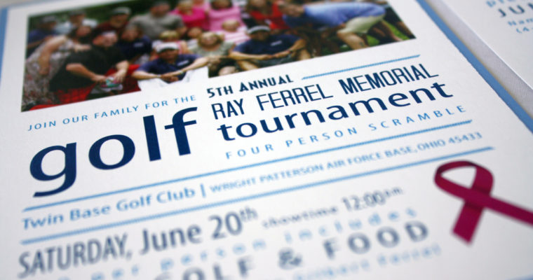
Memorial Golf Tournament
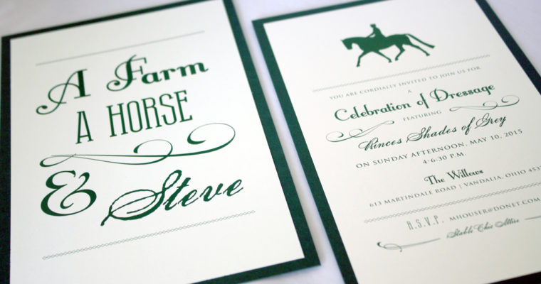
A Farm, A Horse & Steve
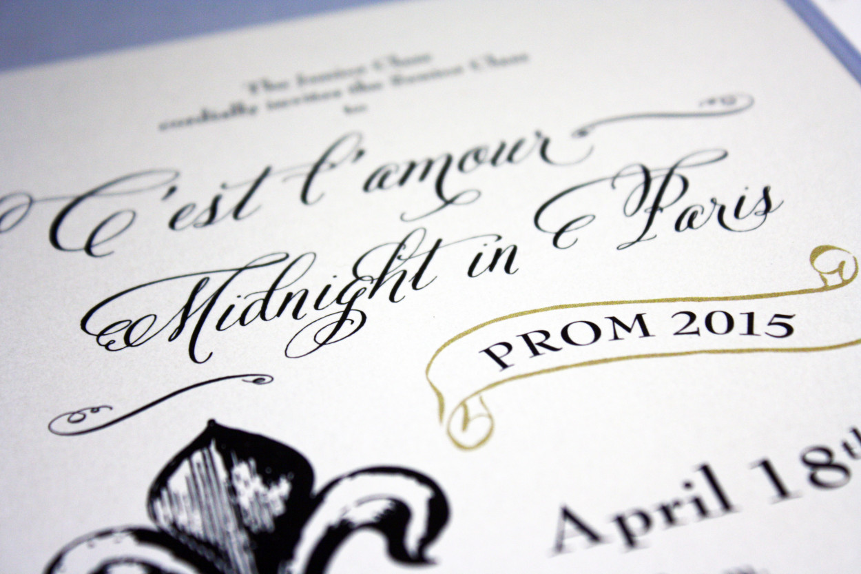
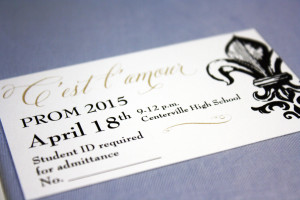
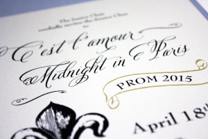
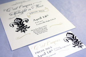
Centerville HS Prom
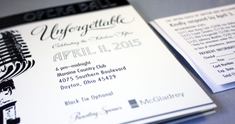
Fabulous Fifties
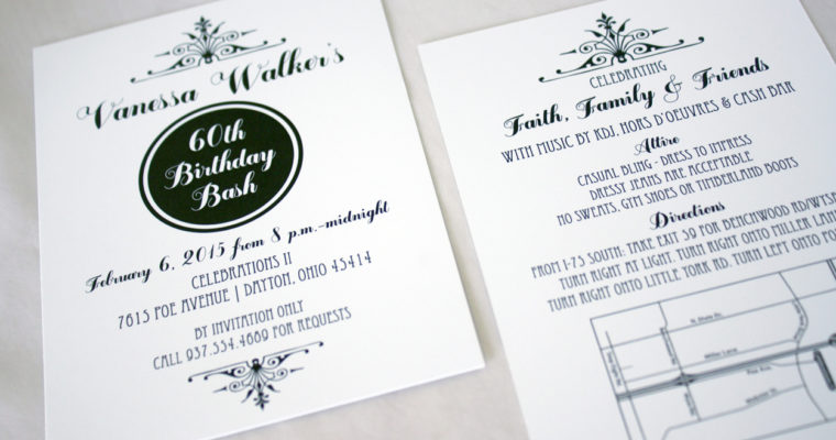
Vanessa’s 60th Birthday
Matt + Meryl + Baby Makes Three
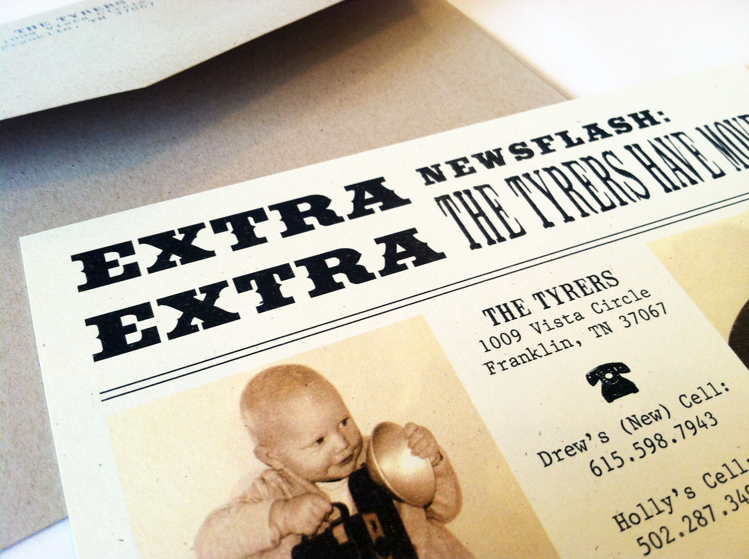
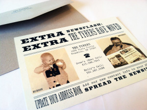
News Flash moving announcement
Extra! Extra! Read all about it… These adorable vintage photos of the two kiddos matched up nicely with an old newspaper themed moving announcement.

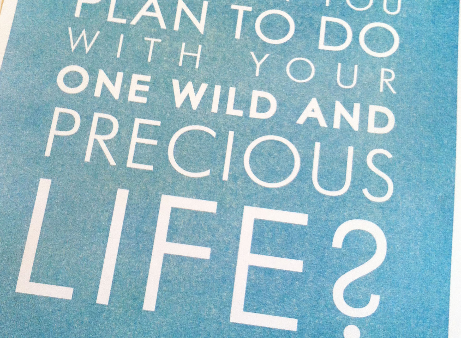
Mary Oliver Quote
“Tell me- what is it you plan to do with your one wild and precious life?” This Mary Oliver quote was a request from a customer who wanted to give these framed as gifts. We fully justified the text and made key words stand out, turning a quote into a piece of art.
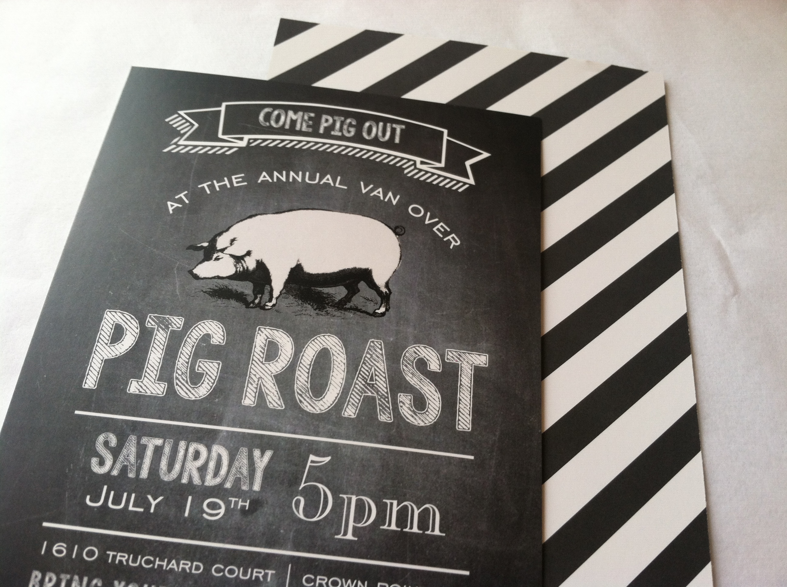
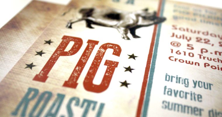
Woo Pig Sooie!
This year’s triumphant return of the Pig Roast invitation adhered to the ultra-trend of using reverse type and a chalkboard background (don’t knock it too much- it’s part of our logo, too…). The stripes on the back were a fun surprise for anyone who turned the card over, or happened to drop it and have it land back-side up. Whatever will we think of next year to top this design?
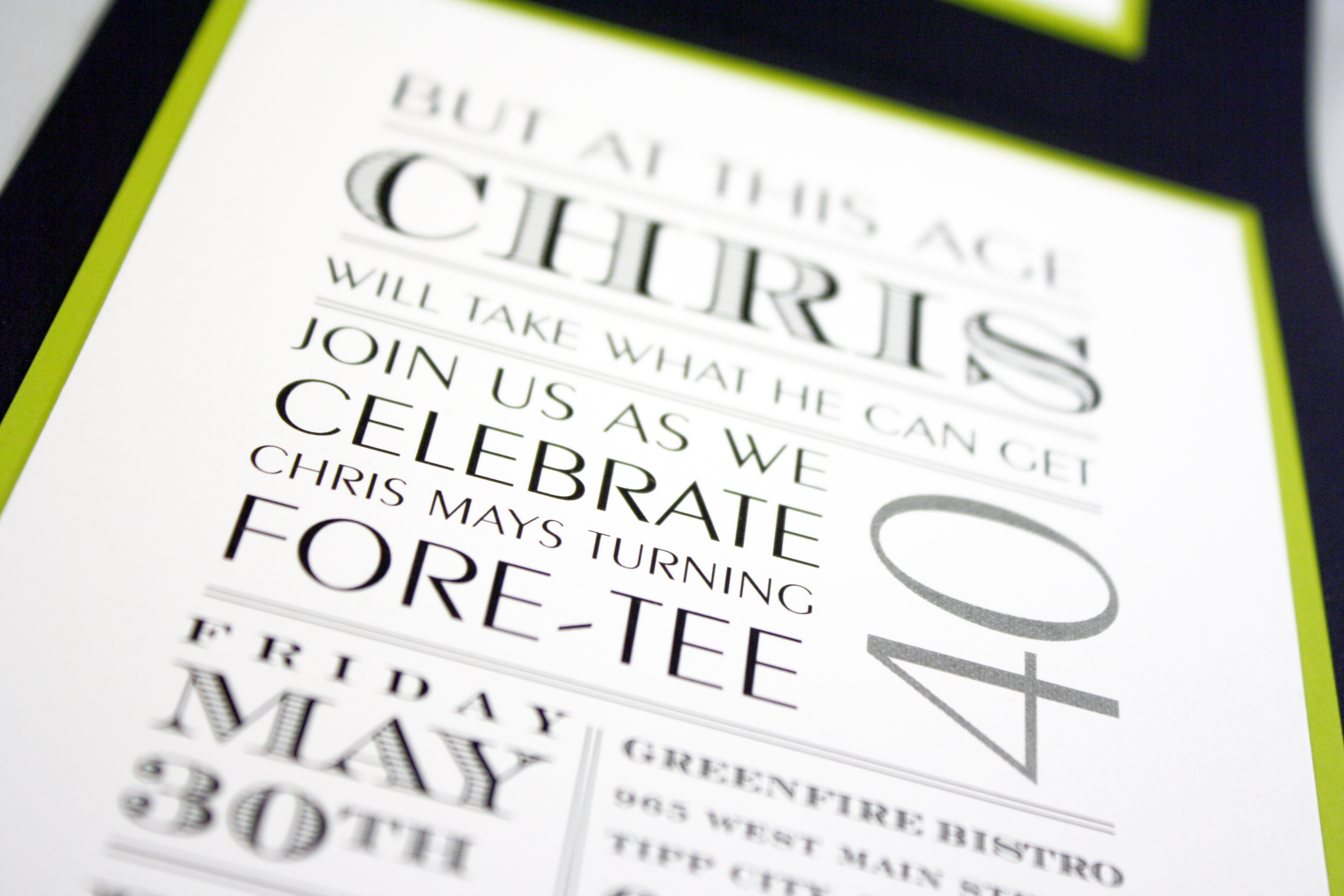
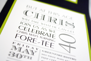
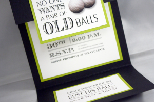
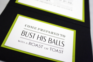
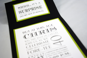
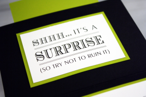
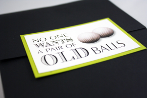
Old Balls 40th Birthday
Oh buddy… this invitation kept us laughing from the moment the customer brought the idea to us. She saw something similar elsewhere and wanted to know if we could recreate it for her… and it was truly our pleasure. This surprise 40th birthday party for the client’s husband played up the golf theme while humorously incorporating various innuendos throughout.
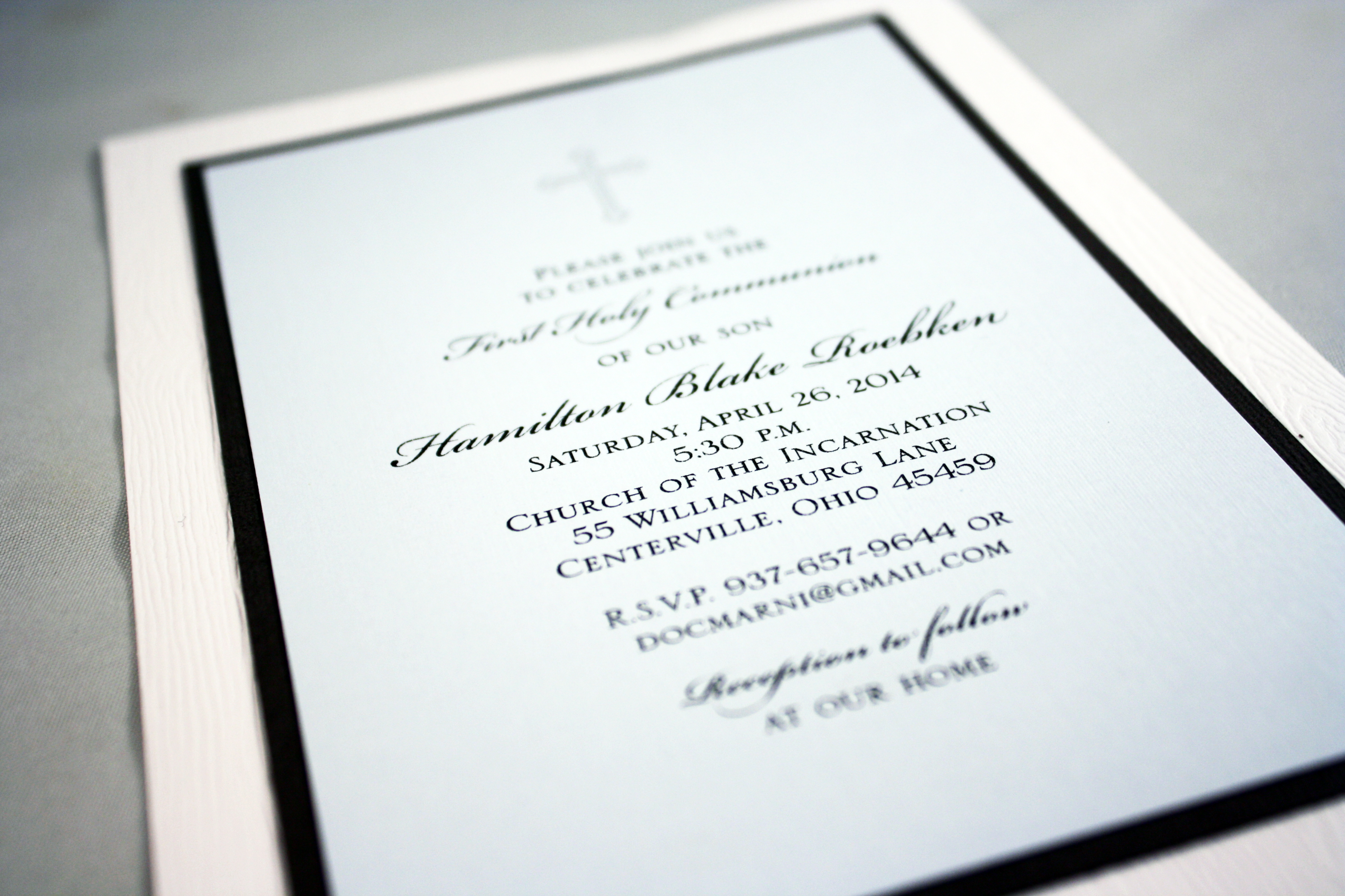
Hamilton’s First Communion
This First Communion invitation could easily be turned into a baptism or birth announcement. The bottom layer is a white faux wood grain card stock, accented with charcoal and powder blue.
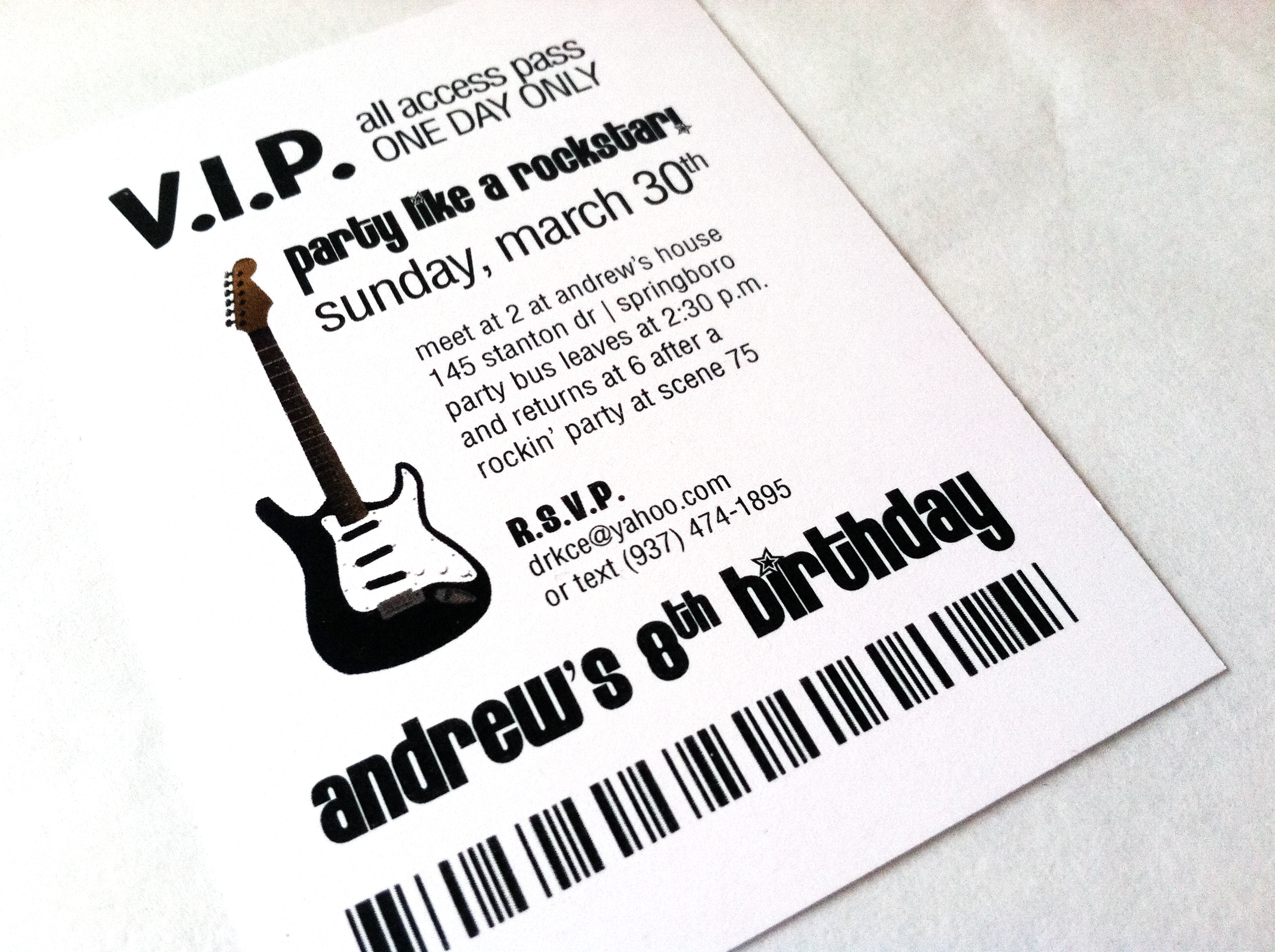
Andrew the Rock Star
These VIP backstage pass invitations were being inserted into lanyards and distributed to the party guests. We tried to make them fun and authentic at the same time, complete with a bar code at the bottom.
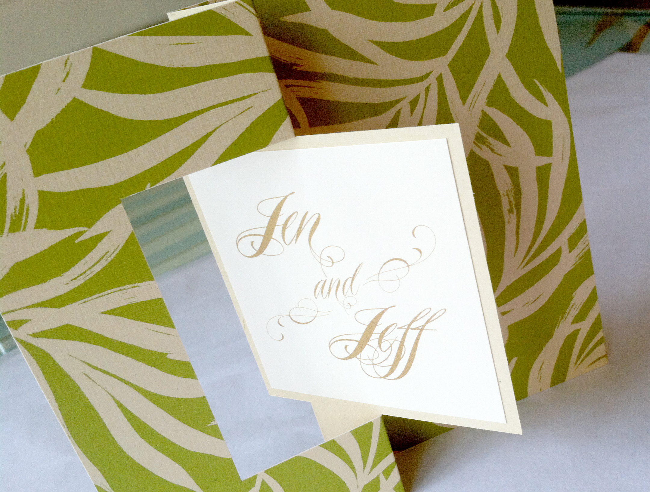
Jen’s Post Wedding Brunch
This Palm Beach wedding began with a colorful retro save the date card, and ended with a leafy green and gold twist card as the post-wedding brunch invitation. We printed their names on a small card that we adhered to the twist card. Gently pull the edges of the card and the center twists around to reveal the invitation details on the other side.
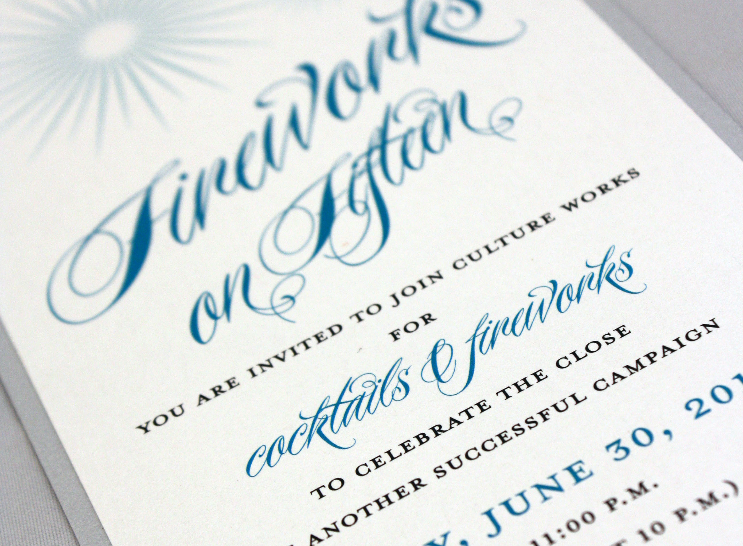
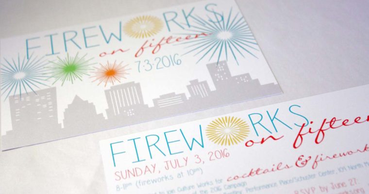
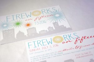
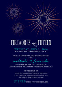
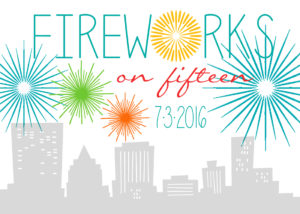
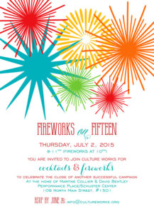
Fireworks on Fifteen
Festive invitation by a non-profit arts organization to the Dayton fireworks display
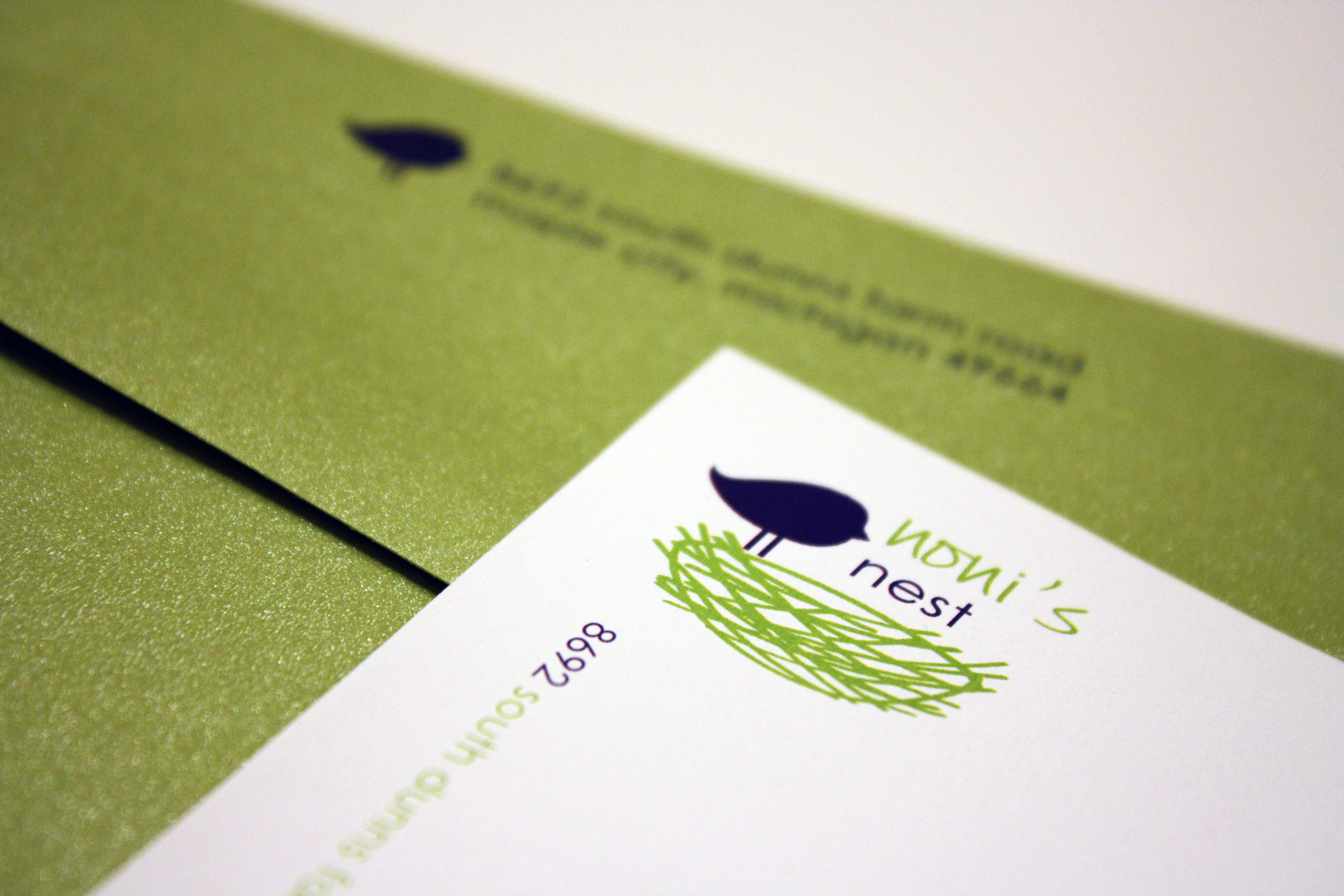
Noni’s Nest
A lovely logo I designed for a private residence in Michigan, fondly named Noni’s Nest after the nickname the owner’s grandkids call her, which we then incorporated into stationery sheets and personal calling cards.
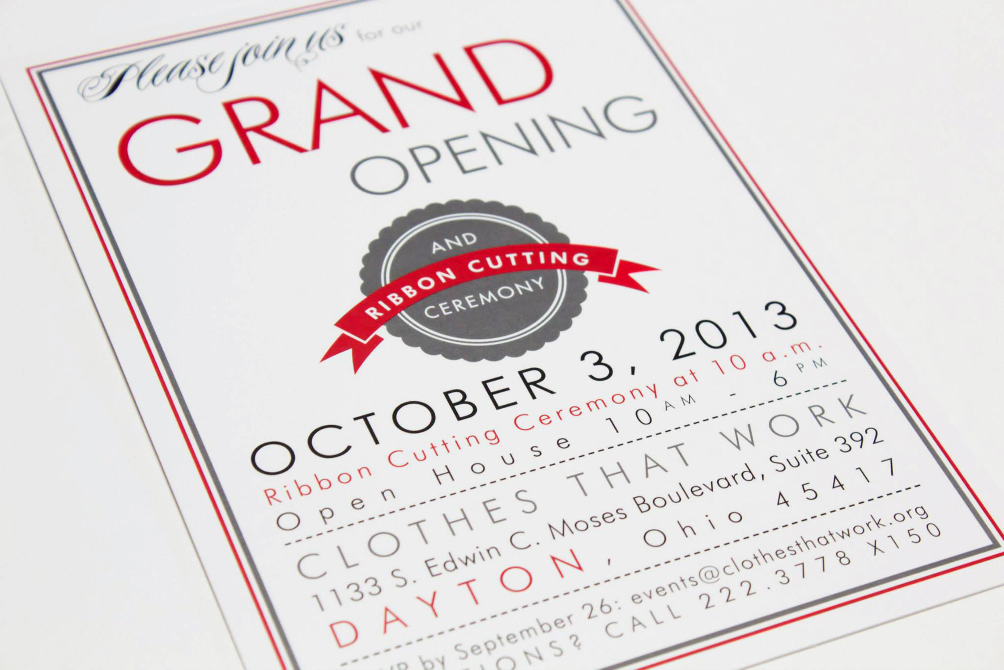
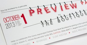
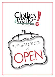
Clothes That Work
Clothes That Work has kept us busy creating designs for their very exciting boutique expansion, and in the process we have done several open house and preview party invitations, as well as the design for the boutique logo itself, new pledge cards, plaques, and signs.
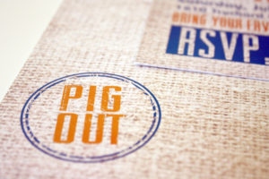
Here Piggie, Piggie
It’s that time again! PIG ROAST TIME! This was the 2013 edition….as I’ve said before, every year is my favorite to date. This was no exception.

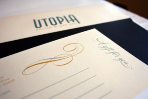
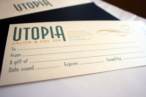
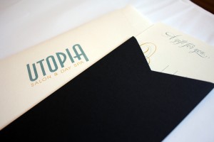
Utopia Salon & Spa
In addition to designing business cards for many of the stylists at Utopia Salon, I recently put together some new gift certificates for the salon. The tea length ivory card slides into a black portable pocket sleeve, which is then paired with an ivory envelope bearing the Utopia logo. The certificate is intentionally worded so it would work for many potential services or dollar amounts.
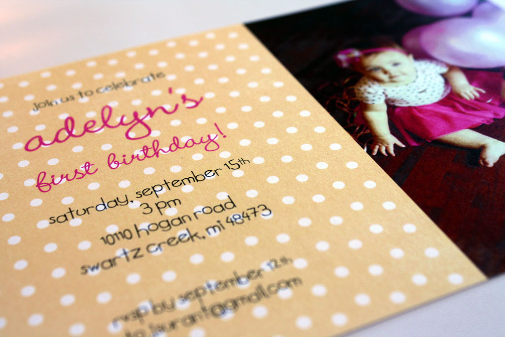
Adelyn’s 1st Birthday
The baby daughter of a photographer friend of mine turned one, and they gave me the privilege of working on her birthday party invitations. This simple 5×7 card incorporated a photo of Adelyn wearing a bright pink tutu, sitting next to a chalkboard with the number one drawn on it (she’s very advanced for her age…). We added a hot pink metallic envelope to make it extra special.
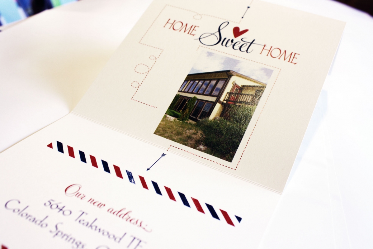
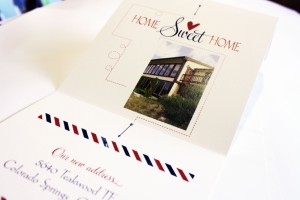
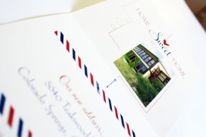
Midwest to the Mountains
Five years after we did a birth announcement for this family, they moved to Colorado and asked us to find a truly unique moving announcement that would include a photo of their new digs. After looking through some ideas, we landed on a cool tri-fold announcement patterned after a design featured on the Envelopments website. It worked beautifully with the photo of their house and the fact that they moved from here to there (love the zig zag line.)
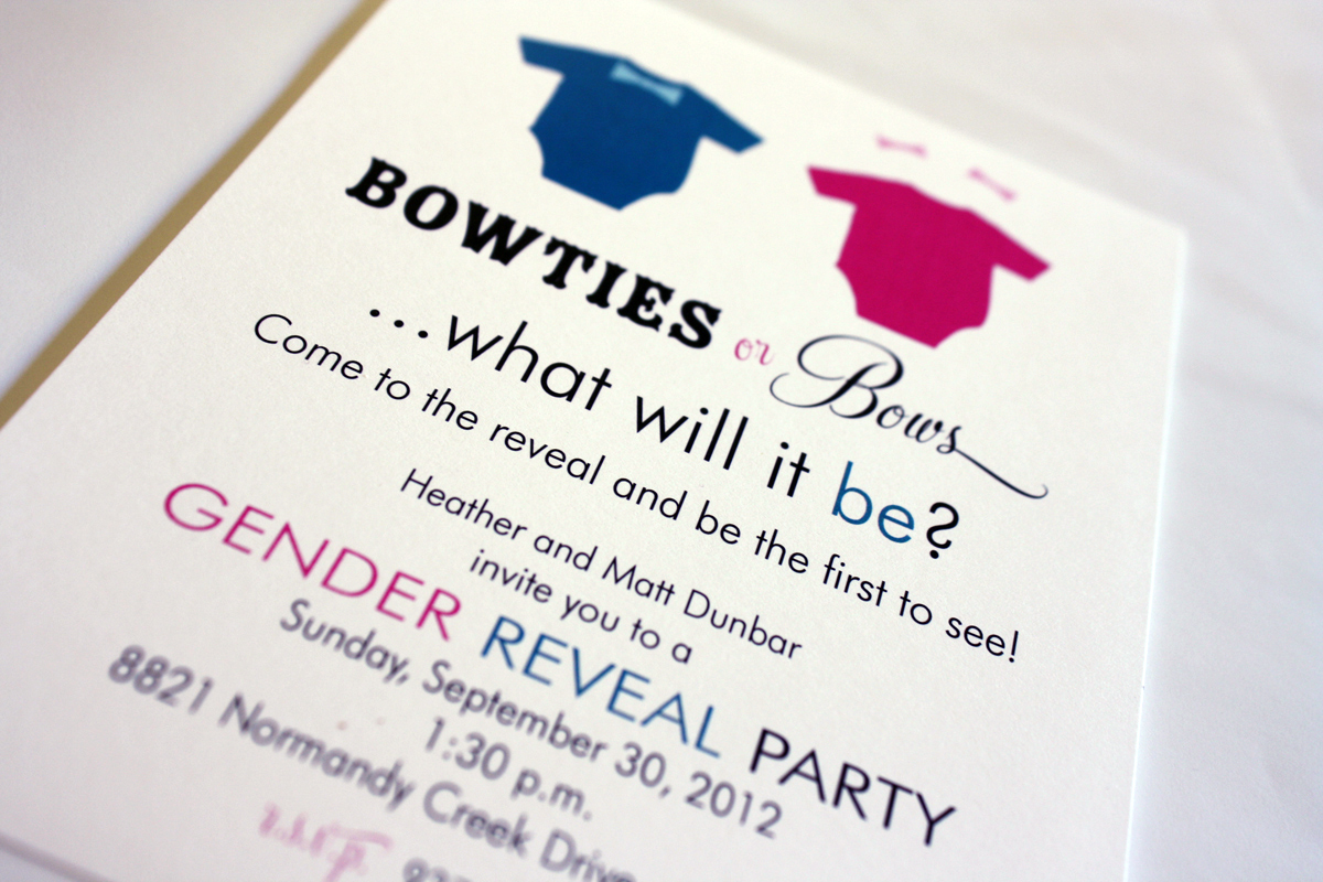
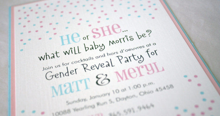
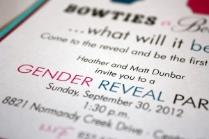
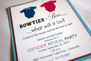
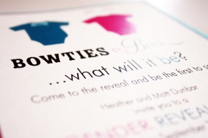
Gender Reveal Party
Heather and Matt got married at the Dayton Art Institute in November 2010 and are expecting their first bundle of joy. They decided to find out the sex of the baby at a “Gender Reveal Party” that included all of their closest friends and family members. The Gender Reveal is a new trend that just recently started making headlines across the country as couples started coming up with unique ways to find out the sex of their baby at a celebration with family and friends. Heather scheduled their Gender Reveal Party for the day after her 20-week ultrasound…she and Matt shielded their eyes at the appointment and had the ultrasound technician put the determining photo into a sealed envelope, which was then delivered to the bakery that was responsible for creating the shower cake. The bakery was instructed to use pink filling for a girl and blue for a boy, and to carefully frost the cake to conceal its contents so it wouldn’t ruin the surprise before the big moment. Heather cut into the cake at the shower to reveal……blueberries! They’re expecting a little boy in early 2013, and couldn’t be more thrilled. Congrats to the parents-to-be! (To see Heather and Matt’s beautiful winter wedding invitation, click here.)

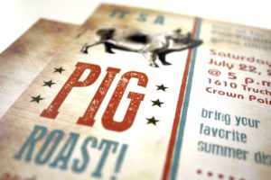
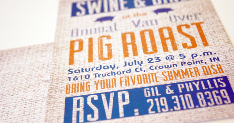
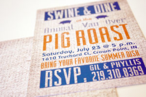
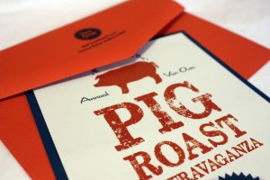
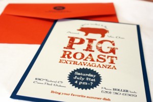
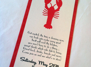
Pig Roast Extravaganza
The Van Overs roast a pig every year and I adore that even though they live in Indiana, they call me every summer and ask for new ideas for their annual shindig. (That just gave me an idea for next year’s invitations….hmmm, “Pig Shindig”!) This year’s invitations blew the others out of the water- this was by far, the prize hog at the county fair. We used an indigo bottom layer of cardstock and a nice deep blue ink to match, coupled with a rusty red envelope and accent ink to coordinate, and printed everything on a pale grey stock called London Fog that gave it just the right amount of grit. I particularly like the “seal of approval” we used as a design element- this is one of those invitations that makes me happy just looking at it because it’s such a happy marriage of things I love…fonts, graphics, stocks, colors… it’s bacon-tacular (much like this clever site, which meat-lover computer nerds will appreciate).
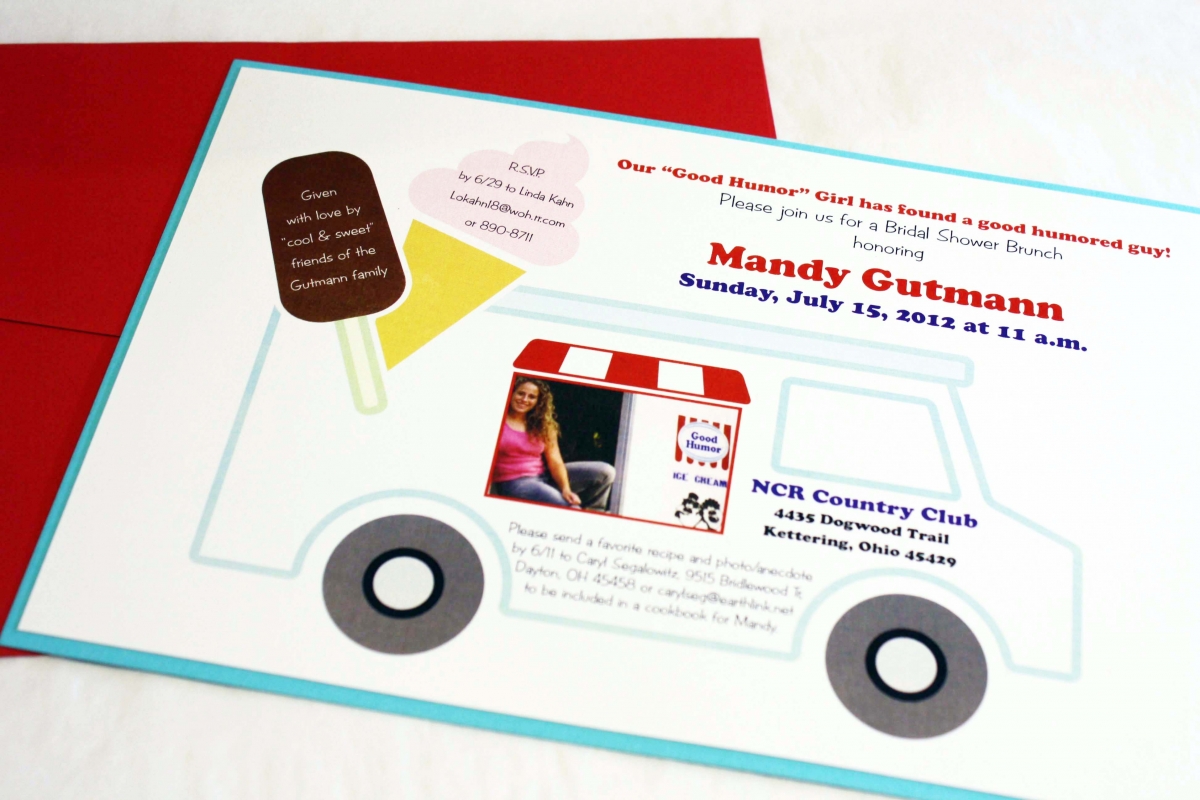
Mandy’s Good Humor Shower
Mandy, the bride-to-be, was a Good Humor ice cream girl once upon a time, and the ladies throwing her shower thought it would be fun to have an ice cream themed shower. They mentioned that humor was also an important part of Mandy’s relationship with her fiance, so the “good humor” theme was doubly appropriate. The hostesses also wanted to incorporate a photo they had gotten from Mandy’s dad (from her ice cream days) into the design. I thought it would be fun to make it look like she was back in the ice cream truck, so I put together some “cool” graphics and voila- a shower invitation unlike any other, custom made just for Mandy.
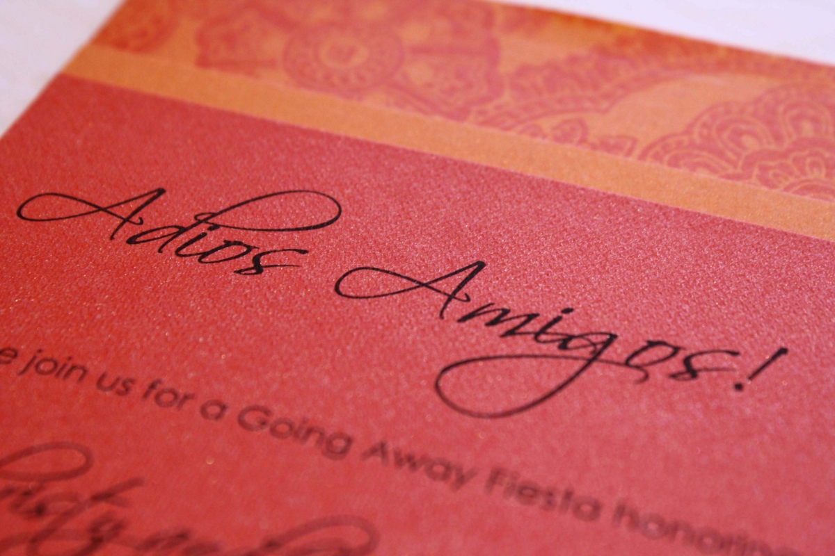
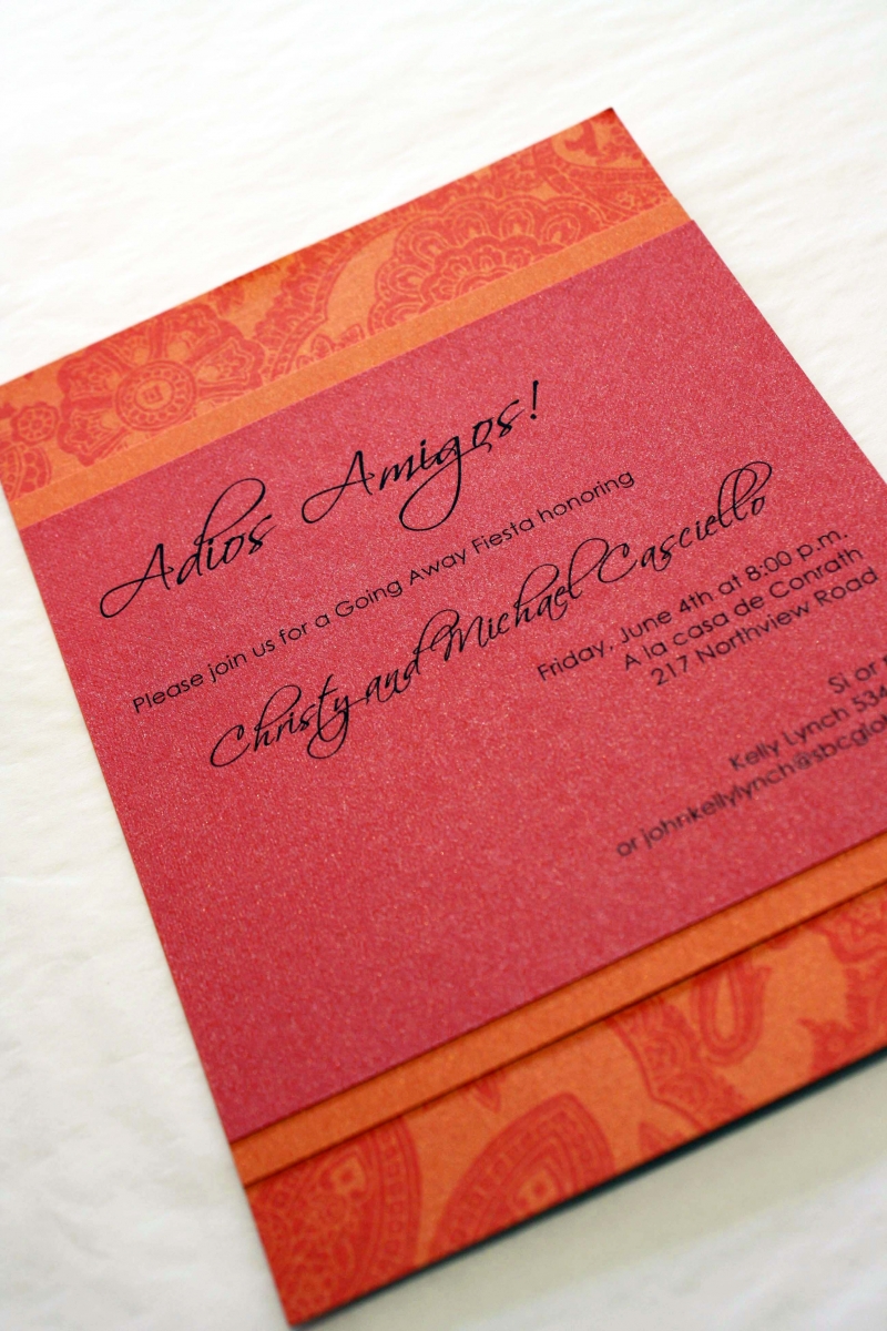
Adios Amigos Fiesta
Hot tamale! Fiery red and tangerine make this fiesta invitation stand out in a crowded room…when we paired the hot colors with a detailed pattern and a cool font, the end result was muy caliente (super hot). I personally love printing on bright colors- it’s a nice change from ivory and white, and really makes a statement. Molly, one of my favorite people and former employees, was throwing a going away party for dear friends and wanted the invitation to be really special. Mission: Accomplished.
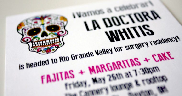
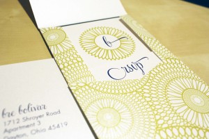
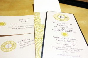
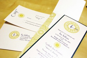
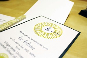
Bre’s Graduation
Bre came into the store for the first time with her mom, brimming with excitement over her upcoming graduation from medical school. She informed me that she never goes “all out” for things, but she wanted something really special to announce the graduation she had worked so hard for, and the degree she was so proud to earn. She chose a fun geometric pattern in a cool chartreuse green and paired it with a navy blue border which gave it a tailored look. We kept the feeling lighthearted with a casual and fun script for her name, and lent a modern lilt to the invitations with one of my favorite go-to fonts, Century Gothic for the rest of her text.
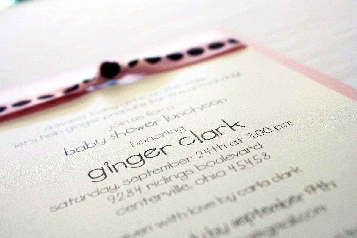
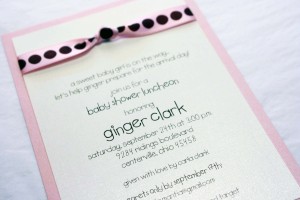
Ginger’s Baby Shower
There are two things I love most about this baby shower invitation: the cool pink and brown polka dot ribbon from Midori, and the adorable font. Those two elements, combined with a metallic pink bottom layer and white micah printed invitation piece make this a simple yet fun invitation, perfect for a baby shower announcing the upcoming arrival of a sweet baby girl.

Joe’s 75th
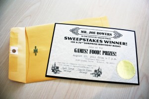
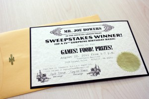
This was a “think outside the box” project, to say the least…when I got an email from a long-time customer telling me her latest theme (she’s a Party Planner Extraordinaire), I couldn’t wait to sit down and design it. Her father is a Sweepstakes fanatic and she decided to have a Sweepstakes-themed party for his 75th birthday. We used parchment paper, found some cheesy graphics and bold fonts, and even added gold seals and manila envelopes to make them look more official. How awesome is that?!
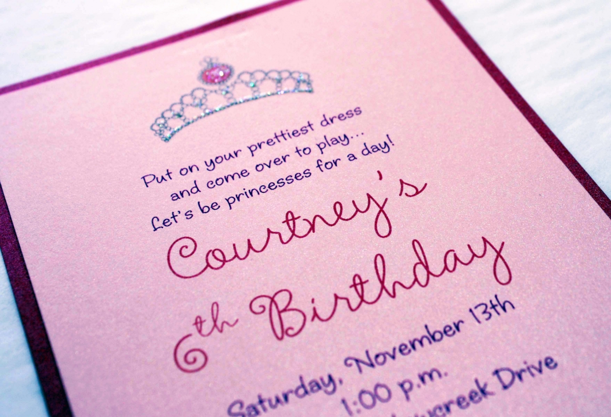
Courtney’s Princess Birthday
Courtney is one of my favorite 6-year olds because she loves paper so much. She even came in to order her own stationery before she started school! This special invitation was for her sixth birthday party, and since it was a princess party we had to make it extra sparkly. We used two layers of metallic card stock and finished it off with a glitter tiara at the top.
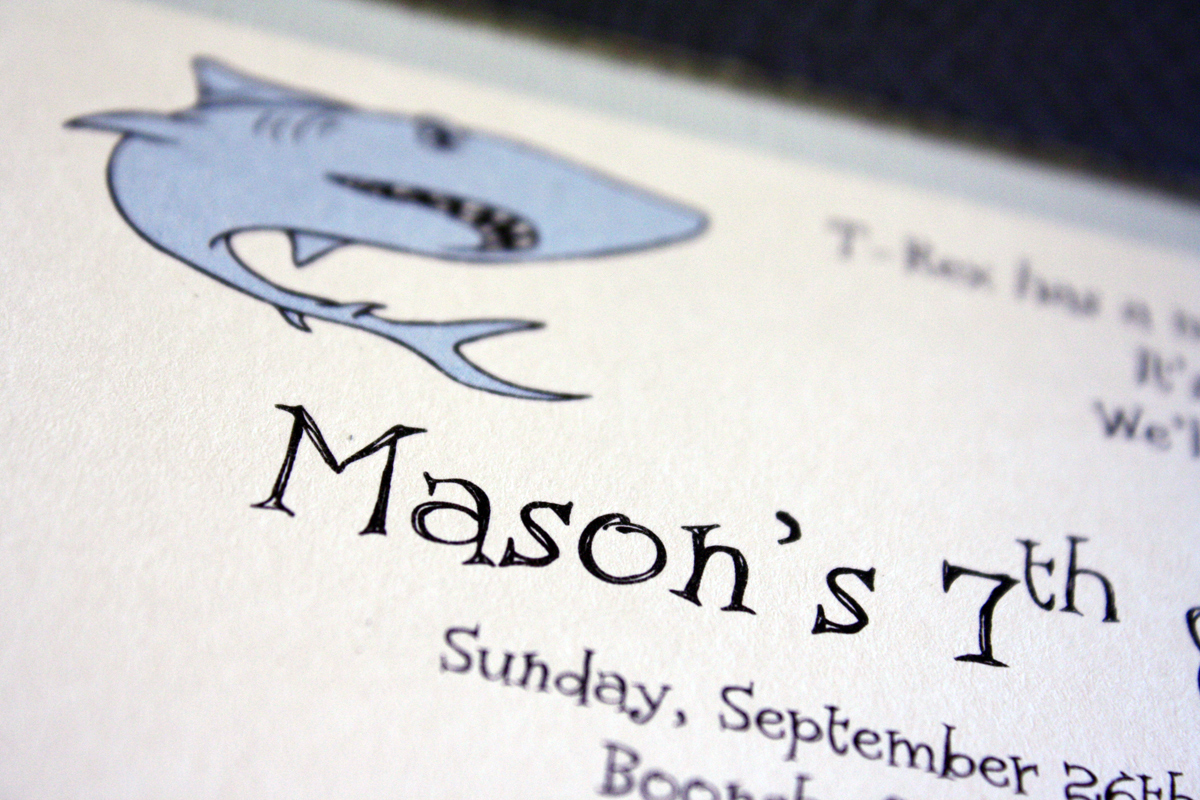
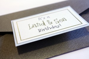
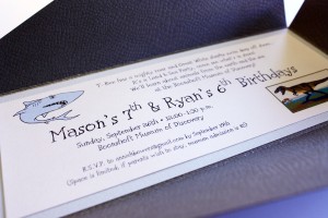
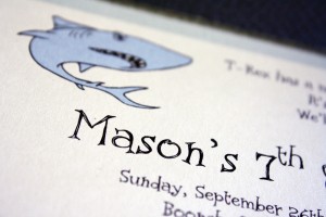
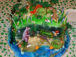
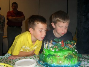
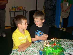
Land and Sea birthday
Mason and Ryan are best friends with birthdays four days apart, and they both happen to love the same two things: dinosaurs and sharks. To compromise, we decided a “Land and Sea” theme would be fun, and created an invitation with a reptile texture wrap, and an accent layer in ice blue that had a wrinkled texture (that I was convinced represented shark skin). The party was held at the Boonshoft Museum of Discovery, and their cake was done by Dorothy Lane Market to match the shark and dinosaur theme and was absolutely INCREDIBLE. We cringed when we finally cut into it, but made sure to take plenty of pictures beforehand to capture it’s awesomeness.

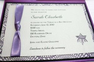
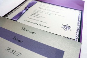
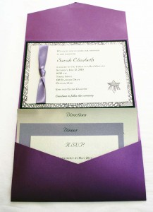
Sarah’s Bat Mitzvah
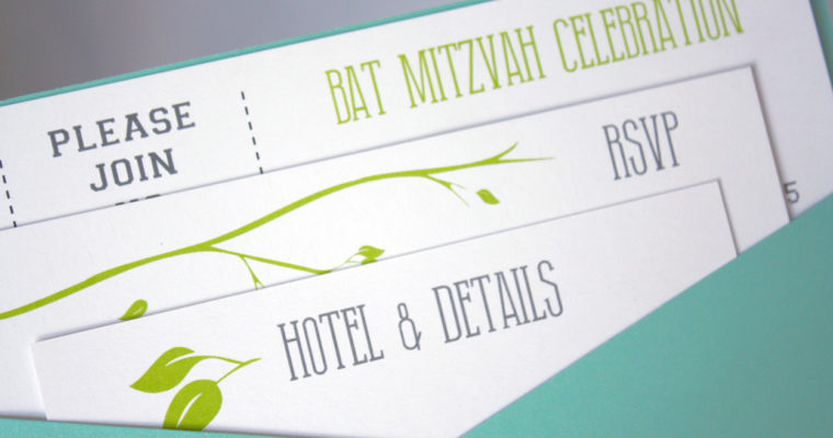
This was the most elaborate Bat Mitzvah invitation we have done to date, with three colors layered inside a pocket, a delicate satin ribbon, a Star of David punch and plenty of purple. The pocket worked well because there were plenty of family members coming in from out of town to celebrate with Sarah, and her mom wanted to make sure we included a directions card for the guests as well as a celebration card detailing the events of the weekend. We frequently use this format for wedding invitations and it worked beautifully to incorporate all of the elements of Sarah’s Bat Mitzvah celebration.
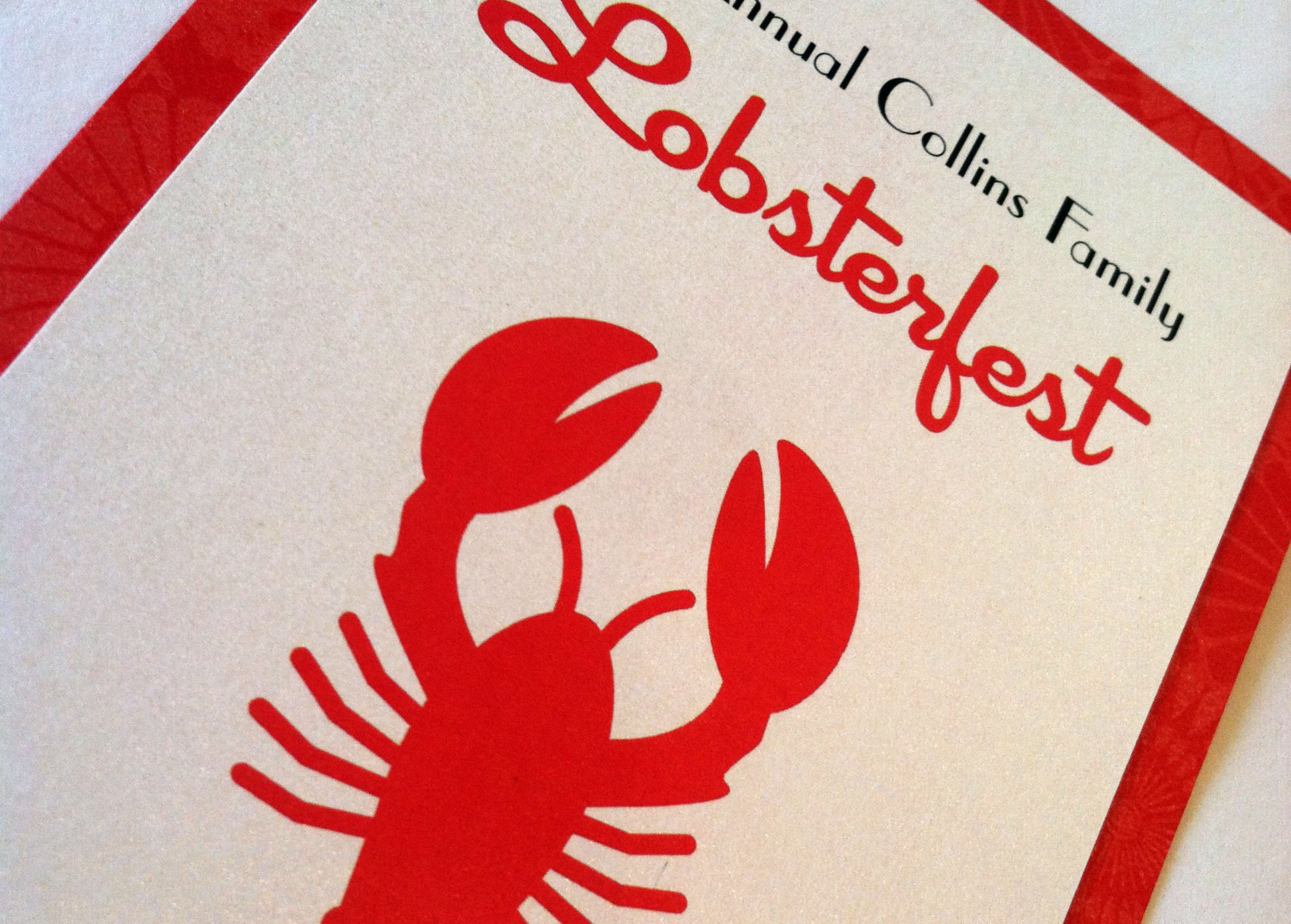
Lobsterfest
Every Memorial Day Weekend, Dorothy Lane Market hosts what is known as “Lobstermania”, which is an all day event at which they sell {super cheap} lobsters until they run out. It’s first come, first served; you get in line as early as you want, you get as many lobsters as you want, and you take them home, invite over a couple dozen people, and feast on lobster as you welcome Summer.

Scavenger Hunt Birthday Party
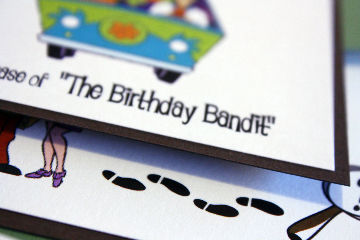
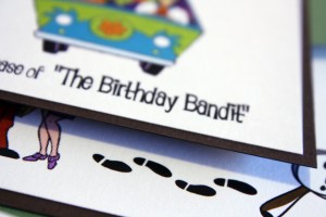
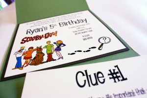
Disclaimer: the first major thing to note about this invitation is that due to licensing laws I was only able to use the Scooby Doo graphics because it was for private use- these invitations were for Ryan’s 5th Birthday. I’m not legally allowed to sell invitations with licensed or protected graphics, however I wanted to post this invitation because it would be easy to do a more general scavenger hunt or mystery-themed birthday invitation. The best thing about this invitation was that I included the first clue for the scavenger hunt in the invitation and instructed guests to bring it to the party to receive their next clue. We played on the idea of a “birthday bandit” stealing the party favors, and the kids had to read the clues and follow the trail to eventually lead to the party favors and balloons, which the kids got to take home with them. It was a really fun activity and kept them busy and running around outside as they tried to figure out where the next clue was hidden and work as a team to find it.

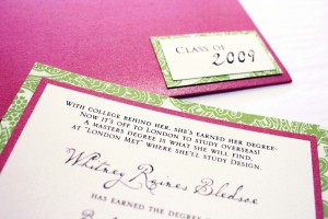
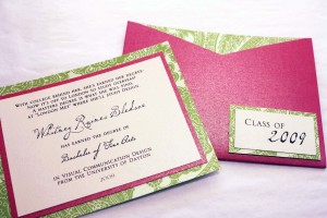
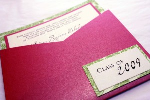
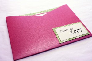
Whitney’s Graduation
Whitney, oh Whitney, where do I start…..Whitney bounced into the store one day applying for our internship position, and even though the first time I met her she reminded me of a bubbly, red-headed Hannah Montana, she quickly found a niche at the shop and was a complete joy to work alongside. Whitney became one of our legendary interns at the shop, and this energetic, Texas-bred girl taught me a lot in her time at The Envelope: she explained the ways of Cotillion and hair weaves, taught me how much pugs love to “dress up,” and discovered that it’s never a good idea to use a shrink-wrap gun as a blow dryer (she ended up burning a hole in her shirt).
When she graduated from the University of Dayton she moved to London to study design, and like most things Whitney did, she wanted to announce her commencement in her own unique style. We designed a 4×5 portable pocket in hot metallic pink, and incorporated a lime green paisley accent stock and a swirly, handwritten font. Simply put, her announcement was *almost* as much fun as she is.

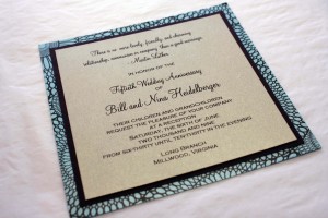
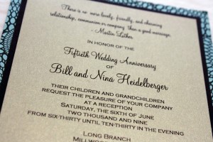
Nina and Bill’s 50th Anniversary
Occasionally we have the honor of creating invitations for milestone events- this 50th Wedding Anniversary was on the contemporary side, as reflected in the chocolate and turquoise kaleidoscope patterned backing. We kept in the 50th Anniversary tradition of gold by printing the top layer on a pyrite stock.
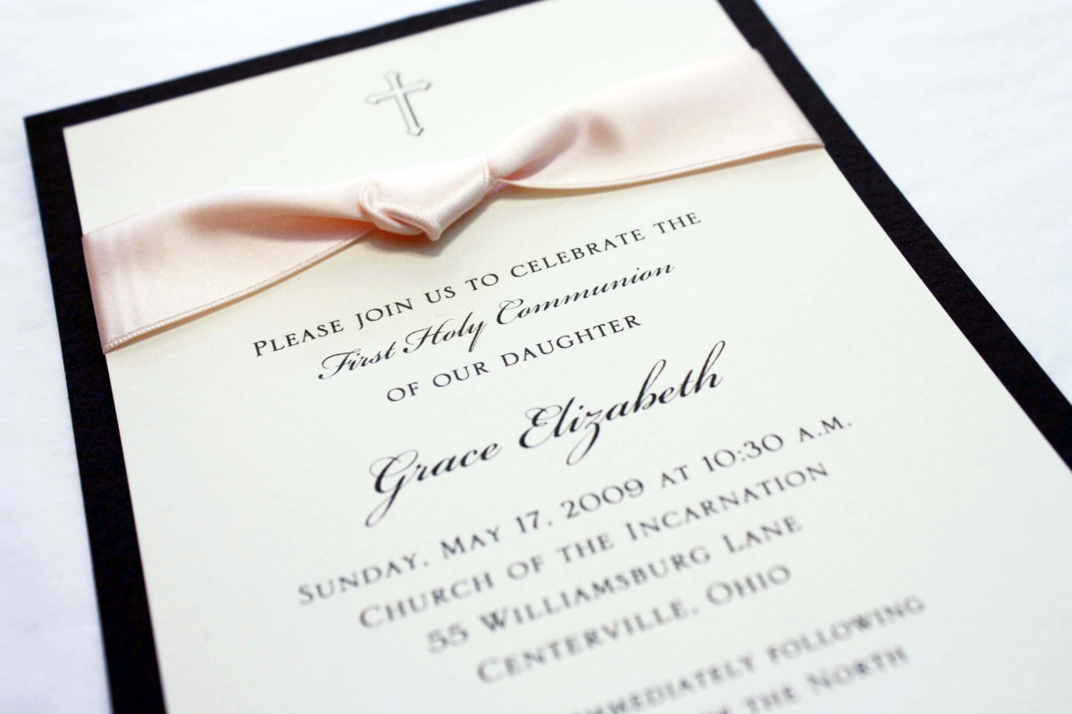
Grace’s First Communion
Grace is one of three lovely sisters for whom I’ve had the pleasure of creating some pretty special announcements and invitations, ranging from birth announcements to First Communion invitations. We took a more traditional feminine approach with this particular invitation, using the palest of pinks and ivory to create a softer feel, and paired it against a chocolate brown backing to coordinate with the mocha ink, adding a delicate, simple cross at the top. This invitation would also make a lovely baptism announcement.
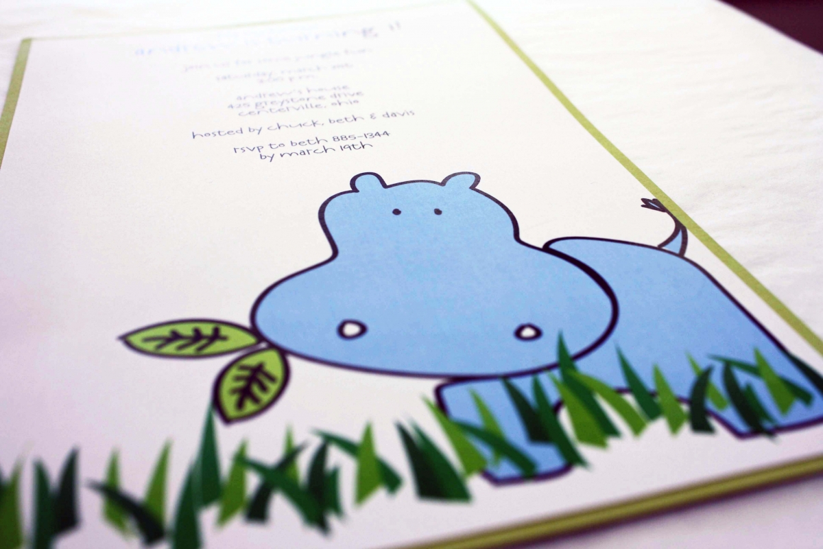
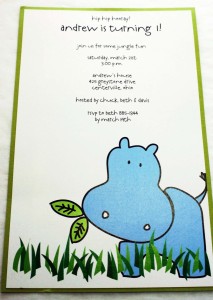
Andrew’s 1st Birthday
I love this hippo. This was the very first thing I ever attempted to draw in Illustrator and I can’t tell you how proud I am of the way he turned out (not bad for being self-taught in CS!) Andrew’s mom came to us looking for a cute hippo invitation and she had found a few online that she liked but like most of our customers, she was nervous about ordering online (understandably so…you just never know what you’re going to get). None of our invitation lines carried a hippo invite, and since I’m one of those people who doesn’t understand the phrase, “Sorry, we can’t do that,” I sat down and decided to draw it myself – and he came out pretty darn cute, if I do say so. 🙂
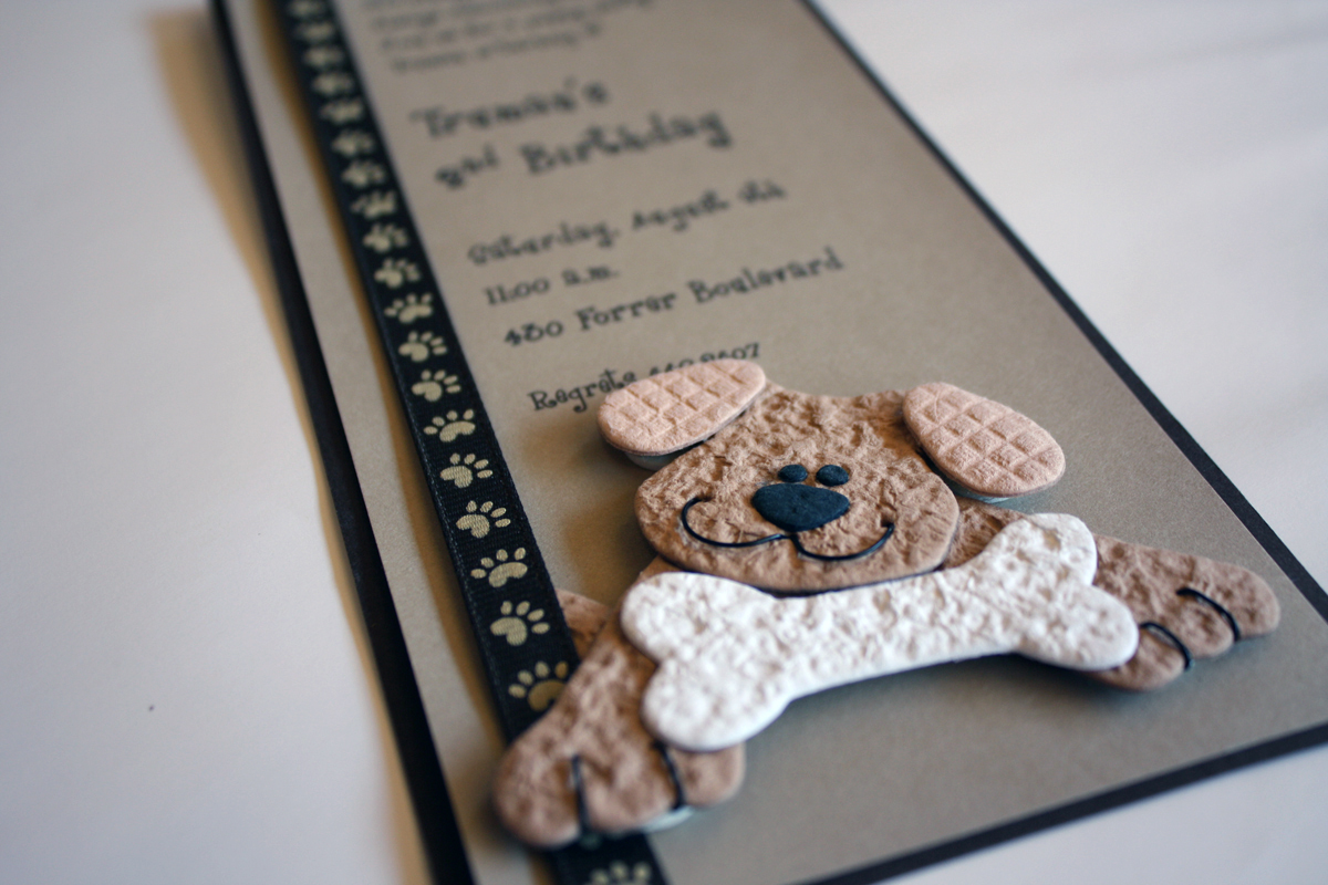
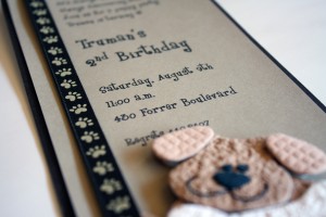
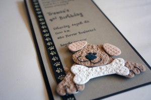
Truman’s Puppy Party
Truman is the adorable son of one of my favorite former employees, and I have to say that Molly throws the best kids’ birthday parties I have ever seen. She spares no detail, and makes everything come together like something out of a magazine (or Pinterest). Truman’s second birthday was a puppy party, so we wanted to use plenty of shades of brown, but what makes this invitation so distinct are the paw-print ribbon, the 3-dimensional puppy embellishment and the playful font.
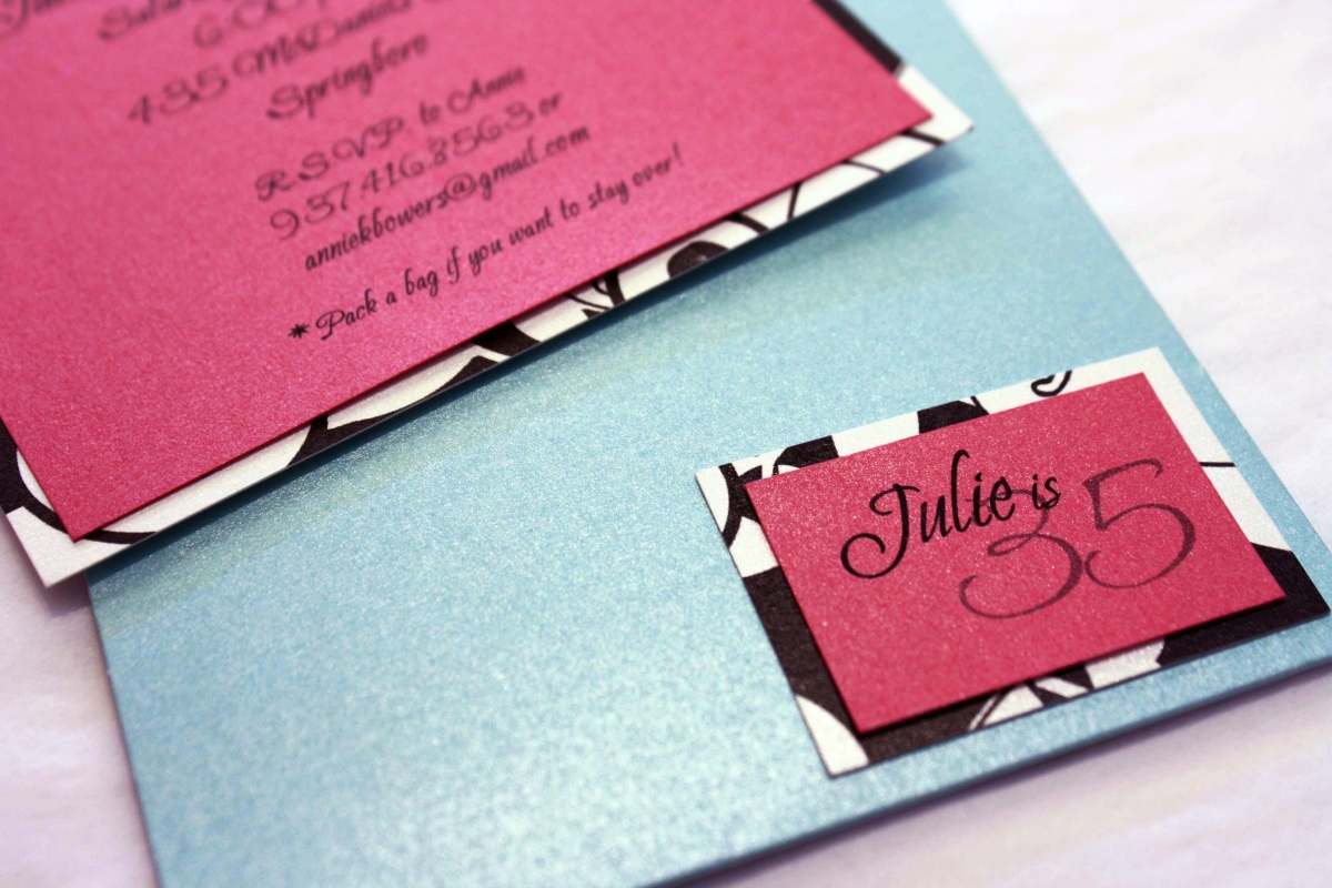
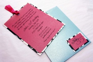
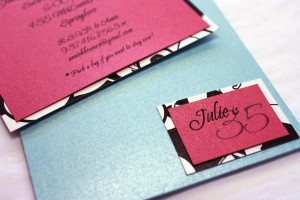
Julie’s 35th at Thai Nine
Julie was turning 35 and decided it was time to get the girls together to celebrate with a night on the town. She liked the compact size of the portable pocket card, but we jazzed it up a bit by adding a cool patterned black and white accent layer which made it feel a little bit more sophisticated. The seal on the front announced the event and gave a sneak peak at the layers we used for the invitation inside the pocket. The hot pink and Tiffany blue were just the right combination of city style and girlish fun (which was exactly what her birthday turned out to be!)
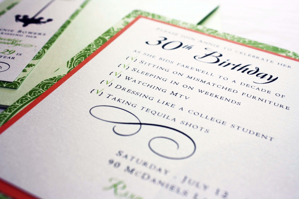
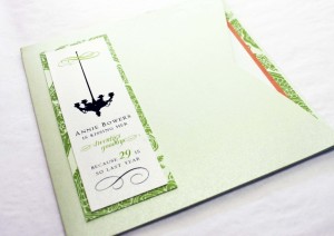
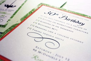
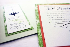
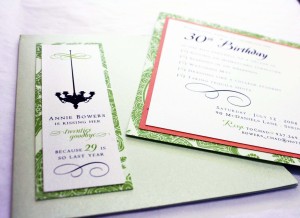
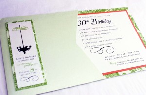
Annie’s 30th
Yep, this one belongs to me…One of the perks of owning an invitation business is that you get to have the coolest invitations (and tend to have more parties just so you can send out fun invites). The thing that makes me laugh about this invitation is how I made a (failed) attempt at making it look as though the invitations were from my then husband. Like anyone who received one wouldn’t know that I sent my own invites, ha….
This design says it all…turning 30 means “kissing goodbye” to a lot of things – that it turns out you won’t actually miss (and for the record, tequila hasn’t been completely banned). Now at 34, I can actually say I have enjoyed my 30’s way more than my 20’s….I’m more settled, I have some amazing people in my life, and I feel like I finally know myself and my niche in this world.
This invitation was so much fun to design…the multiple fonts, layers, and graphics blend beautifully, and the bright green and orange create just the right statement to go with a gathering of friends at El Meson. The only downside was that they were $1/invitation to mail but I have to say…it was worth it. The overall feel wouldn’t have been the same without the square detail. I particularly love the oversized seal on the front featuring a chandelier and a reminder that “29 is so last year…”
If you’re turning 30, I recommend you do it in style with a portable pocket invitation like this one, complete with a list of all of the things you’ll be saying goodbye to….I have a hunch that even if 30 seems old now, you’ll be pleasantly surprised with this new chapter in your life, just like I have been. Welcome to the club. 🙂

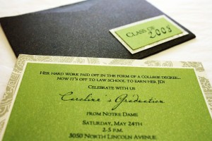
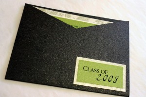
Caroline’s Graduation
Small pockets are perfect for graduation because they give all the details in a tiny, succinct package, and let’s face it- by the time we graduate, sometimes less reading is better! Caroline decided she was up to the task of additional reading and went on to law school, which she announced on a petite bright green and metallic brown textured announcement, with just enough sophisticated patterned border to make it interesting.
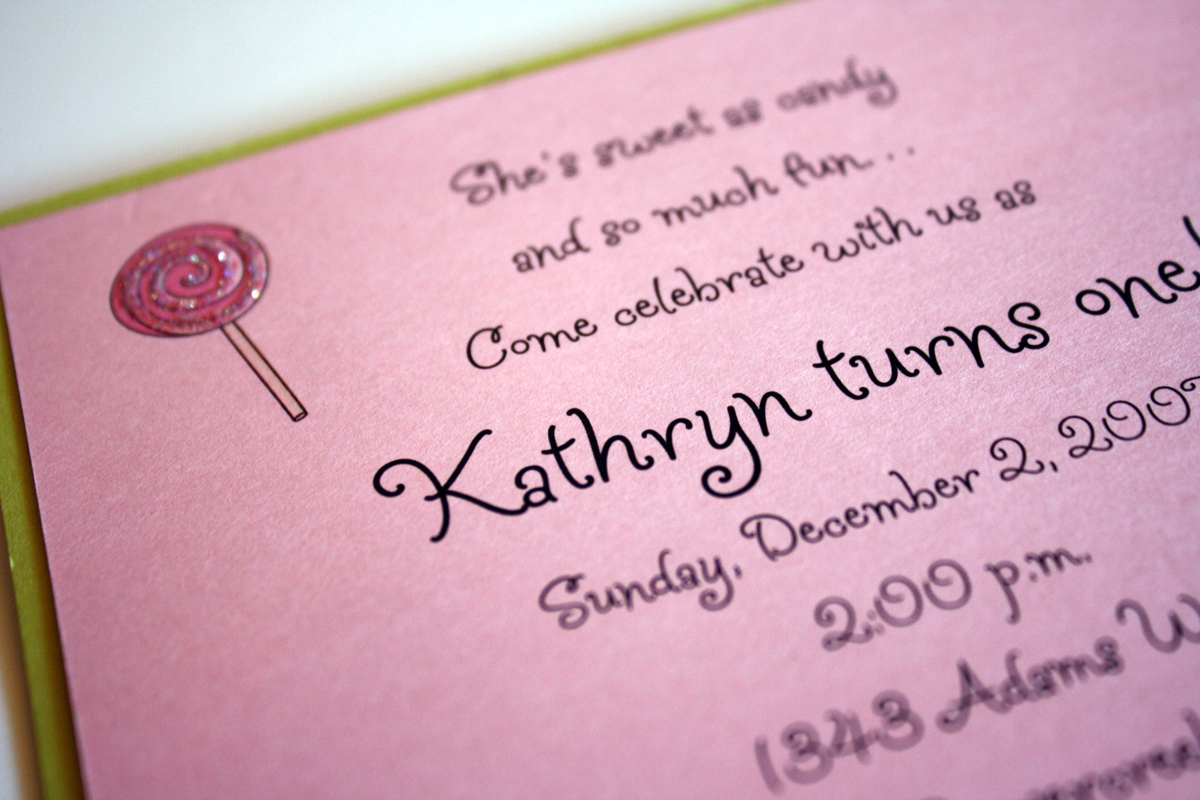
Kathryn’s 1st Birthday
Sweet things come in small packages, and this lovely lollipop of an invitation was the perfect way to invite close family and friends to Kathryn’s first birthday party. Bubblegum pink and lime green were cheerful colors to use for a first birthday and the square size made it a little bit more unique. We added glitter on top of the lollipop swirls and used a whimsical curly font to make it as girly as possible.
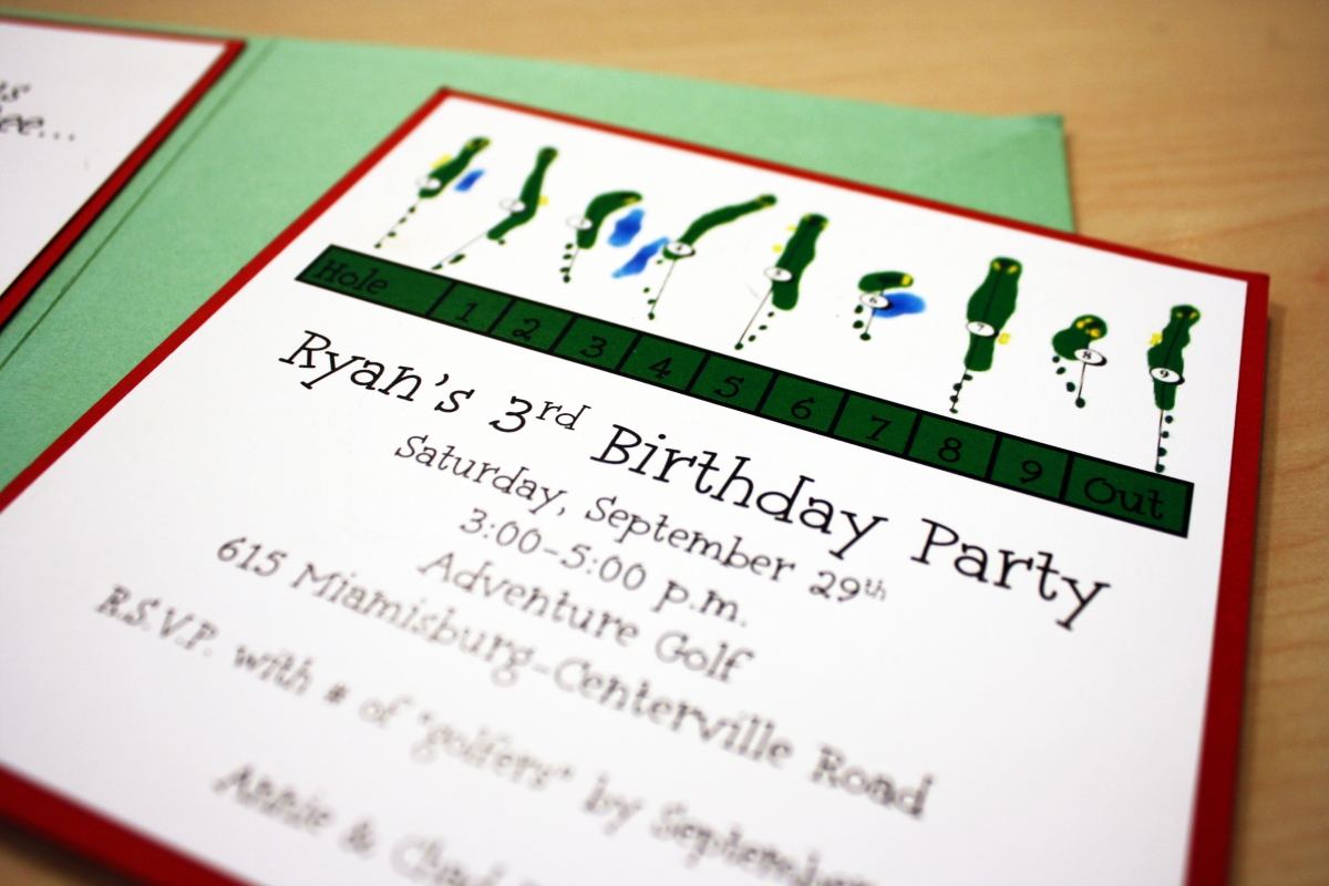
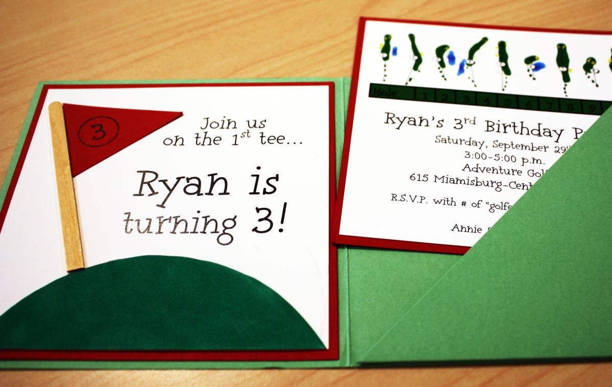
Ryan’s Adventure Golf Birthday
Fore! I don’t recommend taking a bunch of 3 year olds putt-putting…however, if you do, and it happens to be for a birthday party, I highly recommend this custom invitation complete with a faux suede putting green. Ryan is now 8 and doesn’t get into birthday parties as much anymore (this year he just wants to “hang out” at home with us) but when he was younger there was ALWAYS a theme. His first birthday was a monkey safari, his second had a cars and trucks theme, fourth was Hot Wheels, fifth we had a Scooby Doo scavenger hunt complete with clues, sixth at the Boonshoft Museum was a “Land and Sea” party (think dinosaurs and sharks), seventh was all about Angry Birds….whew! And I got a little crazier every year with his invitations- check the links- but the golf theme was one of the best. I designed the insert card to look like a score card that fit inside a green square pocket, used popsicle sticks for the flag poles and found an awesome green faux suede for the putting green.
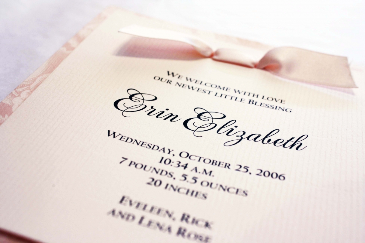
Erin Elizabeth
Erin was welcomed into the world by her big sister, Lena whose birth announcements I did while I was still at Ink back in 2004. We kept a similar floral style, using Anna Griffin patterned paper, this time in a textured blush pink. The ribbon is Midori’s double-faced satin. These two little girls have been a joy to watch grow up over the last several years through various birthday party invitations, including a cowgirl-themed party we did a few years ago.
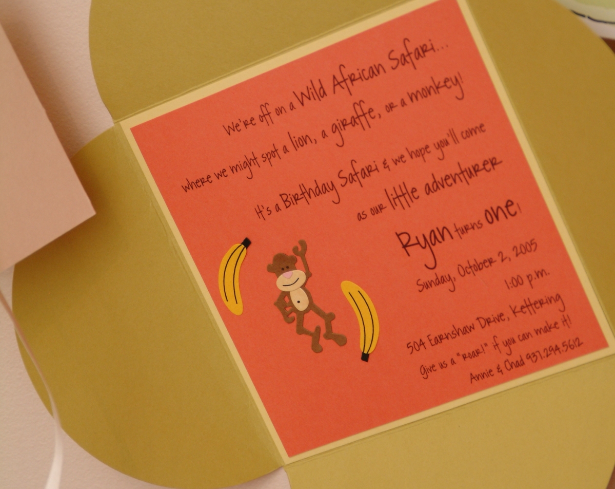
Ryan’s 1st Birthday
This was a very special invitation because it was for my son’s first birthday party. Since Ryan is such a little monkey, and always getting into everything, I decided a Safari theme would be fun to work with. I love the bright orange paired with the chartreuse and butter yellow- it was exactly the feel I was hoping to accomplish. To carry out the theme, I did matching photo cards that I hung on ribbon from the market umbrella on the patio – one for each month of his first year, with a photo and milestones from that month printed on them. It was a cute way to share the details of his first year with friends and family. I also did tent cards for the food table that were labeled with names such as “Tiger Tails” (i.e. cheese sticks) and had the same stick-on embellishments that were featured on the invitations. The weather even made it feel like we were in the middle of the Serengeti- it was over 80 degrees in October!
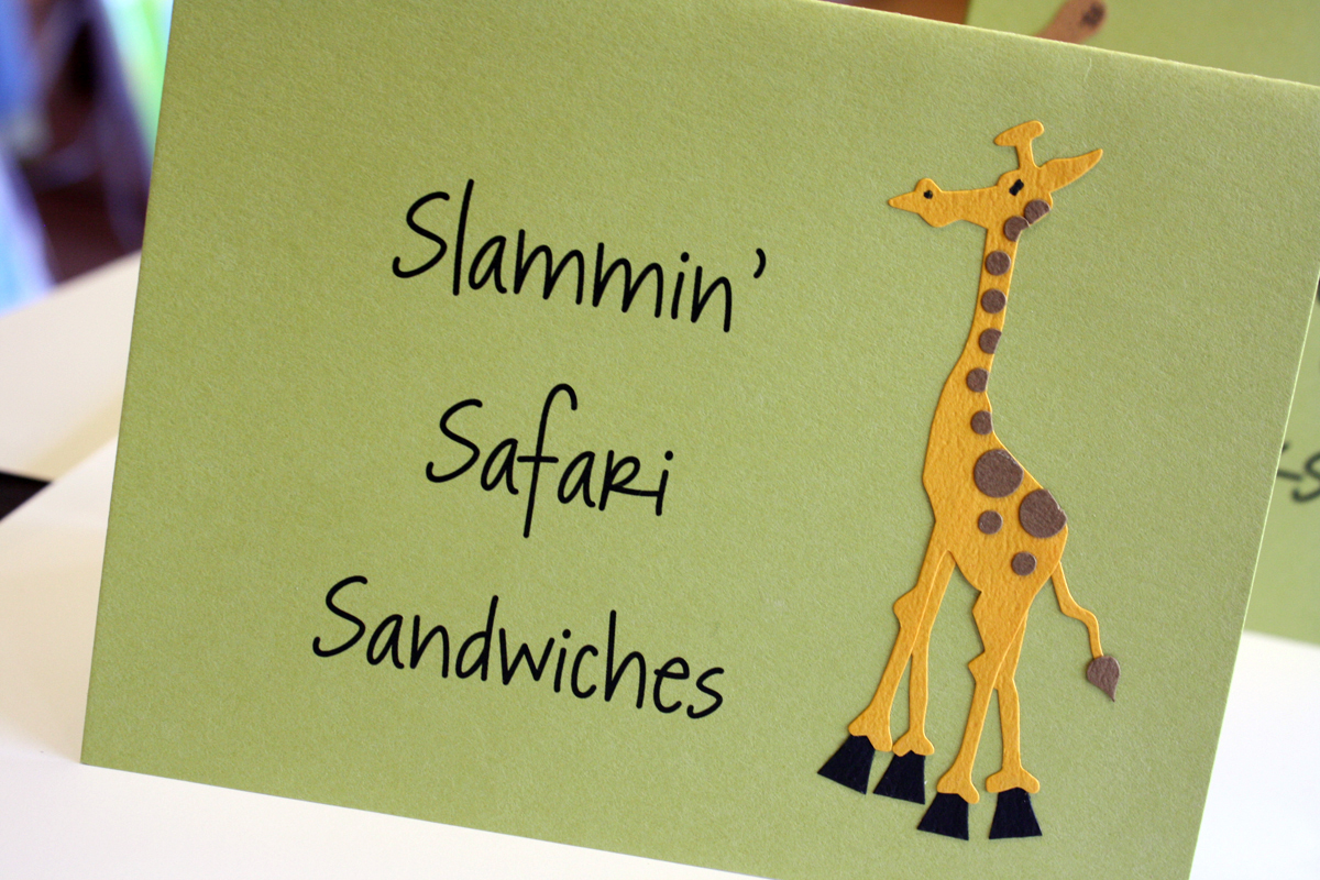
Safari Birthday Table Tents
I went overboard on Ryan’s first birthday, and I’ll be the first to admit it. I thought it would be fun to have table cards for the food and make them coordinate with the party invitations. I kept with the color scheme of orange, yellow and green, and had enough animal embellishments leftover to adorn the table tents. We served everything family style, from mini burgers (“Slammin’ Safari Sandwiches”) to hot wings (“Ragin’ Rhino Wings”).