Category: wedding
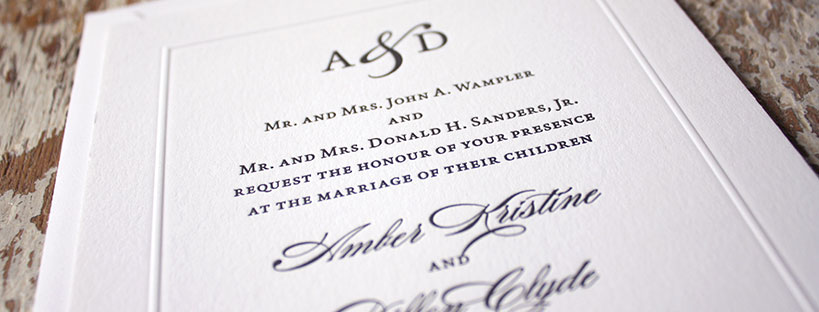
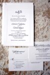
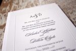
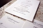
Amber + Dillon
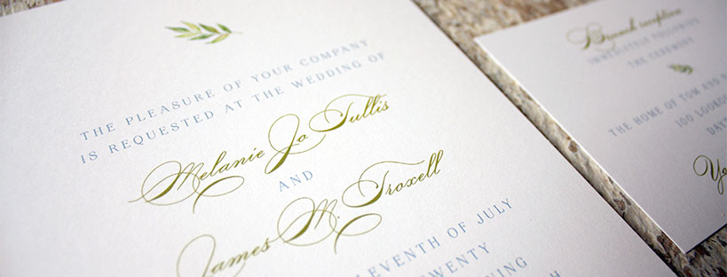
Melanie + James
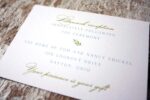
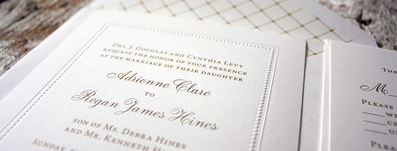
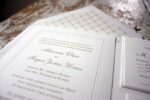
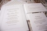
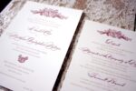
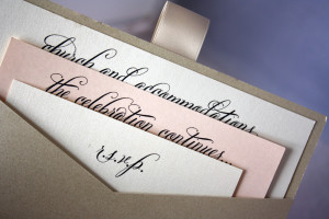
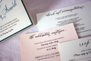
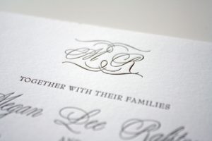
Adrienne + Regan
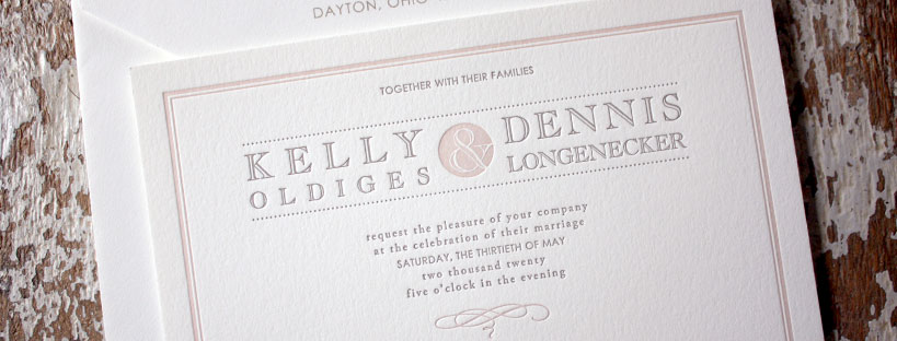
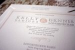
Kelly + Dennis
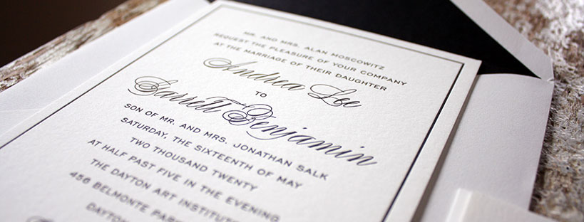
Andrea + Garrett
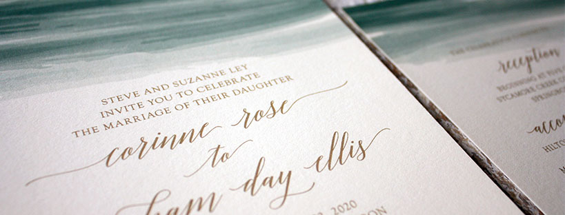
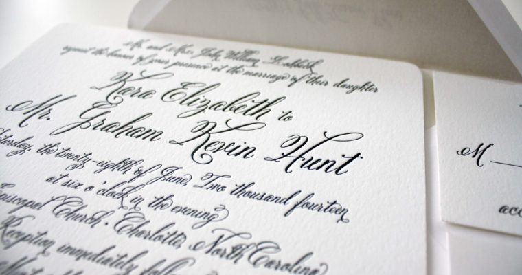
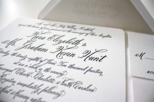
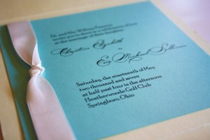
Corinne + Graham
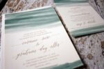
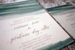
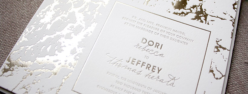
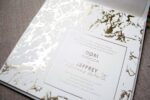
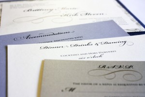
Dori + Jeff
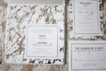
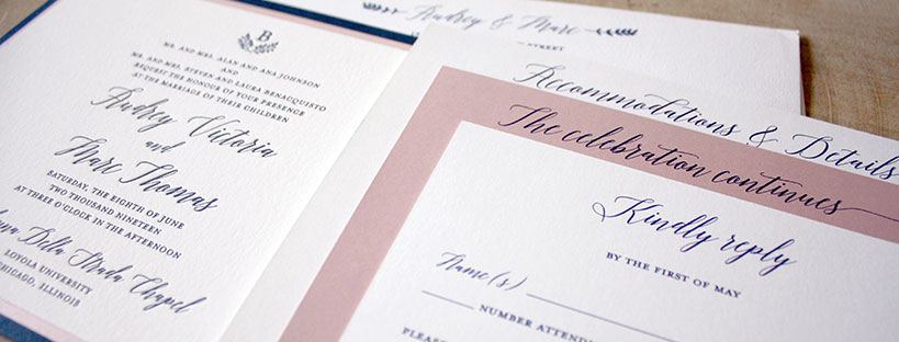
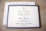
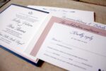
Audrey + Marc
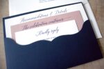
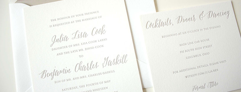
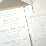
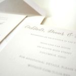
Julia + Ben
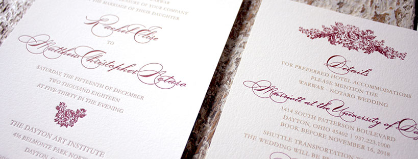
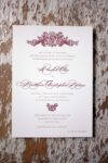
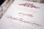
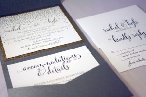
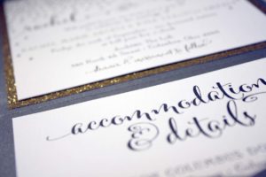
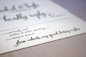
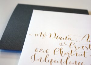
Rachel + Matt
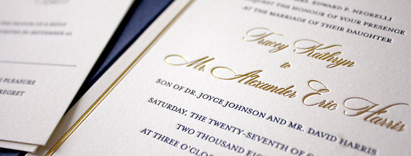
Tracey + Alexander
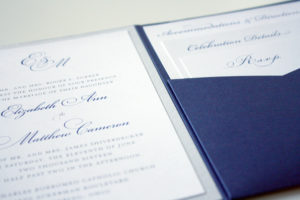
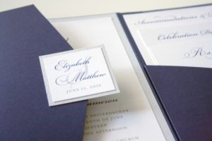
Elizabeth + Spencer
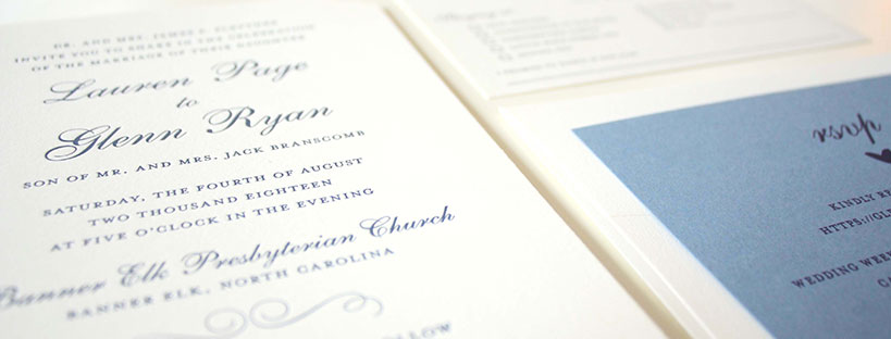
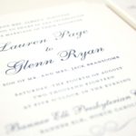
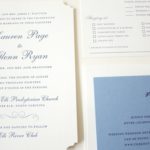
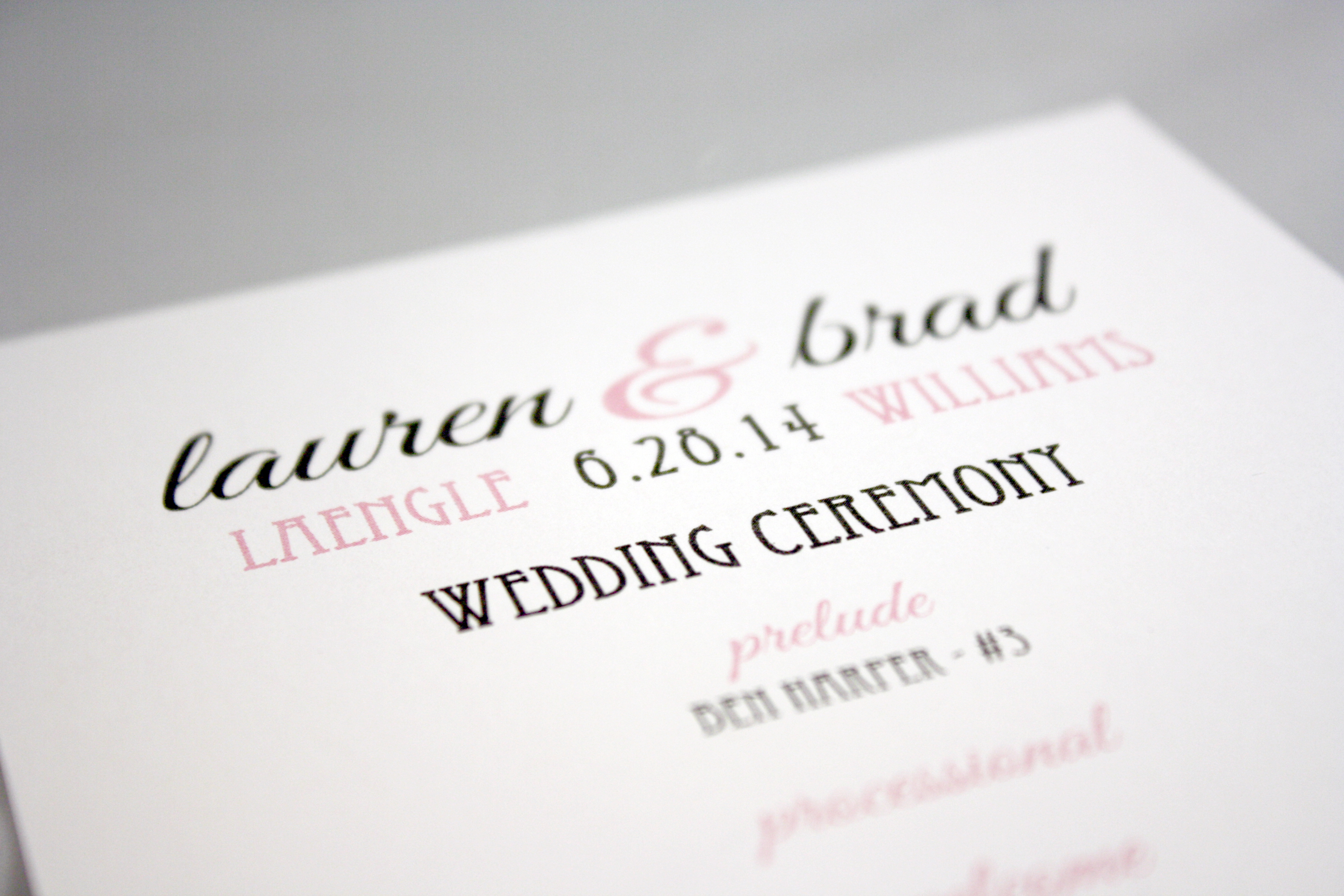
Lauren + Glenn

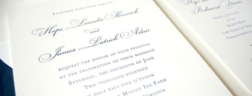
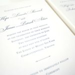
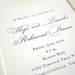
Hope + Patrick

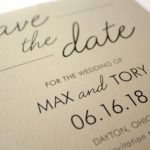
Tory + Max

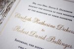
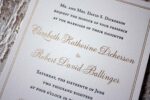
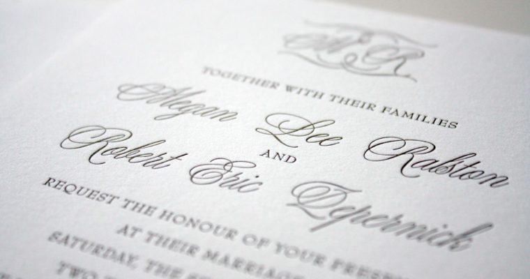
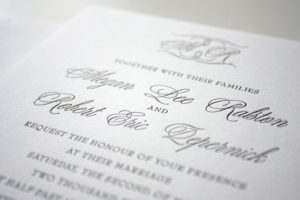
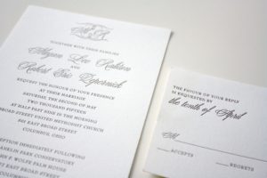
Elizabeth + Robert
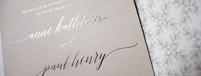
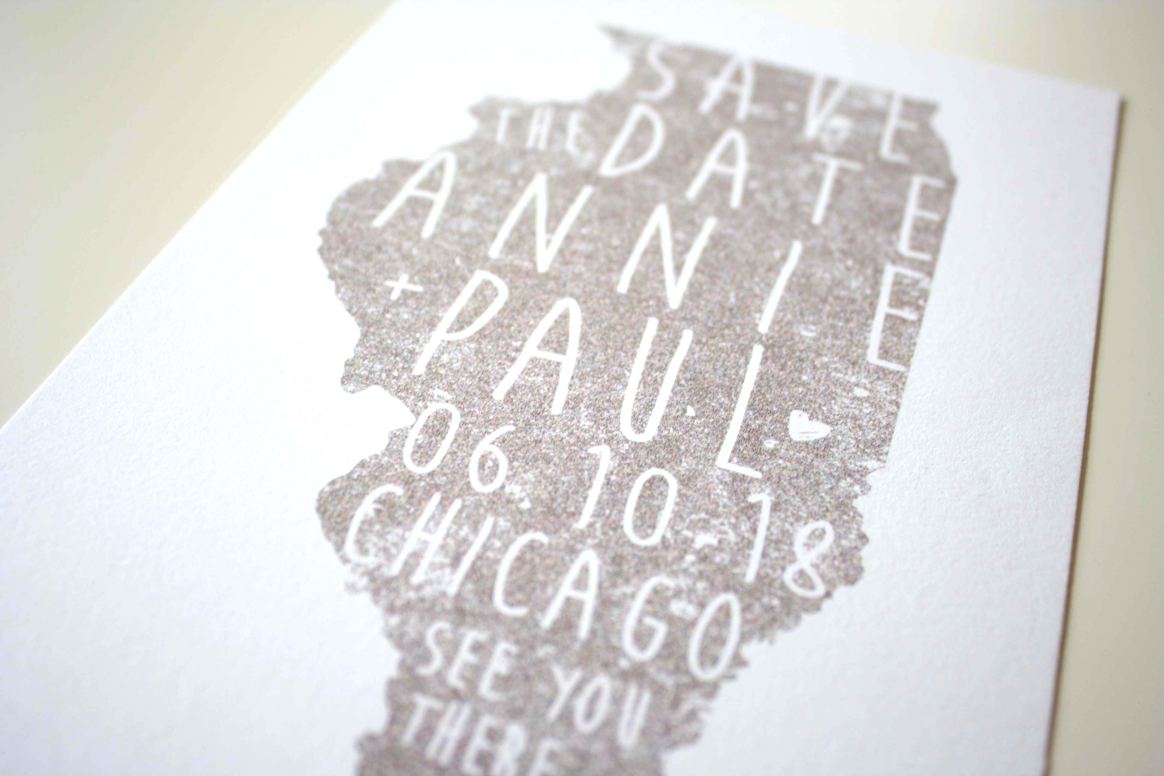
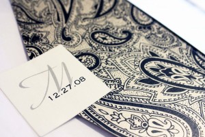
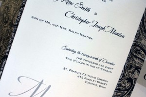
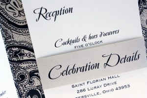
Annie + Paul
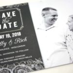
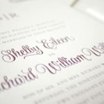
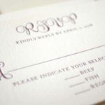
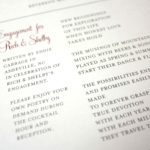
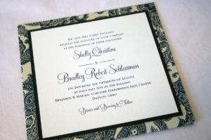
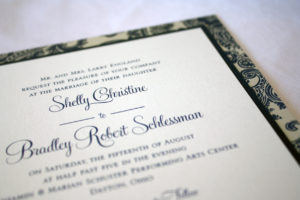
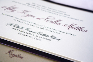
Shelby + Rich
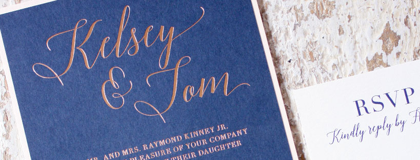
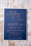
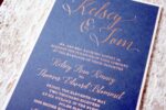
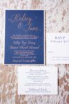
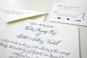
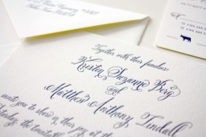
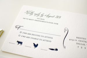
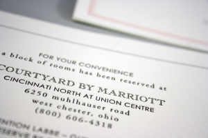
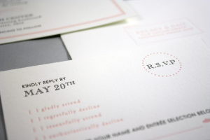
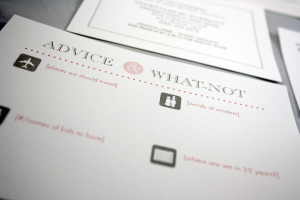
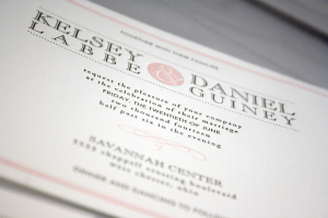
Kelsey + Tom
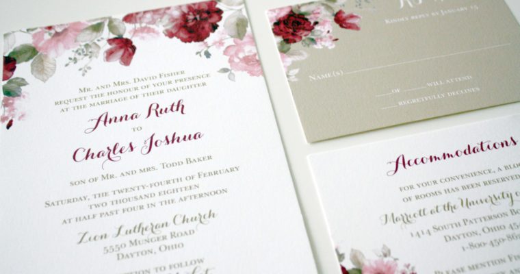
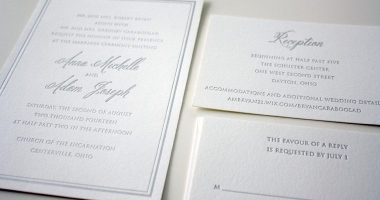
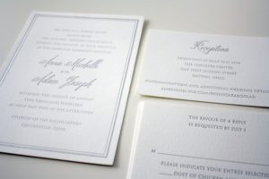
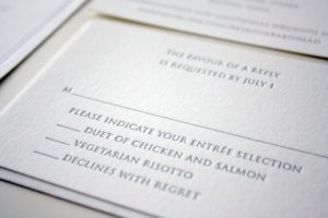
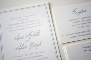
Anna + Charles
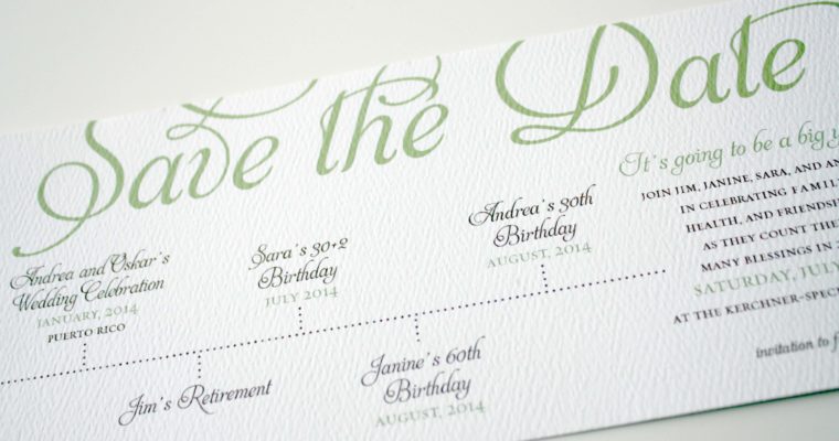
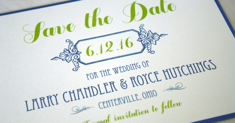
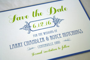
Timeline Save the Date
New Year’s Eve Masquerade Ball
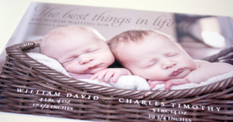
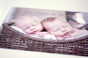
The Best Things
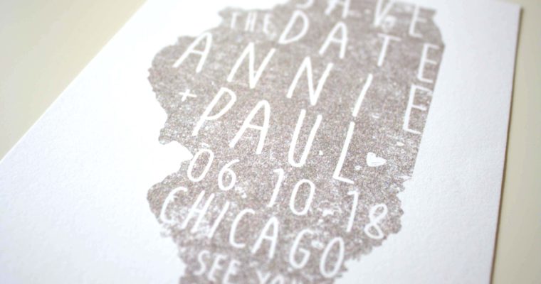
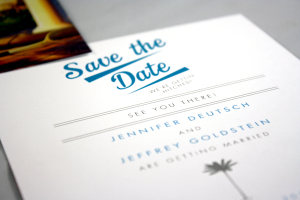
Chicago Save the Date
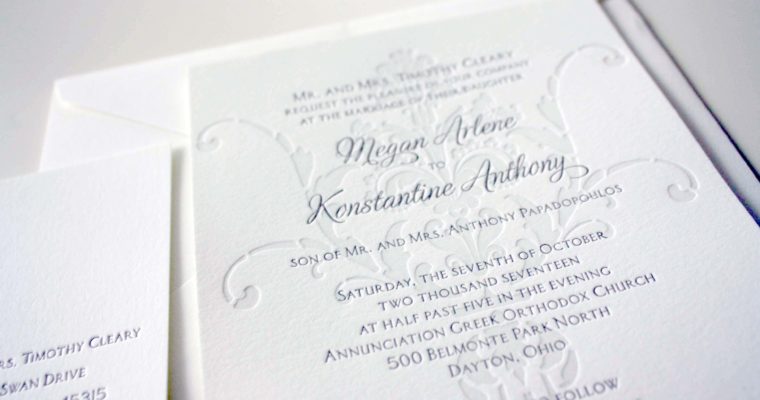
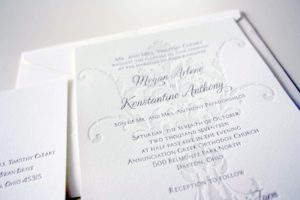
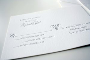
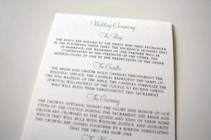
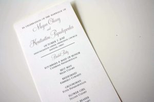
Megan + Konstantine
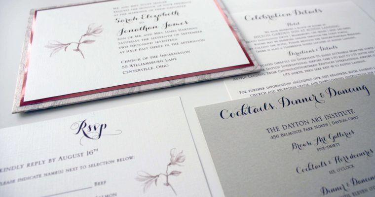
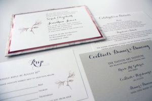
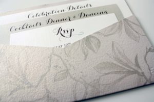
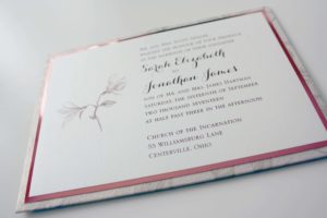
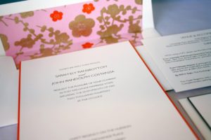
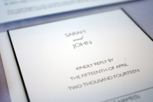
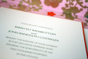
Sarah + Jon
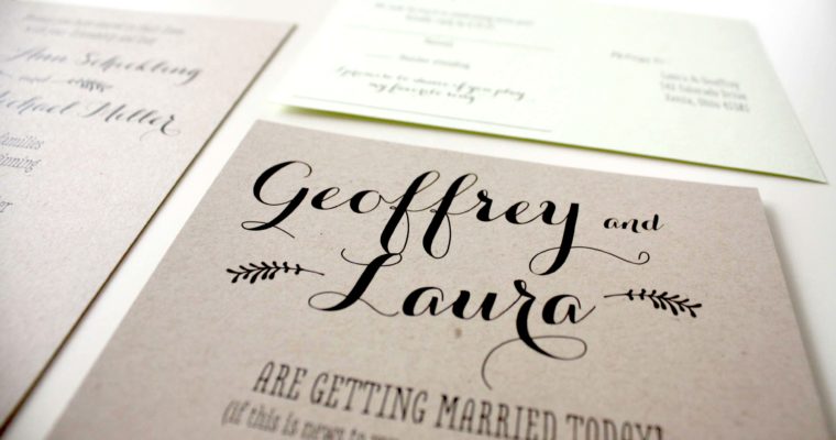
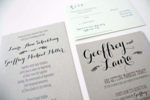
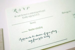
Geoffrey + Laura
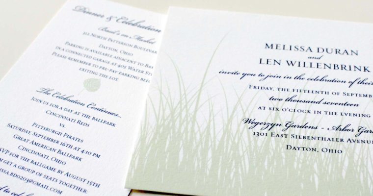
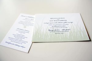
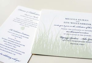
Melissa + Len
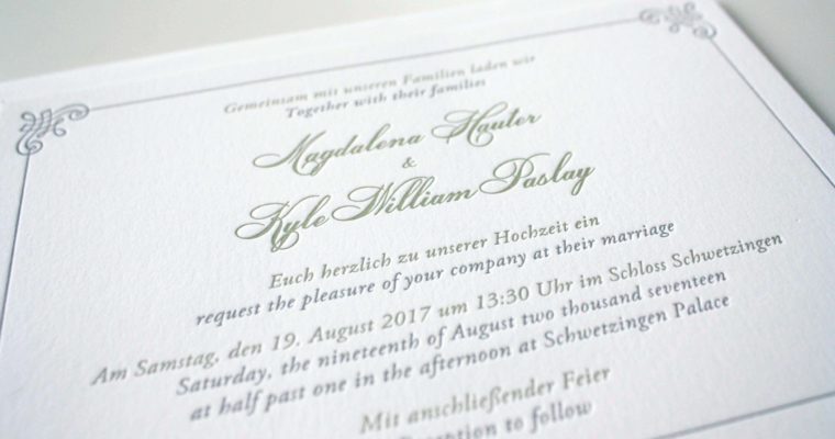
Magdalena + Kyle
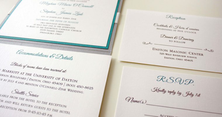
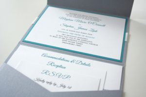
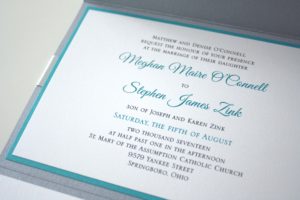
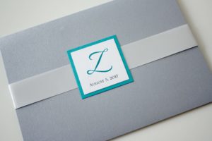
Meghan + Steve
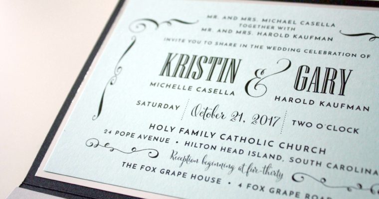
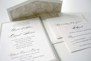
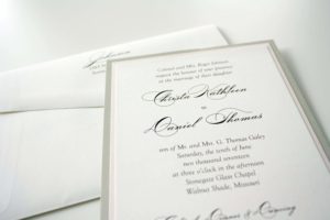
Kristin + Gary
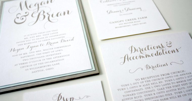
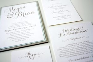
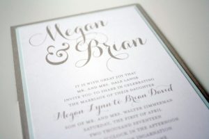
Megan + Brian
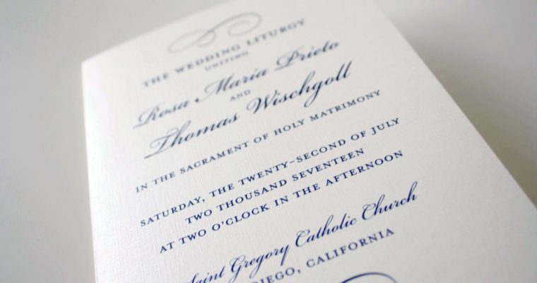
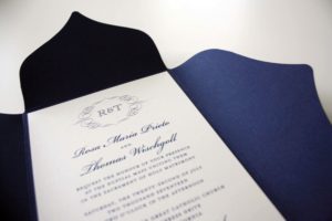
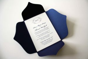
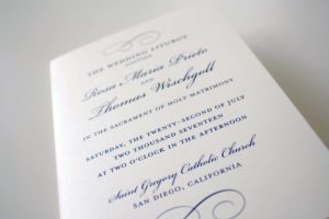
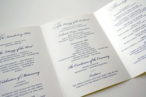
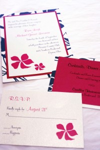
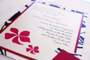
Rosa + Thomas
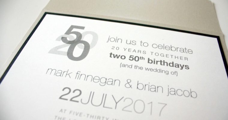
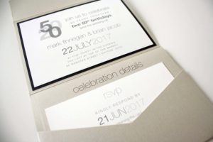
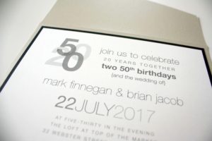
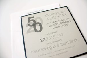
Mark + Brian
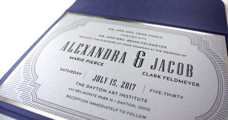
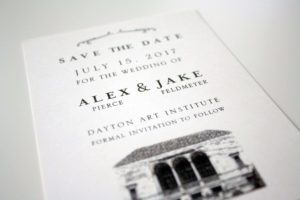
Alex + Jacob
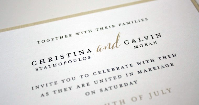
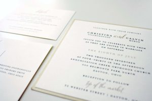
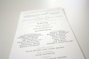
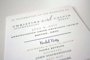
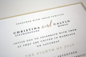
Christina + Calvin
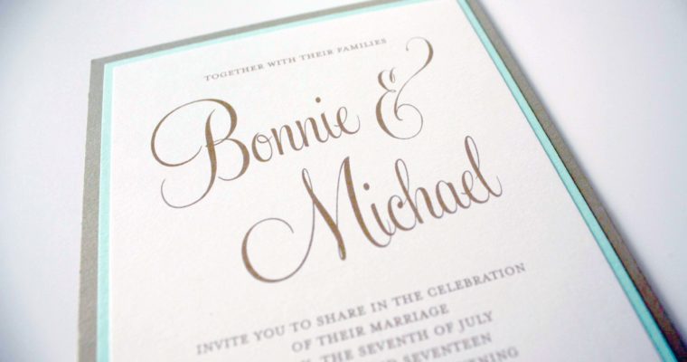
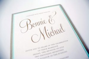
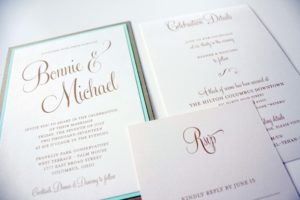
Bonnie + Michael
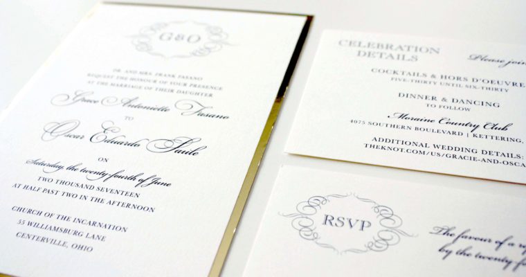
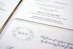
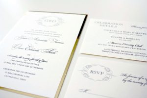
Grace + Oscar
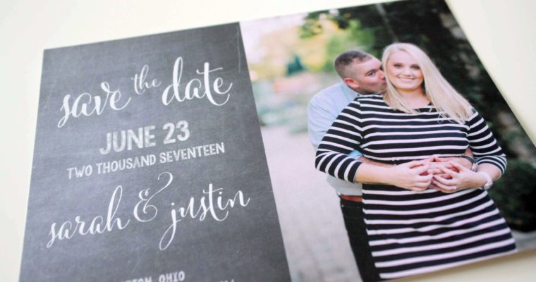
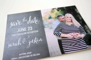
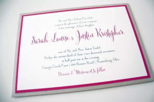
Sarah + Justin
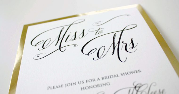
Miss to Mrs.
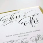
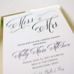
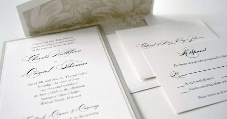
Christa + Dan
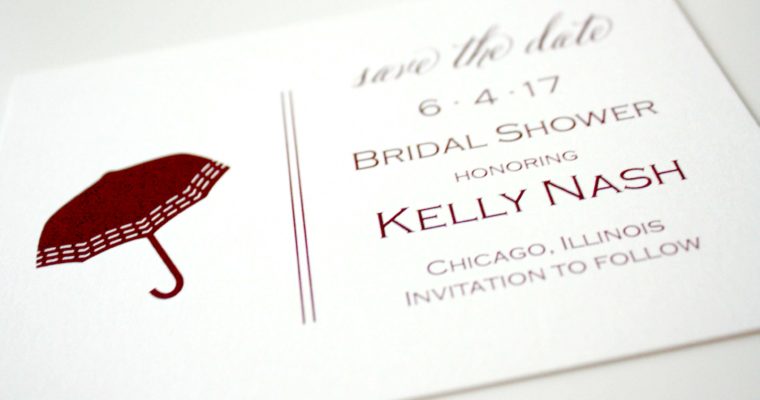
Shower Save the Date
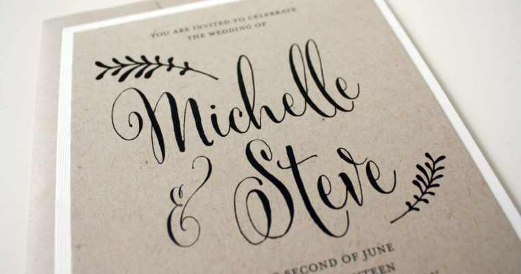
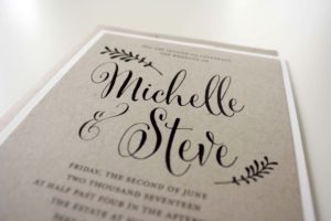
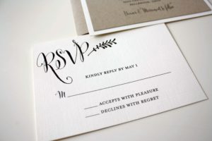
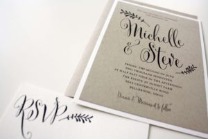
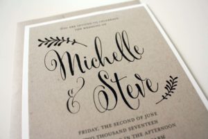
Michelle + Steve
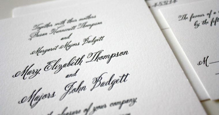
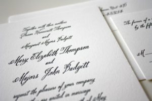
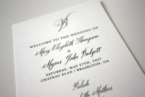
Mary Elizabeth + Majors
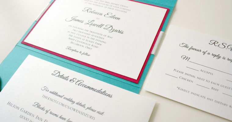
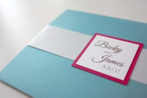
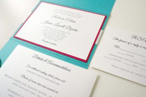
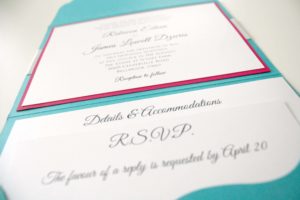
Becky + James
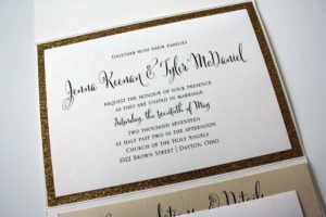
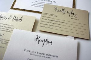
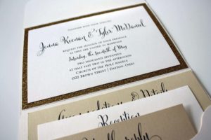
Jenna + Tyler
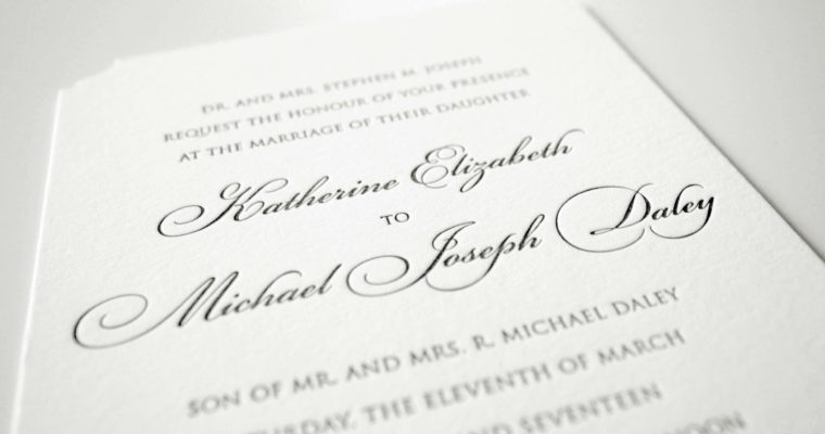
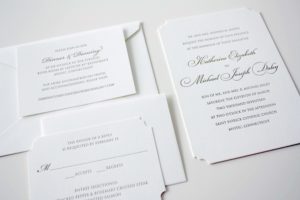
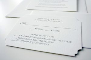
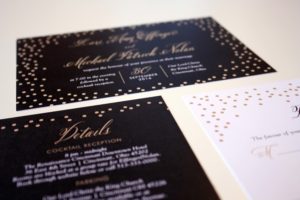
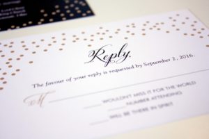
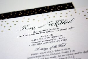
Katherine + Michael
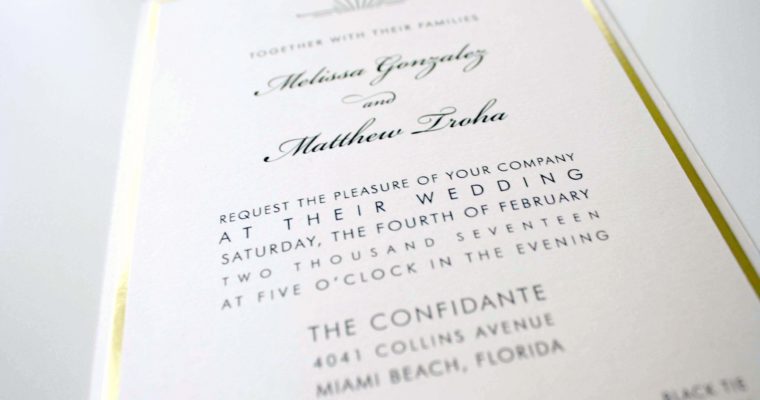
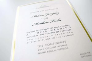
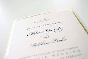
Melissa + Matthew
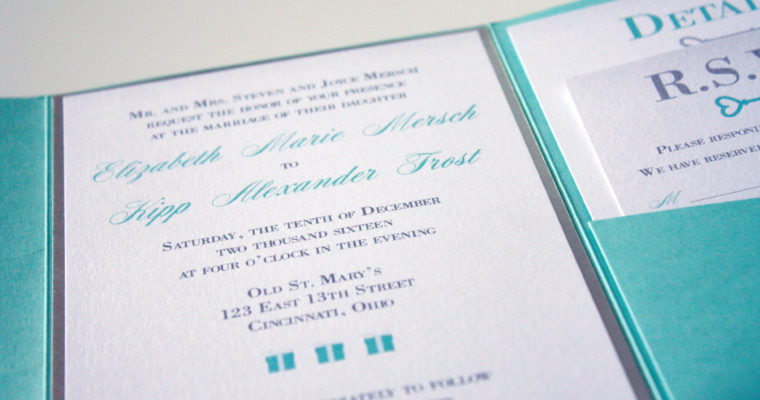
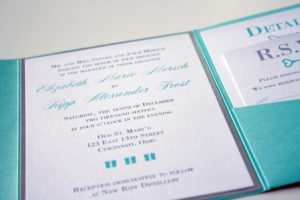
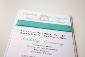
Elizabeth + Kipp
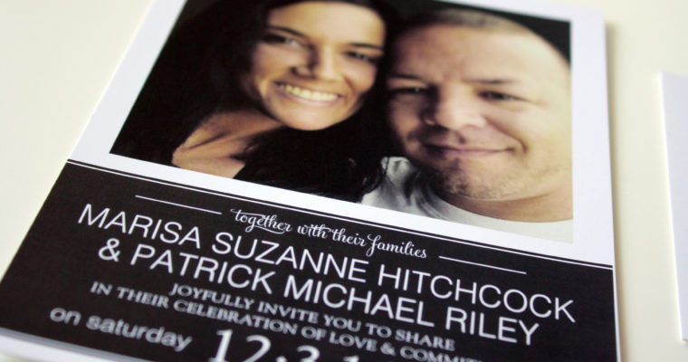
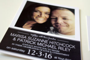
Marisa + Patrick
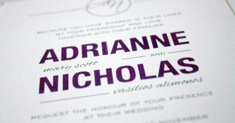
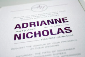
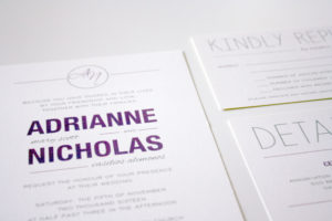
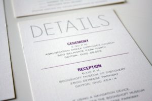
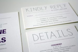
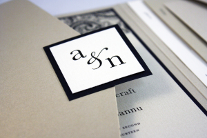
Adrianne + Nicholas
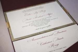
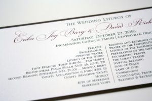
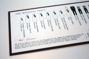
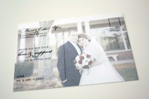
Erika + David
Lauren + Jason
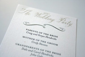
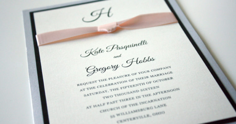
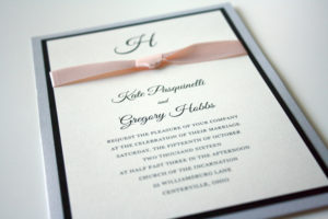
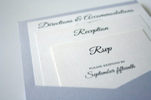
Kate + Greg
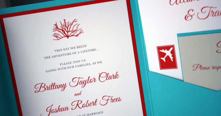
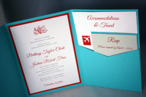
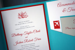
Brittany + Josh
This destination wedding was meant to be bright and fun, so we used splashy coral graphics and a tropic blue to set it apart.
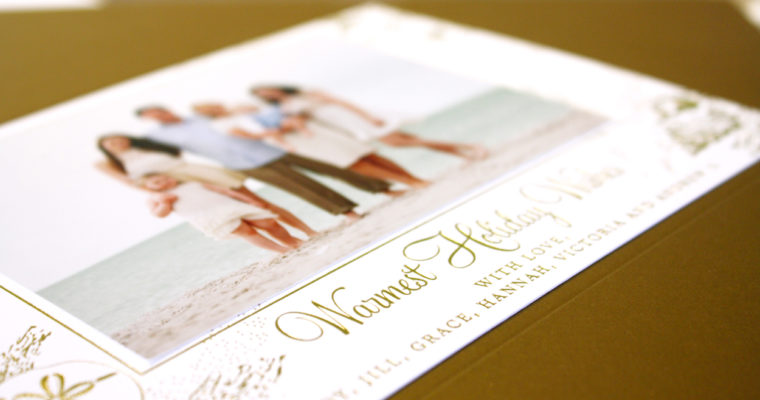
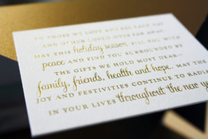
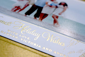
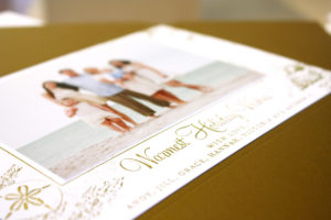
Golden Sand Photo Card
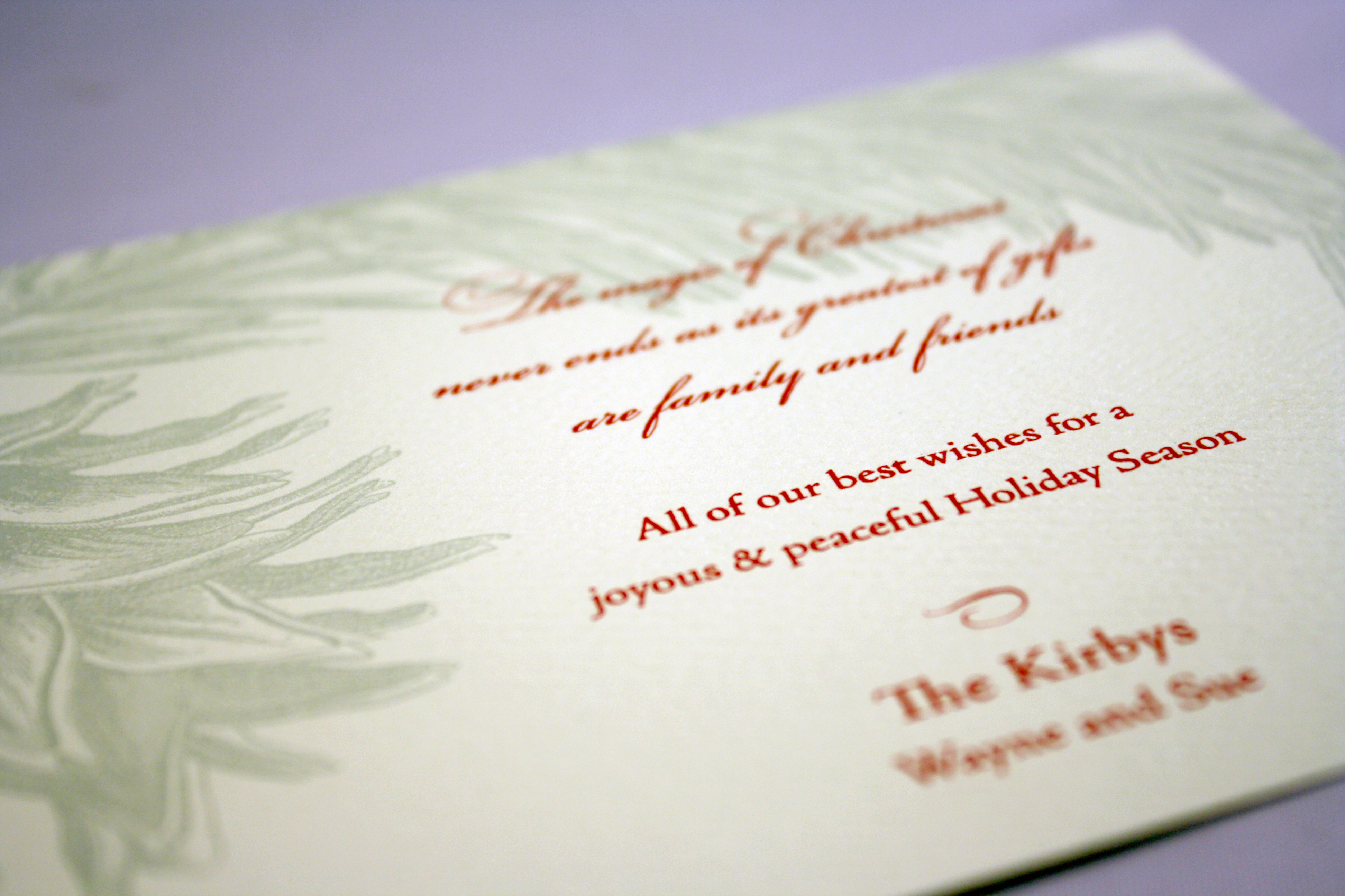
This is one of my favorites of all time. There is something about gold foil seashells paired with sandy beaches and a lovely sentiment that makes this holiday photo card nothing short of perfect.
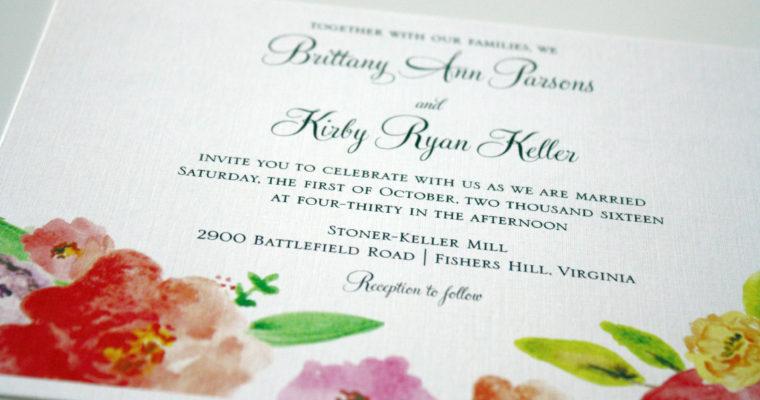
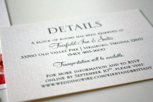
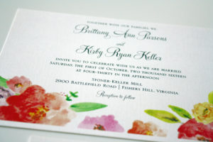
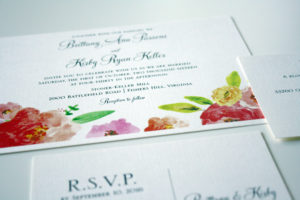
Brittany + Kirby
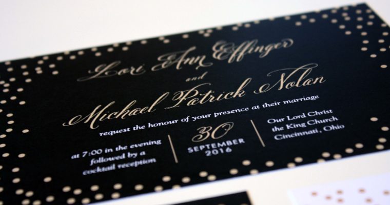
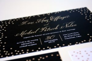
Lori + Michael
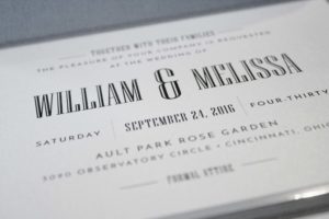
Will + Melissa

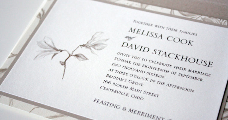
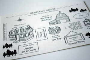
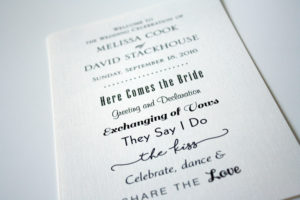
Melissa + David
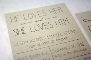
He + She
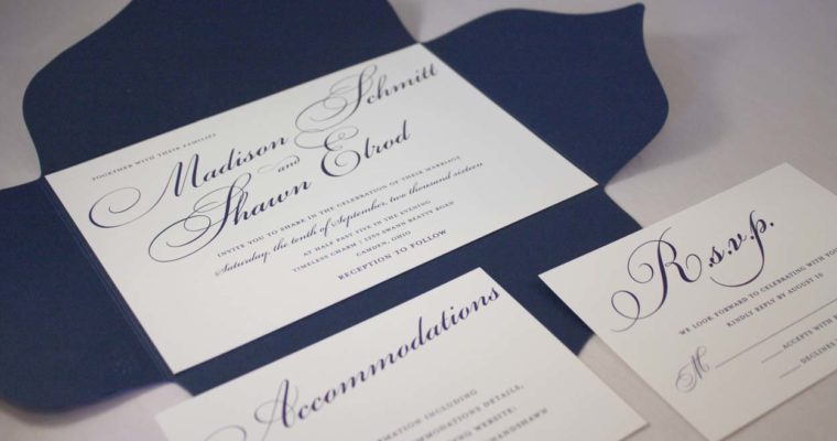
Madison + Shawn
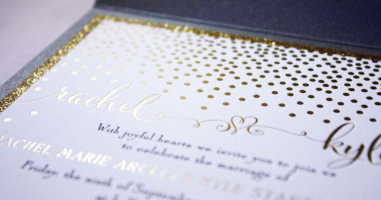
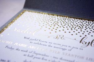
Kyle + Rachel
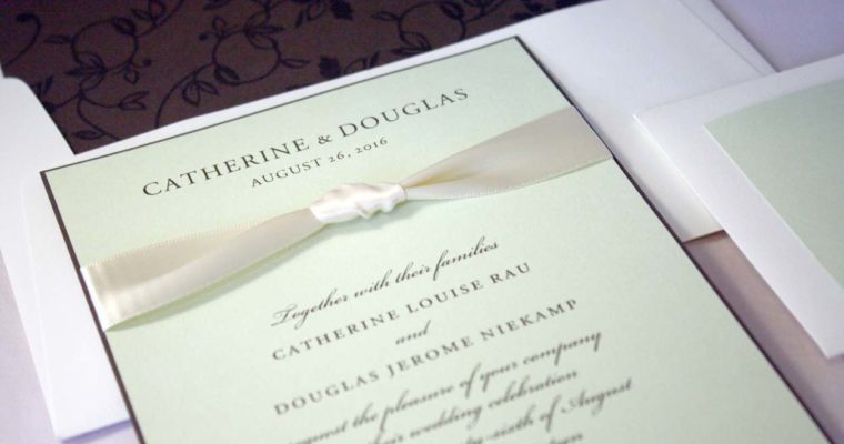
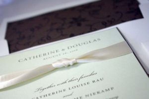
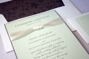
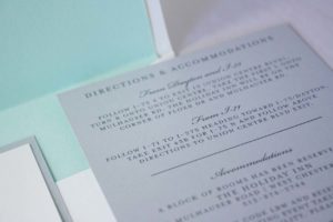
Catherine + Douglas

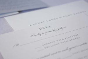
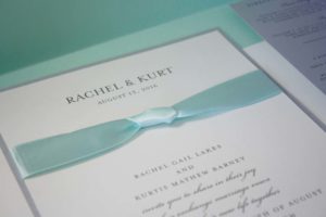
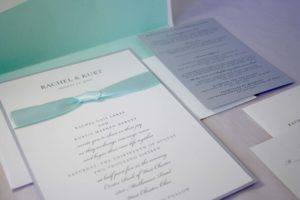
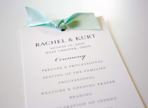
Rachel + Kurt
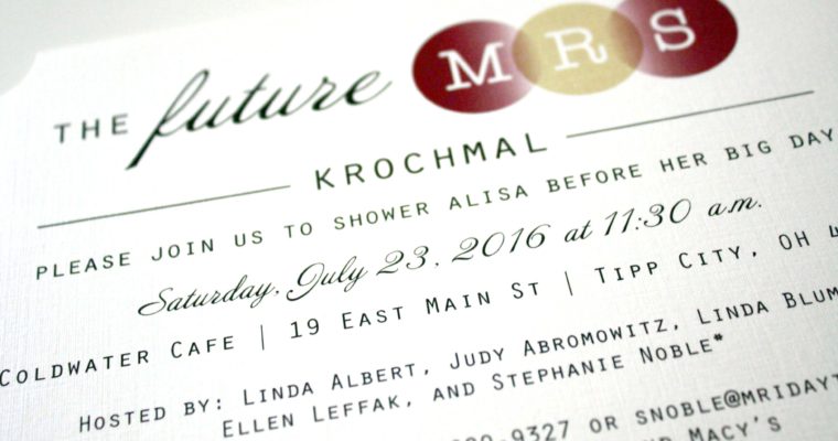
The Future M.R.S.
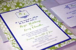
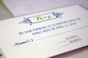
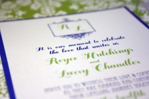
Larry + Royce
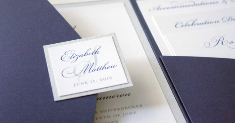
Elizabeth + Matt
Alex + Brian

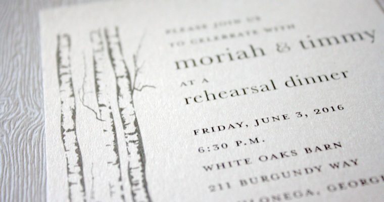
Moriah + Timmy
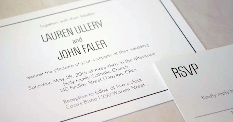
Lauren + John
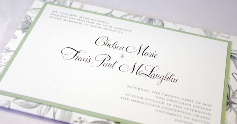
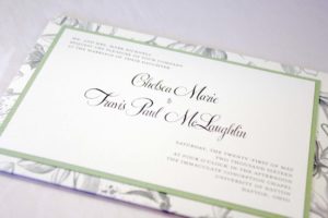
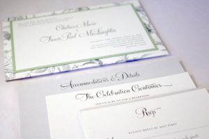
Chelsea + Travis
Becky + Steve
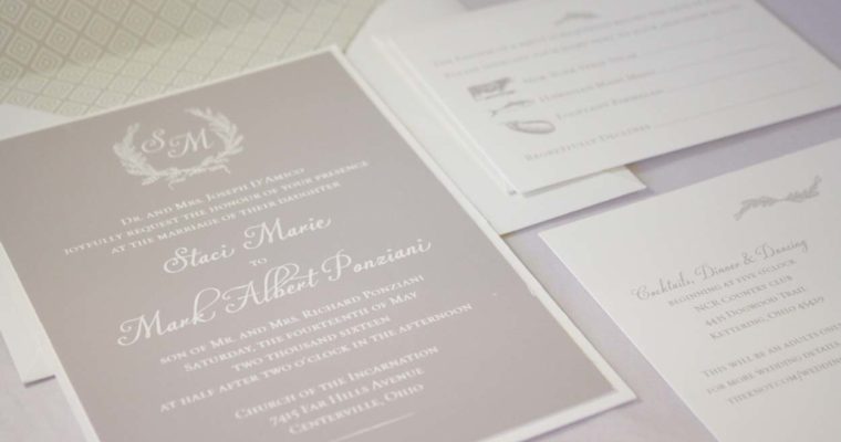
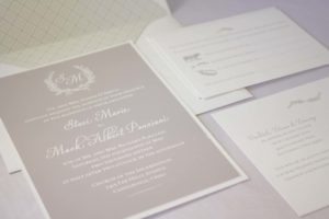
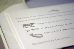
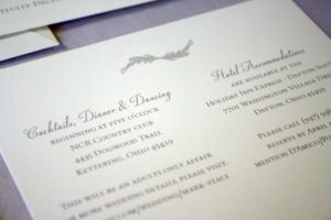
Staci + Mark
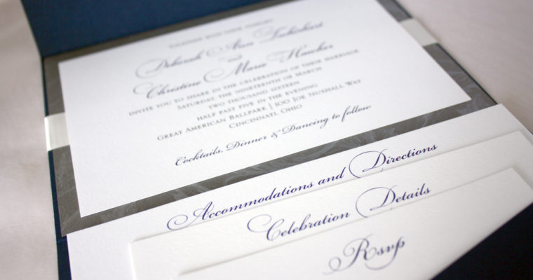
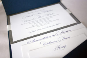
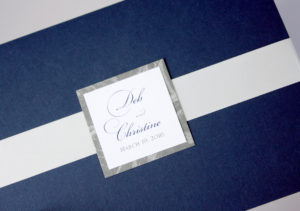
Deb + Christine
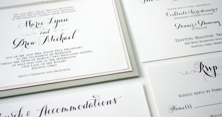
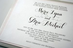
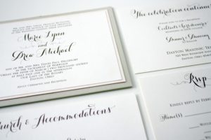
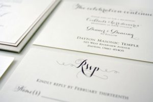
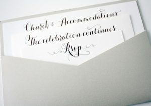
Marie + Drew
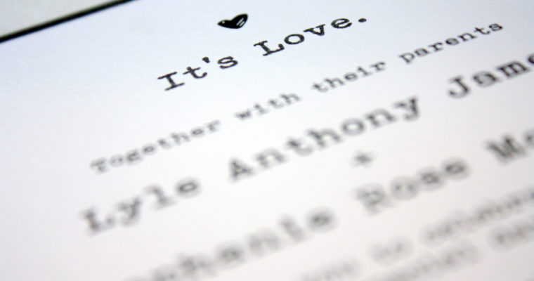
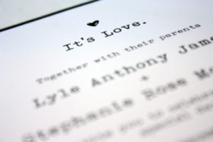
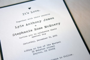
Lyle + Stephanie
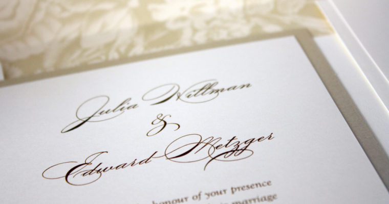
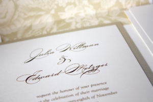
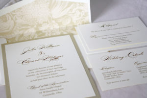
Julia + Edward
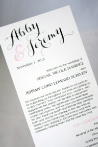
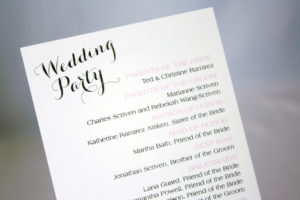
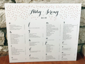
Abby + Jeremy
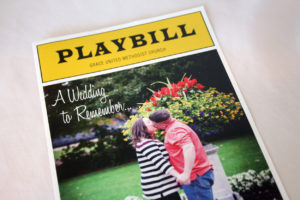
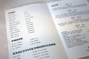
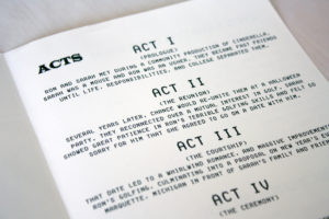
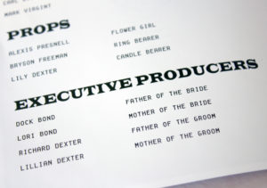
Broadway Playbill
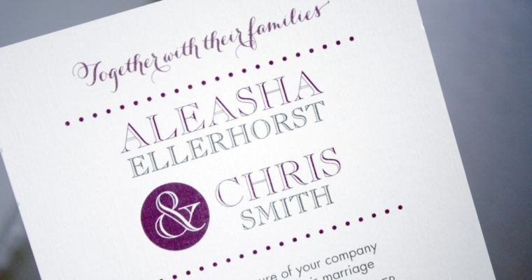
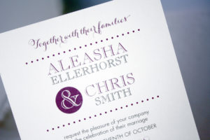
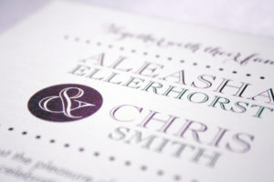
Aleasha + Chris
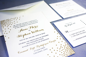
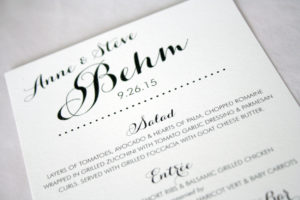
Anne + Steve


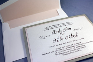
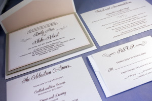
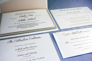
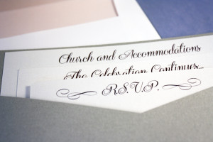
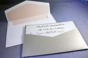
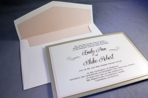
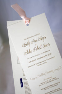
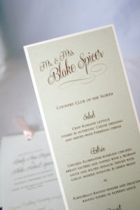
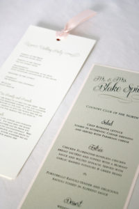
Emily + Blake
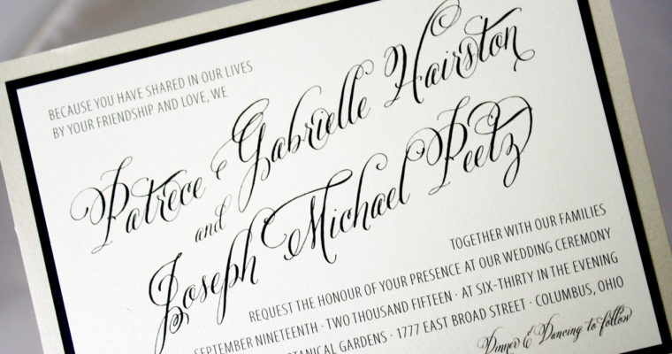
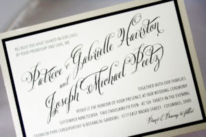
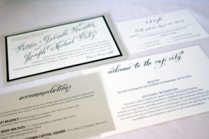
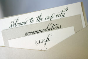
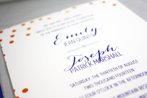
Patrece + Joseph
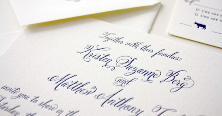
Kristen + Matt
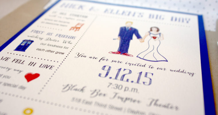
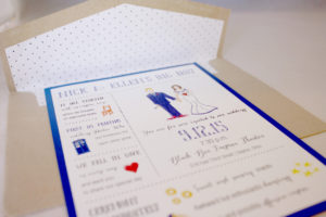
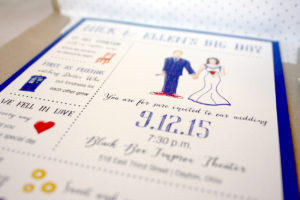
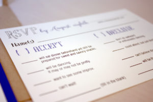
Nick + Ellen
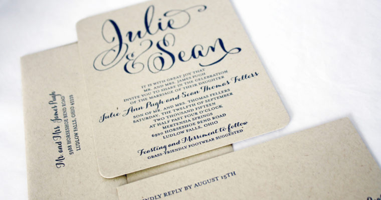
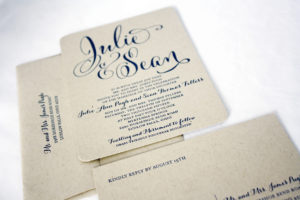
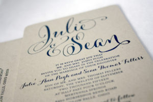
Julie + Sean
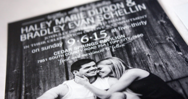
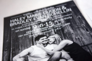
Haley + Brad

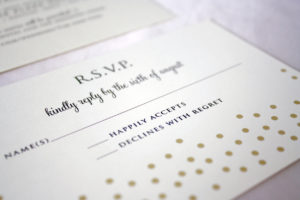
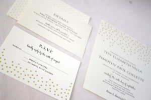
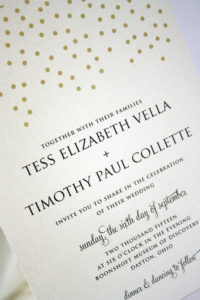
Tess + Tim
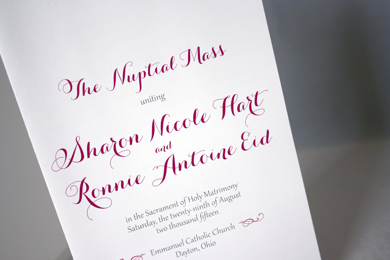
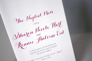
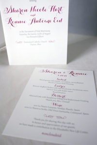
Sharon + Ronnie
Shelly + Brad
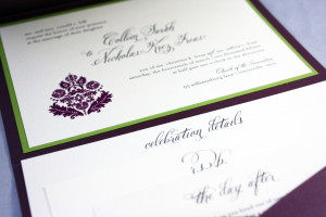
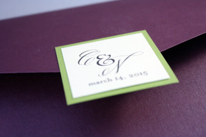
Abby + Collin

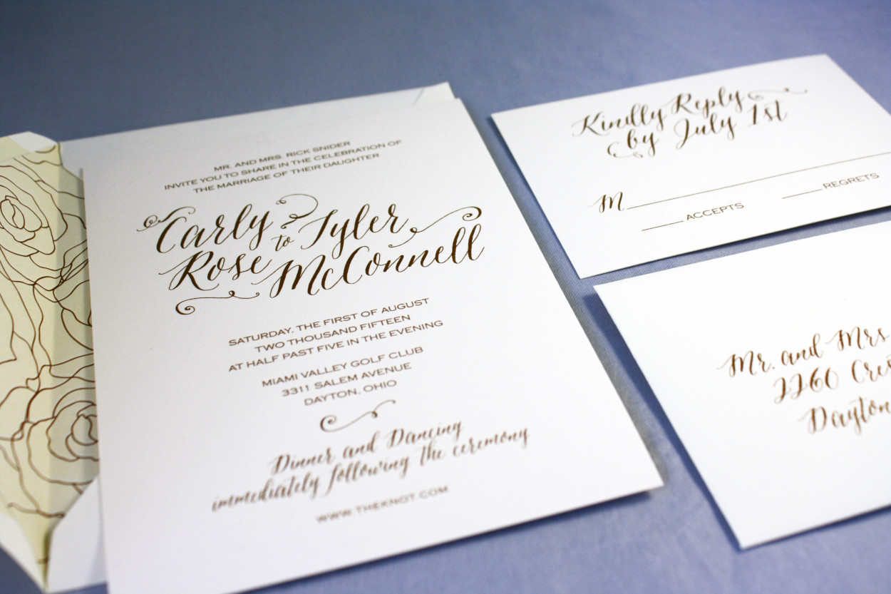
Carly + Tyler

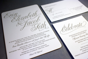
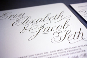
Erin + Seth
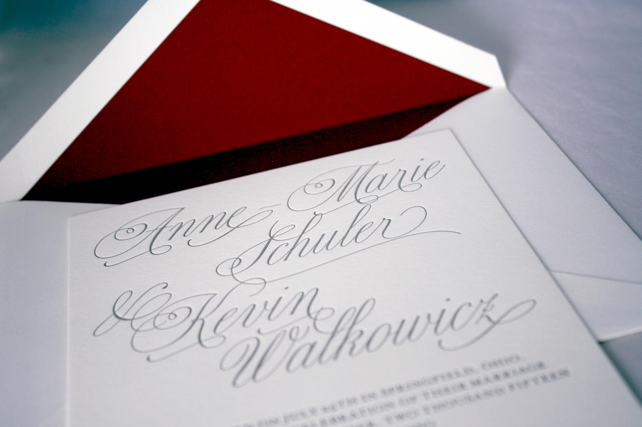
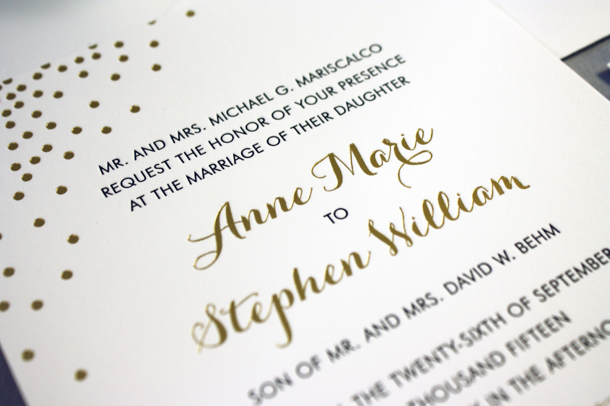
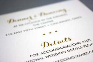
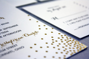
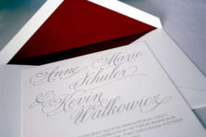
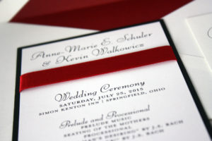
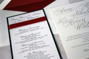
Anne Marie + Kevin
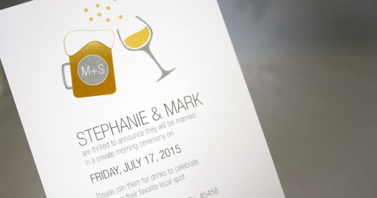
Stephanie + Mark
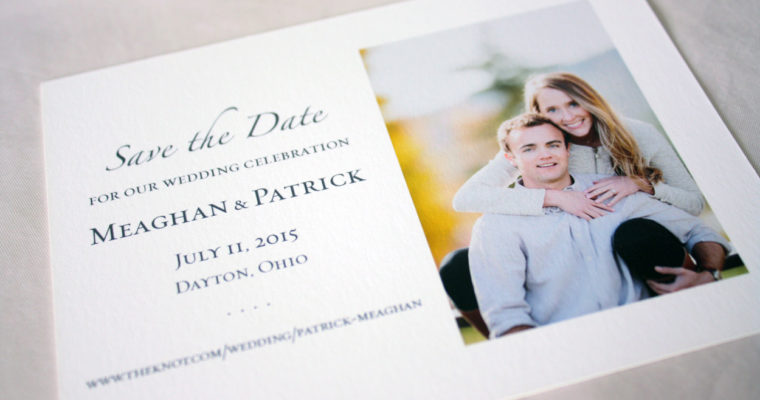
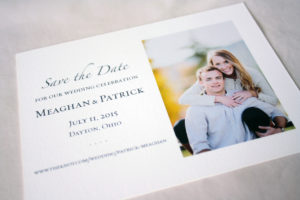
Meaghan + Patrick
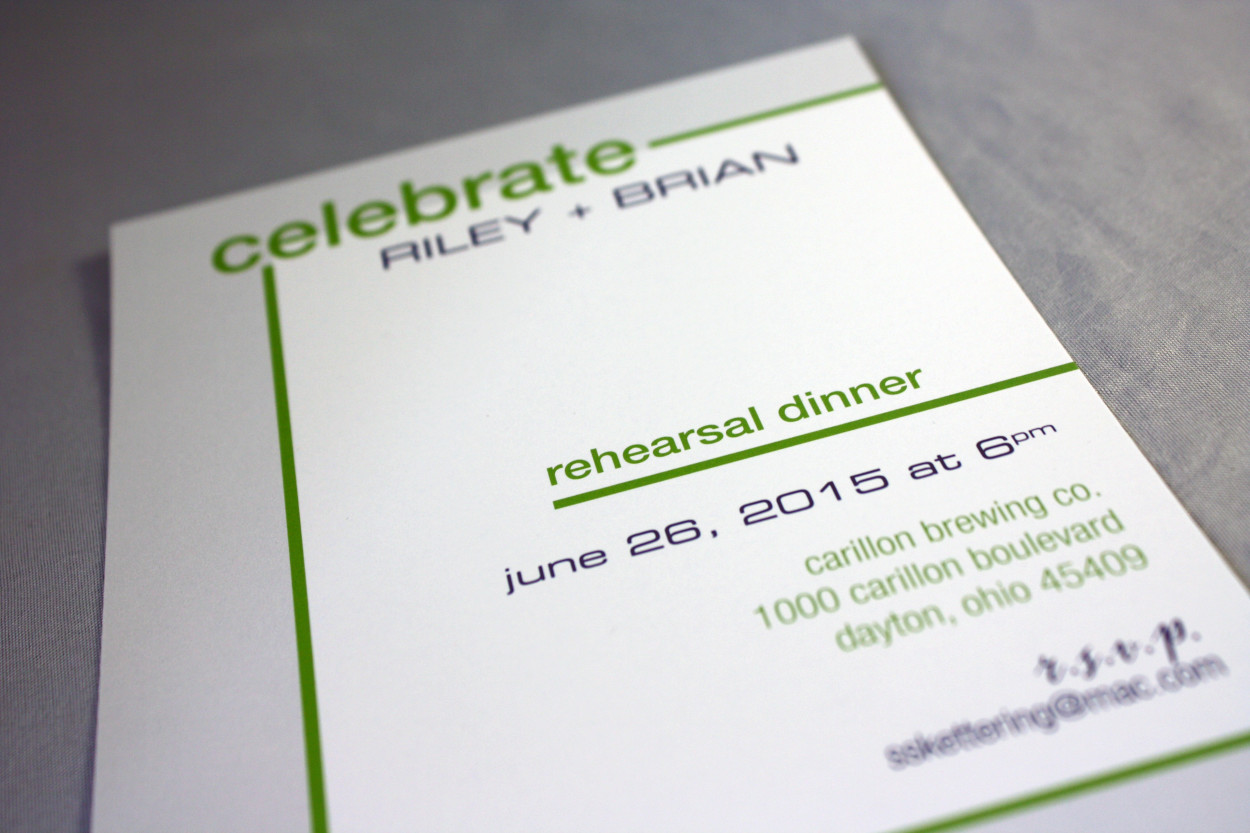
Riley + Brian
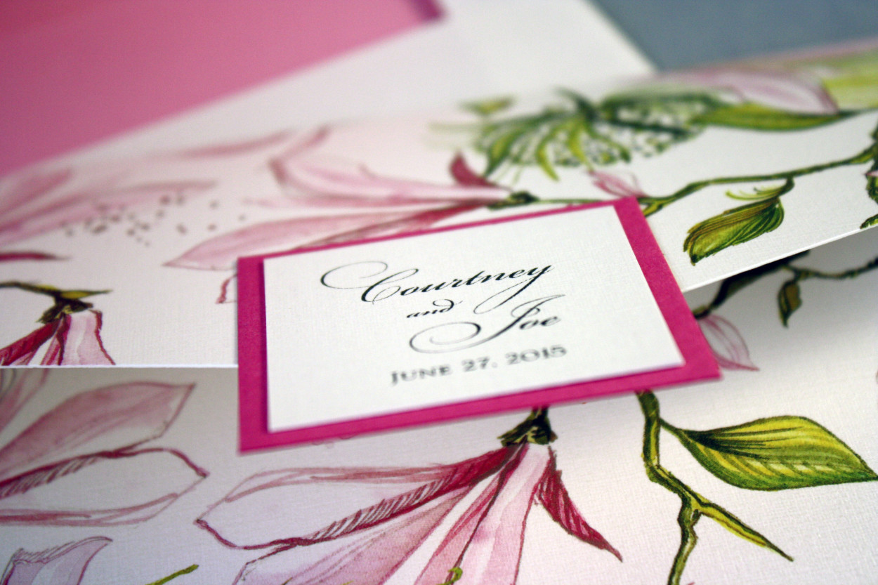
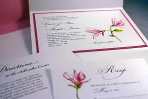
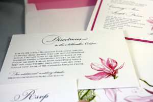
Courtney + Joe
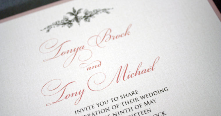
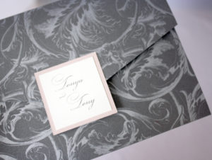
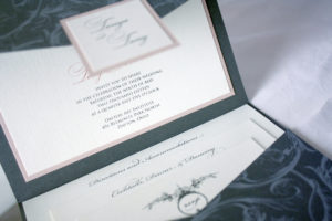
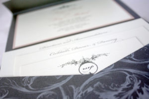
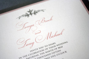
Tonya + Tony
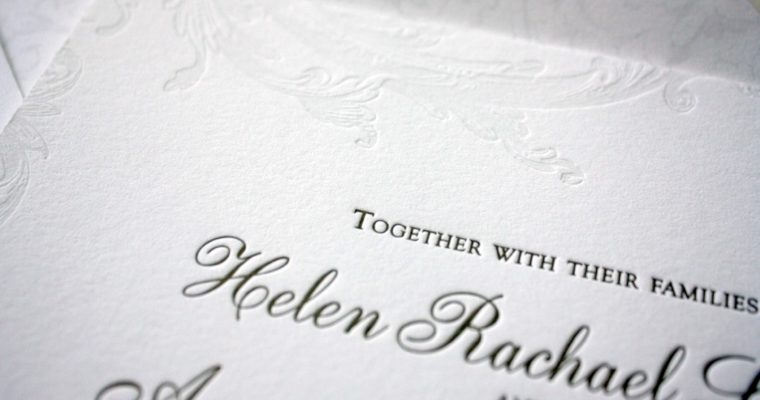
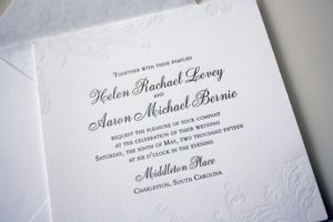
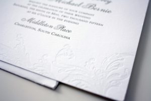
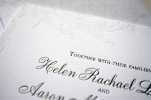
Helen + Aaron
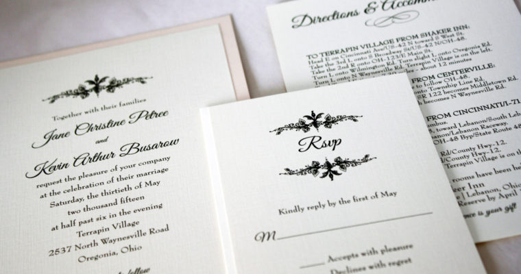
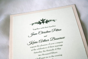
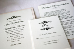
Jane + Kevin
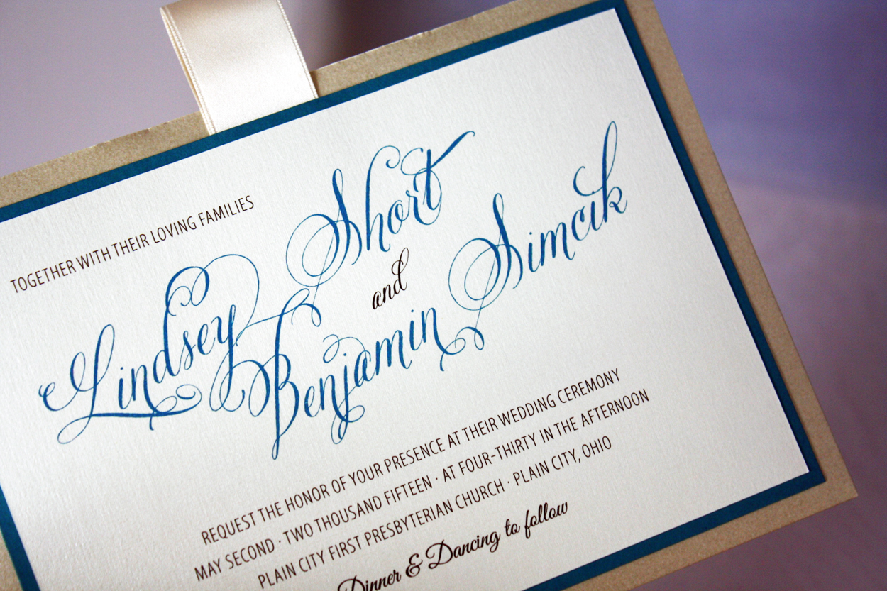
Lindsey + Ben

Meg + Rob

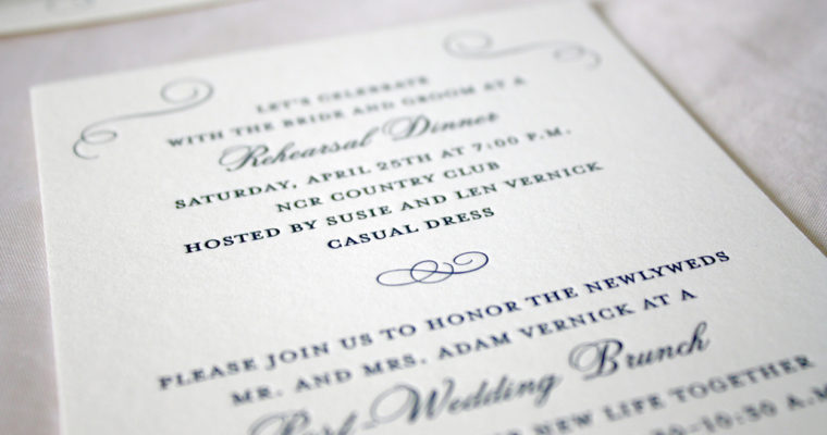
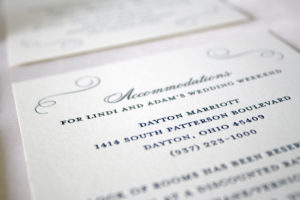
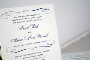
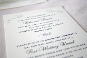
Lindi + Adam
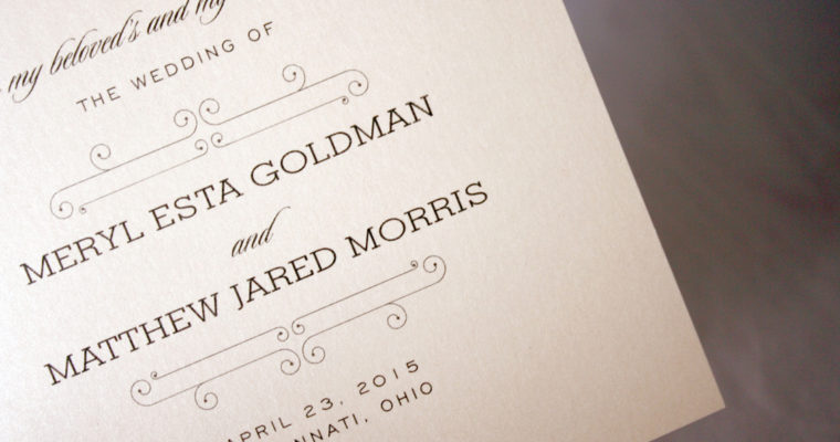
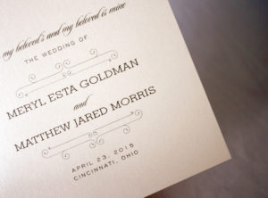
Meryl + Matt
Colleen + Nick

Betsy + Michael
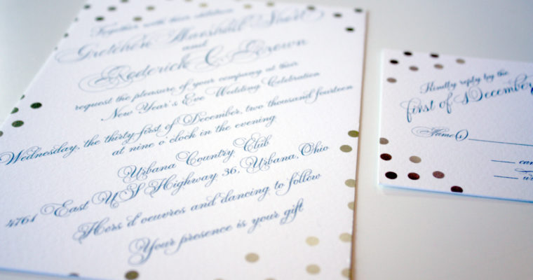
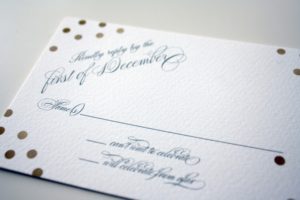
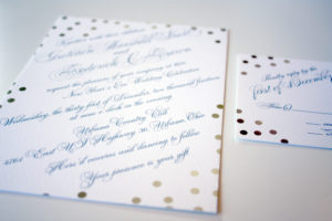
Gretchen + Rod
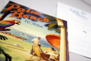
Palm Beach Save the Date
This save the date had a cool retro feel, incorporating vibrant Palm Beach artwork on one side and wedding weekend details on the other.
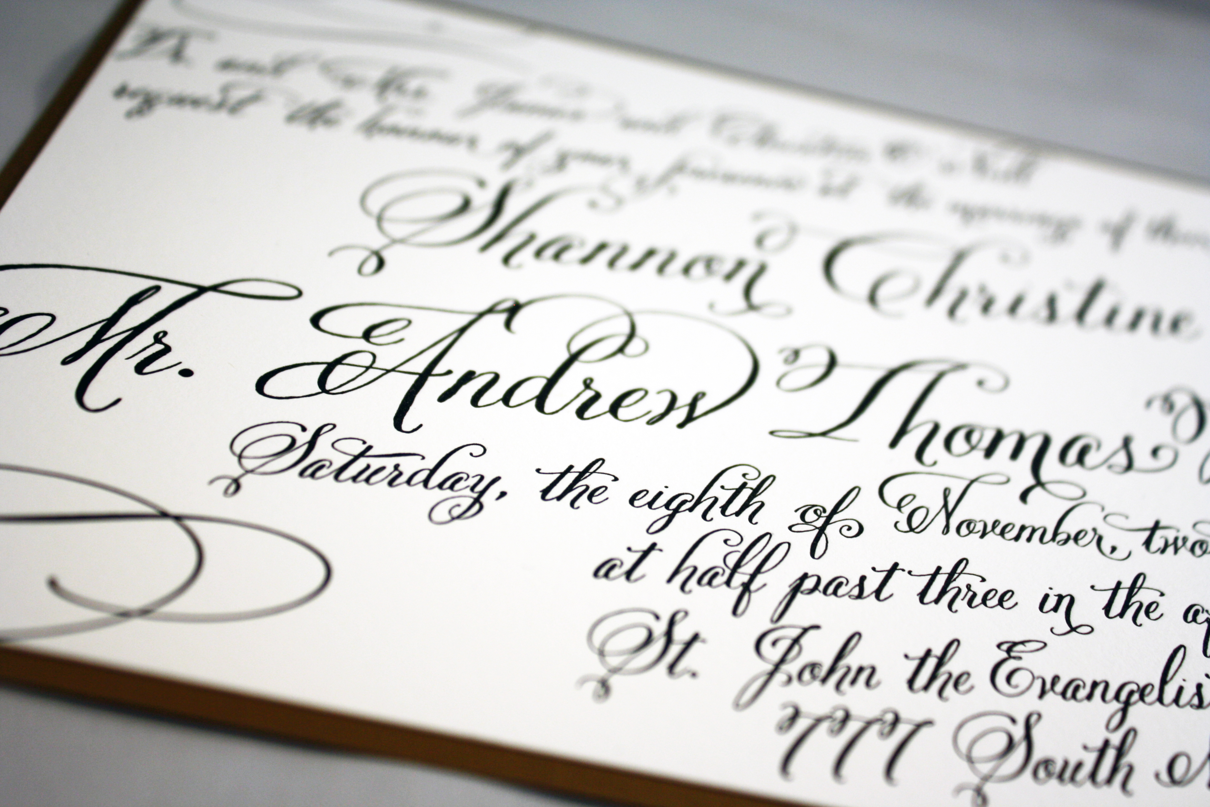
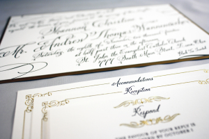
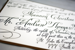
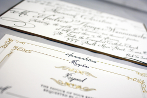
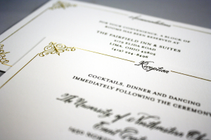
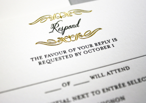
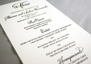
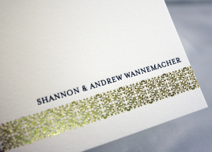
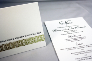
Shannon + Andrew
-
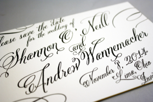
- Letterpress
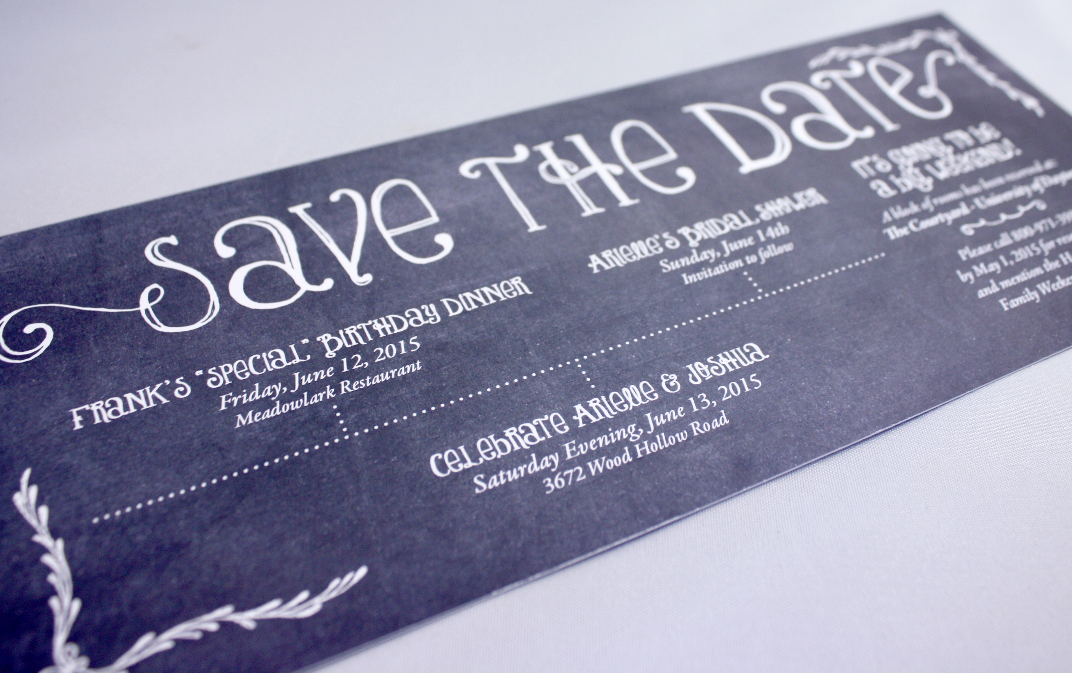
Chalkboard Save the Date
A cool way to tell friends and family to “save the weekend”, this chalkboard style save the date lists on a timeline three key events for the weekend: a birthday party, an engagement party, and a bridal shower. Let the fun begin!
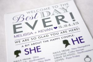
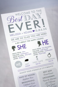
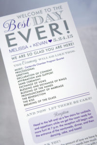
Melissa + Kevan
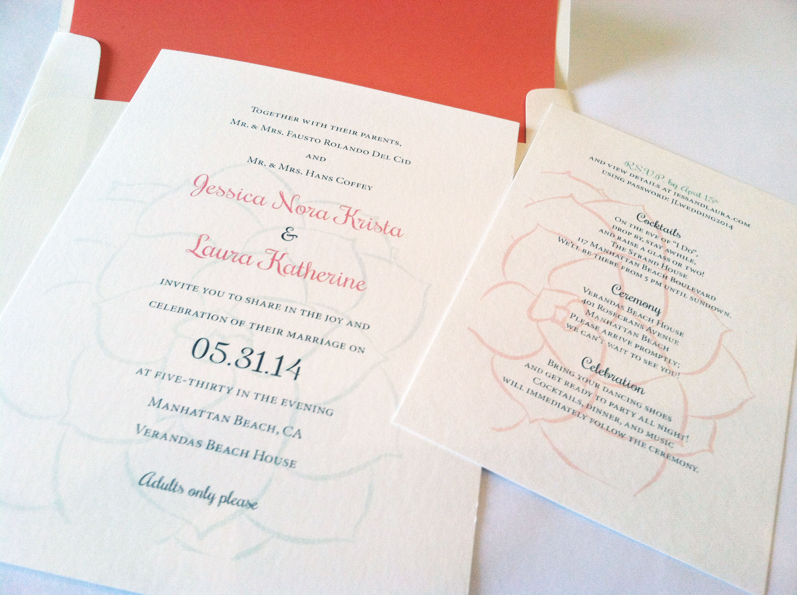
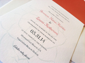
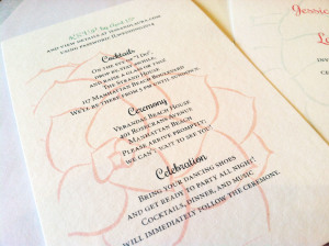
Laura + Jessica
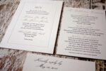
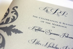
Everything about this invitation suite was gorgeous. The paper we chose was lightly textured and felt like a letterpress stock (even though we printed these digitally). The graphics were pale green and coral succulents, and the text was all soft shades of grey. These romantic, feminine invitations were one of the last projects our intern Eric completed before he moved out to the West coast, which is coincidentally where this lovely wedding took place as well.


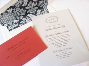
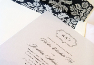
Kaitlin + Jonathan
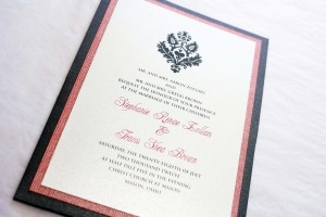
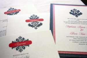
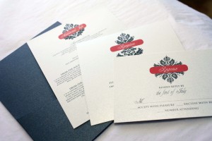
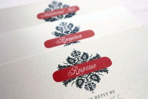
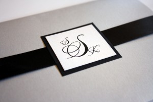
I love this invitation. It’s one of the only single layer custom invitations we have ever done that I actually loved every part of. The card stock they chose was a duplex with a dark grey damask pattern on the back, and a lighter grey solid matte on the front where we printed a luxe framed monogram and the invitation text. The envelopes had the same damask liner as the back of the invitations, and for a pop of color we chose a bright coral reply card. Beautiful.
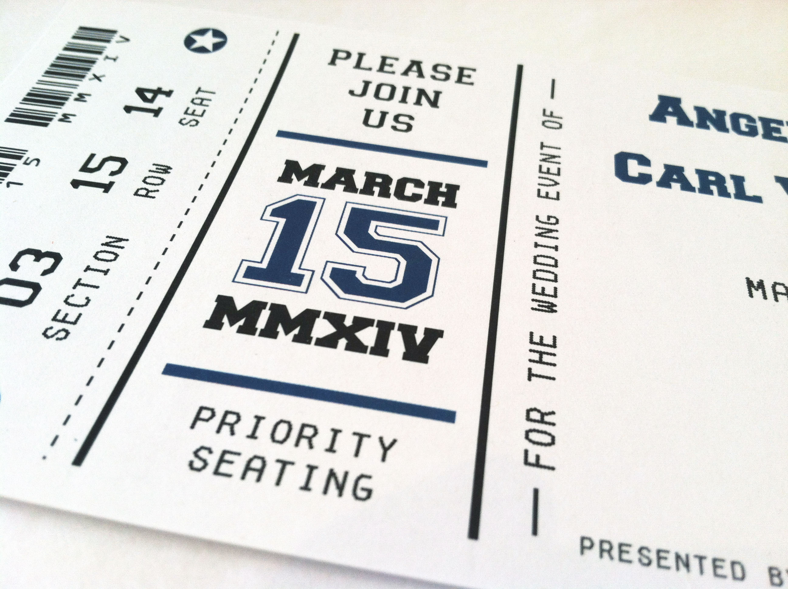
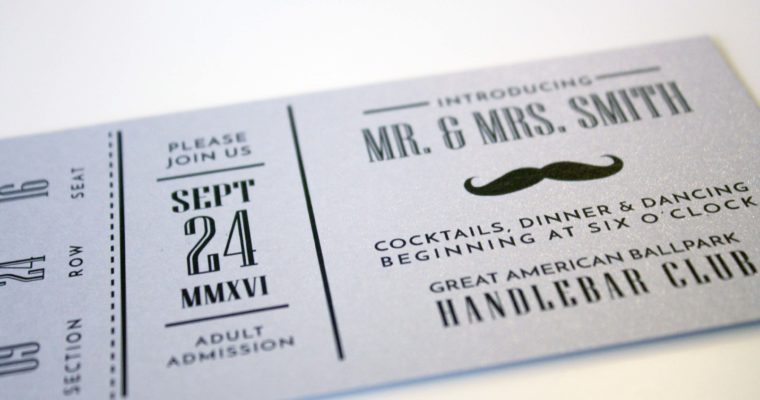
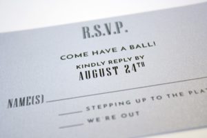
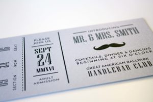
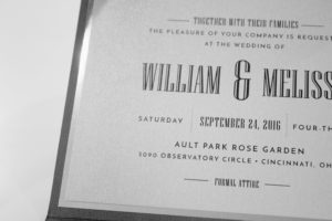
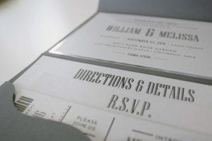
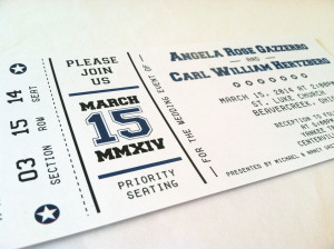
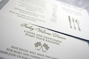
Sporting Event Wedding
This couple came to me with the vision of having a sports-themed wedding. They wanted us to create an invitation that felt like a ticket to an event, so we developed an invitation, reply card and program to fit the bill.

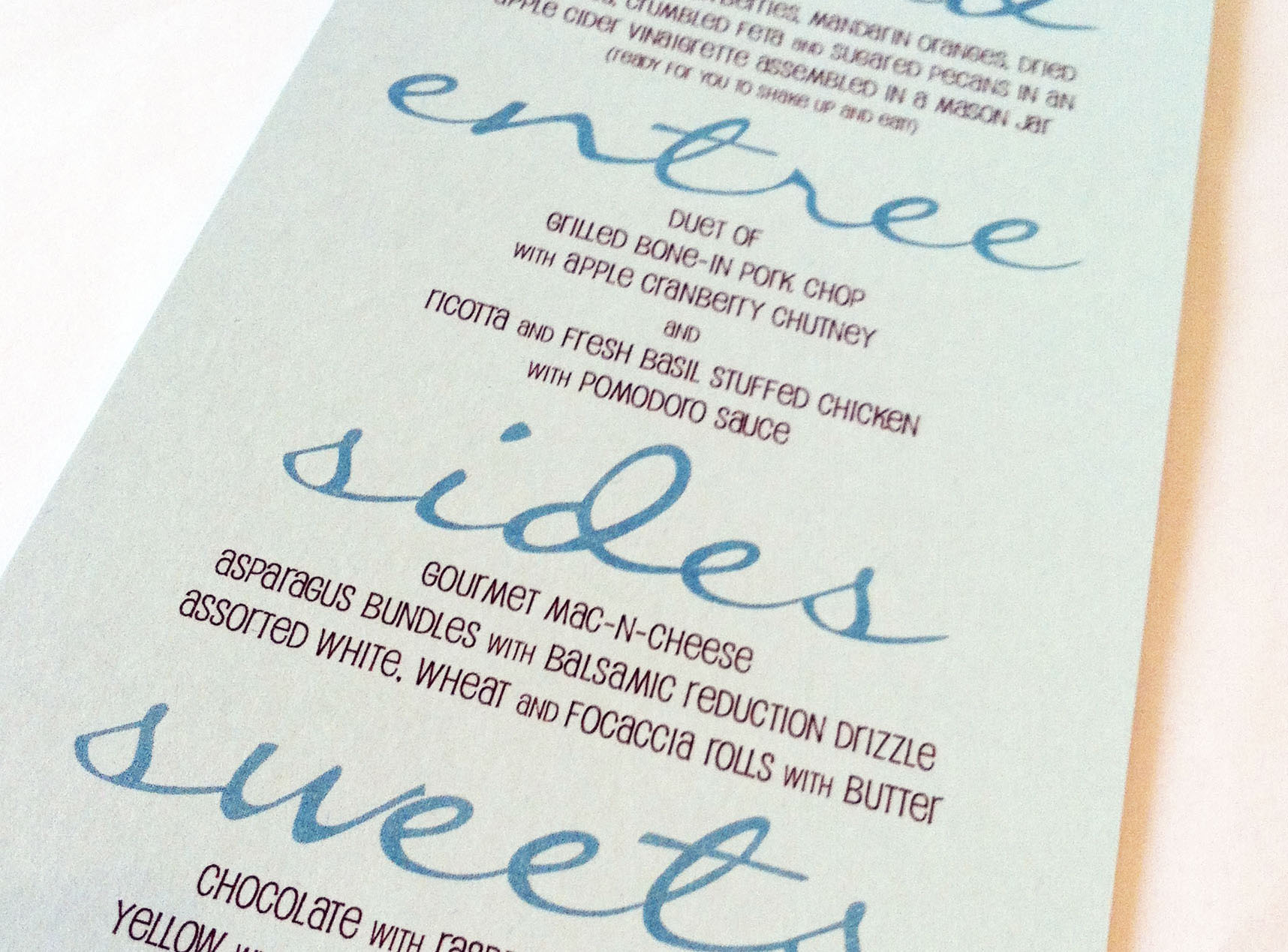
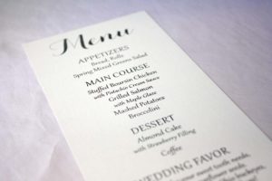
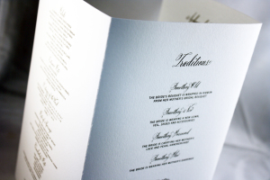
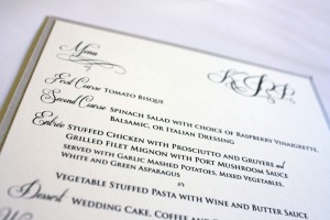
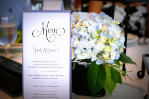
Modern Script Menu
What makes this menu stand out is the large script that bleeds almost all the way to both edges. It was a cool way to let guests know what they were being served, and matched the colors of the wedding as well, serving up a nice compliment to the table settings.
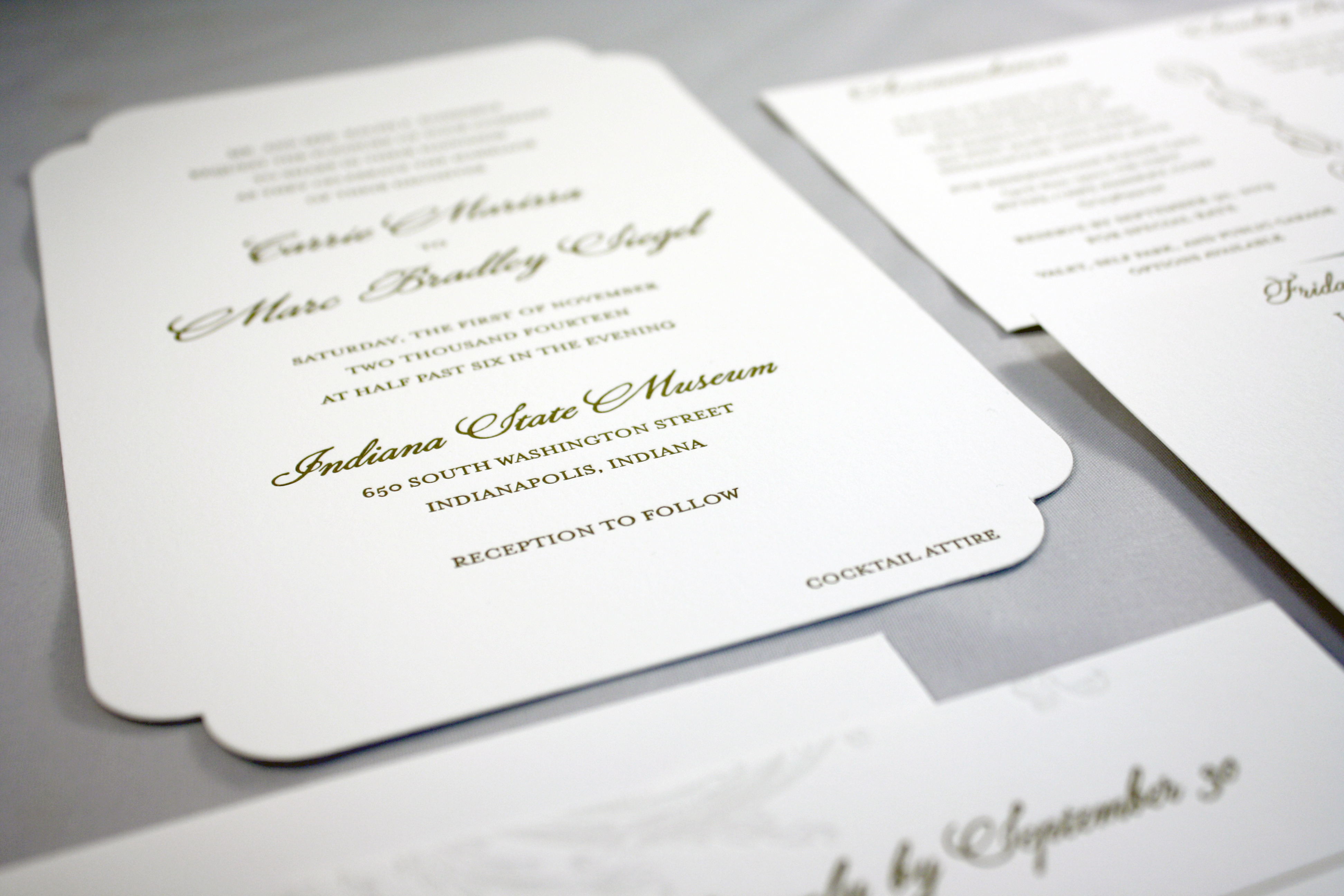
Carrie + Marc

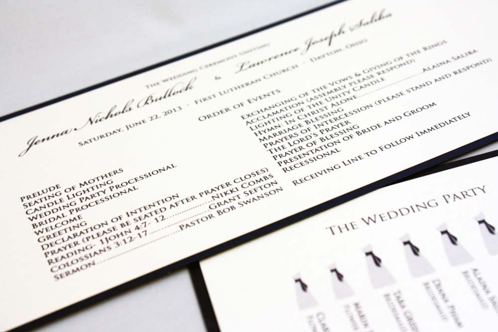
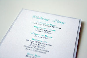
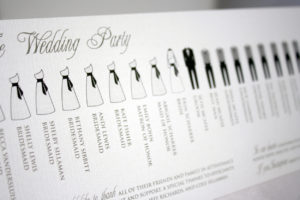
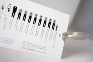
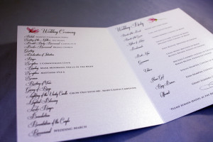
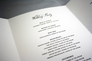
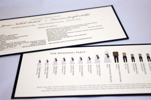
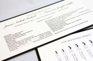
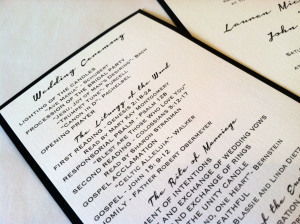
Bridal Party Silhouette Programs
This was one of our more popular designs for wedding programs during Summer and early Fall, and involved the use of bridal party graphics to provide a fun visual break in the text. Of course, we customize the colors of the paper and ink with the bride and groom’s wedding color palette, and could easily switch up the font for a less traditional look as well.

Laurie + Keith
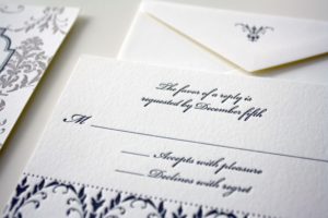
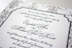
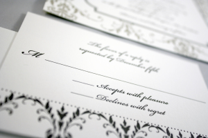
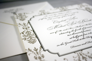
This one should look familiar… despite it being one of the year’s most sought after designs, this invitation never gets old. This image really shows the depth of the letterpress, and paired with the gold printed patterned envelope liners, this invitation was simply bellissimo.

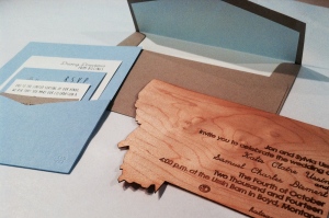
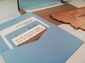
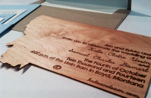
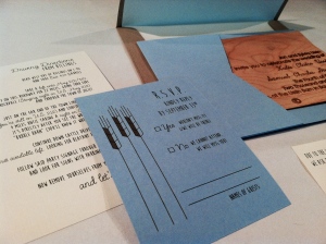
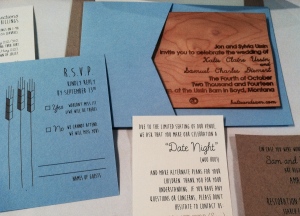
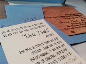
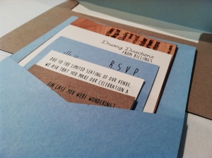
Rustic Montana Wedding
Ok, so this was pure awesomeness. This was a collaborative effort between myself and Sam, the groom. He found someone to die cut wooden invitations into the shape of Montana, and burn the text into the material. We stepped in to find a pocket that would accommodate the shape and size of the invitation, as well as provide enclosure cards to match the look and feel of such a rustic, outdoorsy invitation. Check out the gallery below- these pieces are all worth a good look!

Jenna + Michael
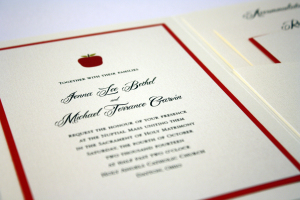
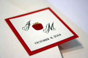
Jenna had an apple-themed wedding, so we created an original apple illustration to use on everything from the invitations to the place cards and thank you notes.
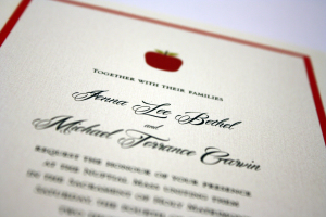
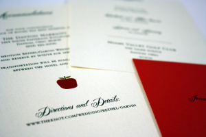

Jessica + Martin
Katie + Joe
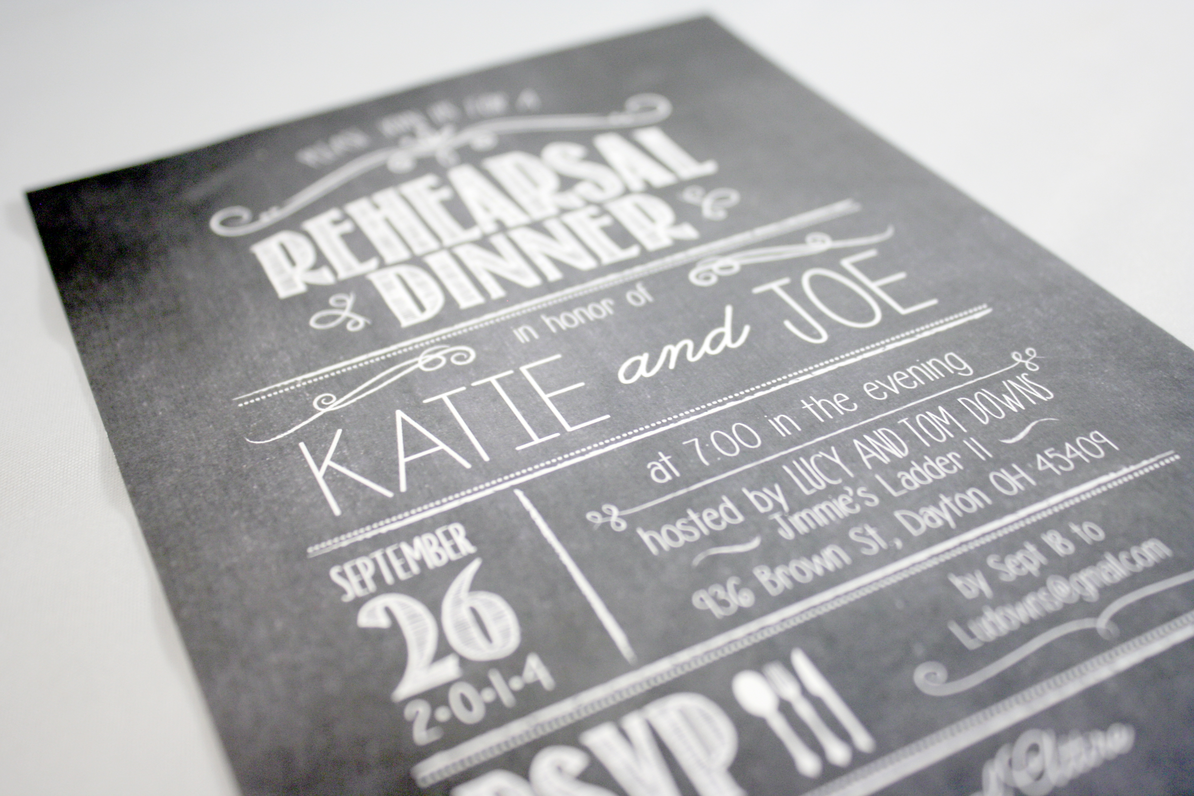
Still haven’t quite had enough of the chalkboard look…Especially when it involves really fun fonts, like this rehearsal dinner invitation does.
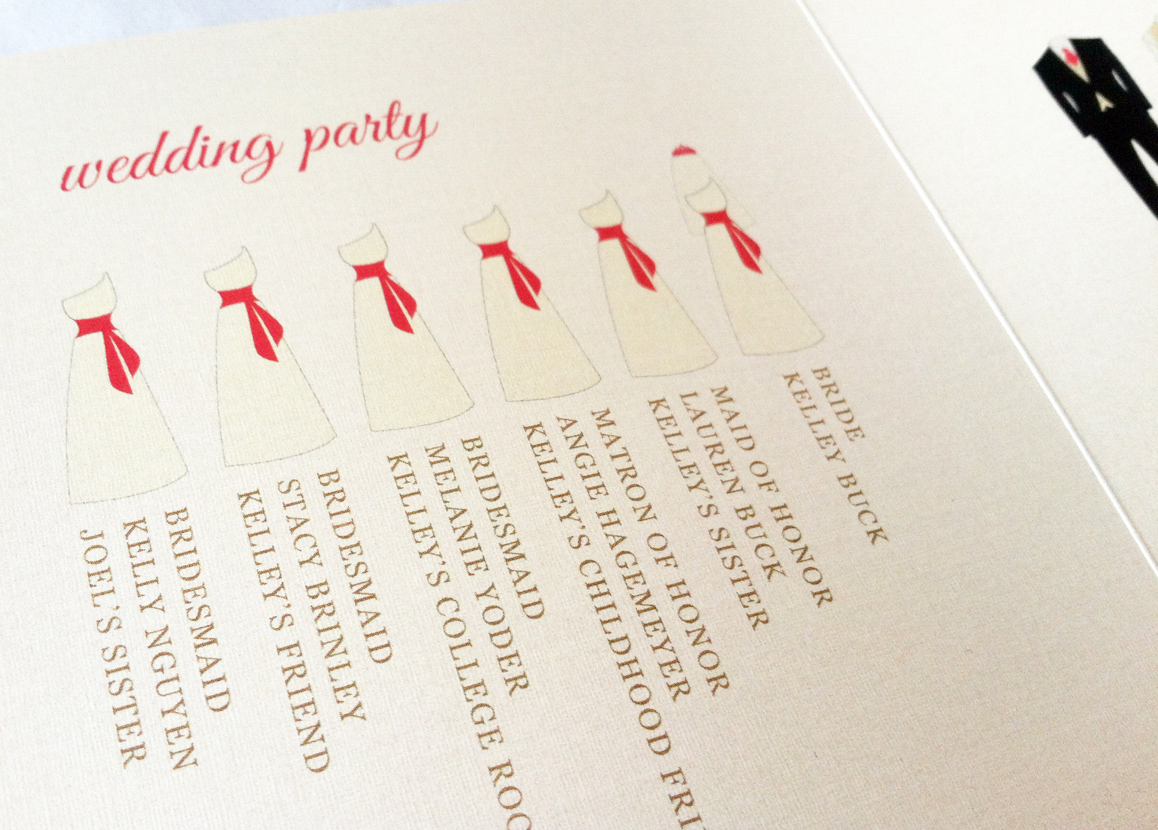
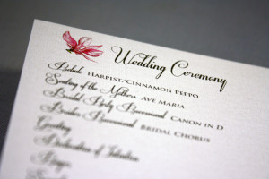
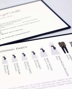
Kelley’s Wedding Program
We keep getting requests for bridal party silhouettes on wedding programs, which is fun because we are able to change up the colors involved, as well as the style of the program. This was a trifold square program on a raw silk ecru card stock, using the bride’s colors of coral, gold and ecru.
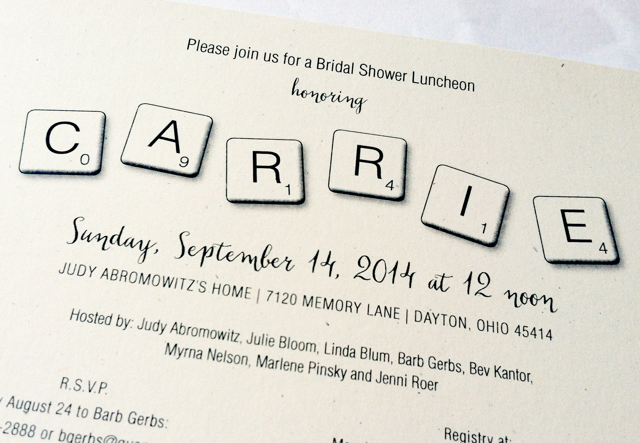
Carrie’s Scrabble Shower
This was one of the more fun bridal shower themes I’ve heard of to date. Carrie grew up playing Scrabble, so the ladies who threw her shower thought it only appropriate to go along with her idea for a theme. They were even able to procure a bunch of Scrabble boards from garage sales to use as decor at the shower… the tiles played a role throughout, and we even printed 3×3″ squares with letters on them to send with the invitations. The idea was each guest was supposed to bring a gift off Carrie’s registry that began with that letter of the alphabet.
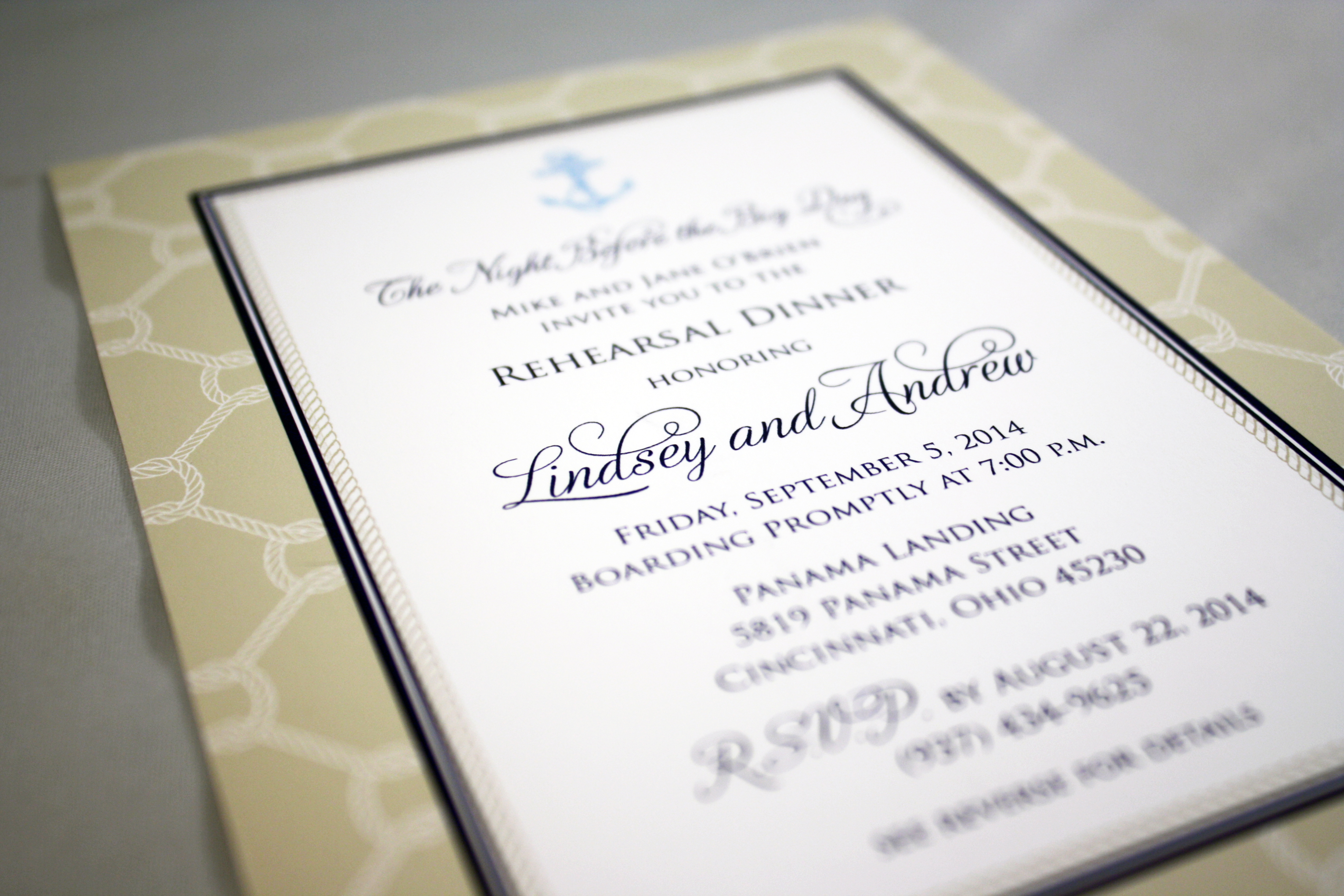
Lindsey + Andrew Rehearsal
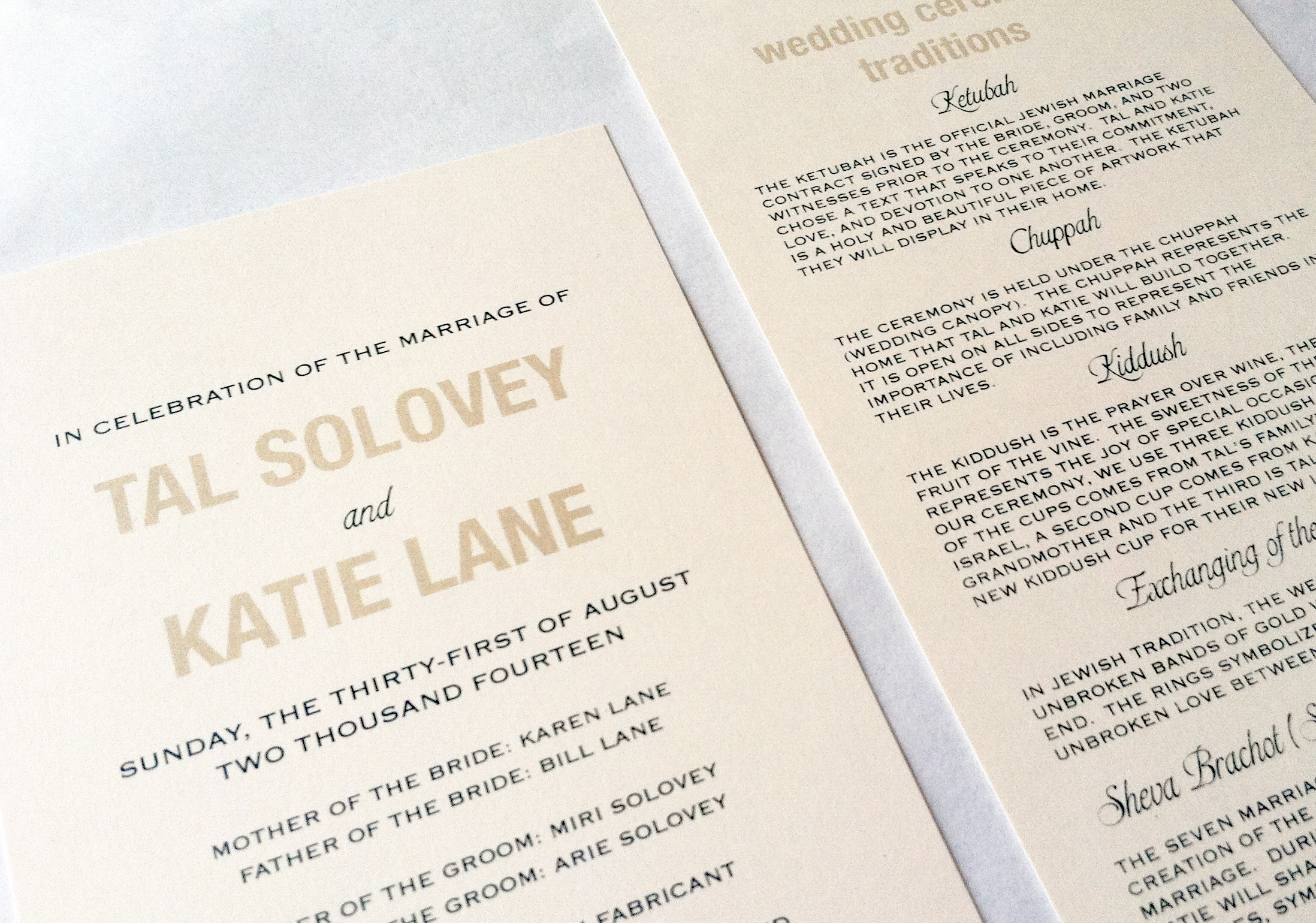
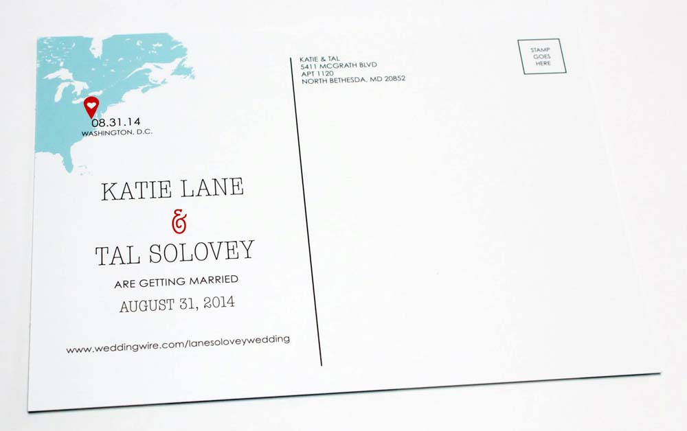
Katie + Tal
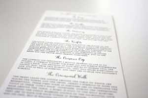
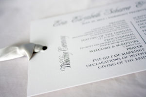
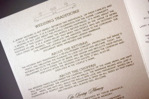
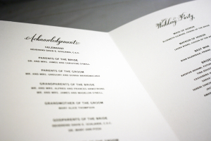
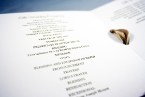
A great change of pace from most traditional programs, this single card two-sided wedding program explained Jewish wedding traditions in lieu of simply listing the order of ceremony events. I really loved putting this program together to match the invitation Katie and Tal chose, as well as read about the various traditions involved in their wedding ceremony. I would be willing to bet some of their guests found the information interesting and useful as well.
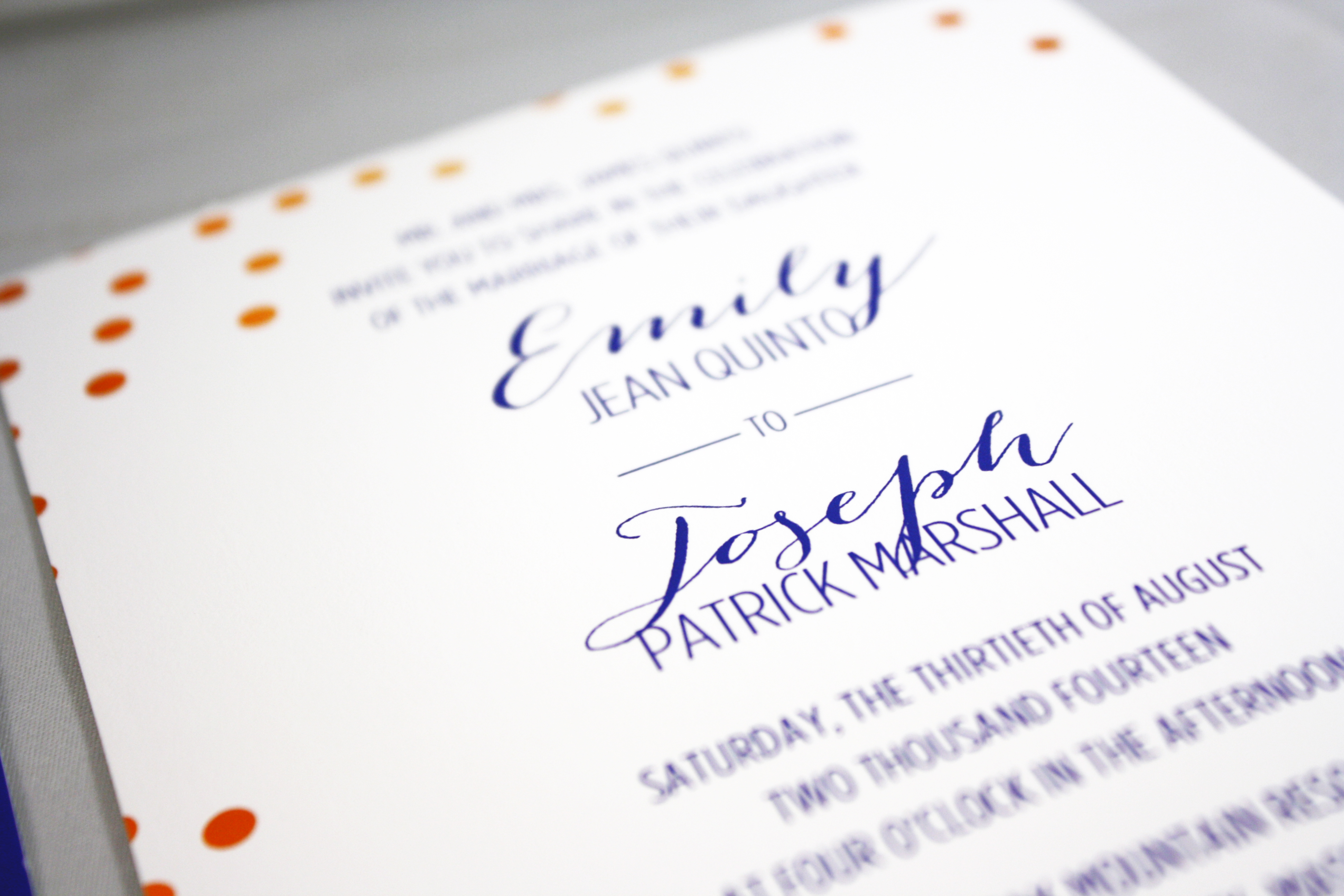
Emily + Joseph
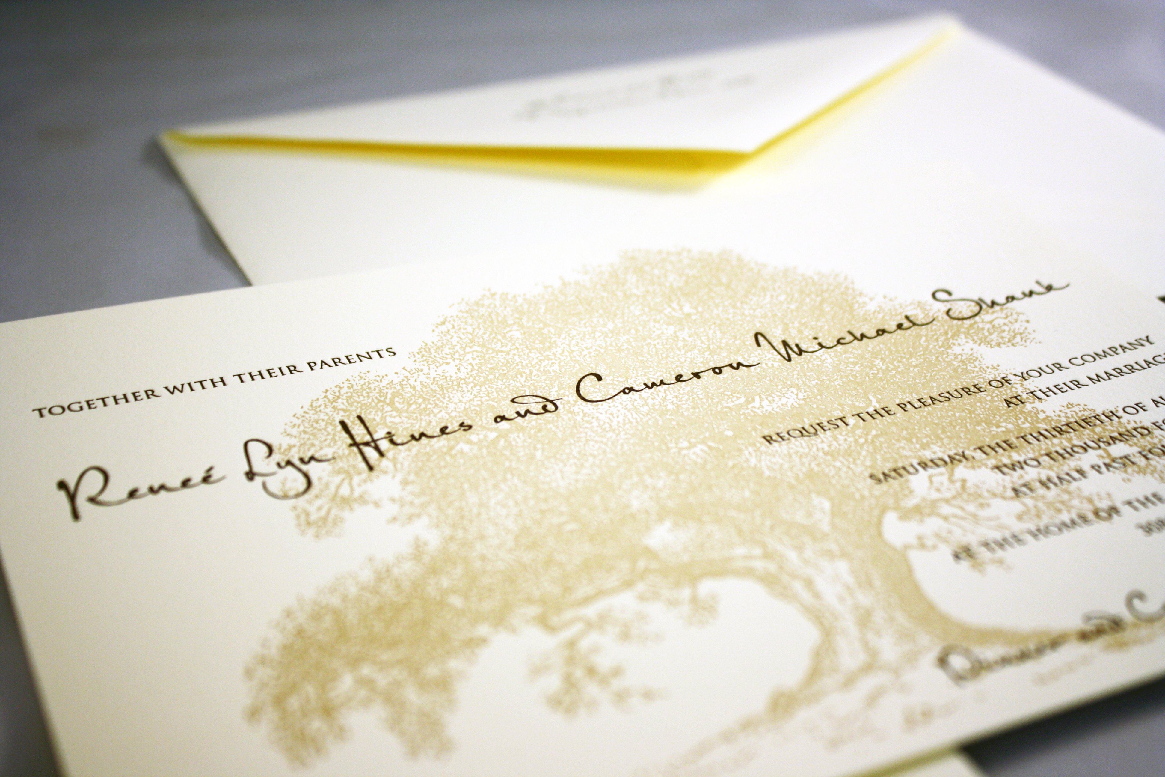
Renee + Cameron
Anna + Adam
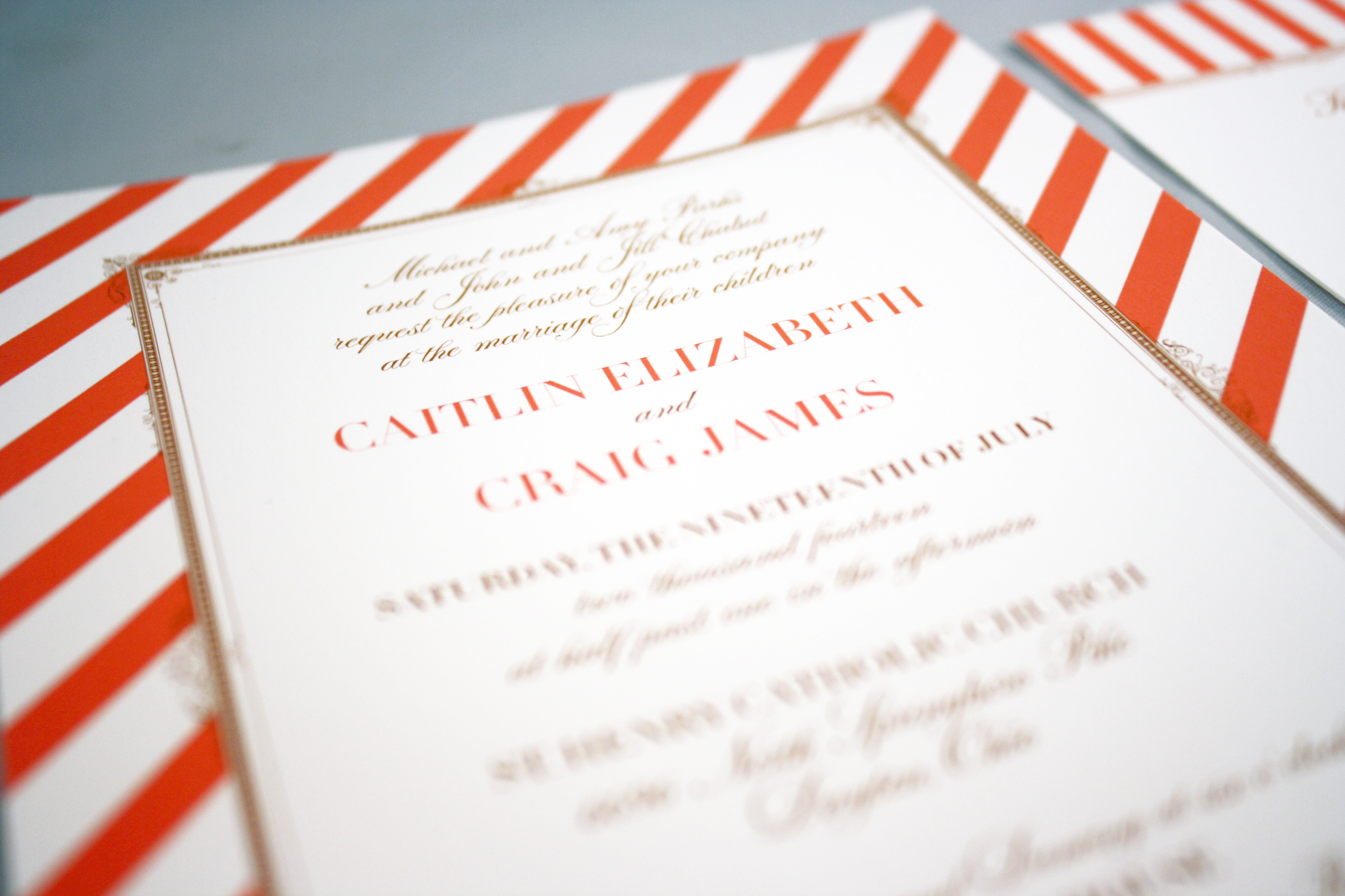
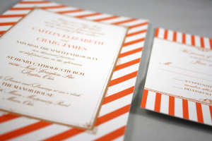
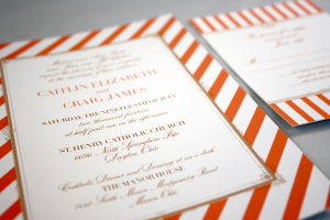
Caitlin + Craig
We saw a lot of coral and persimmon in 2014… Shades of orange, grapefruit, and dahlia were extremely hot, and look good with nearly any color you pair them with. The tailored stripes and traditional font were a crisp combination for this July wedding.


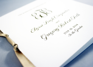
Elyse + Greg
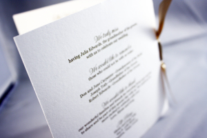
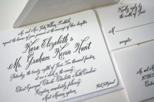
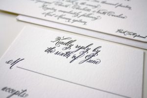
Kara + Graham
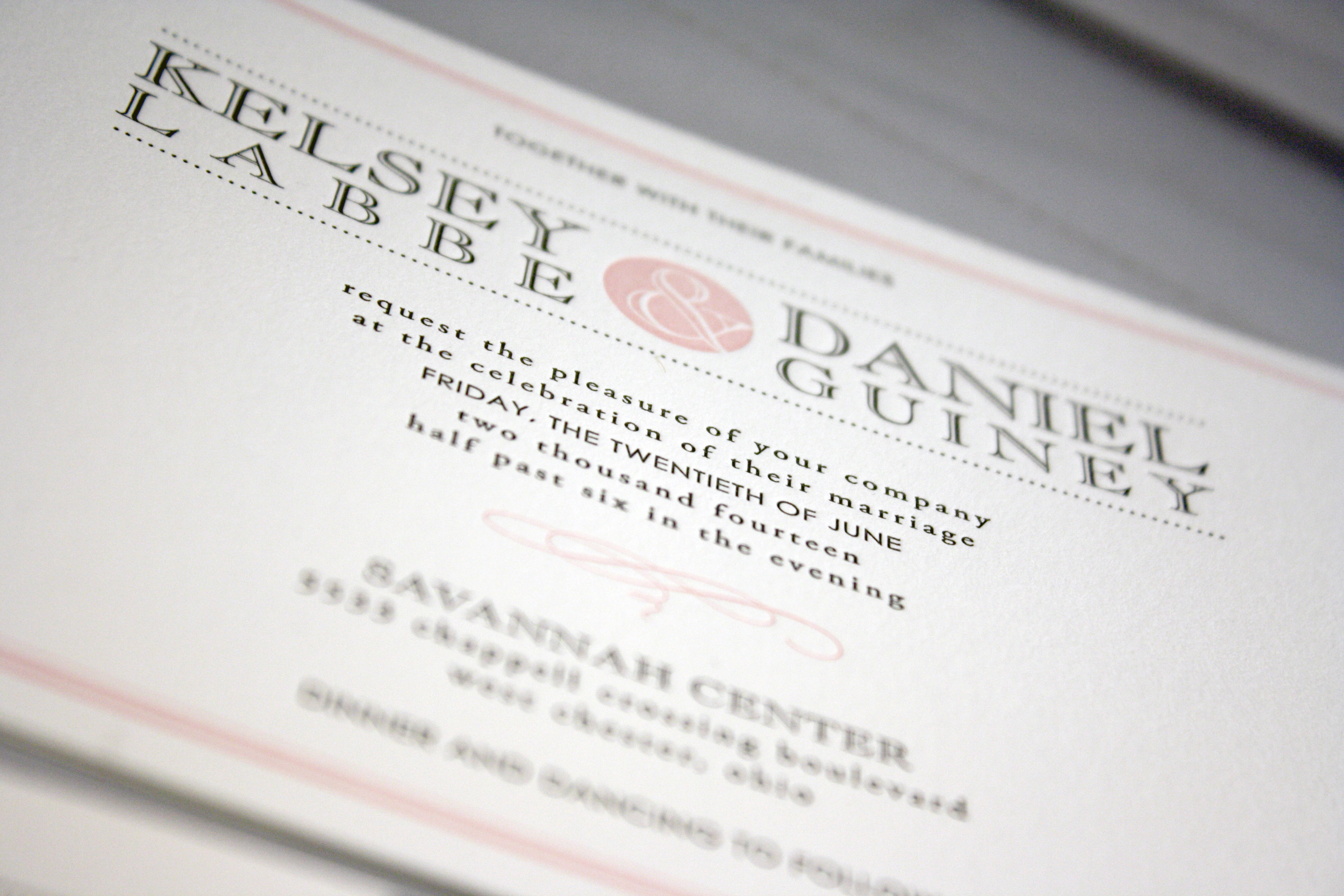
Kelsey + Dan
Kelsey chose one of the contemporary designs from Designer’s Fine Press for her wedding invitation ensemble and we ran with it for some in-house accessories, including her programs, menus, and “newlywed advice cards”.
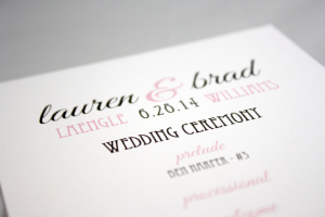
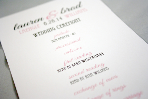
Lauren + Brad
Art deco font wedding program in pink and grey
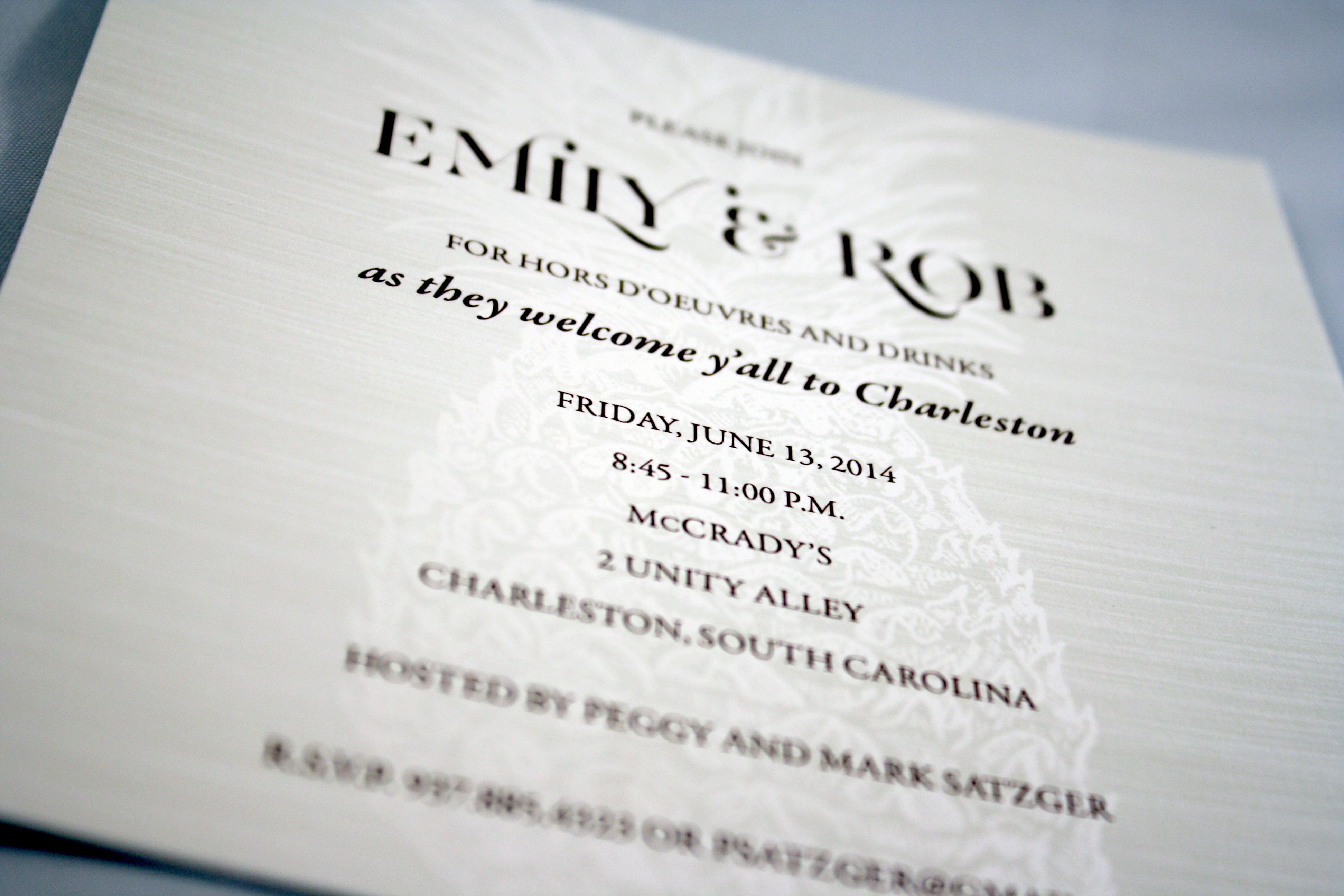
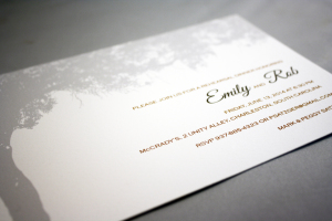
Emily + Rob
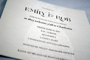
This Charleston, South Carolina wedding was full of southern charm and hospitality. The welcome dinner invitations included the iconic pineapple as a watermark, and a tree dripping with Spanish moss.
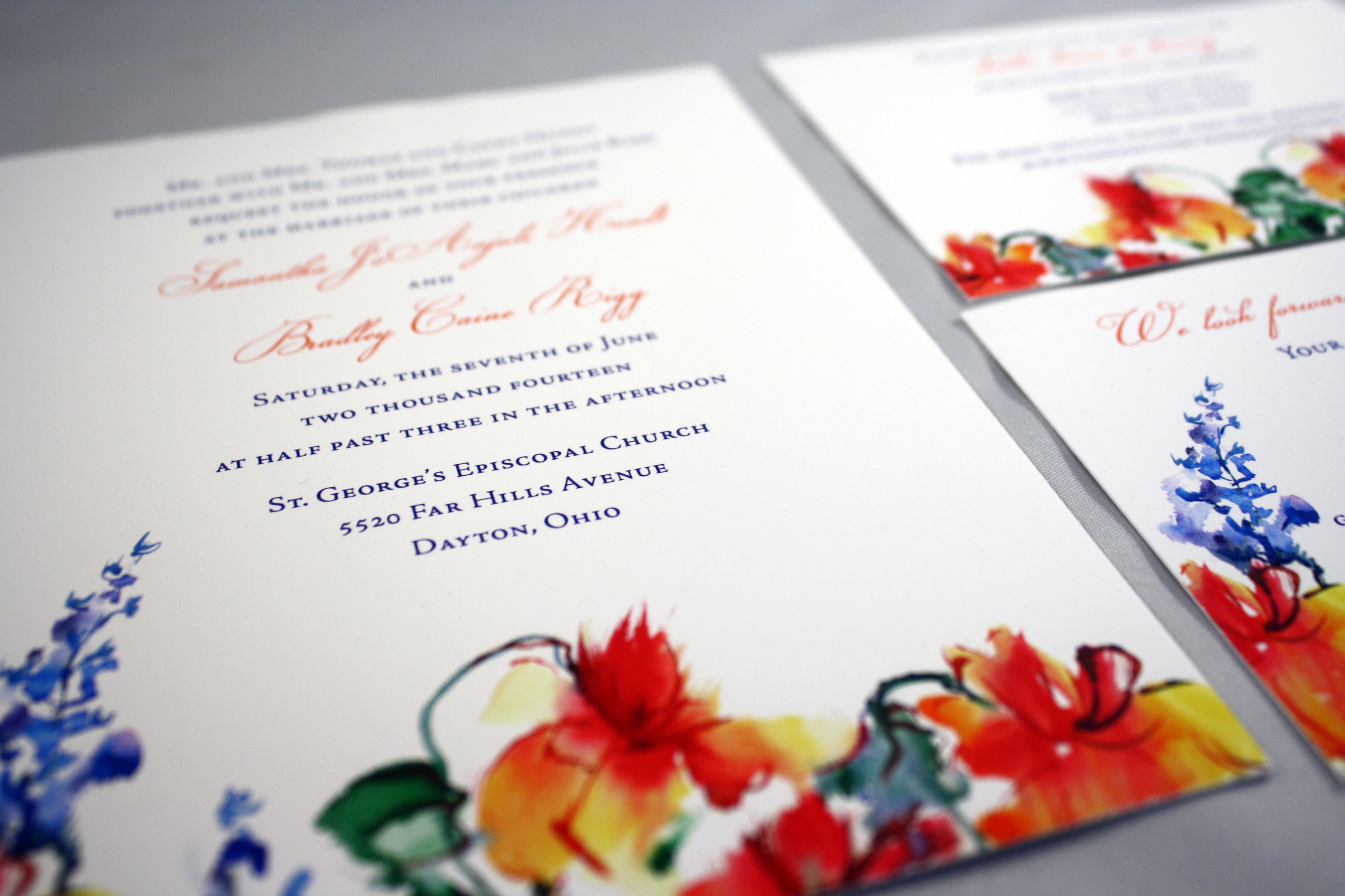
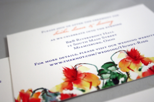
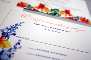
Samantha + Bradley
Watercolor effects made a BIG comeback in 2014, and this invitation shows off exactly why. The vibrant, hand-painted look of this card immediately makes a statement.

Meghan + Mark
This pink floral pocket invitation was a nice remake on the classic ivory and gold version we have done several times. Meghan still wanted to bring ivory and gold into it, but couldn’t pass up the lovely pink textured pocket.
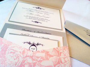
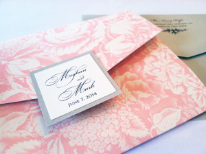
Photo Save the Date
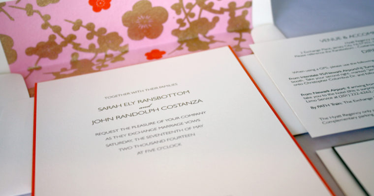
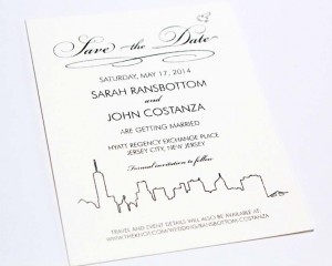
Sarah + John
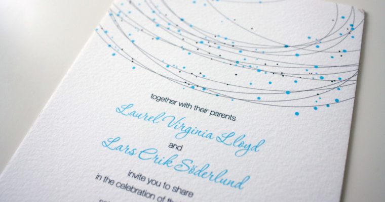
Lars + Laurel

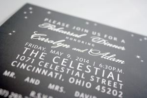
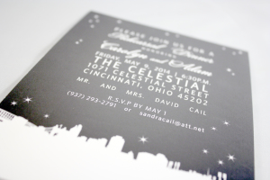
Carolyn + Adam
City skylines made quite a splash in this year’s printed world… Tag and Co. offers some really cool skyline ideas- everything from abstract outlines to more detailed pencil sketches. With the popularity of “going local”, people are developing a healthy sense of pride in their communities and wanting to show off their local love by incorporating skylines of their city on everything from save the dates to rehearsal dinner invitations. (It would also be cool to screen print a skyline onto t-shirts for the bridal party- hint, hint.)
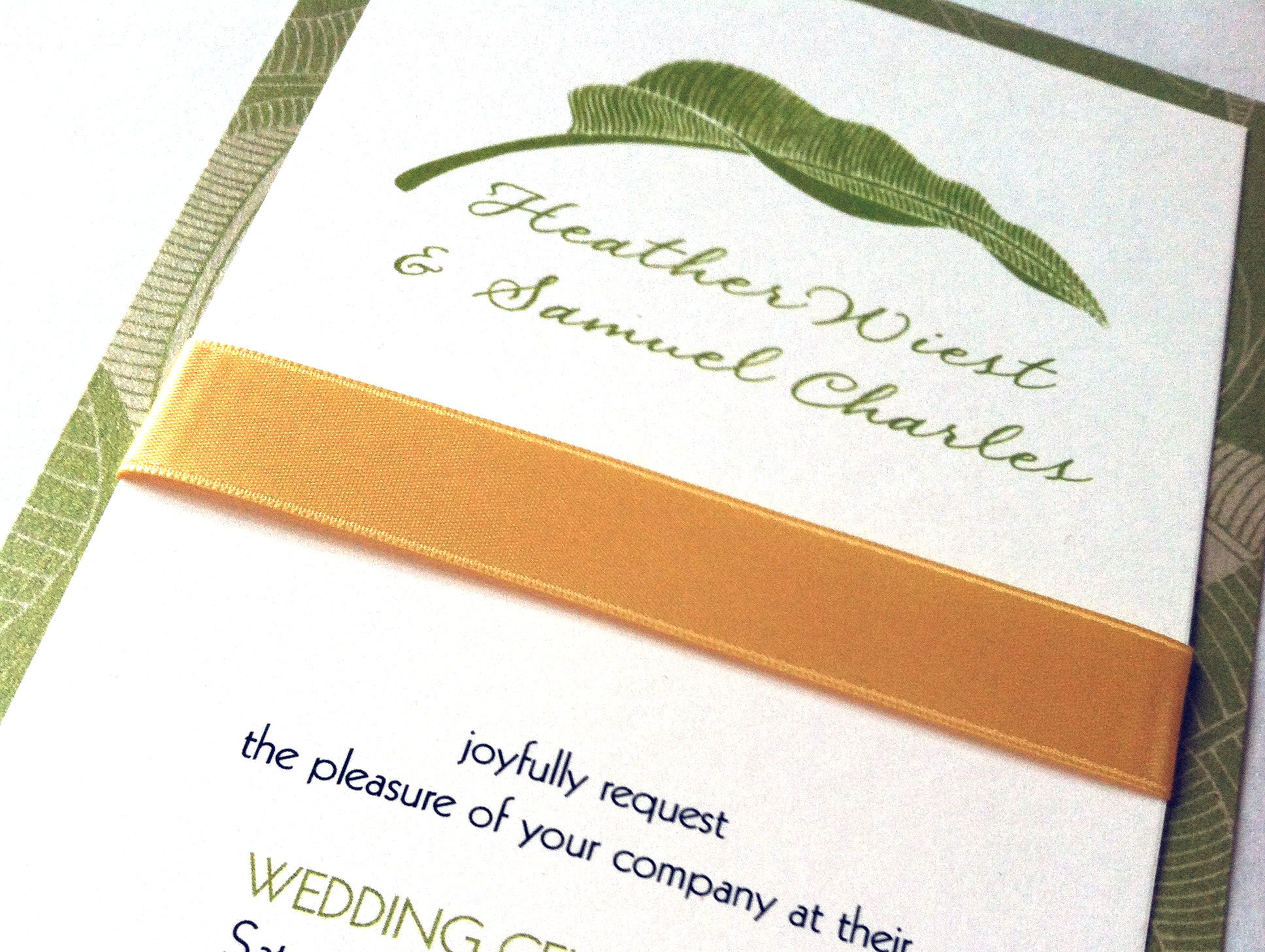
Aloha, Heather
Heather found us online, all the way from Hawaii! She knew she wanted to use green and yellow in her invitations, so we went back and forth via email with color swatch ideas for the card stock and the ribbon. She settled on a tall, tea length card in a leafy palm pattern, incorporating the yellow with her ribbon.
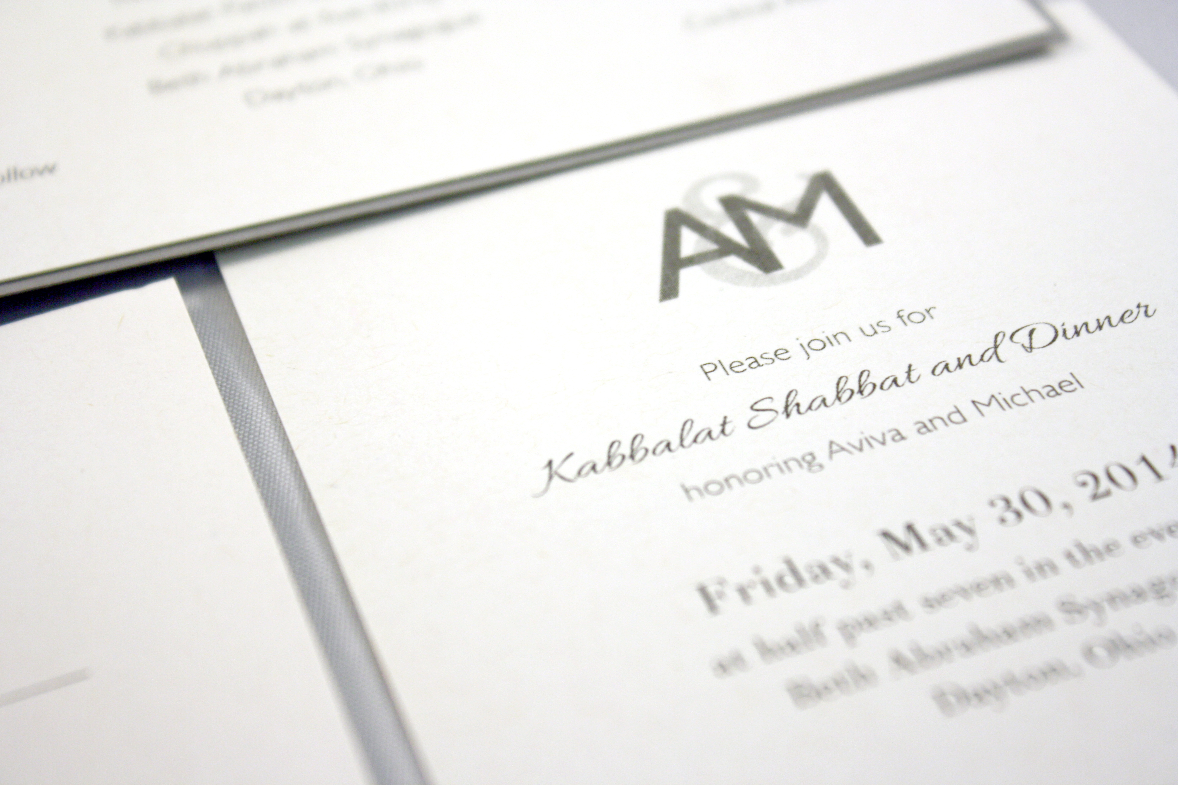
Aviva + Michael
The credit for this grey on grey, half-tone monogram belongs to Eric, our intern who transplanted to Washington to work with reclaimed wood in early 2014. This was one of his projects while he was with us, and the monogram (which the bride absolutely loved) carried throughout the pieces of this no-fuss, grey and ivory wedding invitation suite.
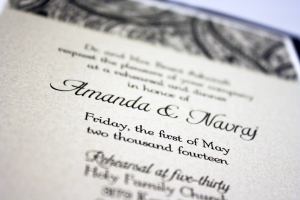
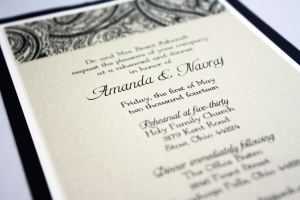
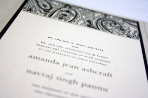
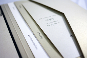
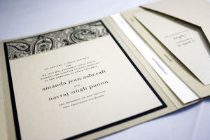
Amanda + Navraj
This was another of my favorites this year. The invitation was neutral and formal using a palette of black, a tiny bit of ivory, and shades of gold. We used all metallic stocks, which set an extra elegant tone. One thing that was different about this invitation suite is that it included a card that listed the dates, venues, and locations of all of the wedding events to make it easy for guests to keep track of where they were supposed to be and when. To coordinate with her invitations, we also designed programs and rehearsal dinner invitations in the same color scheme.
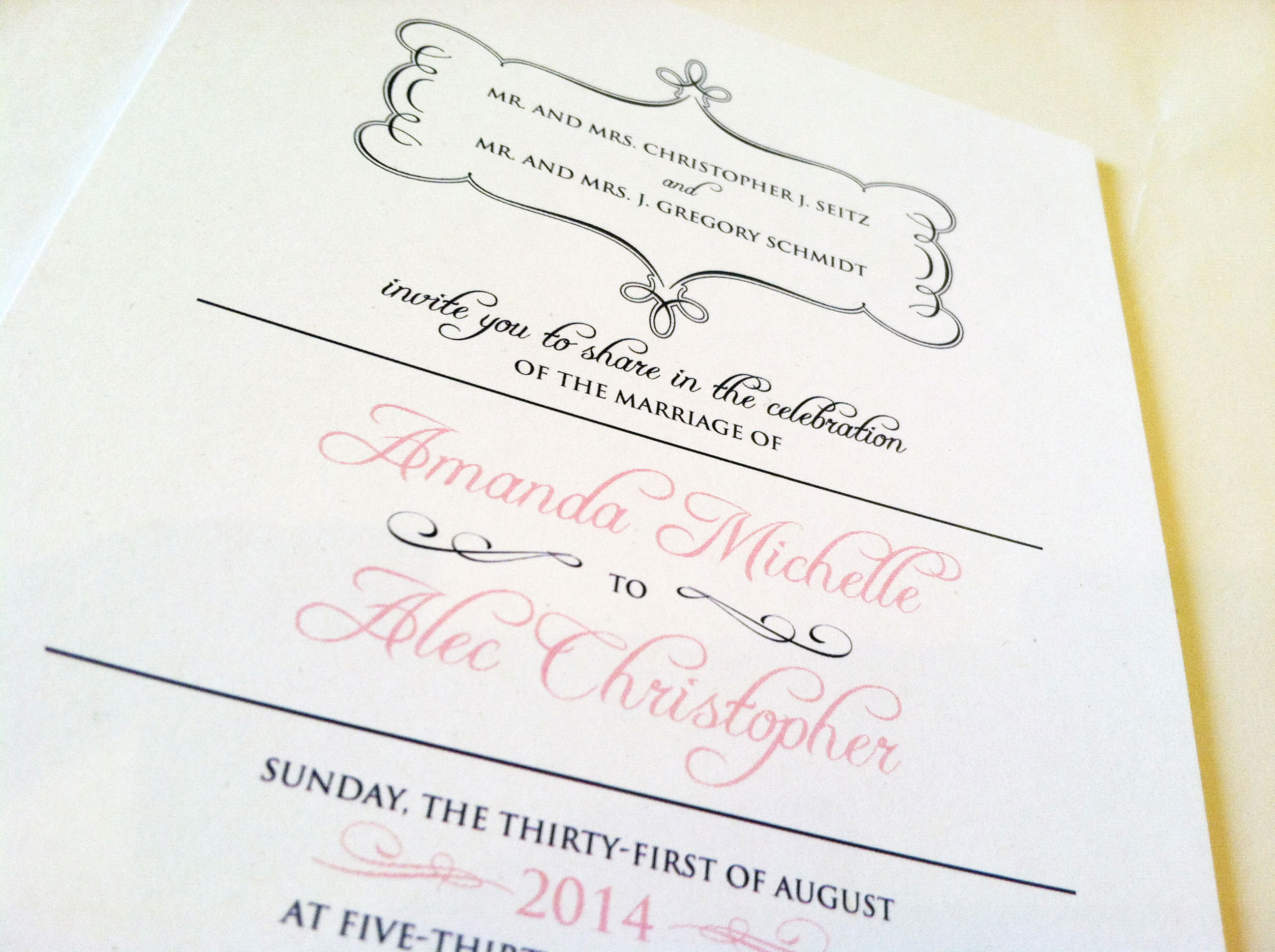
Amanda + Alec
A good use of fonts, frames and minor breaks in the text frames makes this invitation pleasing to the eye, while keeping it simple.
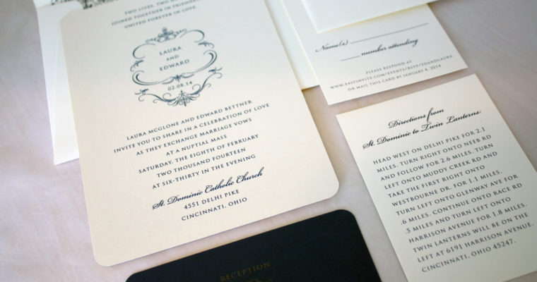
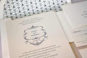
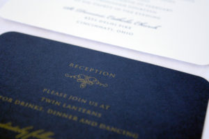
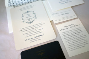
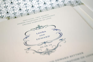
Laura + Edward
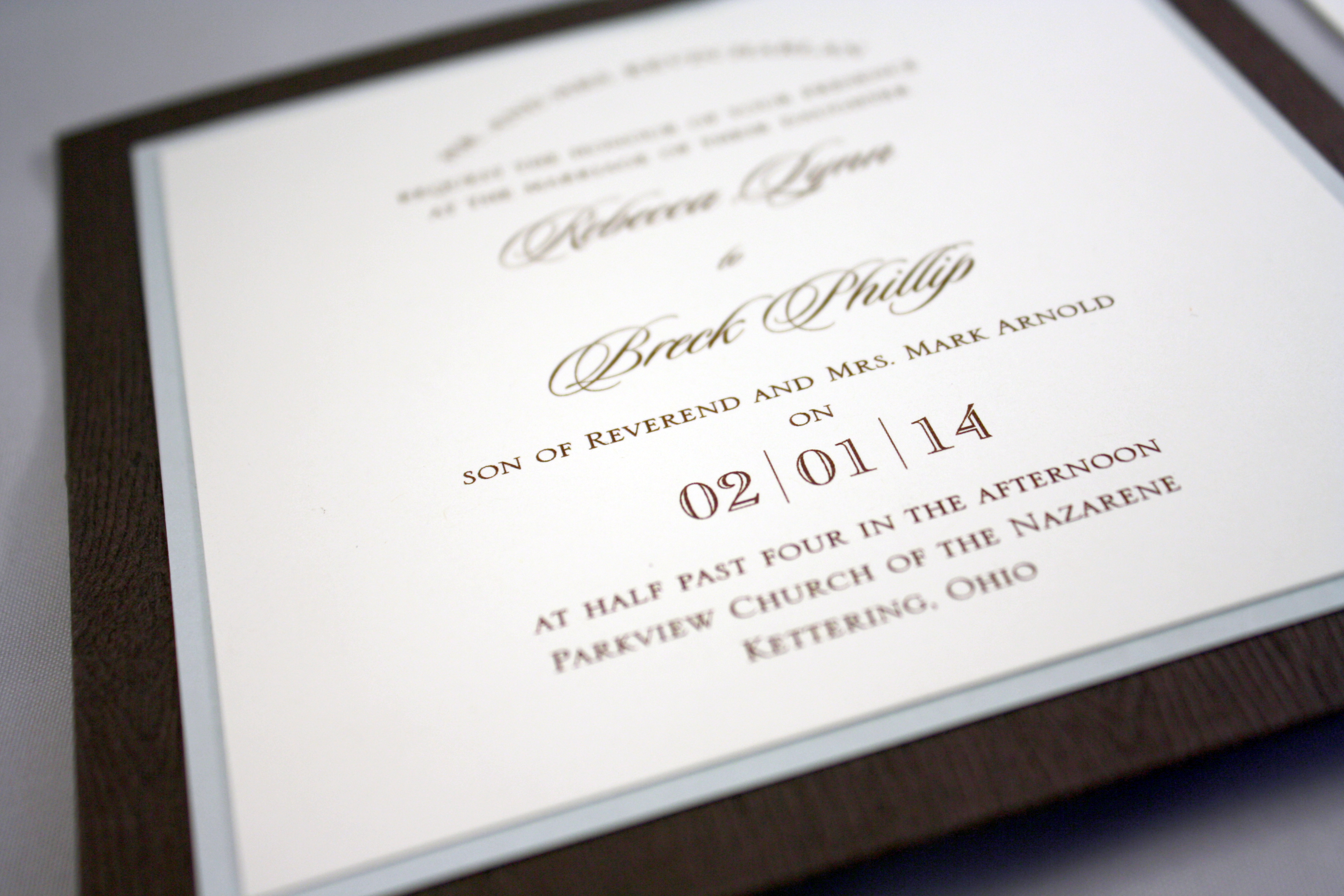
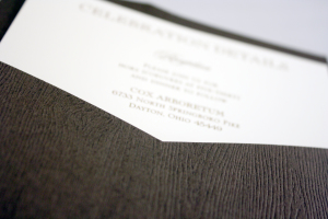
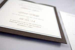
Rebecca + Breck
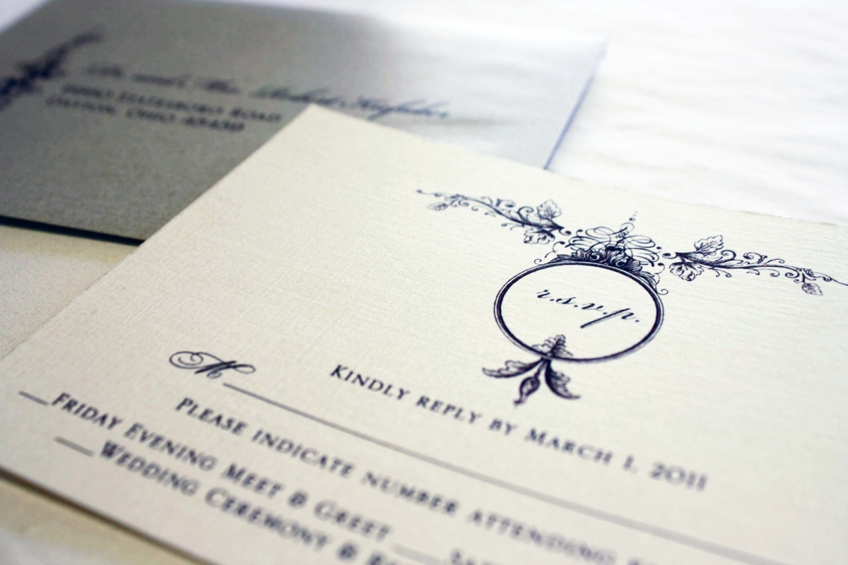
One of the textured papers we carry has a tree bark grain to it, which comes in about half a dozen different colors including this dark chocolate, a lighter birch, and a cool white. This square pocket card invitation boasts a tidy pocket on the back of the invitation, which we tucked Rebecca’s RSVP and info cards into.

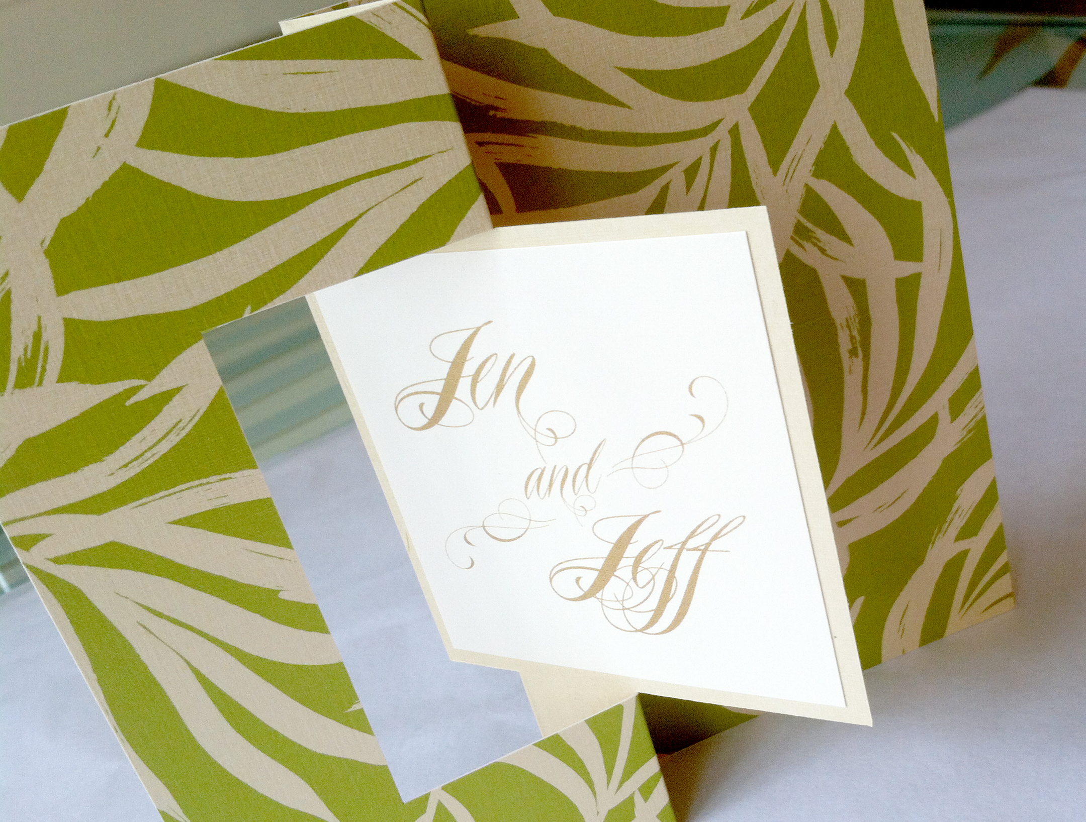
Jen’s Post Wedding Brunch
This Palm Beach wedding began with a colorful retro save the date card, and ended with a leafy green and gold twist card as the post-wedding brunch invitation. We printed their names on a small card that we adhered to the twist card. Gently pull the edges of the card and the center twists around to reveal the invitation details on the other side.

Holiday Photo Greeting
One of my favorite things about this card are the tiny candy cane striped strings that stretch out from each side of the text box in the center, giving it just a sweet, pink touch of holiday magic.
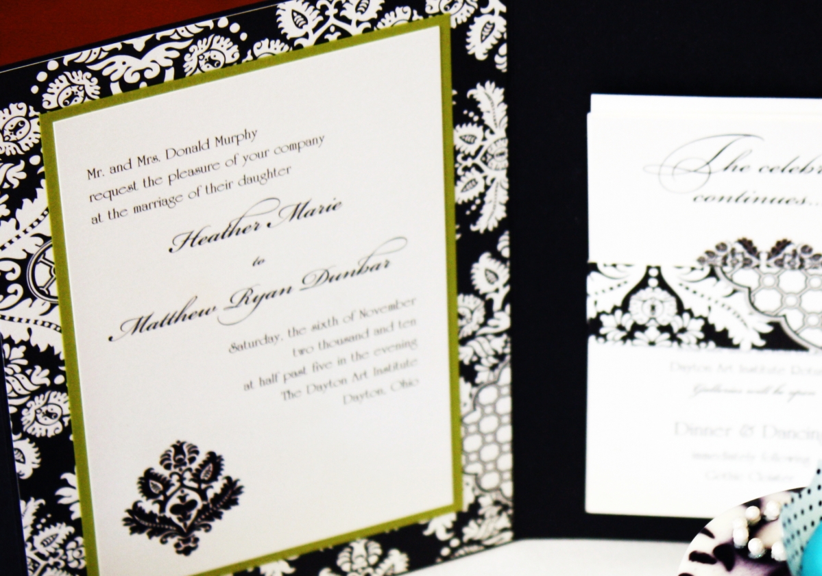
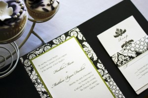
Becky + Mark
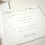
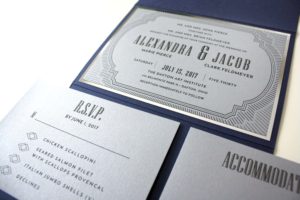
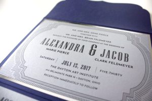
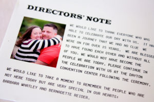
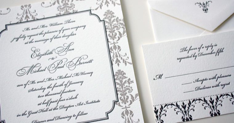
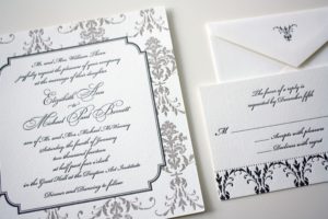
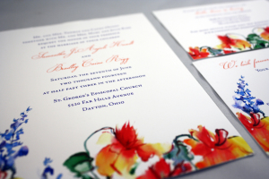
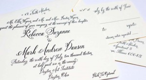
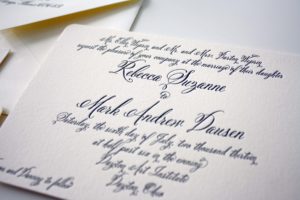
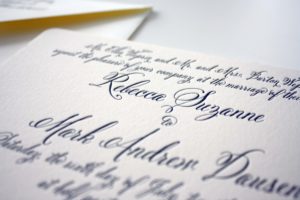
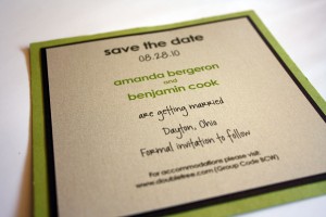
Becky planned a gorgeous, black tie optional wedding at the Dayton Art Institute and this traditional letterpress invitation in black and ivory was absolutely perfect for the occasion.

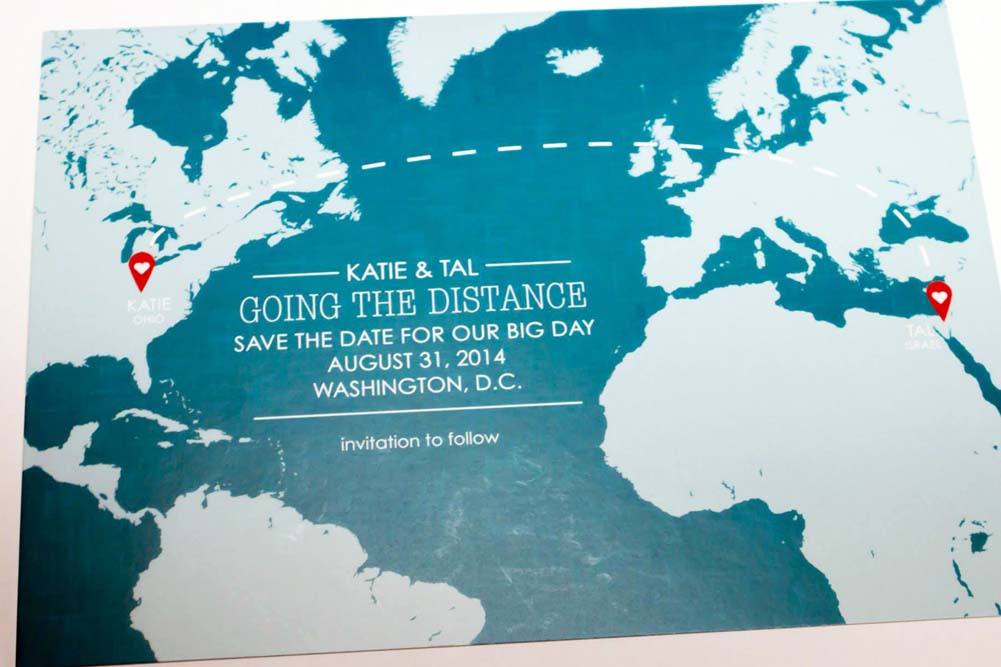
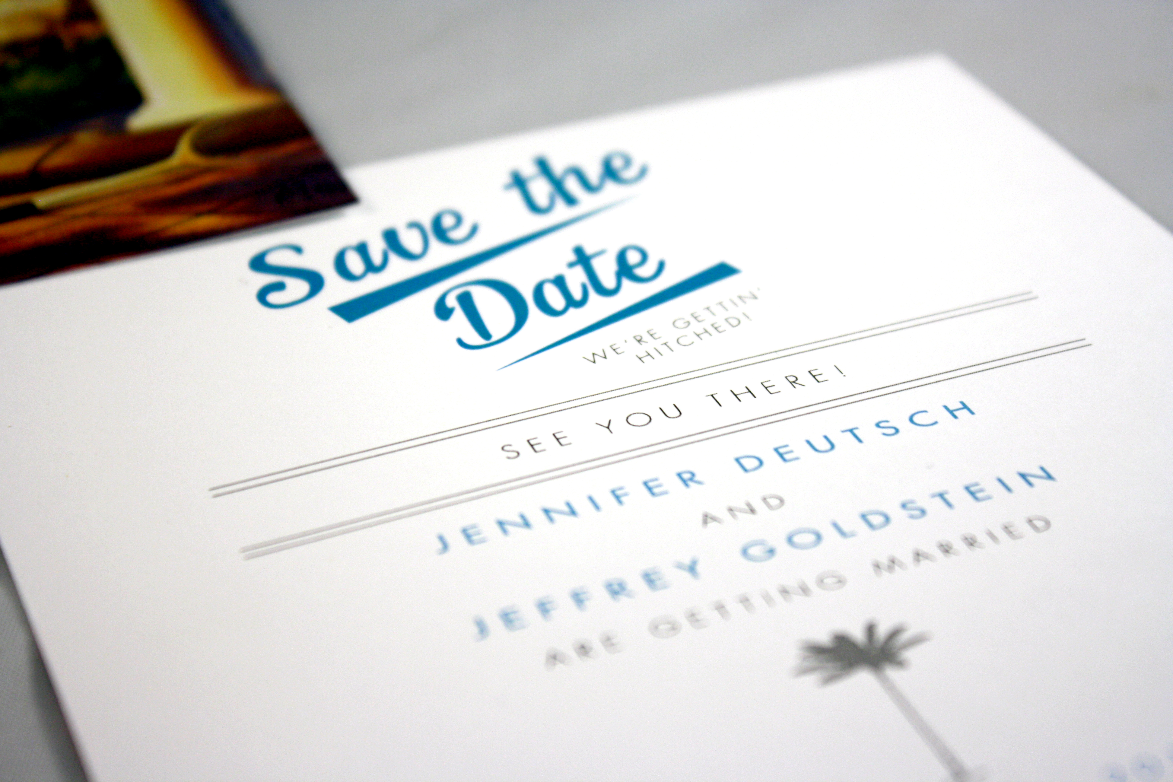
Katie and Tal’s Save the Date
The universe brought them together across the miles…Katie and Tal decided to announce their wedding date with this unique save the date card that pinned their hometowns on the world map.
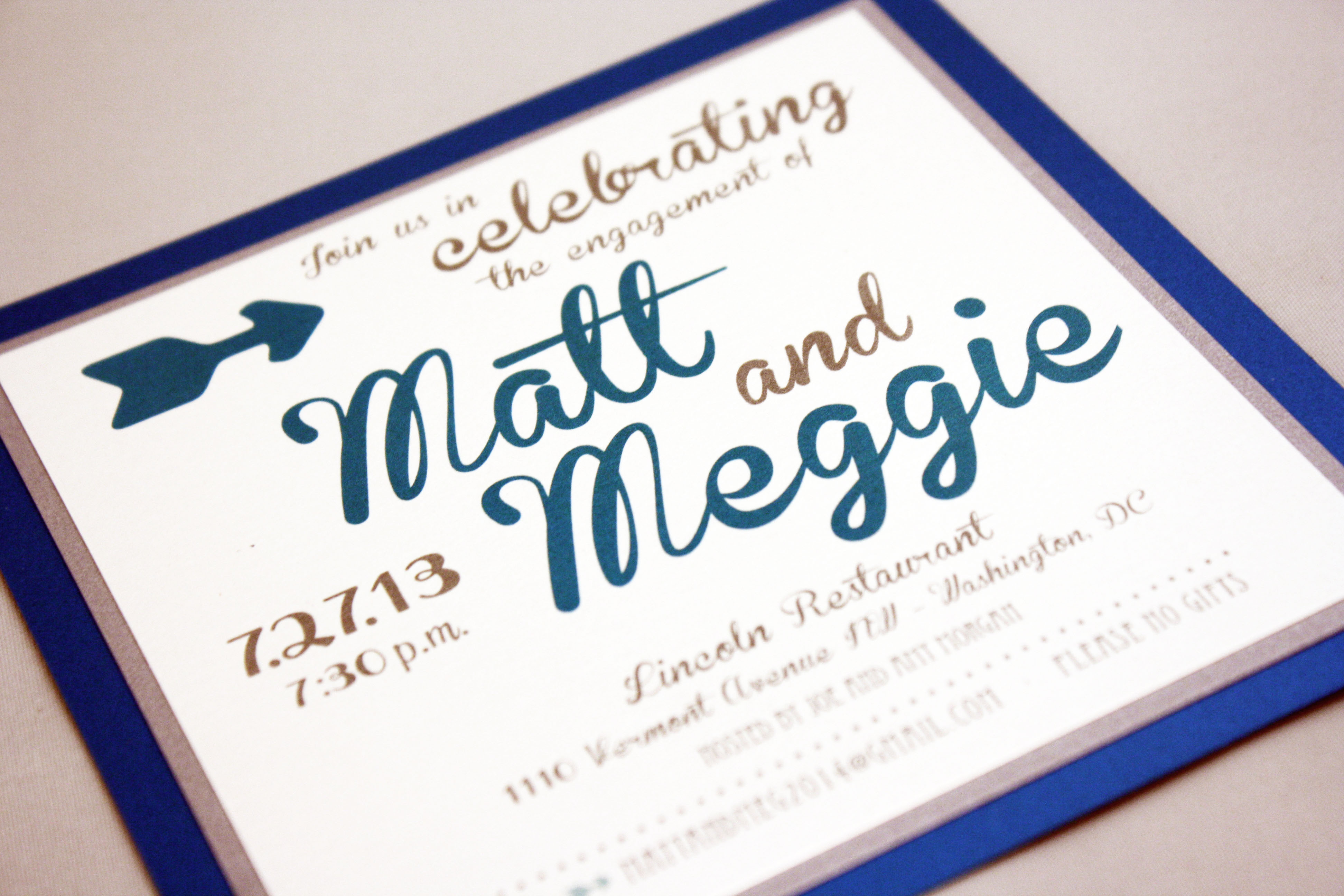
Matt + Meggie
Three layers of metallic silver, peacock blue, and white, coupled with a playful oversized font give this invitation a contemporary lilt.
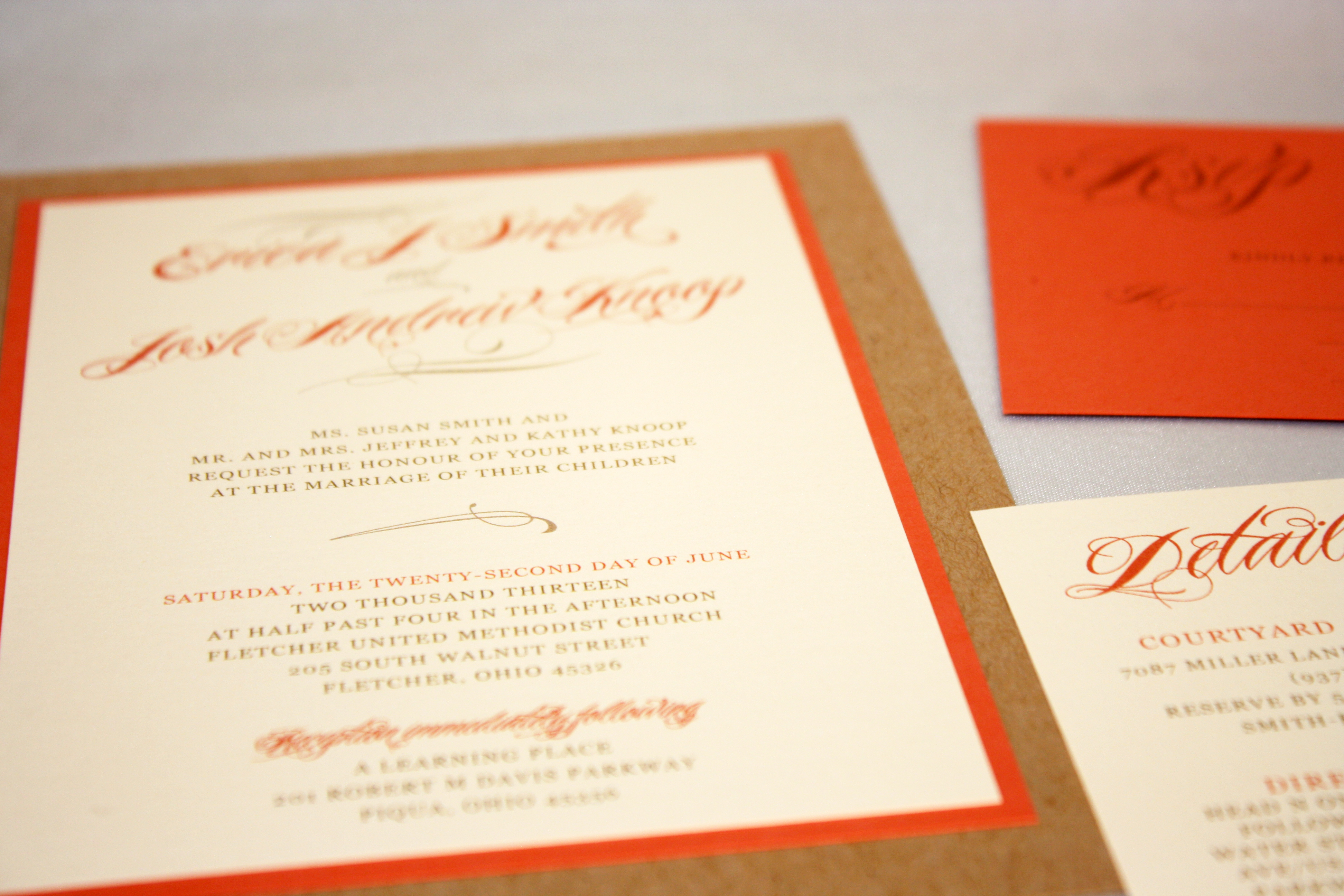
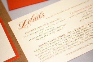
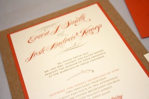
Erica + Josh
Natural kraft fiber paper and a deep coral stock make this earthy but formal invitation a stunner.

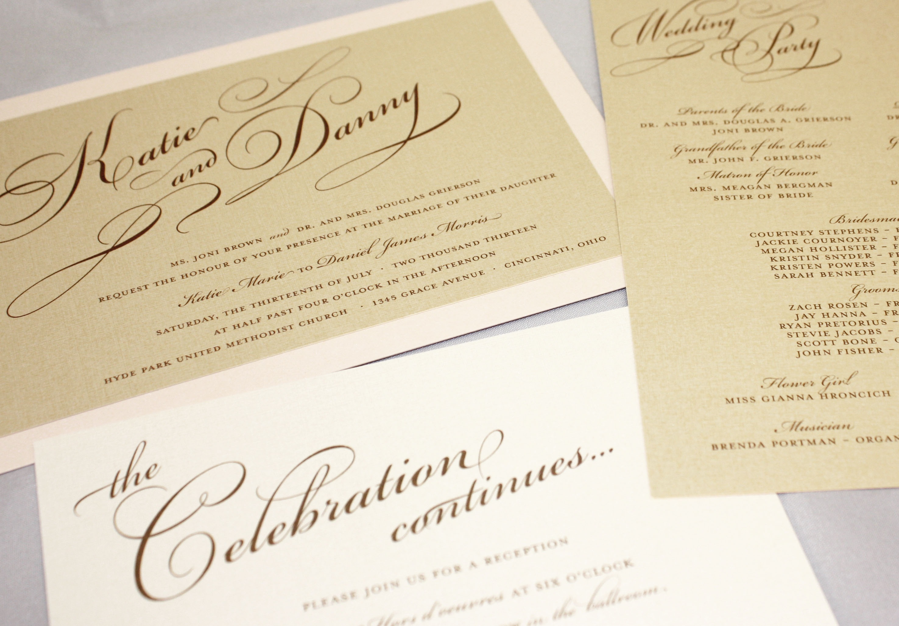
Katie + Danny
Simple yet elegant, this invitation in pale gold and blush pink uses a prominent script as the only graphic element, which we used throughout the ensemble as a recognizable element. This soft and feminine set includes a rehearsal dinner invitation, wedding suite, and program.
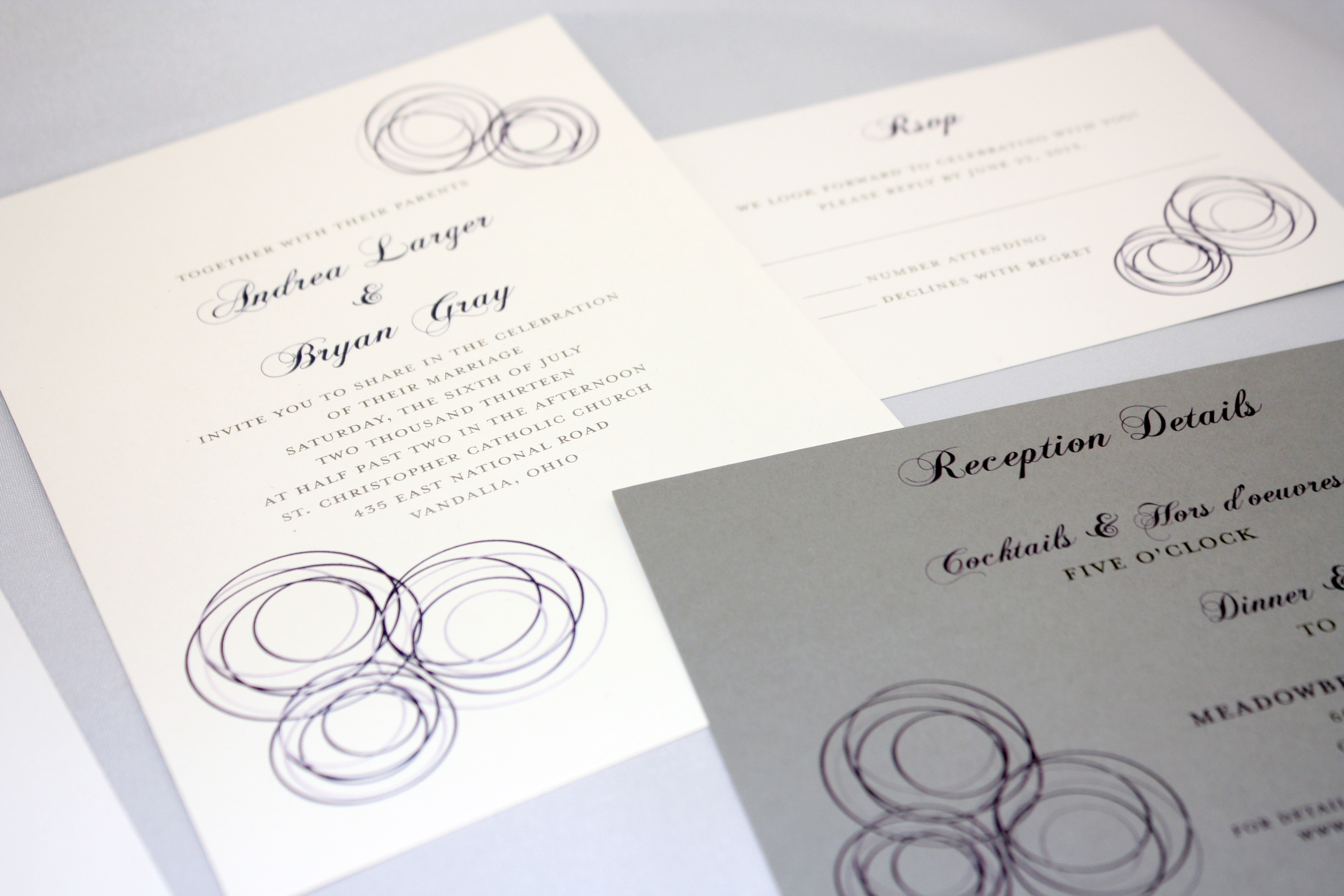
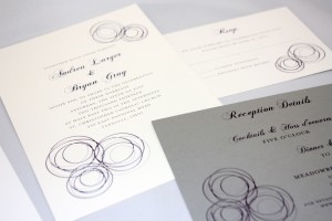
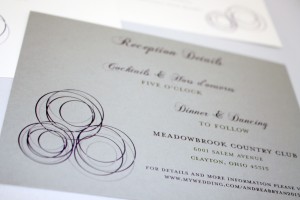
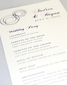
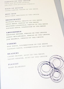
Andrea + Bryan
Concentric overlapping circles in shades of periwinkle, navy, and grey balance well with the traditional script.

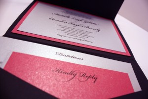
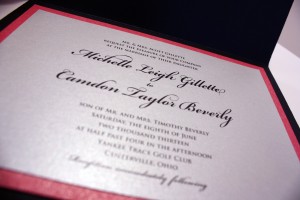
Michelle + Camdon
A classic black pocket invitation with a monogram seal in hot pink and silver with black ink.
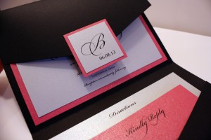
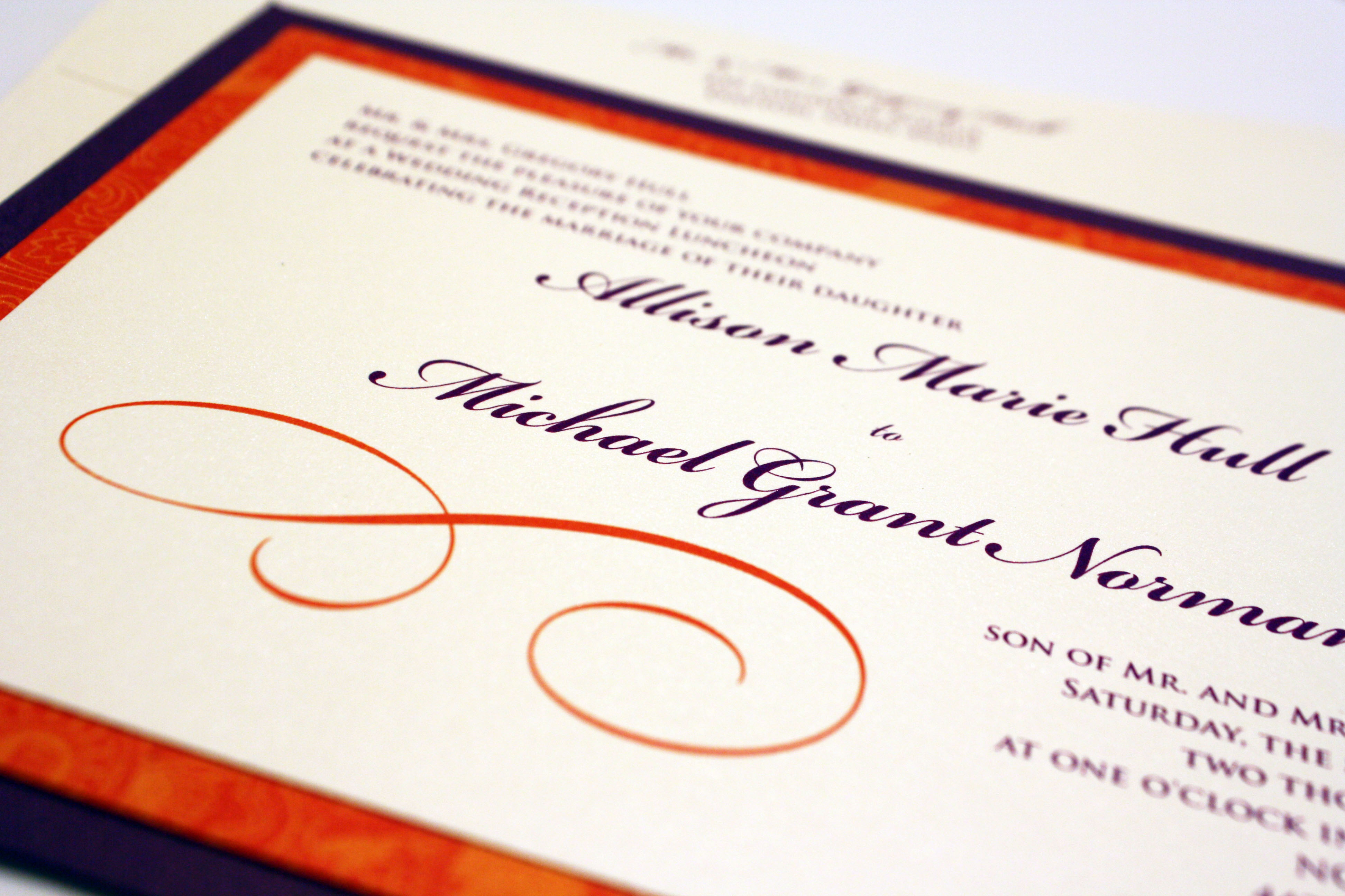
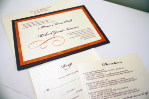
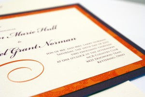
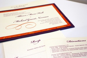
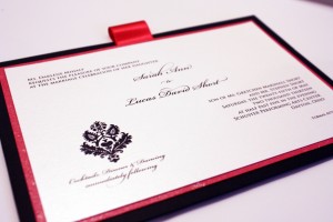
Allison + Michael
This unique combination incorporated purple and a bright orange pattern, but kept a formal font so as not to downplay the elegance of the occasion.
Sarah + Luke
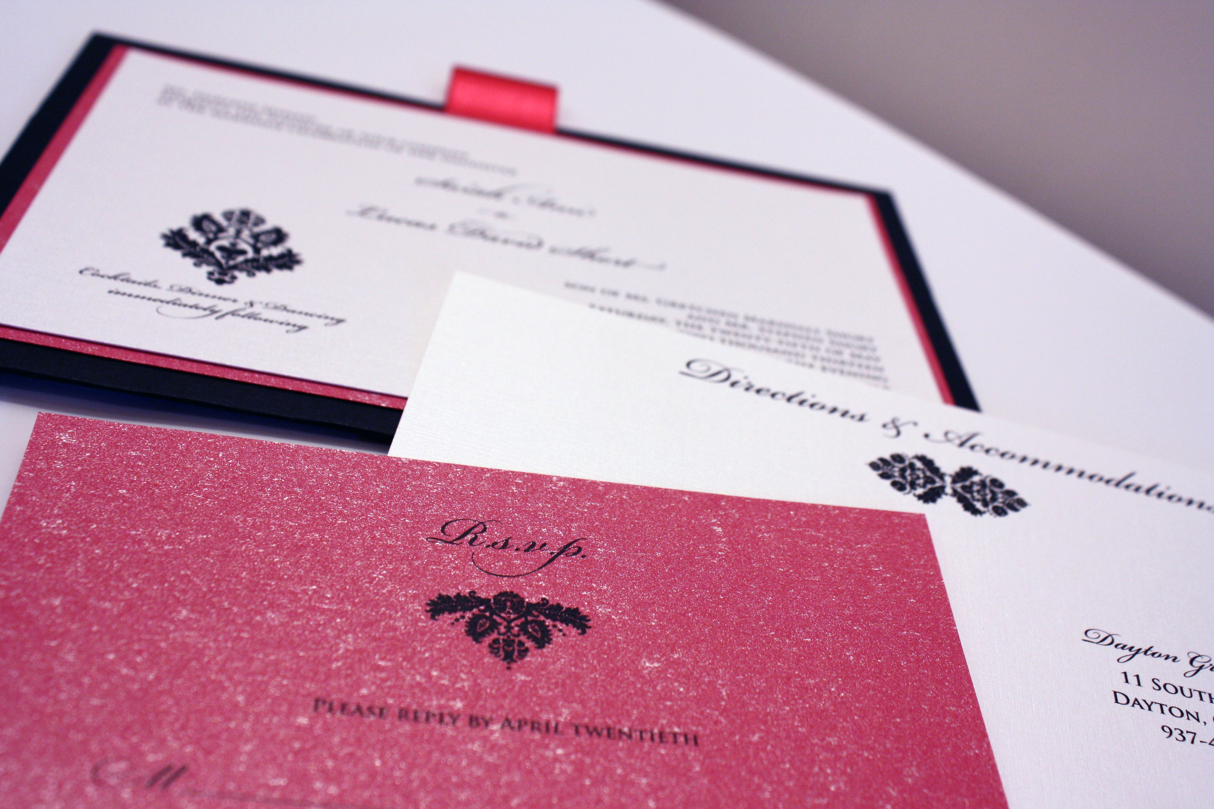
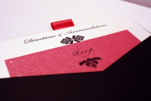
I never get tired of fuchsia and black together, and this pocket invitation didn’t disappoint. This sparkly invitation was for a spunky bride with a flair for style who “didn’t know what she wanted” but as soon as we pieced it together with her, she knew this was it. A few weeks prior to the Big Day we also printed coordinating menu/table cards using the same black damask graphic to restate the theme of the invitation at the event itself.
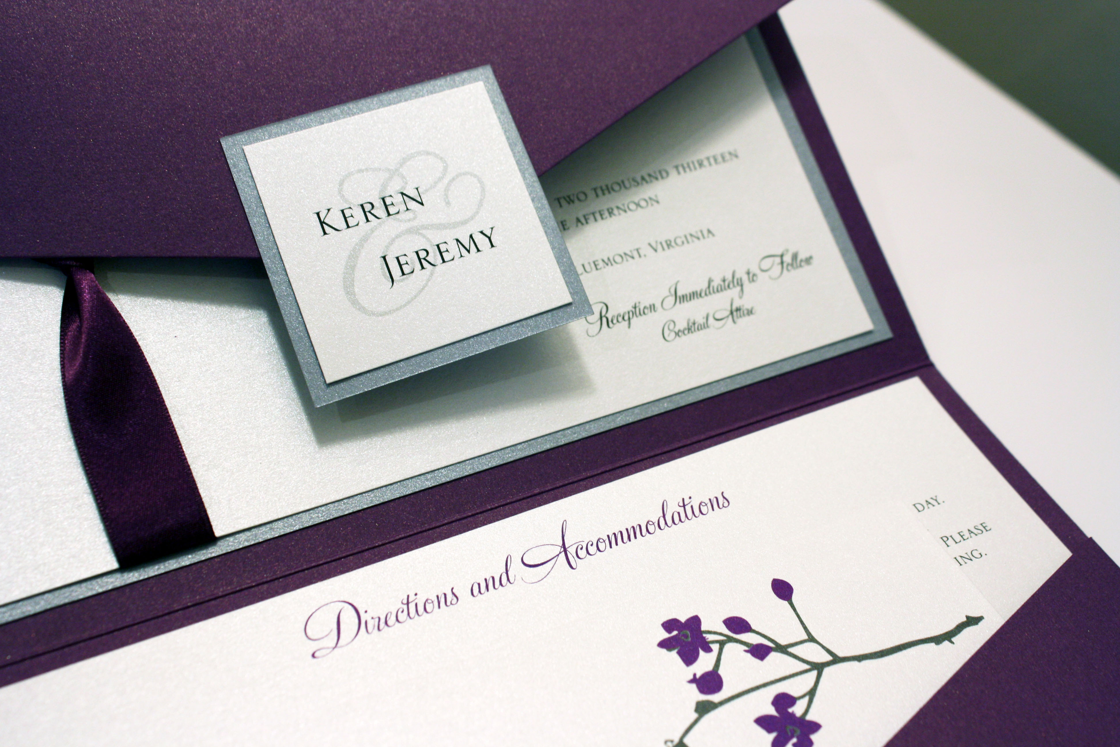
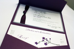
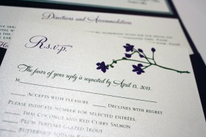
Keren + Jeremy
This beautiful invitation incorporated cherry blossoms into the couple’s purple palette, as well as their names in Hebrew for their Spring wedding outside Washington, D.C.

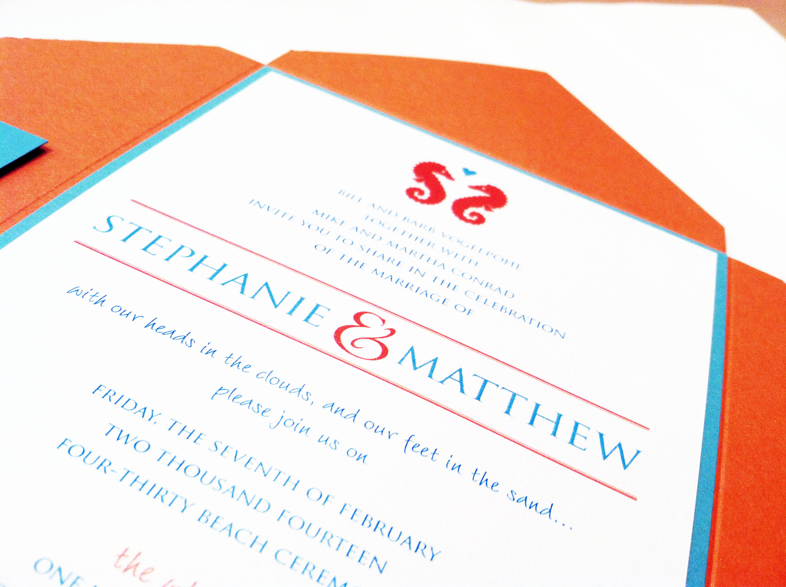
Stephanie + Matthew
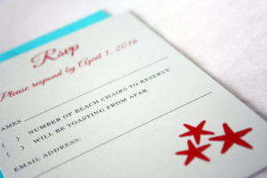
Another destination wedding, woo hoo!! We love the hot and cool colors of the beach, shown here with a seahorse/starfish motif in Tiffany blue and bright coral.
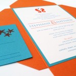
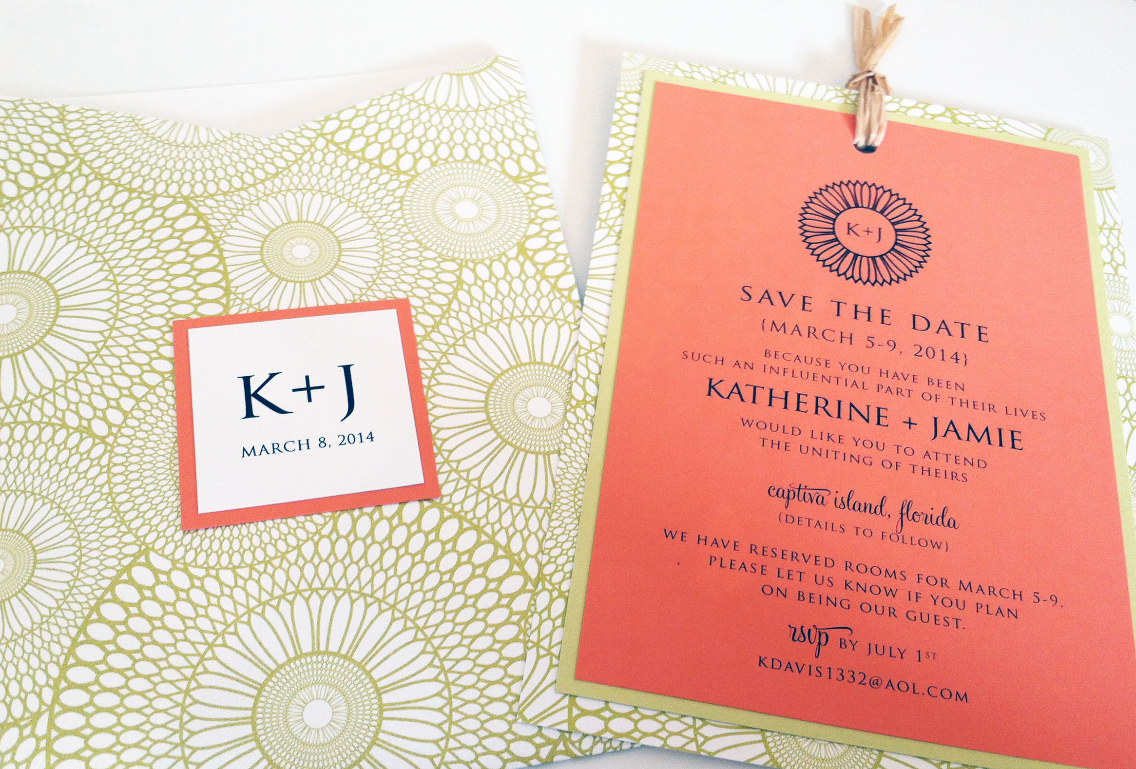
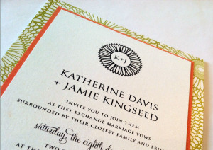
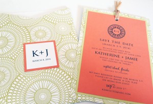
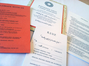
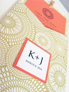
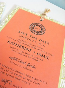
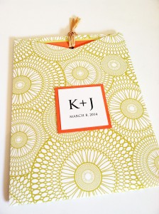
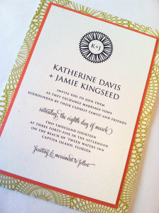
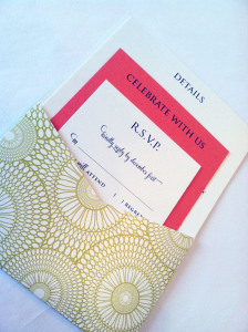
Katherine + Jamie
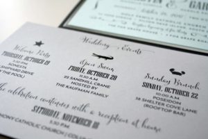
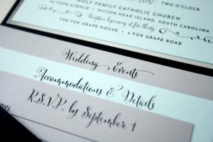
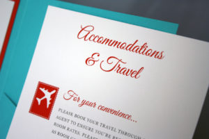
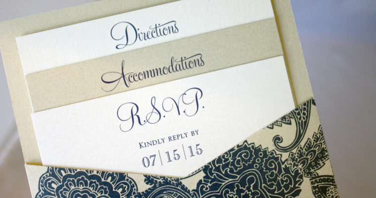
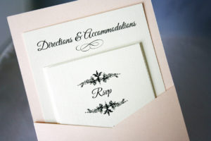
For this Captiva Island wedding, we chose one of this year’s hottest colors, a deep coral, paired it with a funky chartreuse kaleidoscope pocket, and used a blocky roman font to create balance in the design. The simple monogram kept the look modern and clean, while adding a personal touch to the outside of the pocket. This save the date card was the perfect precursor to Katherine and Jamie’s wedding invitation, which incorporated the same colors and overall style, using a pocket card to envelop all four of their enclosure cards: a schedule of weekend events, information about the resort and surrounding area, a reply card, and a hotel card listing accommodations info for their guests.
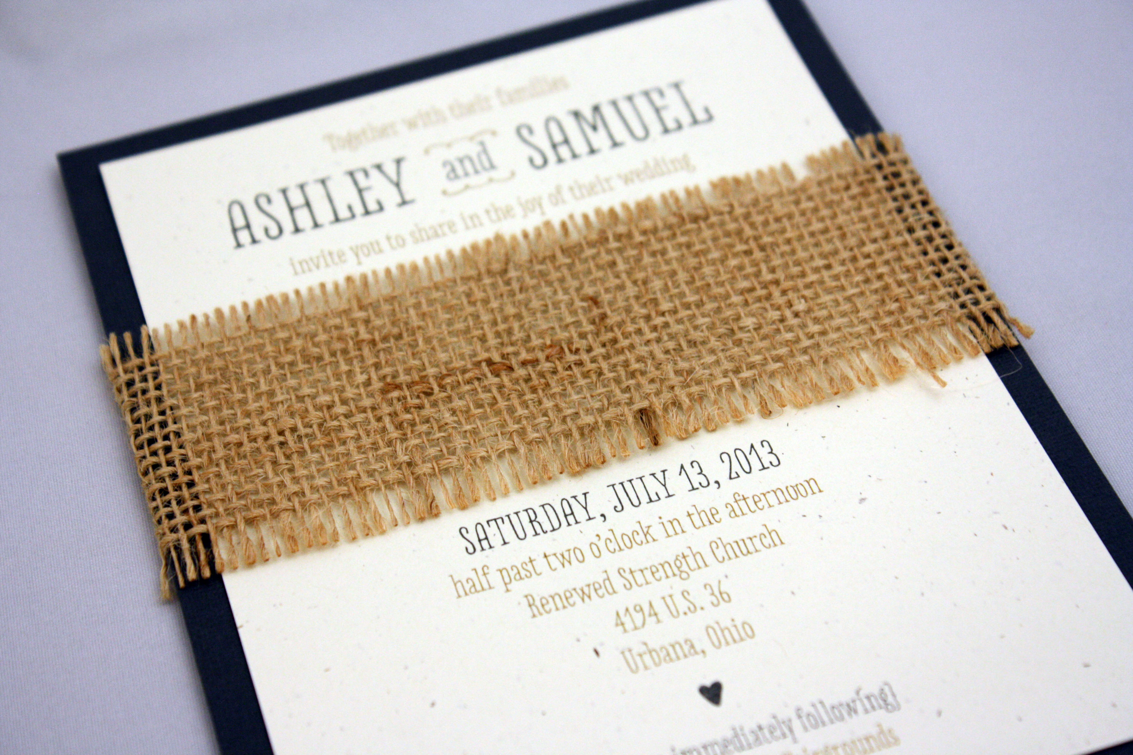
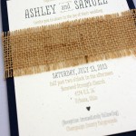
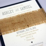
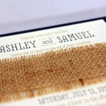
Ashley + Sam
This is one of my 2013 favorites. Burlap makes everything cooler, and we paired it with an oatmeal colored PC 100 recycled stock and a darker charcoal accent layer. The fonts and layout idea were inspired by the work of one of our favorite letterpress lines, and it worked beautifully with these colors and textures.
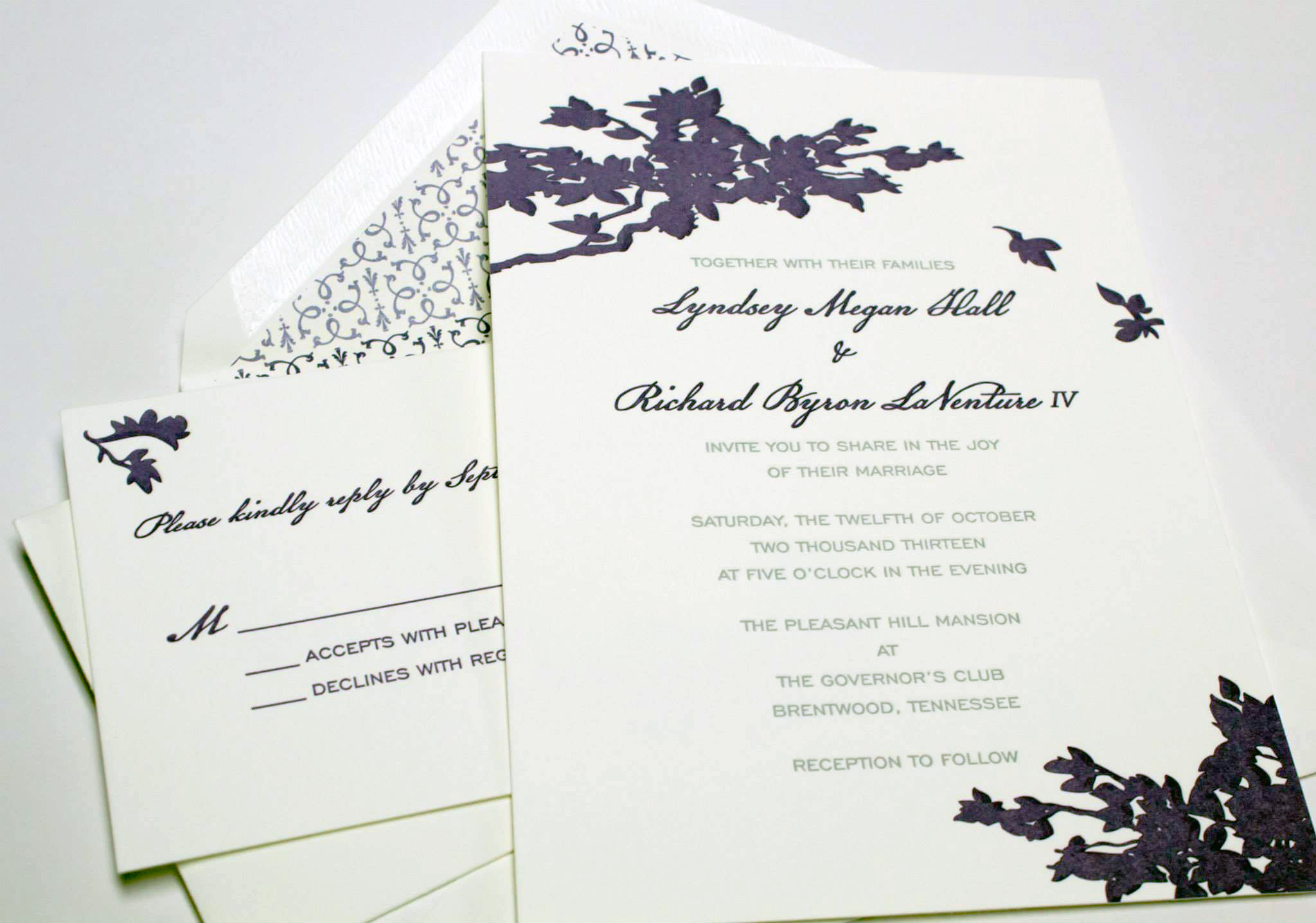
Lyndsey + Richard
This was the year of the out-of-state wedding, and this fabulous letterpress invitation was the introduction to a Fall wedding in Tennessee for Lyndsey and Richard. They chose a 600 gsm Crane lettra stock, a rich purple ink and a fantastic envelope liner to round out the set.
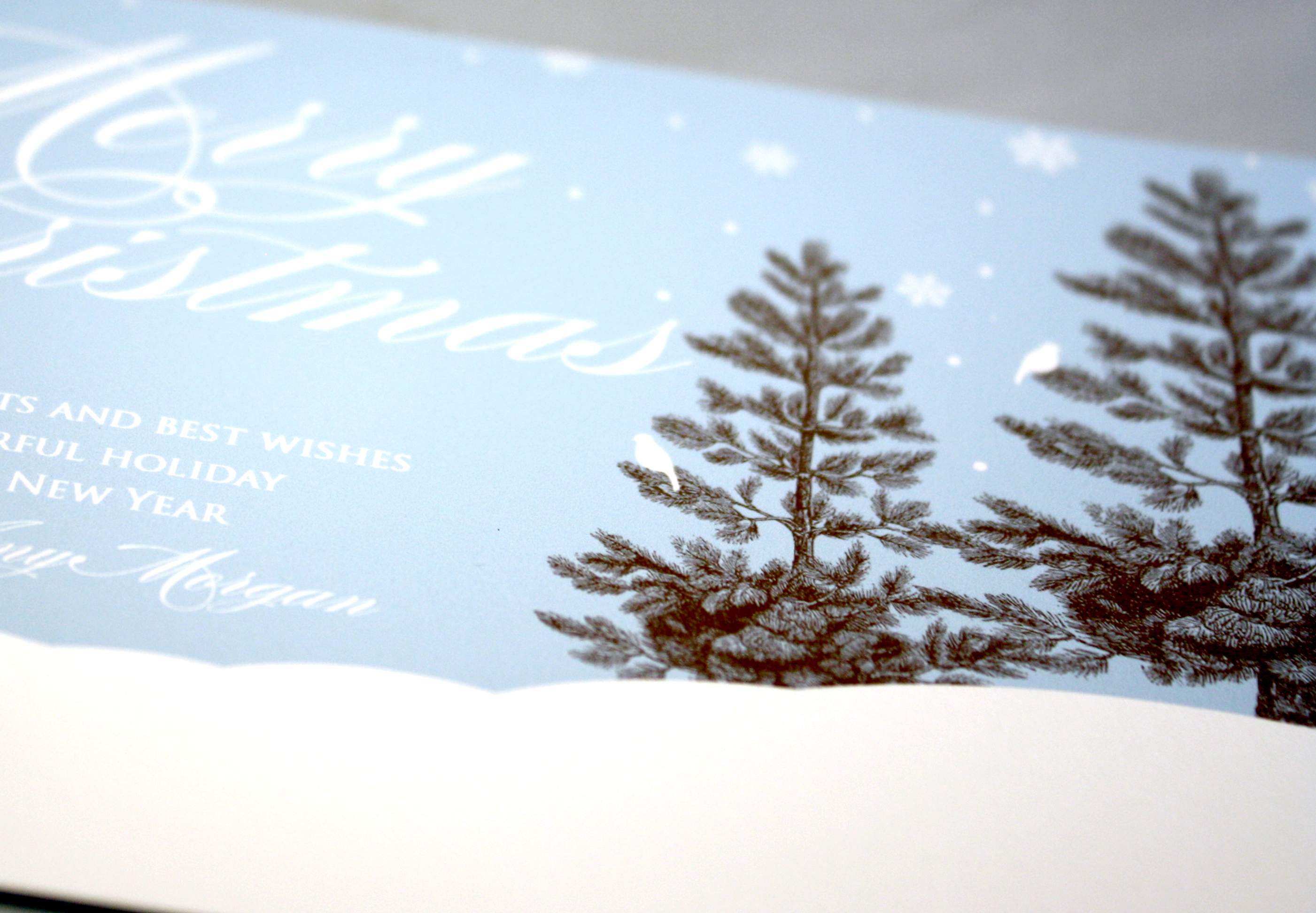
Winter Landscape
If you’re a little tired of all the red and green at Christmas, a lovely alternative for a holiday greeting is to go with a winter landscape in snowy tones of blue, white and chocolate. This Tag and Co. design boasts a sort of calm tranquility and the elegant, white script at the top is a perfect complement to the rich color of the evergreen trees.
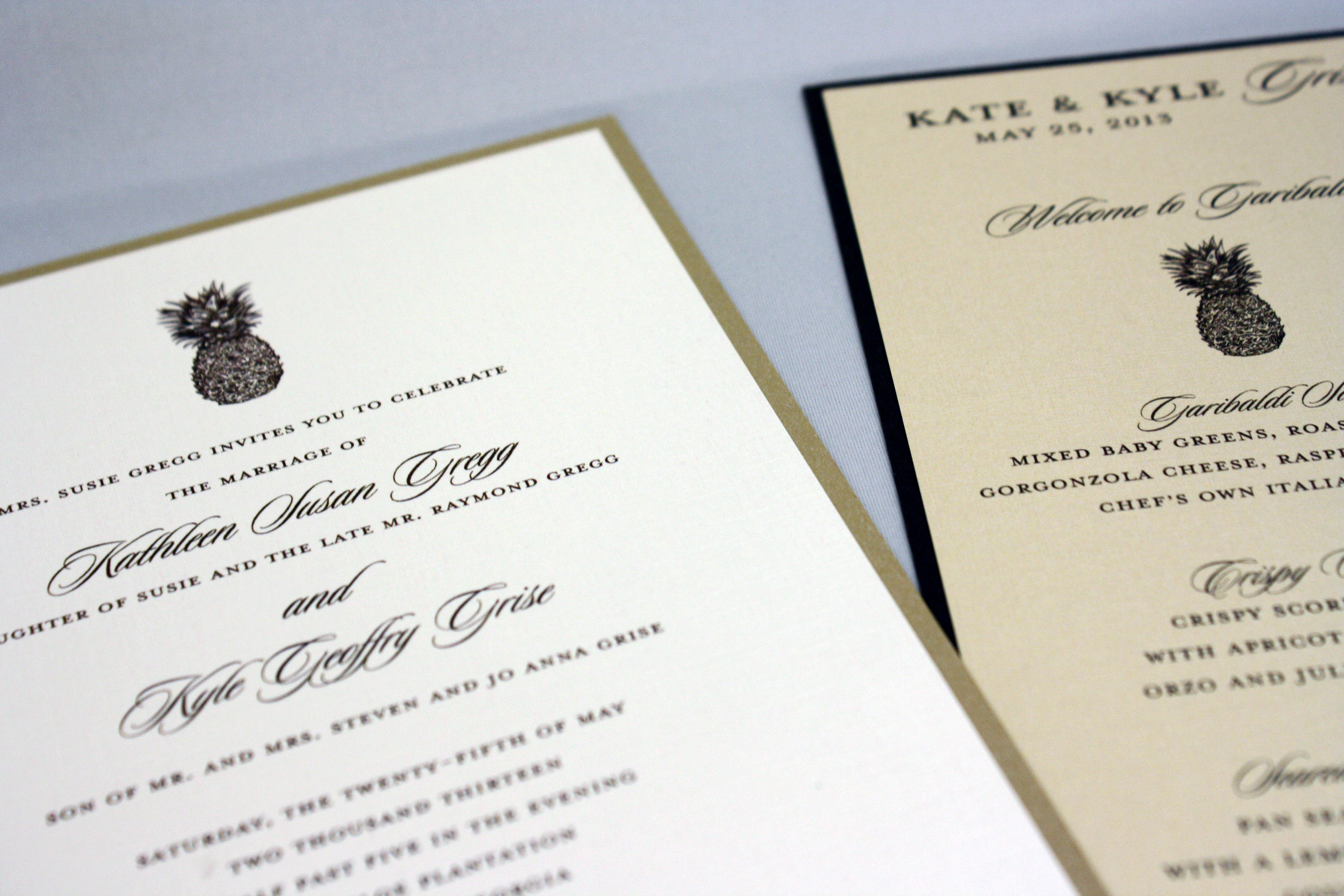
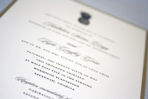
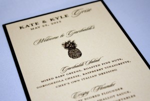
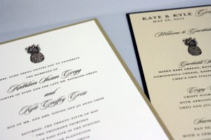
Kate + Kyle
The pineapple is a well-recognized symbol of Southern hospitality; I learned once during a visit to an old plantation outside of New Orleans, Louisiana that the tradition of leaving a pineapple in a guest’s room during their stay was a polite way of informing them that they had overstayed their welcome, i.e., “Here’s a lovely pineapple, kindly be on your way…” This Georgia wedding played up the Southern theme by incorporating tidbits of nostalgic charm- a pineapple and a palm tree- on their various printed pieces.
Floral pocket program
This little pink and grey floral pocket program was fitting for the garden wedding it accompanied, and the sleeve ended up protecting the programs when it started to rain. They say rain on your wedding day is supposed to be good luck…
Lauren + Scott

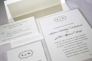
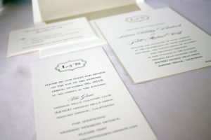
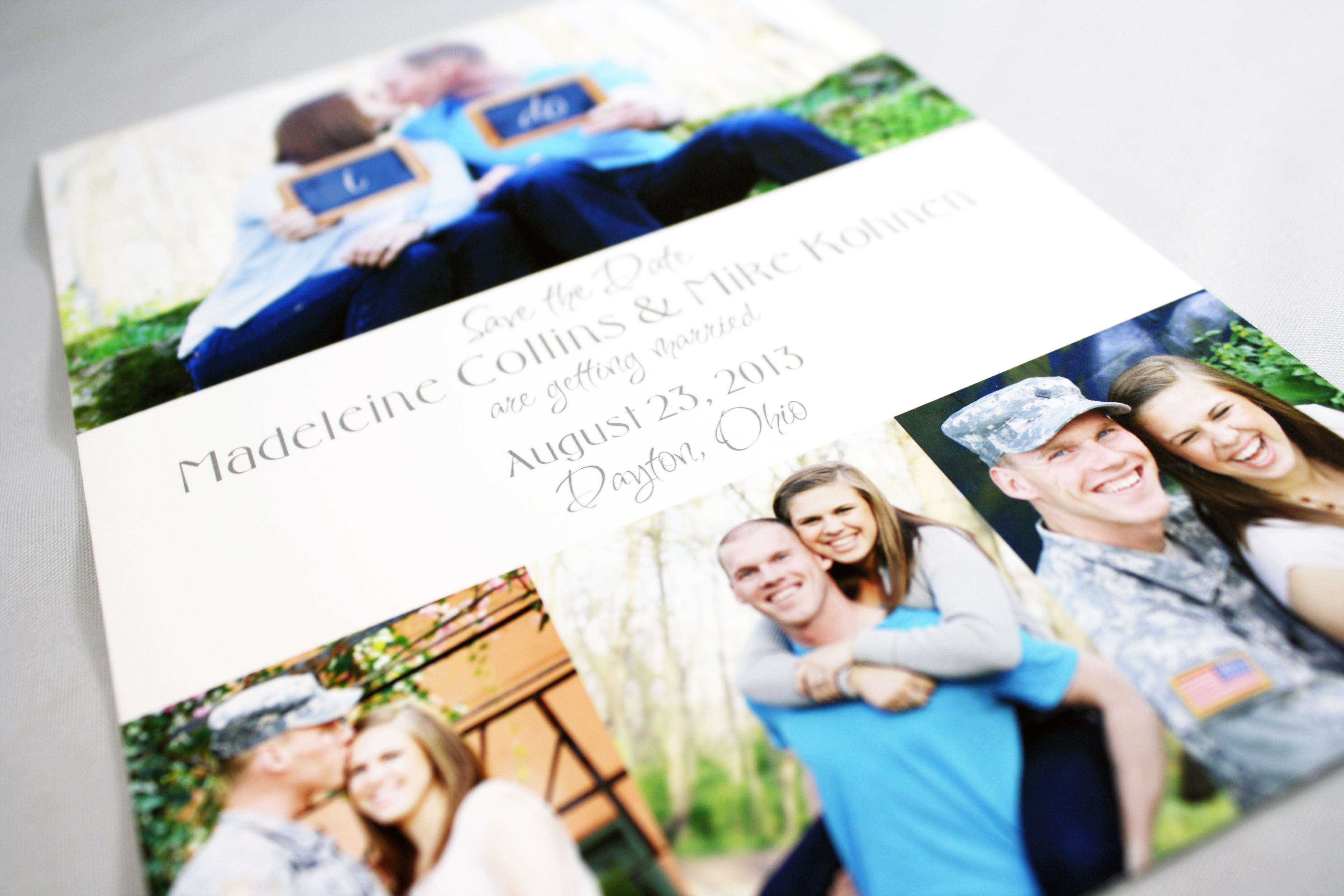
Madeleine + Mike

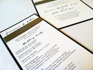
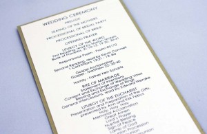
Lauren + John
Green ribbon across the top ties the invitation and the program together (not literally), while the black and white and funky script makes these invitations crisp and modern.
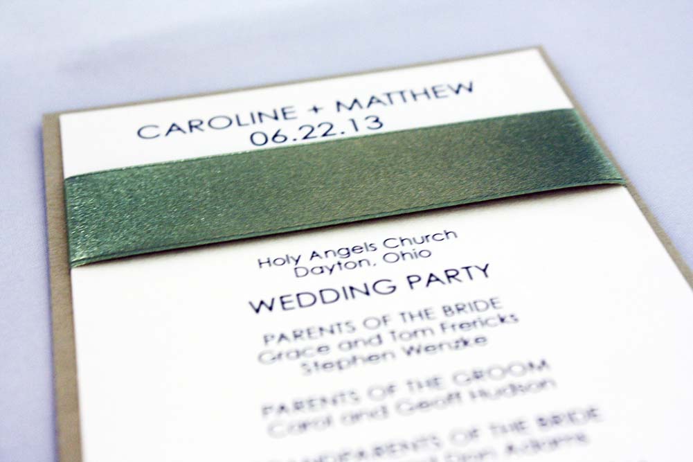
Caroline + Matt
Caroline and Matt’s program was a delightful compliment to their layered gold and ivory wedding invitation, from the layers of gold and ivory, right down to the moss satin ribbon.

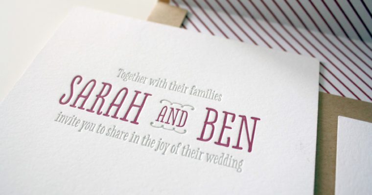
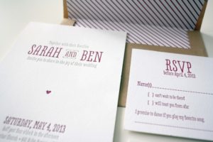
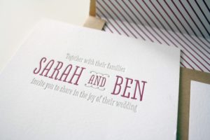
Sarah + Ben
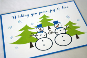
Holly Holidays
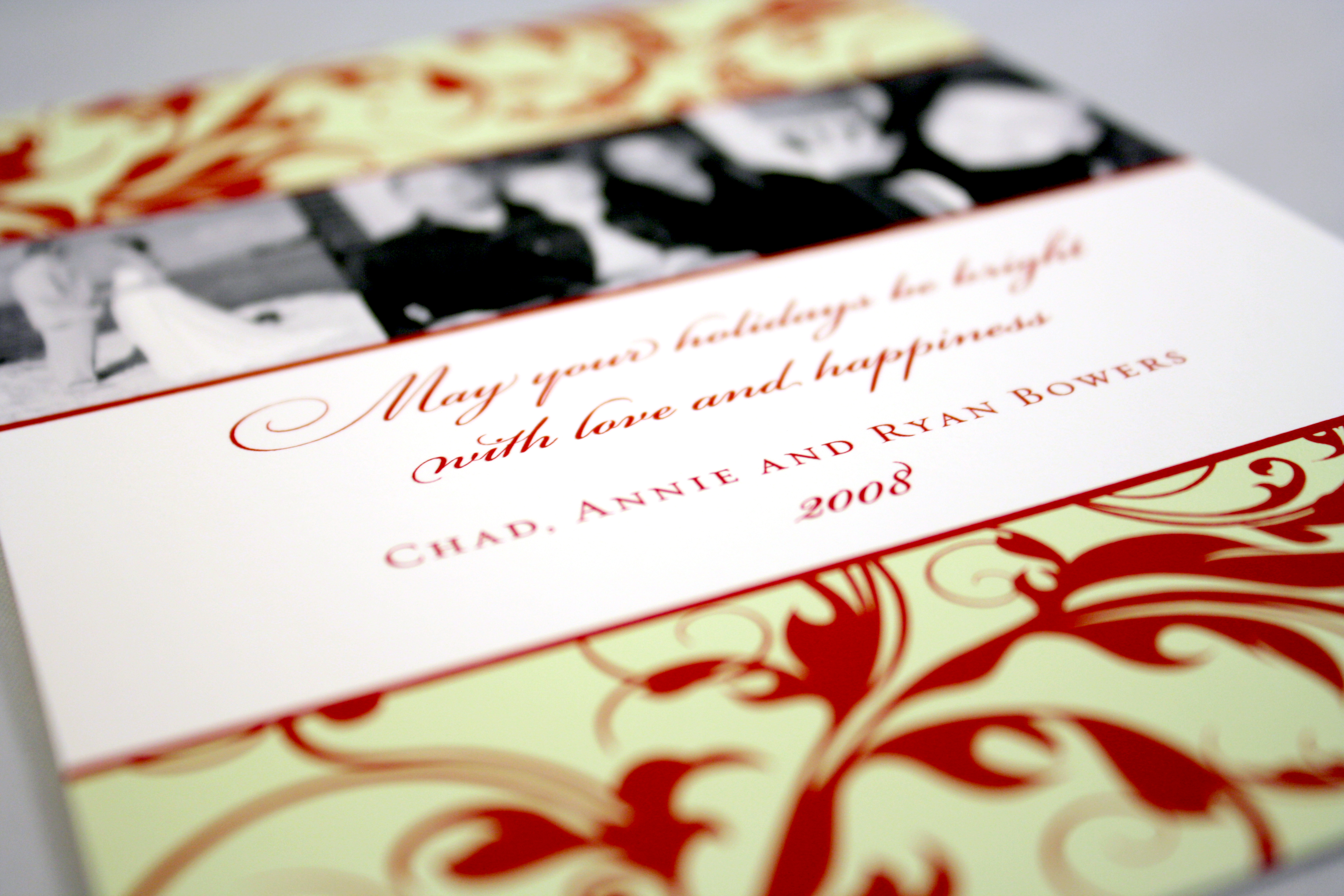
There’s just something about a few bursts of bright holiday red that is absolute perfection when paired with light blue and deep mocha. This card found the perfect balance of soft blue, vibrant red, and rich brown.
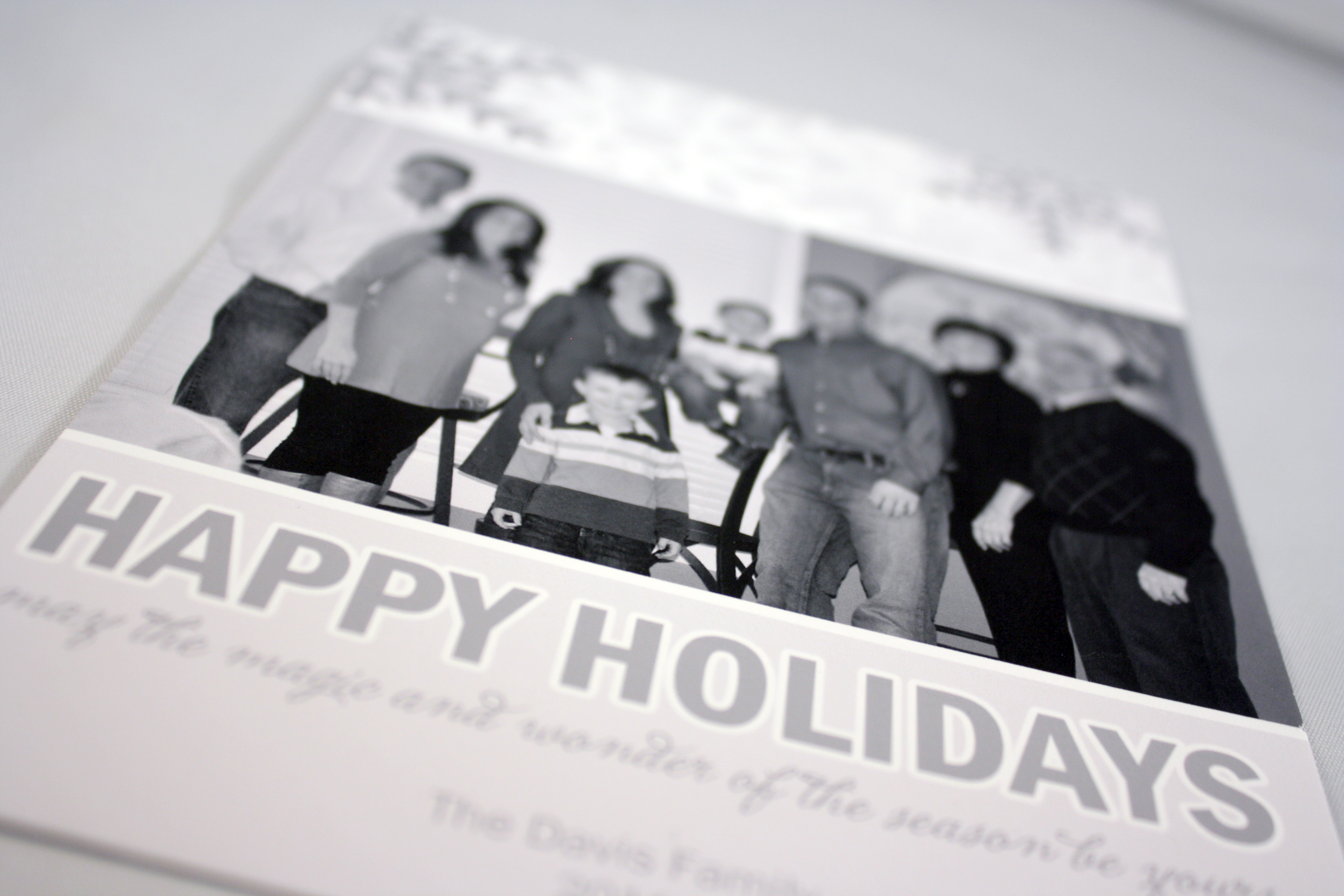
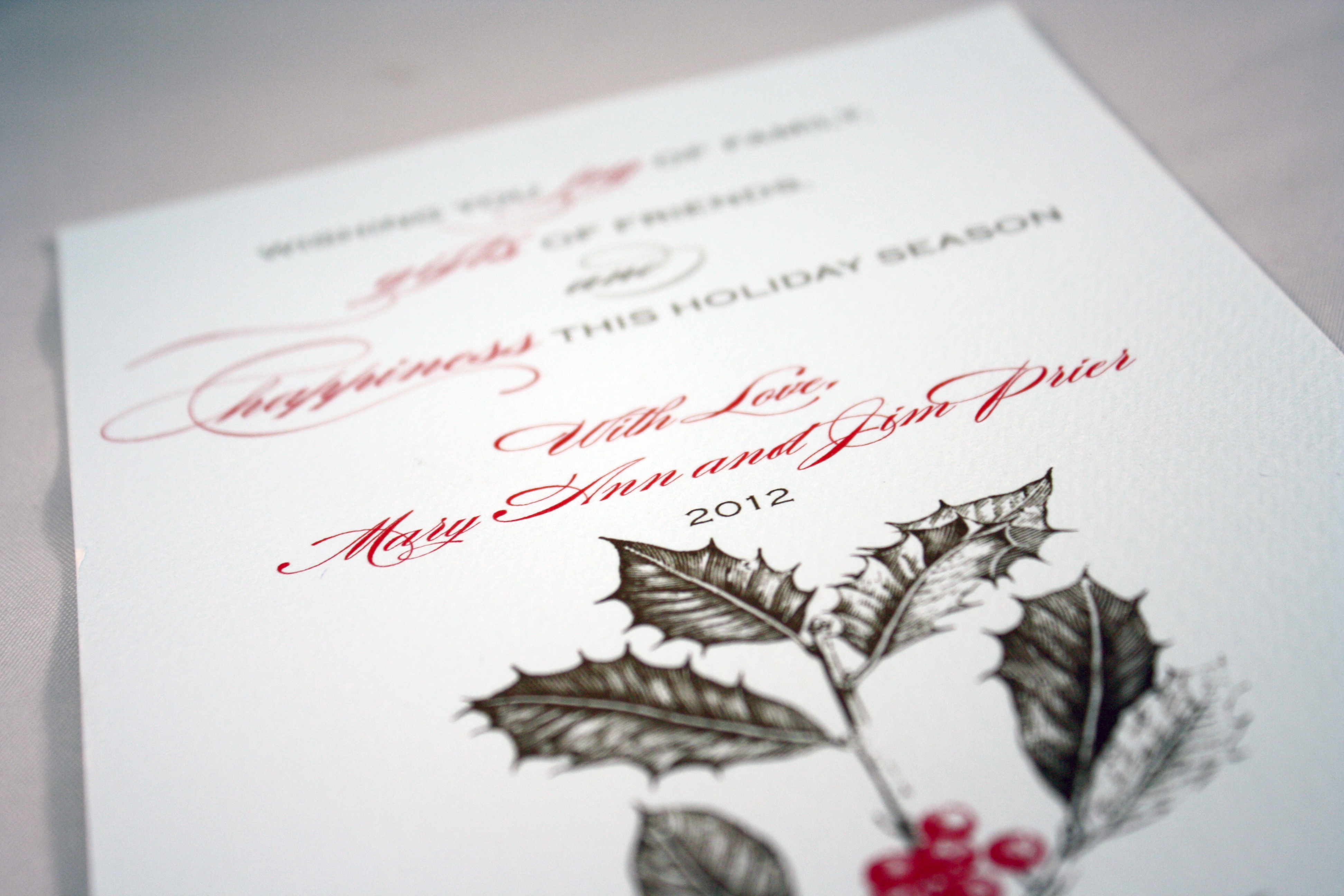
Davis Holiday Card
Tag and Company does exquisite photo printing, which is why they are a big favorite of ours for any holiday card that uses a photo. This monochromatic card stays clean and simple with a black and white photo and grey tones for the rest of the design.
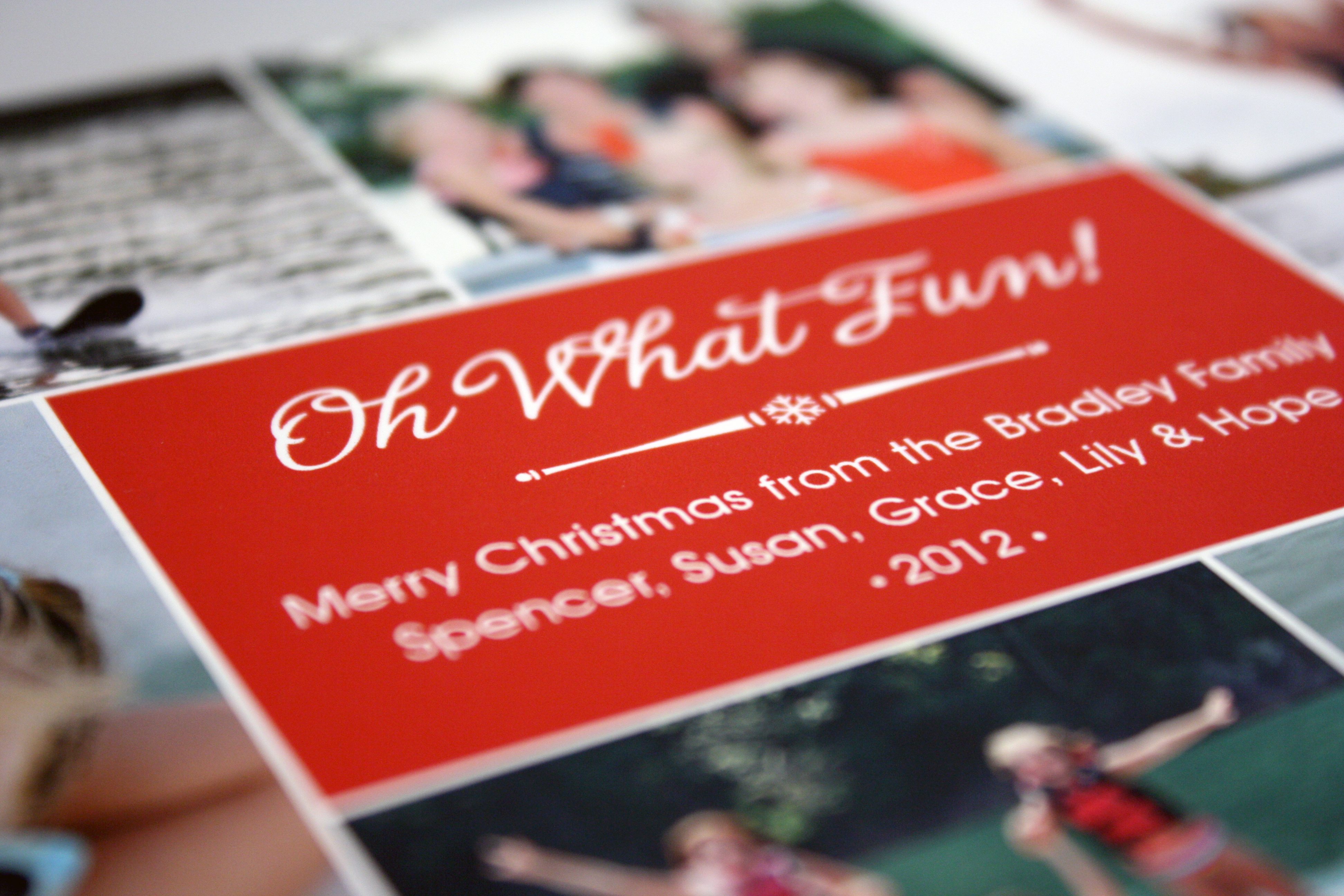
Oh What Fun!
We had Tag and Co. create another masterpiece with a selection of fun summer family photos that was sure to warm the hearts of their friends and family.

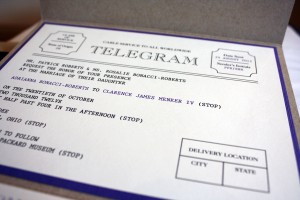
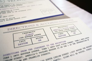
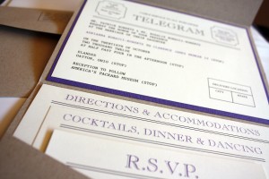
Adrianna’s Telegram
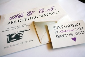
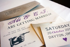
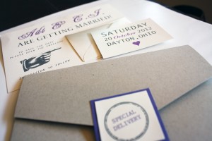
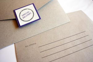
What goes better with a vintage wedding at the Packard Museum than a telegram invitation? Answer: Nothing. Adrianna’s invitation topped the creativity charts and didn’t miss a single detail, from the full stops after each piece of information to the fun text frames we peppered throughout the natural kraft pocket-fold style invitation. We had a hard time finding the perfect shade of periwinkle that wasn’t too purple and wasn’t too blue, but Adi pulled through and provided some scrap booking stock she found for us to cut and use as her accent layer. Once we had the perfect accent color, we then matched small parts of the text to her color to tie everything together. Special delivery, indeed!
Her save the date was a single card with the infamous pointing hand graphic, pointing at a tiny envelope which housed a card bearing the date of the wedding. She mailed them in paper bag style envelopes, giving guests a glimpse of what to expect: a classic wedding at a truly unique venue.
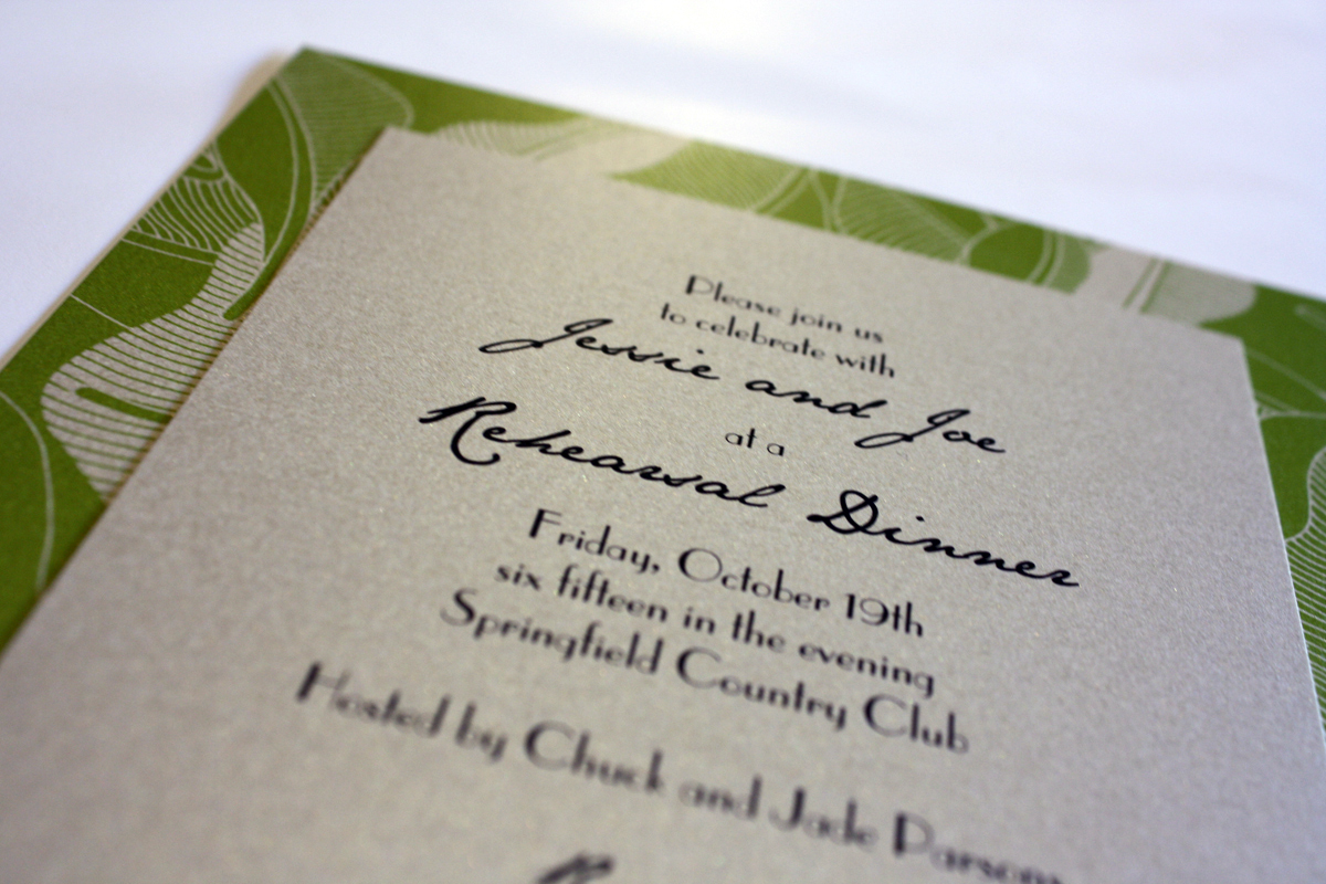
Jessie and Joe’s Rehearsal Dinner
Jessie and Joe’s wedding had an orange and silver theme, but Joe’s mom decided to lend a totally different feel to their rehearsal dinner invitation. The rehearsal was to be held at the Springfield Country Club, and we created a green and pale gold invitation with a modern leaf graphic entwined into the background layer.
Kate + Pete
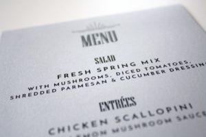
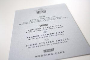
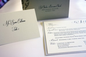
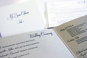
Kate had one heck of a wedding planner in her corner for this fabulous October wedding- her wonderful mom, Monica. Together, we planned every printed detail of this wedding from start to finish: the invitations, programs, rehearsal dinner invitations, place cards, menus, thank you notes…the whole kit and kaboodle. Kate’s invitations were from Checkerboard, and she wanted a traditional elegance theme- ivory and black with touches of gold and silver. Featured here are her programs, place cards and menus.

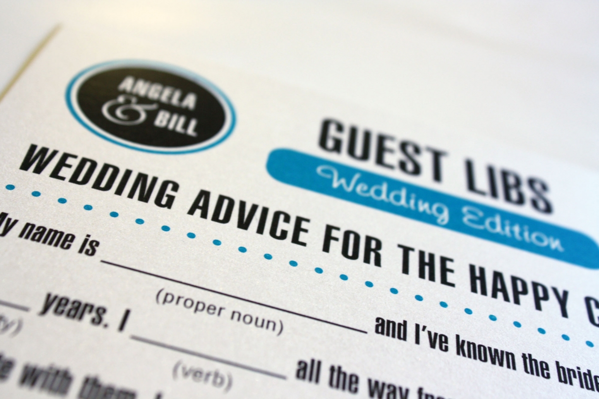
Wedding Guest Libs
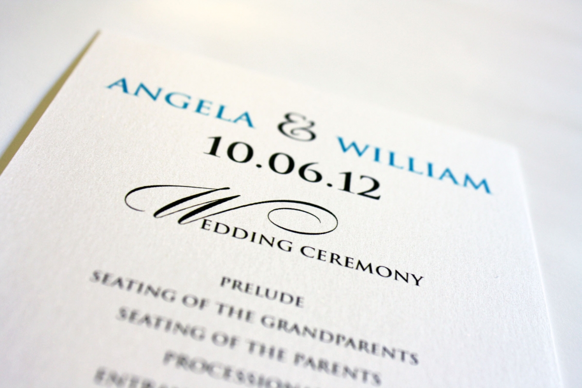
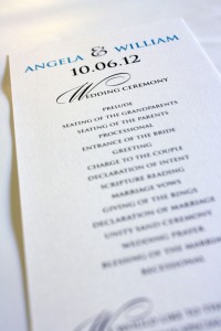
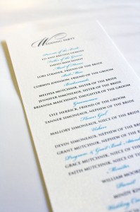
This was an entertaining way to get Angela’s guests involved in providing a fun keepsake for the couple after their Big Day. Angela came to me with this incredibly fun idea- Wedding Guest Libs- into which we easily incorporated her wedding colors of turquoise and mocha. We used the turquoise as a color pop on a crisp white background. Angela’s invitations were from Checkerboard and she had several custom projects she asked us to do to coordinate with that look. Angela felt strongly that her wedding needed to be fun and reflect her and Bill’s personalities, so the Guest Libs idea was perfect because it engaged her guests and gave them something interactive and fun to do at their tables, while providing amusing anecdotes for the couple to read after the festivities were over.


Britt + Kirk
Love, love, love this couple! Britt came in with her mom, looked through some books and just wasn’t sure what direction she wanted to go. A few albums and a little flutter of disappointment later, Britt saw the “Christina” style invitation hanging on the wall and said, “That one. That’s the one I want.” It was awesome- that moment of clarity when something all of a sudden clicks into place was almost palpable. Britt did something unusual that ended up being completely gorgeous- she blended shades of gold and silver into the same invitation and tied them together with a warm diamond-colored card stock. She chose a traditional script, an elegant flourish and a soft charcoal ink to complete the look of the graphite pocket card, patterned accent layer and pale gold ribbon pull tab. Britt was the sweetest bride to work with, right from the start, and put her trust into us to create the perfect invitation she visualized when she said, “That’s the one I want.” Her genuine excitement to marry Kirk was adorable, and after her mom picked up her invitations and sent her a picture of the finished product, Britt sent me a message saying she cried in front of her first graders because she loved the invitations so much. I couldn’t possibly receive a higher compliment, and it’s brides like Britt that make me love what I do.
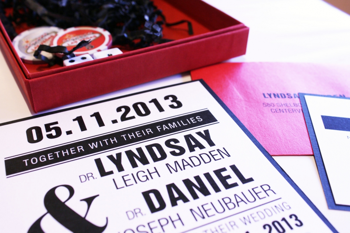
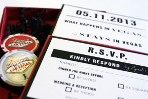
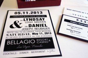
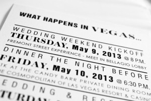
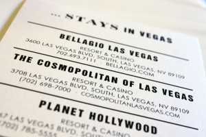
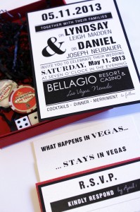
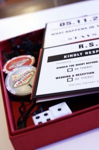
Lyndsay’s Vegas Wedding
I have never been as excited about an invitation as I was to work on this design for a small Las Vegas wedding. The bride-to-be came in knowing she wanted to send invitations in a box with poker chips and dice, so I knew we had to raise the bar- we had to create something really special. The best moment in our brainstorming session came when we were trying to think of an appropriate title for the events card, and Melissa said, “What about, ‘What happens in Vegas…?” We all instantly fell in love with the idea, and I followed through with the next logical step- the accommodations card title: “Stays in Vegas…” At this point, we all started high-fiving. It was one of those awesome moments when you’re convinced no one has EVER had an idea as good as this one. The finished product came together like a straight flush, and I couldn’t wait to post photos of it as soon as Lyndsay picked up her invitations.
A + B Programs
Angela’s Tiffany blue and mocha wedding needed a simple program to match, and by the time she made it to the program stage of things, Angela was tired of making decisions and asked me to suggest something simple and easy that wouldn’t break the bank. Our go-to program in situations like these is a 4×9 card, printed with ceremony information on the front and wedding party on the back. With a reasonable cost, no assembly and a high likelihood that people would tuck them into their purses after the ceremony, this was a no-brainer.
Evergreen Christmas
This super fun couple comes in once a year to order holiday party invitations as well as their Christmas cards, and catch up on the latest news around the shop… this was the traditional Tag and Co. design they chose to send to friends and family.

Stephanie + Travis
This was a classic case of a “color matching challenge”- there was a very specific shade of coral that Stephanie was trying to match and we couldn’t seem to find the right color in our custom line so she ended up bringing us 12×12 sheets of scrap-booking paper that we cut and used as her accent layer, then we matched the ink color of her headings and accent boxes to that shade as well. She went with a grey portrait pocket card for the base of the invitation, and we made sure the cards in the pocket lined up so the headings were stacked on top of one another for a seamless look.
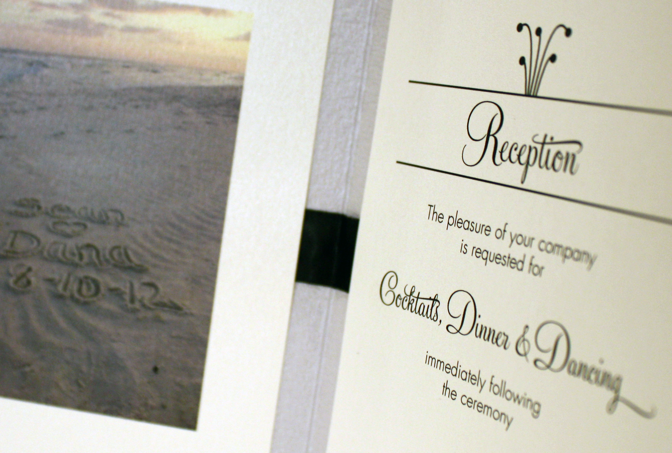
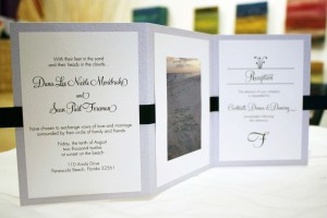
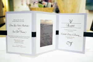
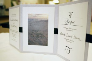
Dana + Sean
Beach weddings are the most popular type of destination wedding; Dana exemplified the destination bride with her laid back attitude…from the first day we met Dana, she put the power of creative control into our hands and told us to “just do it.” She had a few ideas of her own that she wanted incorporated into her invitations, including a picture of the beach where they would be getting married, but other than that she just wanted something simple and fun to reflect her small destination wedding. We chose a tri-fold card that had a heavy texture on it, almost like seashells; to complement the shimmery silver tri-fold we used white micah printed cards and a simple black ribbon to pull it all together and make it feel less informal. The photo of their initials carved into the sand added a nice personal touch, and the overall effect was beach-elegance.
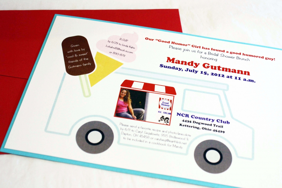
Mandy’s Good Humor Shower
Mandy, the bride-to-be, was a Good Humor ice cream girl once upon a time, and the ladies throwing her shower thought it would be fun to have an ice cream themed shower. They mentioned that humor was also an important part of Mandy’s relationship with her fiance, so the “good humor” theme was doubly appropriate. The hostesses also wanted to incorporate a photo they had gotten from Mandy’s dad (from her ice cream days) into the design. I thought it would be fun to make it look like she was back in the ice cream truck, so I put together some “cool” graphics and voila- a shower invitation unlike any other, custom made just for Mandy.
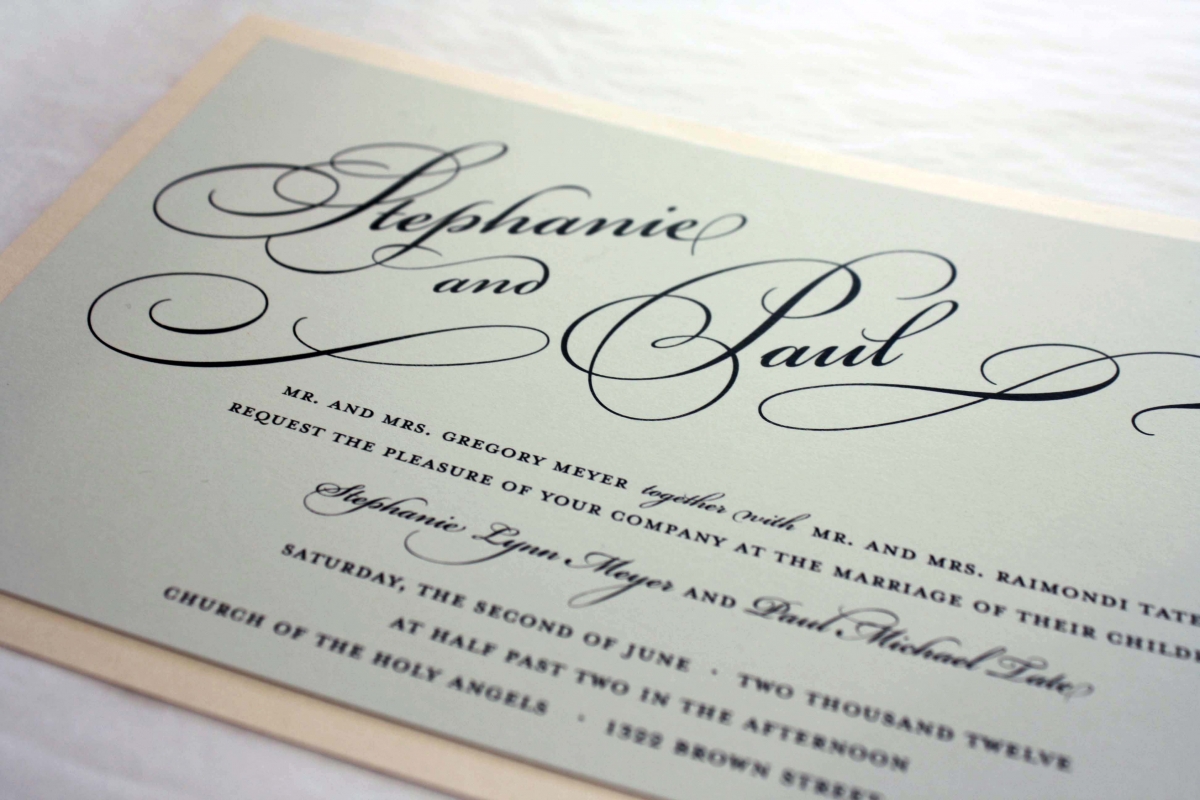
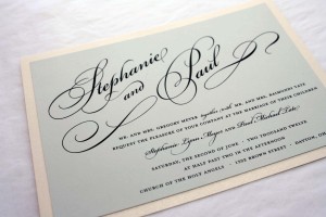
Stephanie + Paul
Sometimes customers bring us ideas they have seen online and ask if we can create something similar…almost always the answer is, “Yes!” Usually it’s a font or graphic that draws their attention, and there was something about the typography of a certain invitation she saw online that really grabbed Stephanie’s attention, so we made sure to incorporate that look. The most noticeable feature of the invitation is the bride and groom’s names, which are set apart in an oversized script encompassed in swashes and flourishes- in this way, the type actually becomes a graphic element, and no other graphics are needed to complete the look. We kept the overall design simple and chose a light pink for the bottom layer, topped with a light grey color called London Fog to give it a hint of romance.
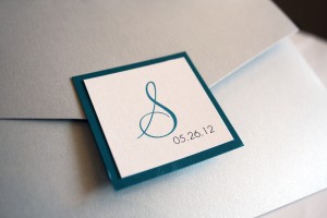
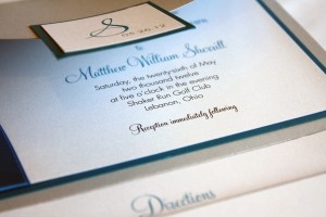
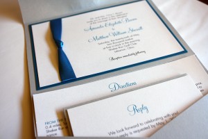
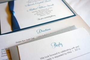
Something blue
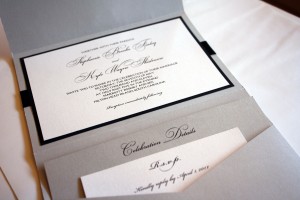
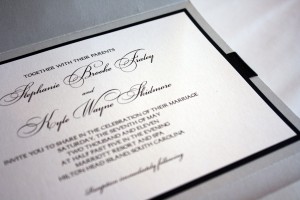
As you may have noticed, we do a lot of pocket-style wedding invitations; the two main reasons they are so popular is that they are highly customizable while also being practical. The pocket provides a neat and tidy place to keep the enclosure cards for the reception, directions and reply, and everything can be done in whatever the color palette of the wedding happens to be. Amanda’s wedding involved hues of a luxurious deep teal blue; the shade was so rich that we decided to only use punches of it as a rich accent. The double-faced Midori satin ribbon, the 1/8″ border underneath the printed layer and their names and headings were all done in her teal, which was just enough to add a pop of color while the rest of the invitation stayed classic and sophisticated.

Christina + Nick
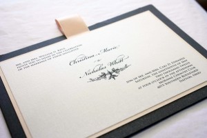
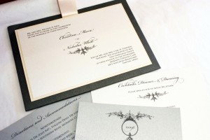
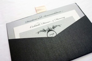
This pocket invitation has become known as the “Christina” because it became a hit almost the instant we designed it for Christina and Nick earlier this year, and at least half a dozen brides since then have seen it and said, “That’s the one.” For Christina, we chose a graphite pocket card, with shades of silver and white silk, and used a hint of blush pink as an accent layer- and since we wanted to sneak a teeny bit more pink in there to make it feel even more feminine, we added a blush satin pull tab at the top edge. This style of “pull” tab doesn’t serve a function, it merely adds another pop of color to tie in with the accent layer, and gives the invitation another dimension (and a girlish flair to boot). The front of the invitation appears traditional, but the back of the card has a hidden pocket that holds the enclosure cards. The presentation is neat and compact, without a lot of fuss.
I first met Christina and her mom several years back when we created custom invitations for her older sister Julie’s wedding, and I’ve gotten to know the ladies in this wonderful family, including their absolutely awesome mom, Patricia. The thing I noticed right away with both girls’ weddings is that the spirit of what it means to plan a wedding was not lost on them- Patricia and her daughters seemed to enjoy the process more than most of the brides I encounter. They seemed rooted in the important things (i.e. love, commitment, values) and the fun they had along the way was just an added perk.
Working with Christina was easy- she knew what she wanted and placed complete confidence in us to build her perfect wedding stationery, not just for the wedding invitations but for her bridesmaids’ luncheon invites, shower and wedding thank you notes, programs and menu cards. The end result was a perfectly coordinated look that paid attention to every detail.
Chris + Michael
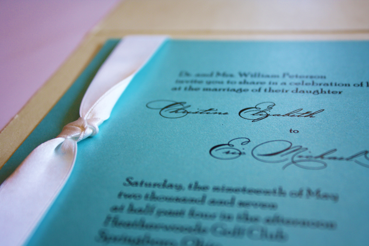
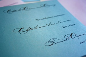
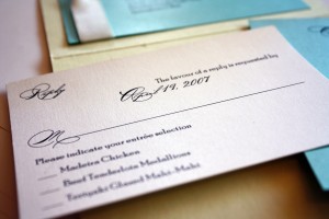
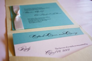
There was a short period of time in 2007 when I was really tired of Tiffany blue, however I got over it and I couldn’t be more pleased with how this invitation turned out. I really love printing on vibrant colors rather than neutral hues, mostly because I feel like it makes a huge impact. I always find that the invitations printed on bright card stock are the ones I remember the most, whether they are part of our custom studio or in an album. Color packs a punch. This invitation used Tiffany blue and a pale serpentine green, both metallic for plenty of sparkle, and added a crisp white satin ribbon and a really cool script. Bellissimo.

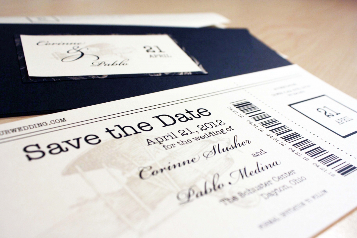
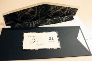
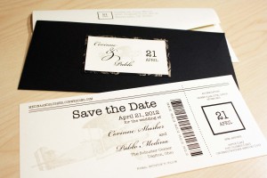
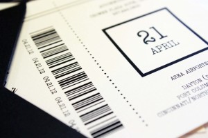
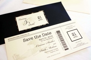
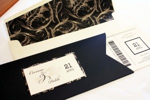
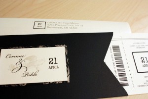
Corinne + Pablo
Corinne and Pablo wanted to incorporate airplanes into their wedding invitations and save the dates, not just because they currently live in city known as the birthplace of aviation, but because they are both involved in the Air Force. They were legally married in a small ceremony in one of the small wedding chapels on base several months ago, surrounded by a close circle of family and friends, and then planned a large April celebration. Corinne shared a funny story with me about how most of their friends didn’t know they were getting married prior to the big April wedding, but their photographer accidentally let the cat out of the bag by posting their wedding pictures – and tagging them – on Facebook! Everyone had a good laugh and the bride and groom were later happily “married” in April 2012.

Celebrate
The oversized script speaks for itself, and the subtle circles of light in the background look like stars or lights glittering in the snow.
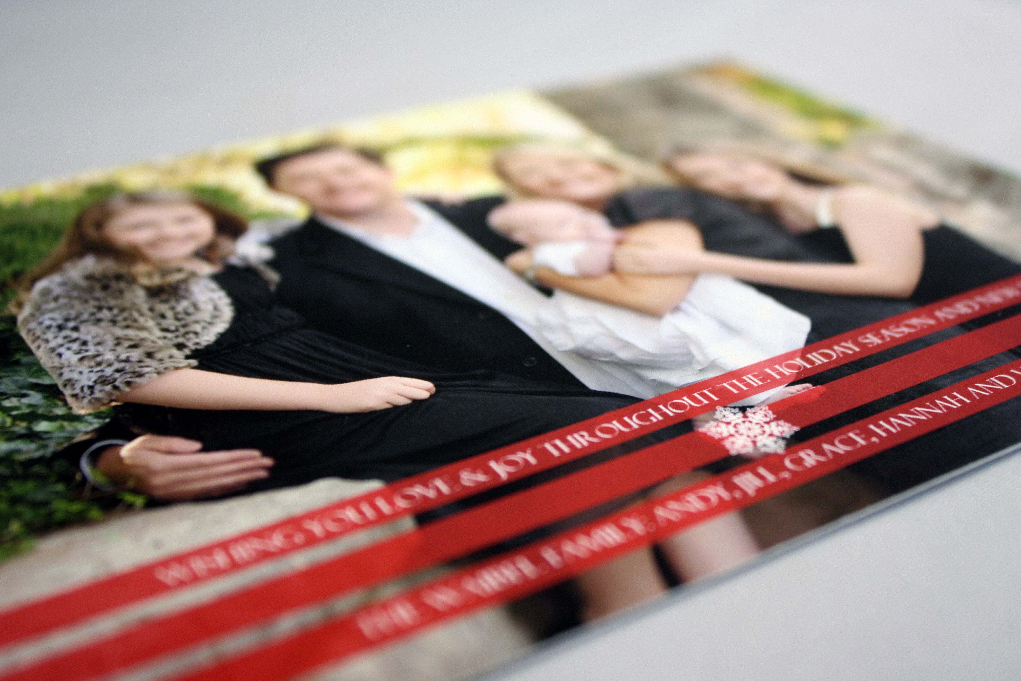
Red Stripes Photo Card
Another by Tag and Co., this holiday greeting features a full bleed photo with a few red stripes across the bottom where the text is placed in reverse type. If you have a professional quality photo, let it speak for itself by keeping the photo as the main focus.
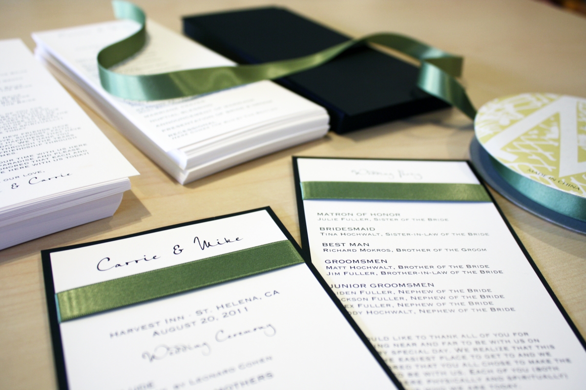
Carrie + Mike
Napa Valley here they come! Carrie and Mike’s invitations were from our custom line, Envelopments, and featured a 7×7 square black linen pocket invitation with a wasabi green accent layer, classic white top layer and enclosure cards, and a green satin ribbon. Since this is a destination wedding, they made sure to include plenty of information about Napa Valley, including travel and accommodations info, and they even planned wine tastings for their guests throughout the weekend’s festivities. They chose a simple format for their program, featured here- a 4×9 black linen card with classic white stock mounted on both sides. The ribbon band added texture and color, and provided a beautiful visual break in the design. Cheers!

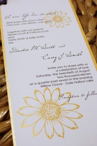
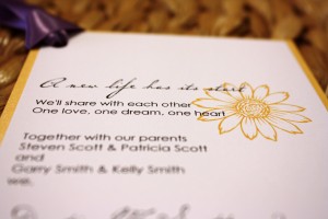
Casey + Dustin
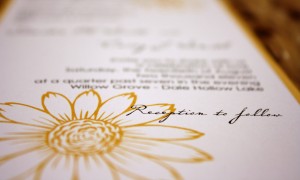
This was a last minute wedding we pulled together this week (the wedding is in 10 days!) Since we had a pretty short window to work with, we used yellow topaz metallic card stock off the shelf, a classic white top layer, and then added a cool script and sunflower graphics. We tied it all together with a corner ribbon knot. I think it came together nicely, and just in time for a sunny August wedding.
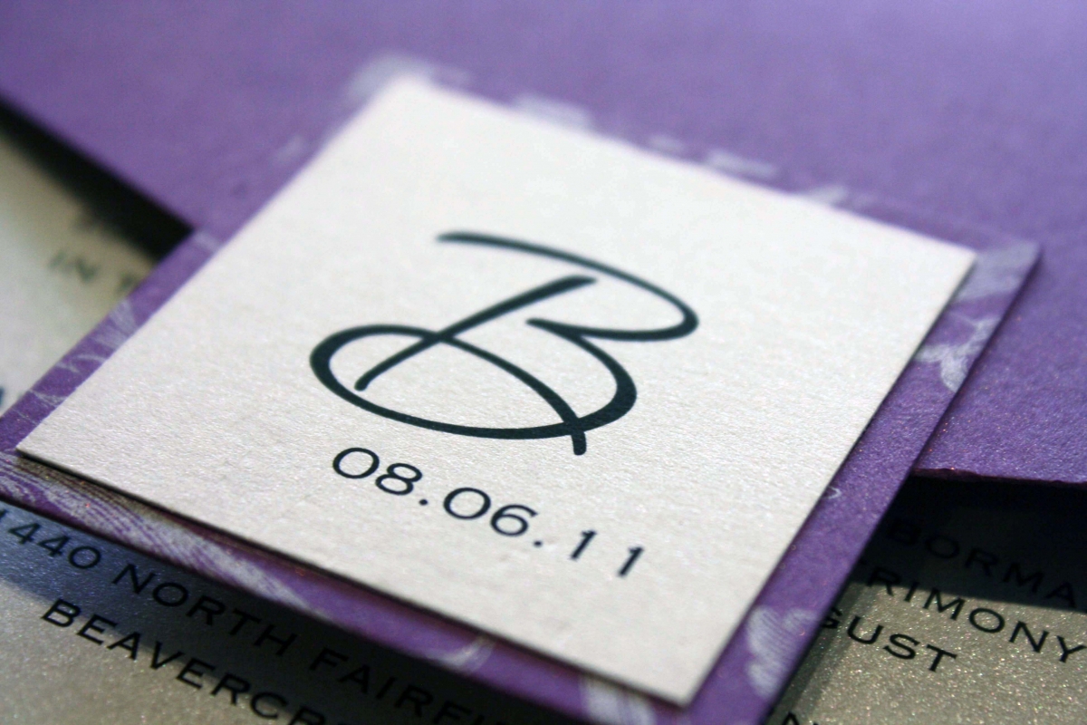
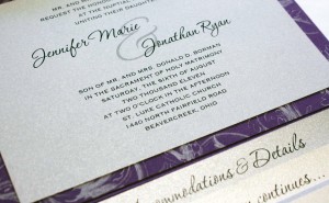
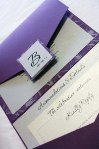
Jennifer + Jon
Purple and silver were HOT in 2011- I can’t count how many weddings we did in this color palette! Jennifer and Jon liked the custom line because it allowed them to choose exactly the perfect shade of purple, pair it with a silver and purple plume pattern to add formality, and finish it with a satin ribbon and two-layer seal as the icing on the cake.
Jennifer added a nice touch on their accommodations card by adding “Jenn and Jon’s Favorite Things in Dayton,” a list of their favorite spots in town including restaurants, hangouts, museums and hot spots every visitor to the Gem City must see. I often remind brides that the wedding invitation isn’t just a representation of the couple but a source of valuable information for their friends and family, so they can ensure that their wedding day is as memorable for their guests as it is for the happy couple themselves.

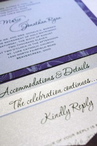
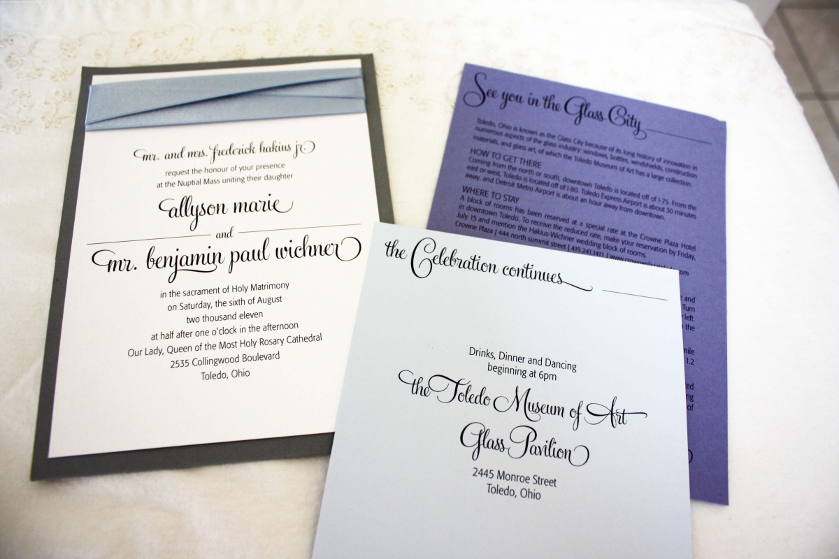
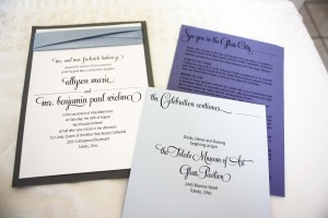
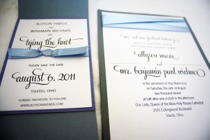
Allyson + Ben
This was an extremely meaningful invitation because it was for my very first intern at The Envelope, “Awesome Allyson” from UD. It was only a few months after we opened, and I didn’t even know I needed an intern until Ally convinced me of all the reasons why she should come to work at the shop- and I’m so glad she did because for the next six months we had an absolute blast (and got a little bit of work done at the same time). Since then she graduated from UD, got a job at Proctor and Gamble, and got engaged to the love of her life. It’s crazy to think that we first met five years ago, but over the last few years we’ve stayed in touch and become great friends.
Ally’s invitations were a collaborative effort- she used her super sweet design skills to layout the save the dates, invitations, menus, and programs. We ordered the paper and did all the printing. She and Ben spent weekends prior to the wedding diligently assembling everything post-production, and made sure every detail was perfect, down to the ribbon they ironed and creased themselves on each and every invitation.
Their wedding was the first weekend of August at the Glass Pavilion in Toledo, which is part of the Toledo Museum of Art. Her wedding was fabulous and absolutely gorgeous – from the traditional Catholic mass in a breathtaking cathedral where both her parents and grandparents were married years before, to the glass-blowing demonstration that took place at the reception, right down to Allyson’s blue Manolos. I’m so glad I could be there to witness the marriage of such amazing individuals, and to take part in the preparation process with her as well.
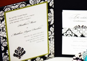
Heather + Matt
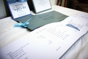
Heather and Matt got married at The Dayton Art Institute in November 2010. Their wedding colors were primarily black and white, with hints of green. To create a Fall Elegance feel, their ceremony featured amazing floral displays lining the aisle that included tall tree branches, clusters of hydrangea and glass votive candles hanging off the branches. The reception featured menu cards, place cards and table numbers that matched the colors and style of their invitations.
Emily + Scott
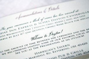
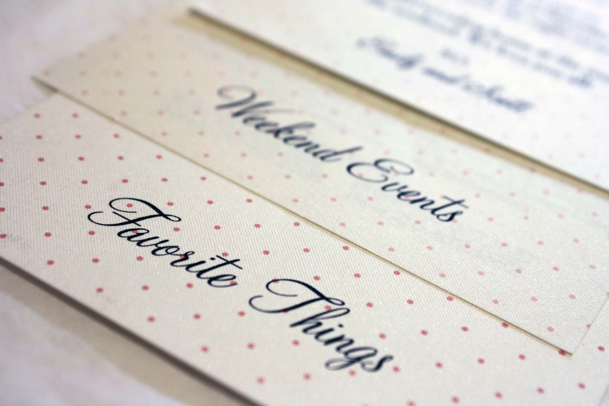
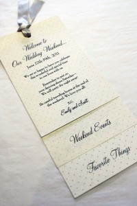
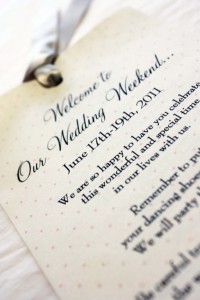
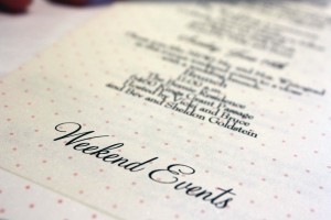
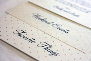
A wedding weekend schedule is a wonderful way to provide tons of helpful information for your guests regarding what to expect the weekend of the wedding. It’s a great place to include a schedule of weekend events, including a “meet and greet”, golf outing or post-wedding brunch, as well as other area information such as local restaurants, favorite coffee shops, museums and other area attractions. Keep in mind that a lot of your guests may be traveling from out of town or out of state and won’t be as familiar with the Dayton area, so giving them tips about what to see while they’re in town- even a suggestion for where to get a good cup o’ joe- will help them feel well taken care of and right at home. The wedding weekend schedule is also a convenient place to list the contact information of the wedding coordinator, or parents of the bride and groom- whoever needs to be available to answer logistical questions during the weekend of festivities. These schedules are typically put in guest bags at the hotel, or left with the concierge under the name of the wedding block so guests are presented with one upon checkin.
Emily and Scott included a heartfelt personal note to their guests, welcoming them to their wedding weekend, as well as a schedule of the weekend’s events and a list of their own personal Dayton favorites. Their guests appreciated the effort Emily and Scott and their families put in to make them feel welcome, and the wedding weekend went smoothly, down to the last detail (which even included Hershey kisses with personalized tags from the happy couple).
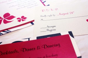
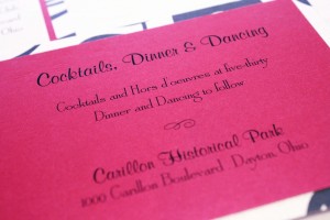
Lisa + Matt
Lisa’s 5×7 pocket fold invitation is one of the most popular styles we design for brides, due to its versatile size and overall design that allows up to four cards to be tucked into the pocket. Lisa’s invitation was clean and classic with a more modern twist since we used nearly all Roman fonts- she didn’t want any frills – no ribbon, no swirly scripts, nothing fancy. The one thing she knew she wanted was a watermark of the Carillon Park Bell Tower on the seal on the outside…but no matter what we tried it just didn’t look right, so I came up with another layout idea for the seal instead, using her and Matt’s initials and a decorative ampersand…and she loved it. This is still one of my favorites to this day because of its simple yet classic look that is dressed up ever-so-cooly with the patterned pocket.
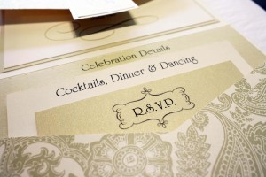
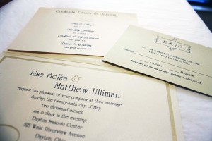
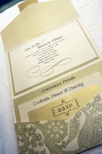
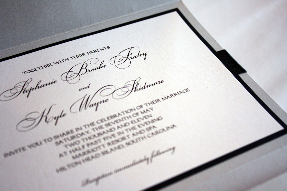
Stephanie + Kyle
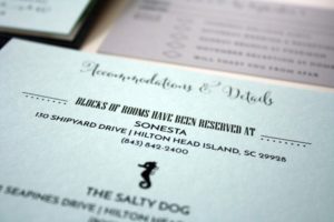
Silver. Black. A script with lots of swashes. Double-faced Midori satin ribbon. Add those ingredients together and you have the recipe for an elegant formal wedding invitation. Stephanie chose a silver metallic pocket invitation in a classic 5×7 size for her Hilton Head destination wedding because she wanted to make sure people knew it would still be a relatively formal event despite it being at the beach at sunset. We work with a lot of destination brides, and most of the time we go with something in tropical colors, or perhaps use a palm tree graphic. This invitation was stunning and let her guests know what to expect (so they wouldn’t show up to the wedding in shorts).
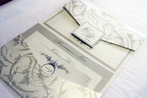
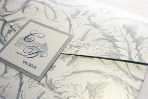
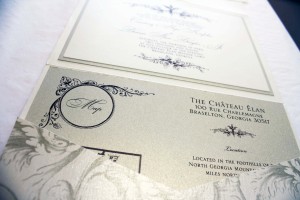
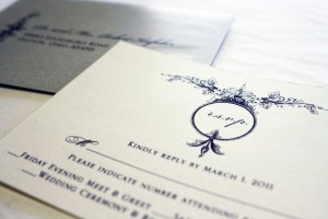
Courtney + Dennis
The Chateau Elan in Atlanta was the perfect setting for Courtney’s “rustic elegance” wedding, and she needed an invitation that fit the feel of the wine cellar where the reception would be held. Courtney also wanted to make sure to include plenty of resort and leisure information about the Chateau for her guests who would spending a long weekend there, so we chose a gold and raw silk ecru pocket fold invitation with a vintage plume pattern that held an in-depth accommodations card, reply card and weekend celebration events card. We printed the invitations on a combination of raw silk ecru and pale gold cards, and for Courtney’s seal on the outer flap of the pocket, we used a simple watermark of the Chateau paired with a monogram and the wedding date. This invitation set a gold standard, literally, for many invitations to follow with its formal scripts, neutral gold and ecru color palette and classic elegance.
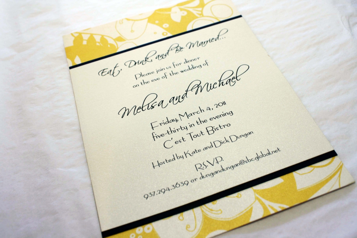
Eat, Drink and Be Married
The rehearsal dinner is an important part of the wedding weekend and as such, should have its own invitation to coordinate with the look and feel of the rehearsal dinner venue. Melisa and Michael’s dinner was to be held at C’est Tout, a French bistro in Oakwood that uses a lot of yellow in their French country decor. The mustard yellow in this eclectic pattern was a perfect way to tie in the colors of the restaurant with the overall feel of the event and the style of the couple. Melisa and Michael also opted to use large 12×12 sheets of the yellow patterned card stock as chargers at the place settings that evening, and we did menus to coordinate.
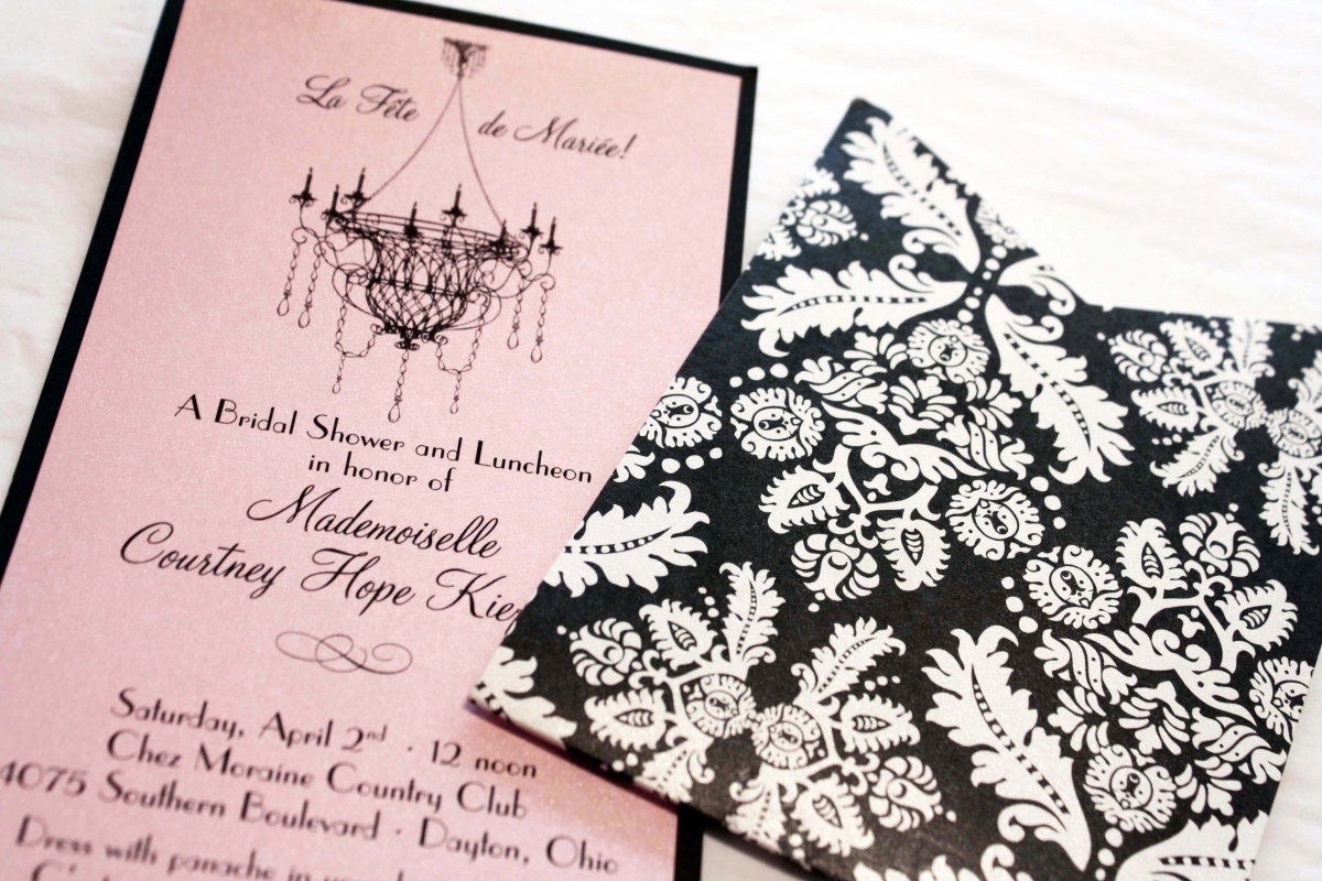
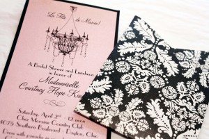
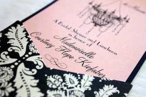
Courtney’s Bridal Shower
Oh La La! Before her Chateau Elan wedding in Georgia, Courtney’s friends and family threw her a French-themed bridal shower. We wanted to go ultra feminine with the invitations so we used a vintage damask black and white portable pocket with a brocade pattern, as well as a black chandelier graphic that was designed to sit at the top of the invitation so it would be seen while the insert was still in the pocket. We printed the French-English verbiage onto a tourmaline metallic card, mounted it onto a black backing and voila- c’est magnifique!
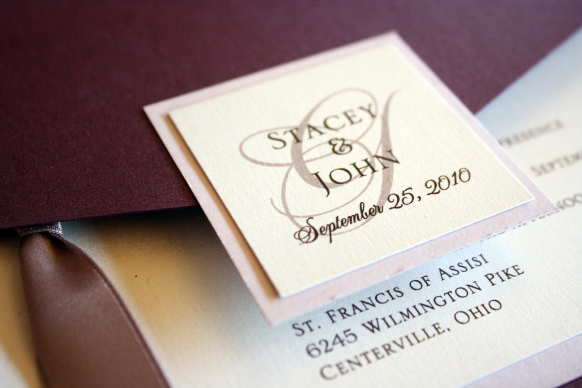
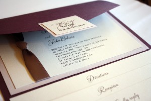
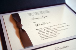
Stacey + John
Eggplant and taupe are a warm and inviting combination in this colorful yet classic pocket invitation. Lots of metallic layers, including an understated lavender layer and a gorgeous taupe ribbon complete this pocket package perfectly. Their wedding program was a coordinating booklet using the same papers, fonts and colors.

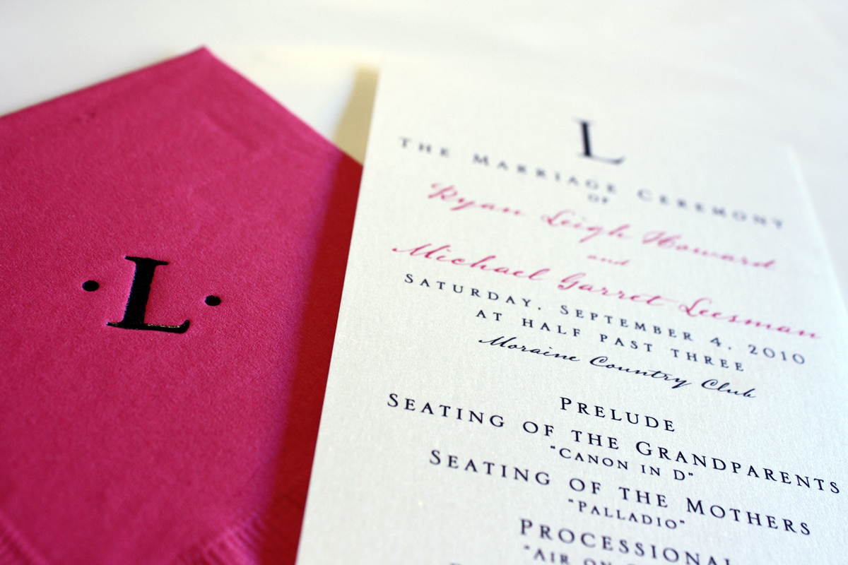
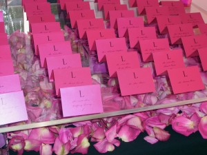
Ryan + Mike
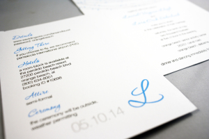
My good friends got married at Carillon Park and had a glamorous wedding bathed in pink and silver, complete with a swanky lounge area and outdoor chandeliers. They paid attention to all the details and provided an incredible event that left their guests talking about it afterward. Their programs were simple 4×9 white micah cards with a monogram “L” at the top, and their place cards and cocktail napkins were hot pink to match.

Amanda + Ben
Sometimes simple is the way to go…three layers: chocolate brown, pale gold and a chartreuse accent and fun, contemporary fonts.
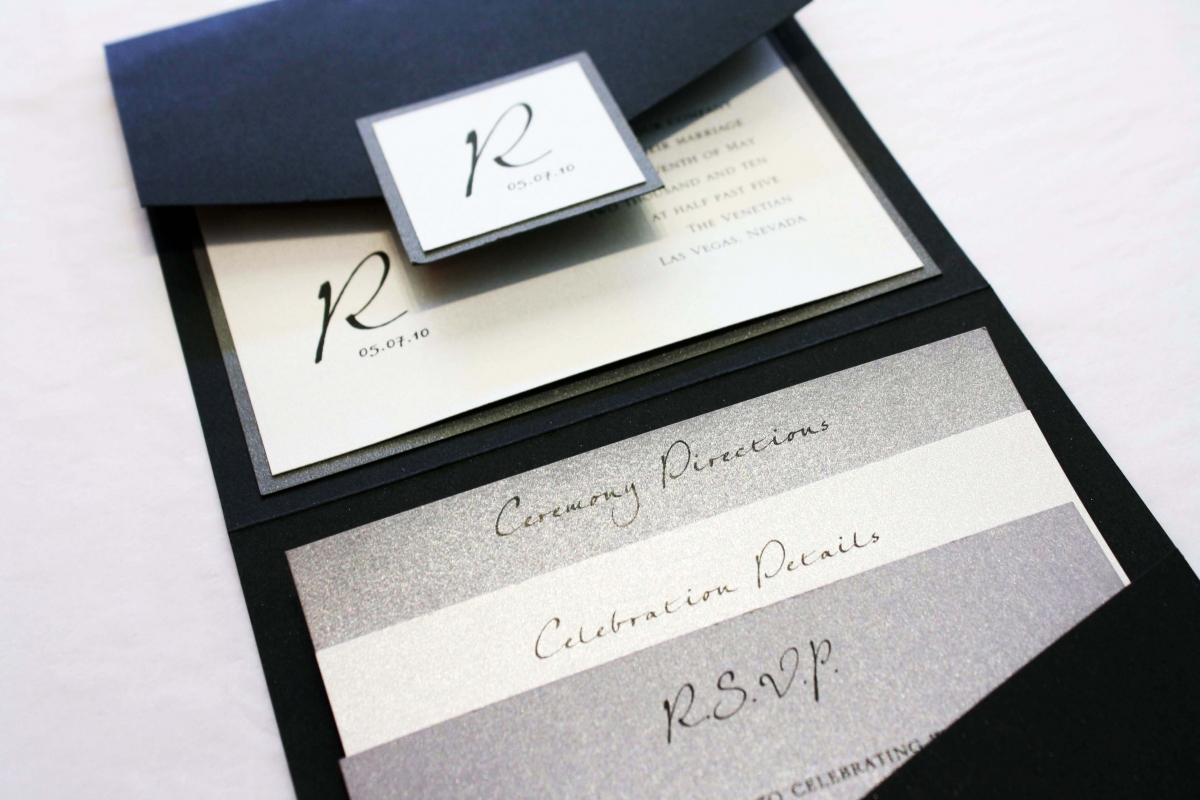
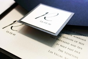
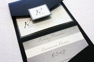
Laurie + David
Laurie and David had fun with the process from the first day… they were planning a Spring wedding in Las Vegas and wanted the invitations to feel formal and elegant, yet still “like Vegas” and not like a traditional wedding invitation because they still wanted to have fun with it.
The ceremony took place on the bridge at the Venetian, with a reception to follow at Caesar’s Palace. We used a more compact pocket invitation in a 5×5 size, with several different shades of silver to make it pop. Laurie was so happy with her invitations that she brought a friend in to see us in 2012 for their wedding invitations, as a gift to the couple.
Megan + Greg
The daughter of one of my favorite customers got married to the love of her life, and they made every effort to make sure the invitations (and the wedding) were a perfect example of who they are as a couple, right down to the surprise after-hours hot wing bar that the mother of the bride planned as a surprise for the groom. I like that they kept the invitation colors duo-tone, using only Tiffany blue and white to keep it feeling crisp and clean.
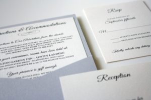
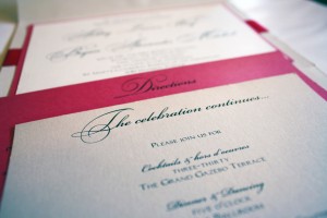
One of the reasons pocket fold invitations are so popular is that they allow several enclosure cards to be neatly stacked in the pocket, which creates not only a handy packet of information for the guests, but a visually pleasing invitation as the headings sit evenly-spaced above one another, announcing details of the reply, reception, and directions and accommodations.
Ashley + Christopher
Winter Wonderland: Ashley and Christopher were planning a winter wedding in Wintersville, Ohio and chose this 5×7 z-card design, a unique design that shows off plenty of the black and gold pattern surrounding the invitation. What makes this invitation different than most is the band wrap on the right panel that houses three 3.5×5 cards: a reply card, reception card and directions card. The finishing touch is the monogram “M” on the seal, accompanied by their wedding date. The result? Gold and black winter wedded bliss.
Red and Green Flourish
This was one of my favorites of the holiday designs Tag and Co. brought out a few years back. I love the combination of the vibrant red and green pattern contrasting with the black and white photos.
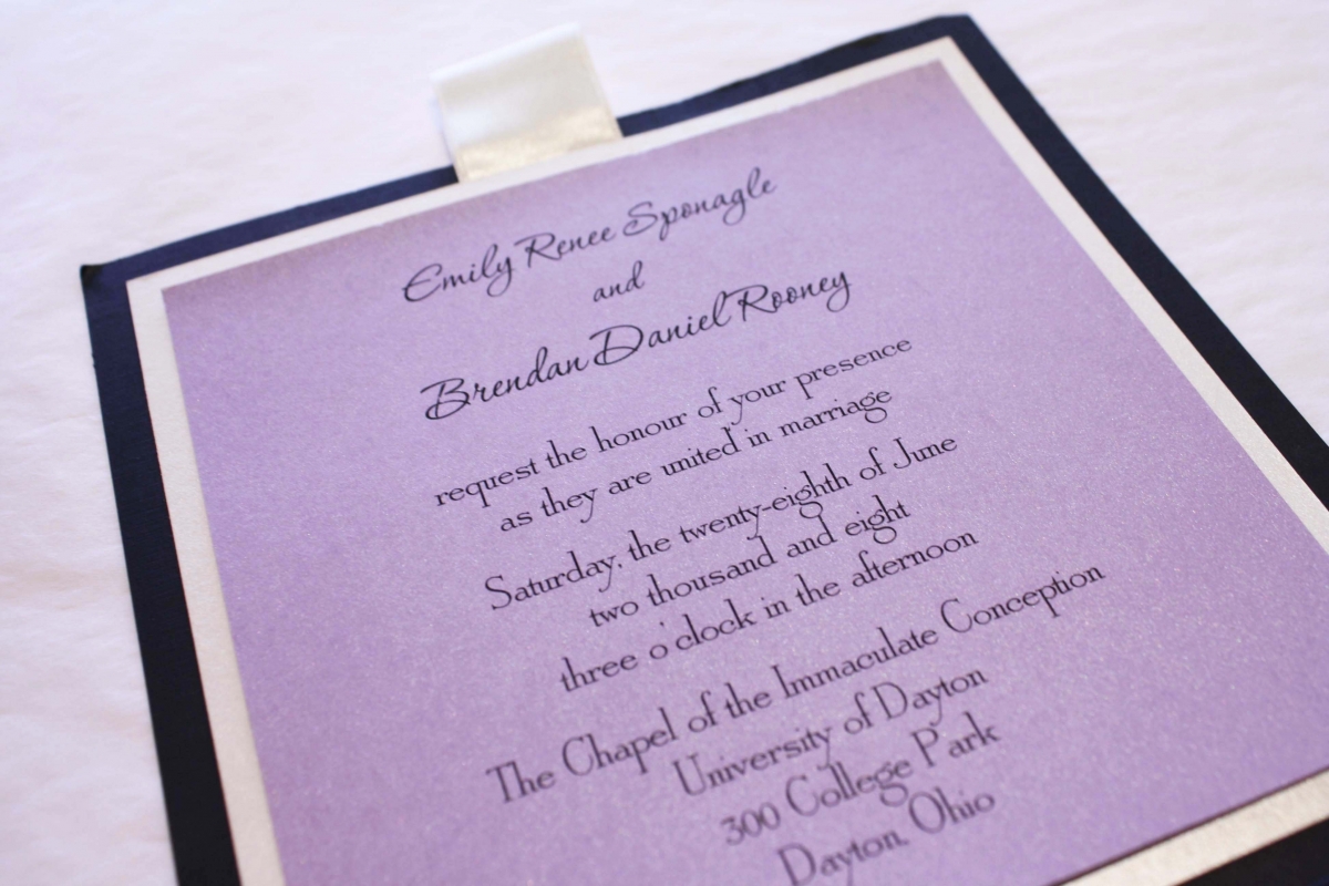
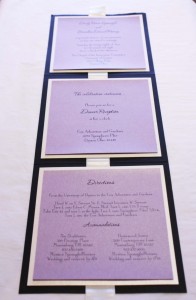
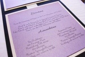
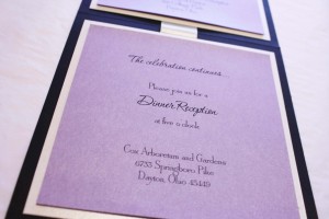
Emily + Brendan
An oldie but goodie, this purple and black 5×5 z-card from a 2008 wedding still hangs on the wall of fame today because a) it’s purple color continues to draw the eye and b) it’s a great example of a different way to combine many pieces of information into one design. The invitation is printed on a purple card that is mounted to a white backing on the top panel of the z-card, while the reception information and directions follow suit on the second and third panels. We placed a RSVP post card in the center of the packet prior to stuffing into the mailing envelopes so when the guests mailed back their one loose card, they were left with an all-in-one invitation that got them where they were going, and let them know what to expect for Emily and Brendan’s wedding.
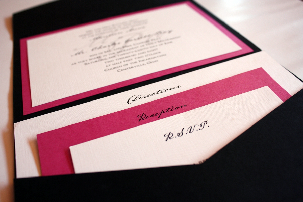
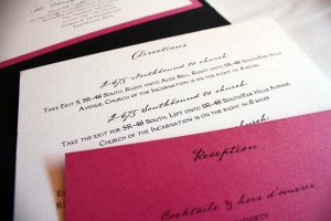
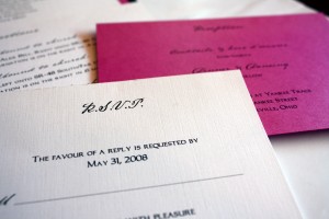
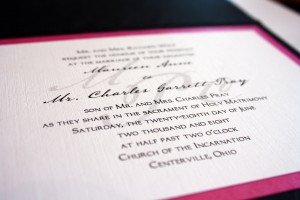
Maureen + Charles
Maureen’s pink and black invitation was a pocket-style with three enclosure cards. We kept the invitation fairly simple, with a modest monogram watermark screened behind the invitation text. She wanted to use primarily black and white with punches of hot pink for style.

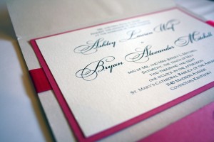
Ashley + Bryan
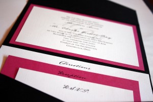
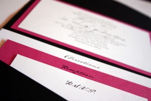
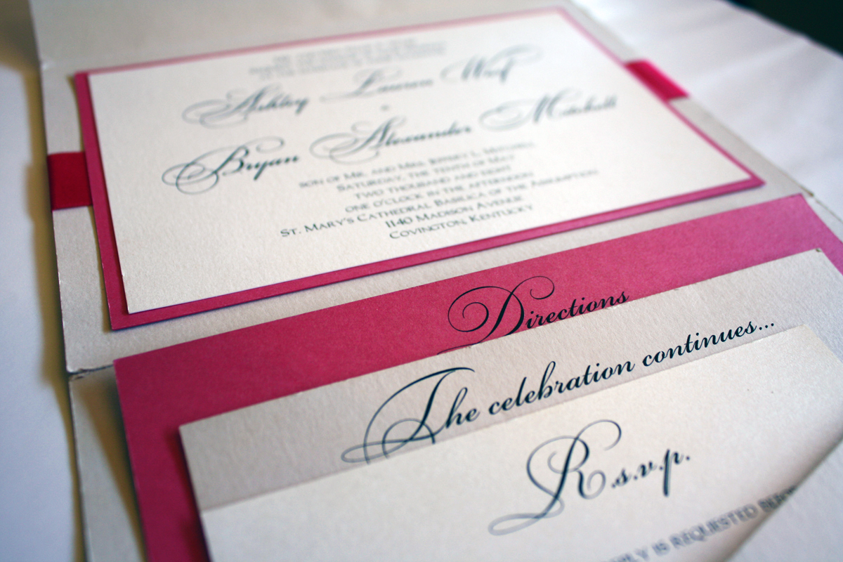
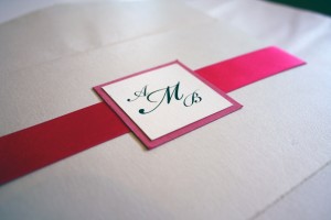
This was the era of the 5×7 pocket fold, which is why you see several of them in our gallery, such as Stephanie and Kyle, Amanda and Matt or Jessica and John. This type of folding invitation became the go-to style for a while because brides would see one on display in the shop, love the beauty and practicality of it, learn they could customize the colors, and voila! Their custom wedding invitation is lovely and practical, large enough yet compact when folded, and is tailored to the colors of their wedding. Having a lot of samples for customers to look through in the shop has been both a blessing and a curse: it allows the creative process to be streamlined for those brides who have a difficult time starting completely from scratch, but it can also create “style ruts” from a design standpoint where we seem to keep creating the same invitation repeatedly. Regardless, Ashley’s invitation was pretty in pink and perfect for her Spring wedding set in a cathedral in Covington, Kentucky.


Morgan + Christopher
Morgan was one of those brides who amazed me because she made planning a destination wedding seem like a breeze, on top of all of the other responsibilities she was tackling in her life (not the least of which were the twins she nannied, who accompanied her on several trips to the shop). Morgan liked the modest size of the 4×5 pocket fold because all she needed to include was a small directions card and a reply post card. The palm tree graphic and orange and yellow color palette made this invitation a southern beauty.
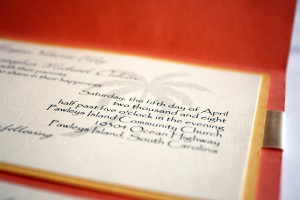
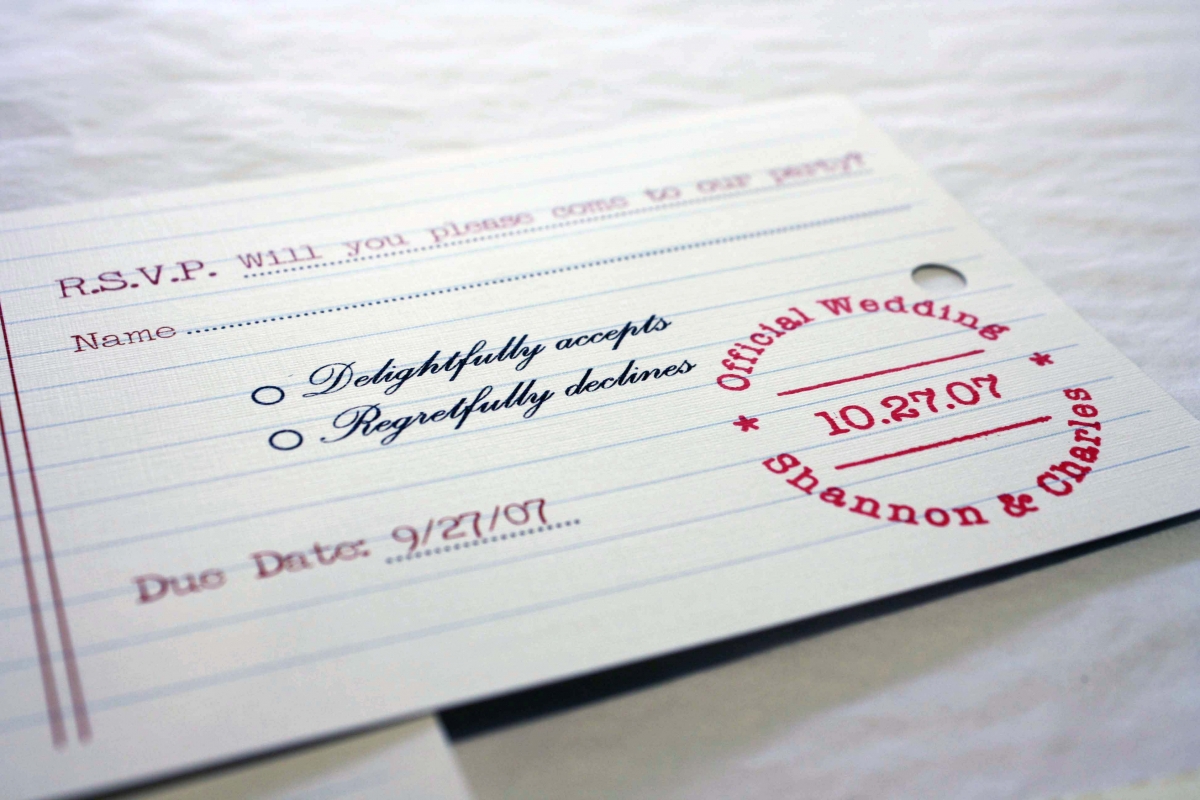
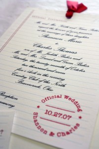
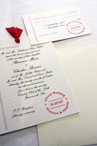
Shannon + Charles
A school-themed invitation is a unique way for two teachers to announce their upcoming nuptials… We created college-ruled card stock, school days verbiage (check out the RSVP card with a “due date”) and a cool red date stamp, and tied it all together with red gros grain ribbon. The invitation and reply post card were slipped into a simple portable pocket and an outer manila envelope and mailed to their guests. This invitation is an oldie but goodie for sure, as it was one of the first really creative invitations we did back in 2007 for a fun couple who wanted to take a risk with their invitations and express their personalities by choosing an invitation that truly represented who they are.
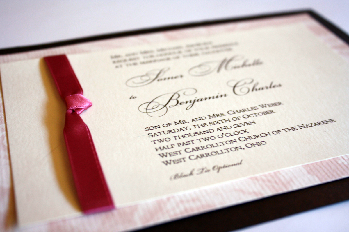
Somer + Ben
Somer and Ben chose a soft and feminine invitation with an Anna Griffin pink floral matte, paired with a rich chocolate shimmery brown and a dusty rose satin ribbon. The invitation design incorporated traditional fonts to keep with the traditional wording and feel of this classic and simple invitation.
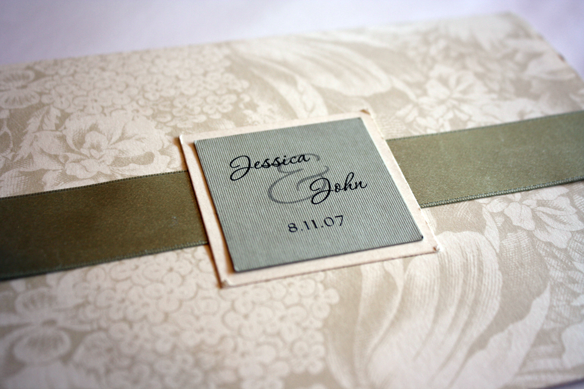
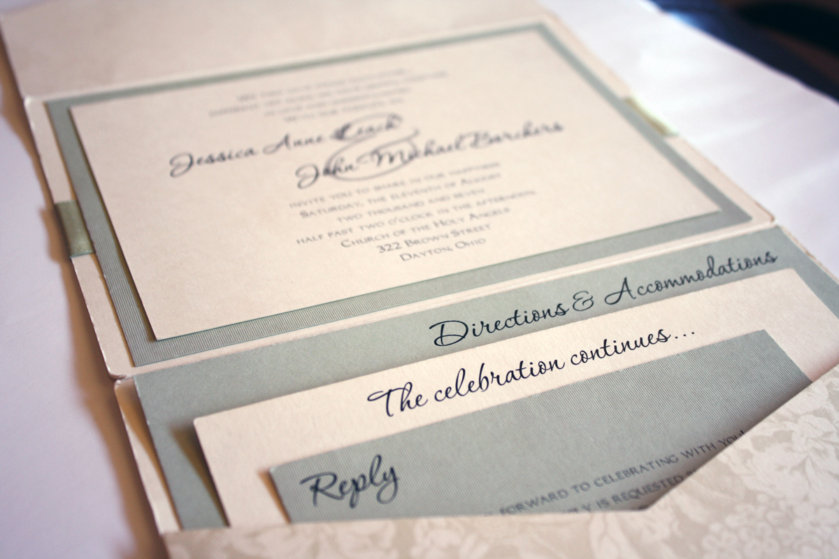
Jessica + John
Every once in a while we end up with an invitation that carries widespread appeal and once the finished product is hanging on our “wall of fame” we get multiple requests to duplicate it. Jessica and John’s invitation is one such example: they picked out this Anna Griffin ivory floral patterned pocket and used plenty of sage green as an accent for their summer wedding and the final design received so many compliments we duplicated it exactly at least twice that year. The soft sage and feminine floral pattern make this style the perfect Spring or Summer invitation.
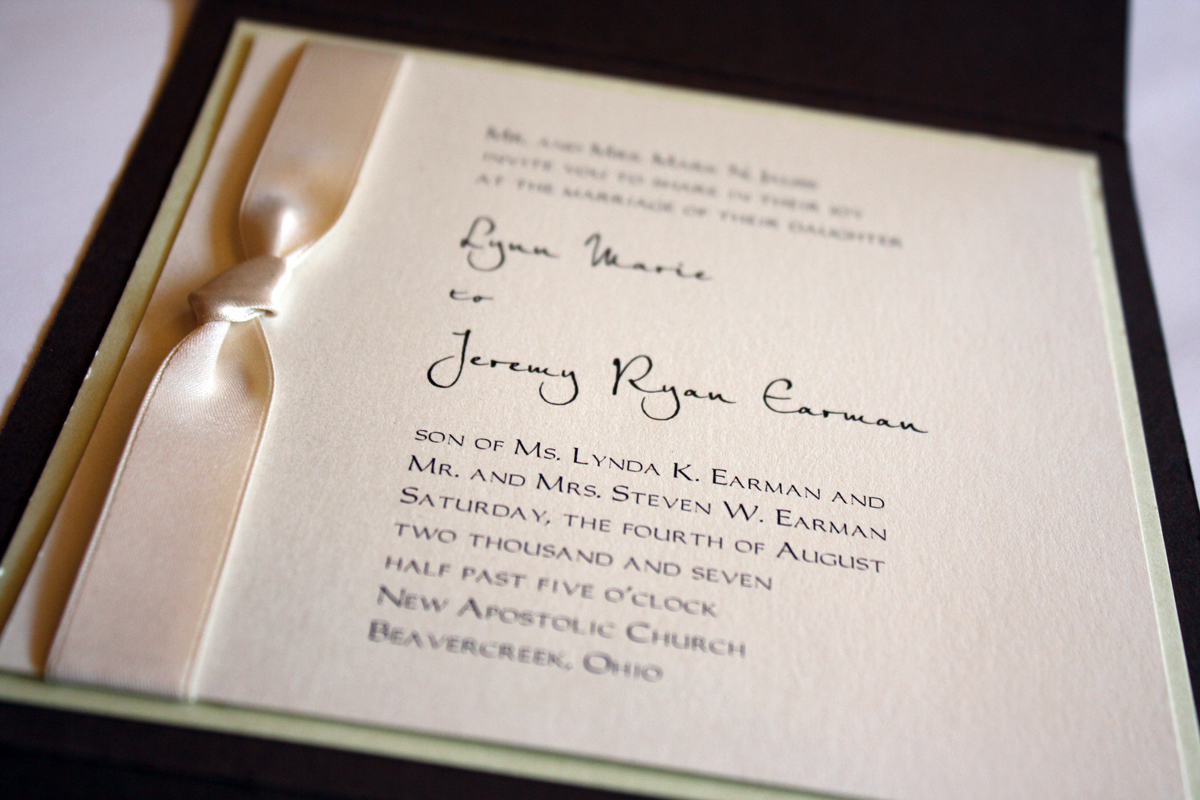
Lynn + Jeremy
Mocha-licious is the word to describe this pale lime and chocolate pocket fold invitation. Just a hint of pale green, a beautiful ivory satin ribbon and a cool script make this a perfect blend of contemporary and traditional.
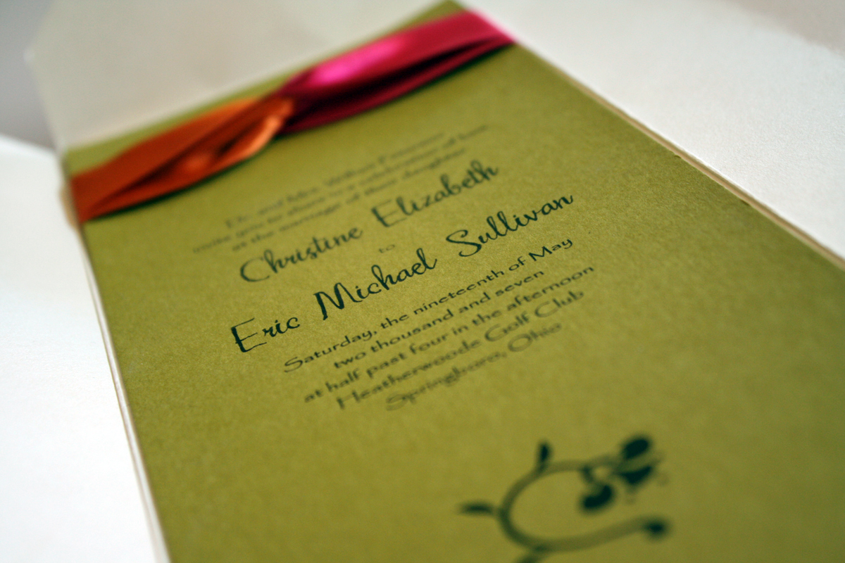
Christine + Eric
Play it safe? Not always. Sometimes with invitations you should take a risk: use a palette of citrus green, crisp tangerine and hot fuchsia; print on a bright color instead of white or ivory, and use a modern floral graphic and a non-traditional font. I love this invitation because it incorporates fresh colors into a cool folding design and draws the eye with the two-tone ribbon loop at the top of the card. The mocha ink works beautifully with these colors, and the heavy brush stroke of the script makes me actually not hate the other font, Papyrus as much.