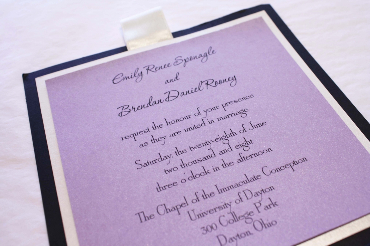
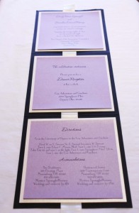
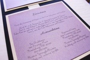
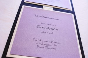
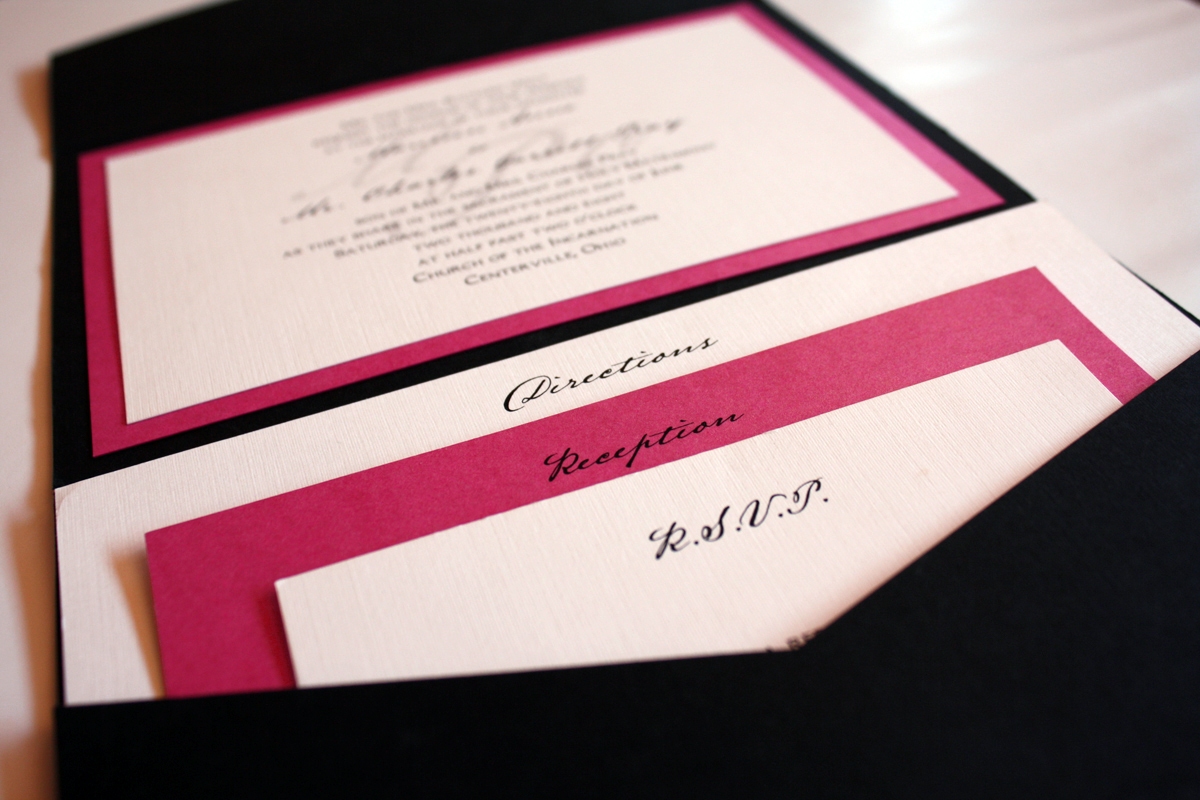
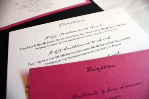
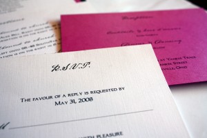
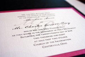
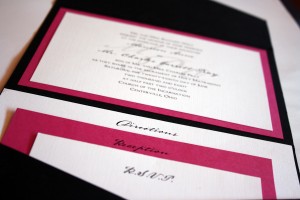
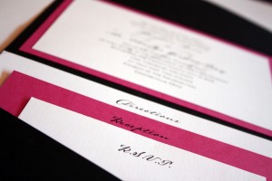
An oldie but goodie, this purple and black 5×5 z-card from a 2008 wedding still hangs on the wall of fame today because a) it’s purple color continues to draw the eye and b) it’s a great example of a different way to combine many pieces of information into one design. The invitation is printed on a purple card that is mounted to a white backing on the top panel of the z-card, while the reception information and directions follow suit on the second and third panels. We placed a RSVP post card in the center of the packet prior to stuffing into the mailing envelopes so when the guests mailed back their one loose card, they were left with an all-in-one invitation that got them where they were going, and let them know what to expect for Emily and Brendan’s wedding.