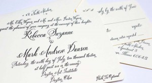
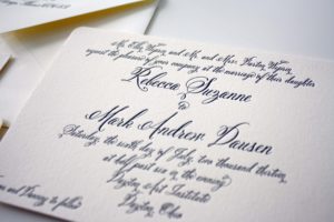
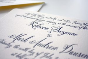
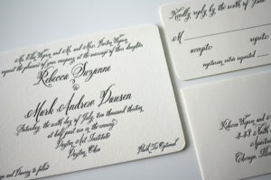
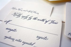
Becky planned a gorgeous, black tie optional wedding at the Dayton Art Institute and this traditional letterpress invitation in black and ivory was absolutely perfect for the occasion.
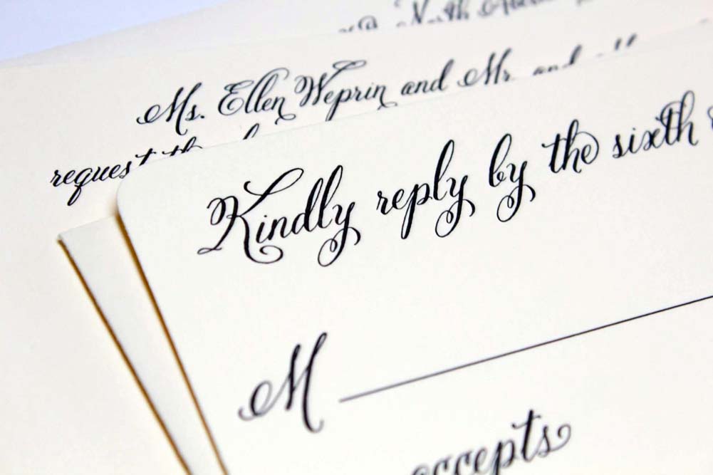
Becky planned a gorgeous, black tie optional wedding at the Dayton Art Institute and this traditional letterpress invitation in black and ivory was absolutely perfect for the occasion.

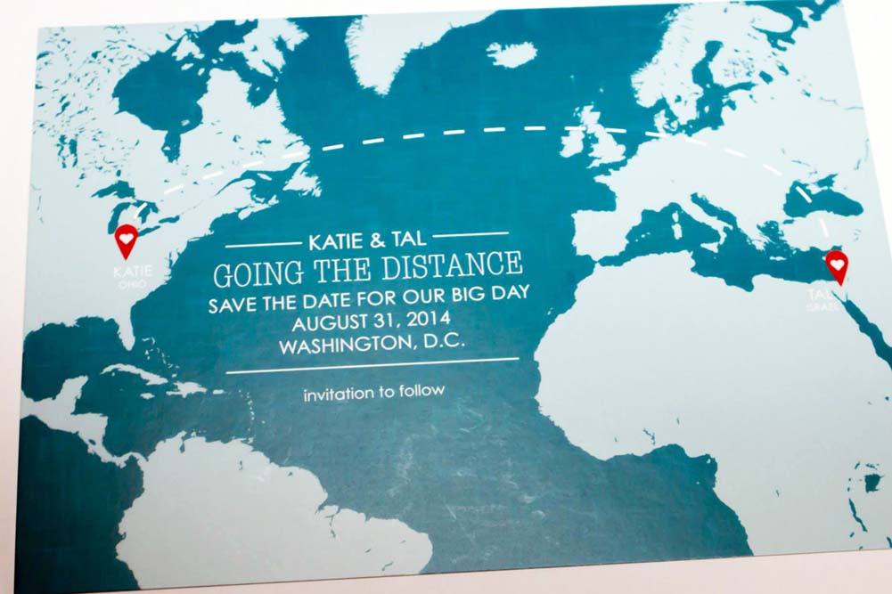
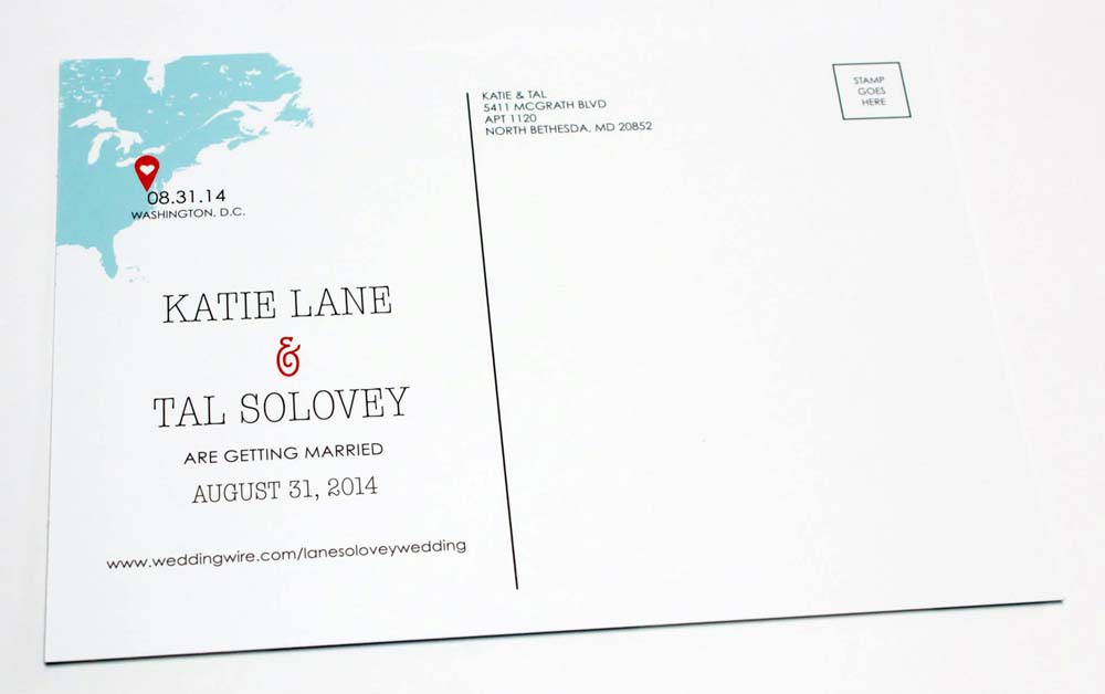
The universe brought them together across the miles…Katie and Tal decided to announce their wedding date with this unique save the date card that pinned their hometowns on the world map.
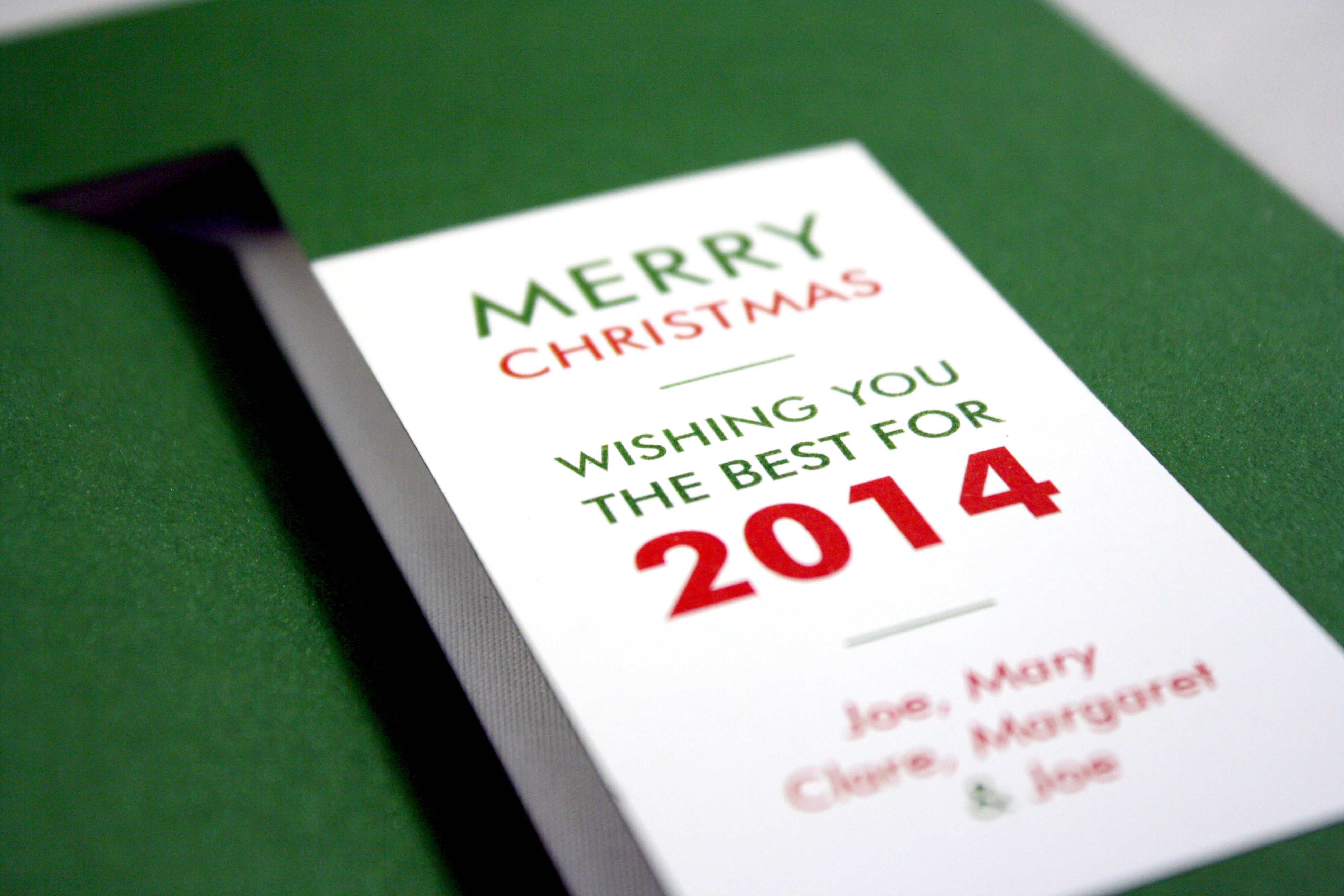
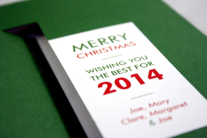
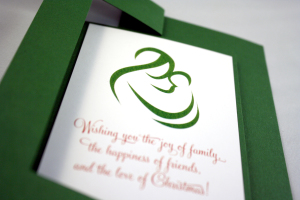
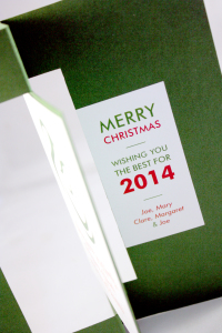
This green twist card has an abstract drawing of Mary on one side, and the family’s greeting on the other. They chose a modern sans serif font for the message and just a few pops of red.
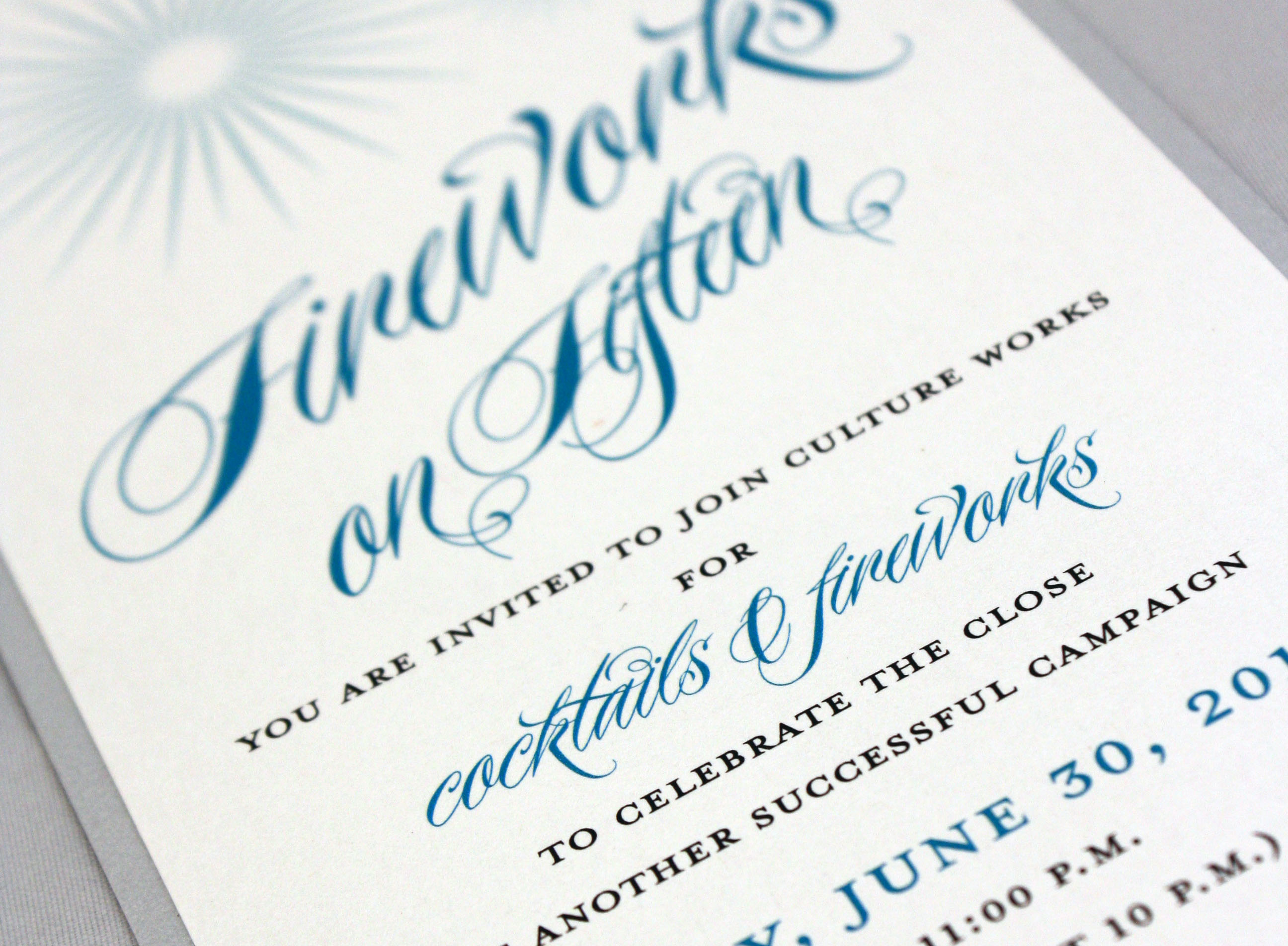
Festive invitation by a non-profit arts organization to the Dayton fireworks display
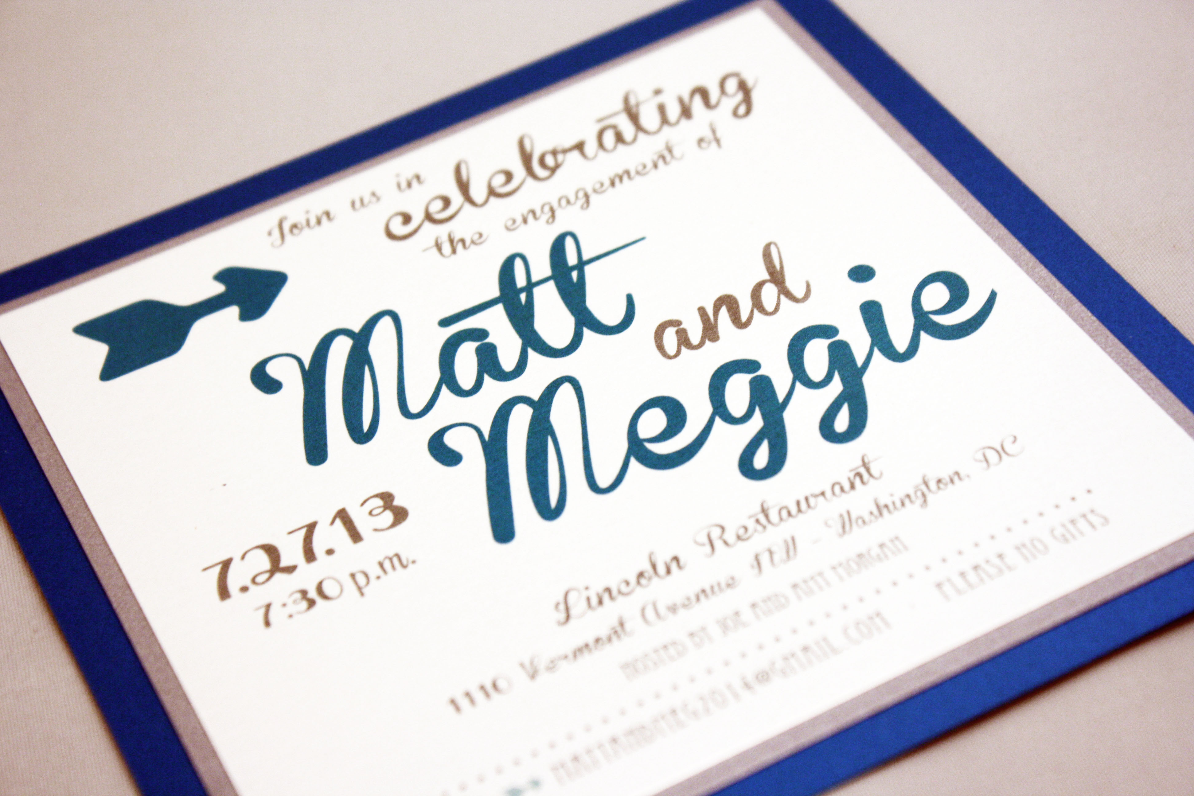
Three layers of metallic silver, peacock blue, and white, coupled with a playful oversized font give this invitation a contemporary lilt.
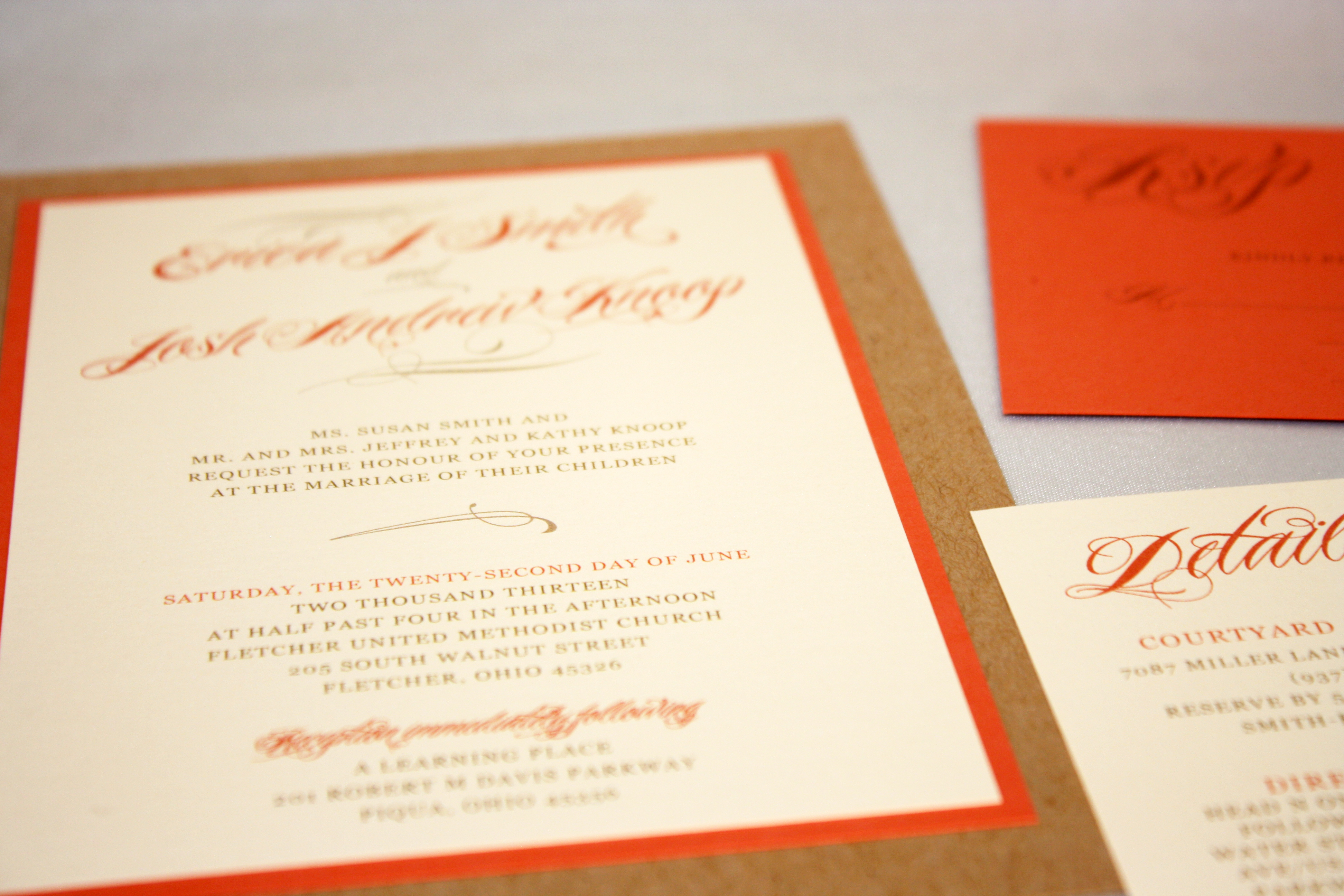
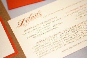
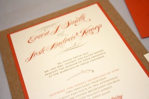
Natural kraft fiber paper and a deep coral stock make this earthy but formal invitation a stunner.

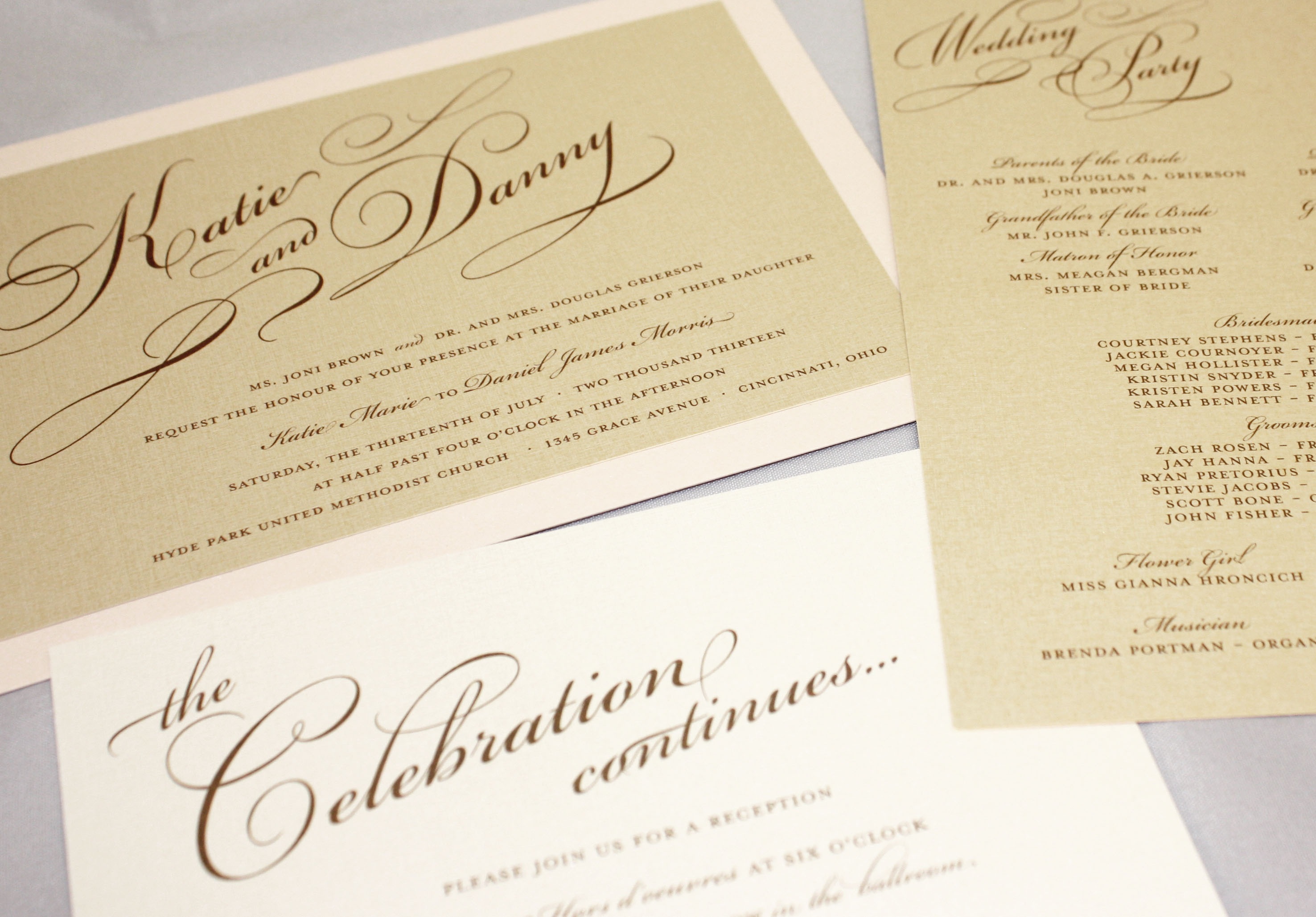
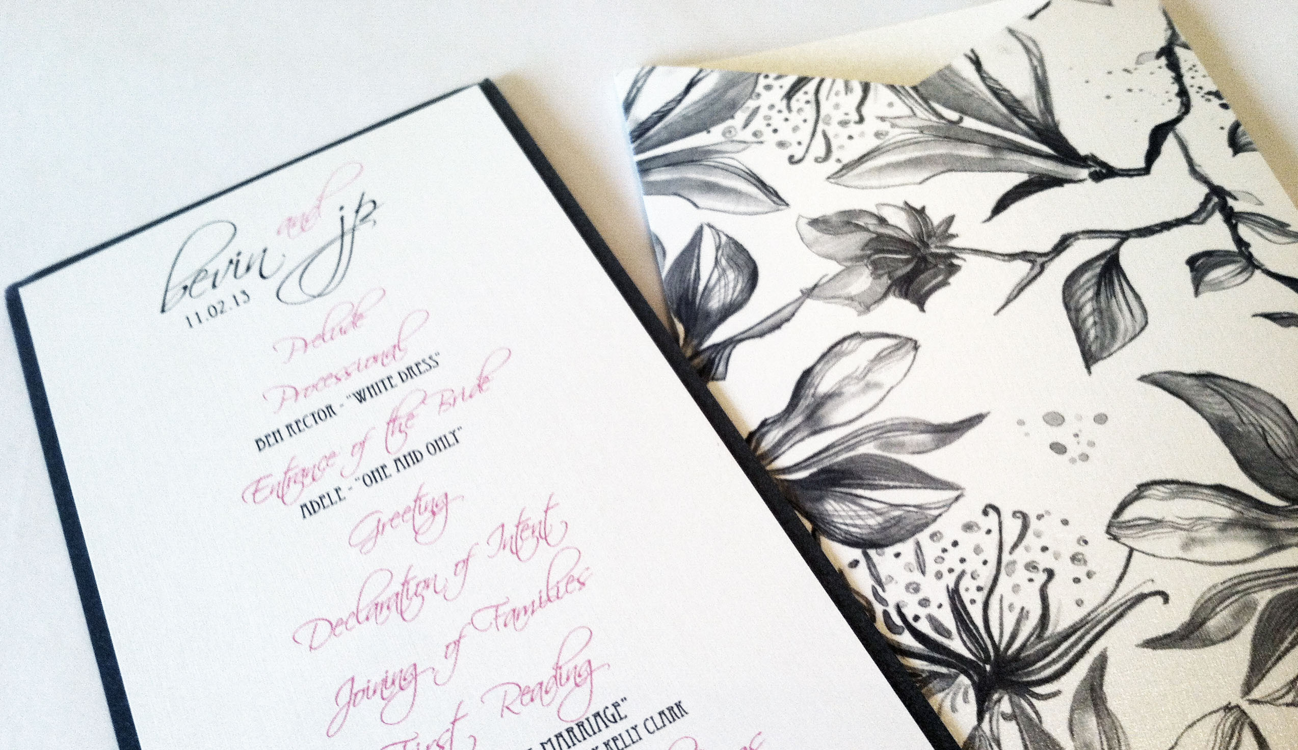
Simple yet elegant, this invitation in pale gold and blush pink uses a prominent script as the only graphic element, which we used throughout the ensemble as a recognizable element. This soft and feminine set includes a rehearsal dinner invitation, wedding suite, and program.
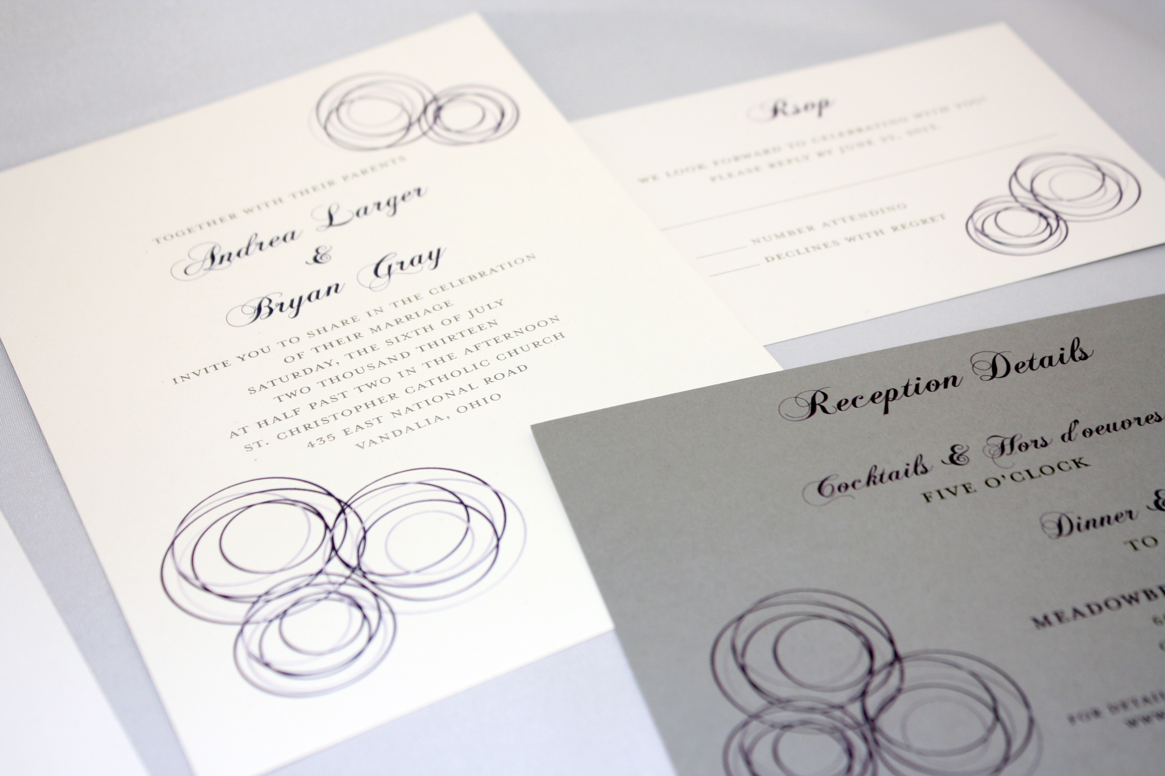
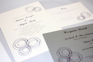
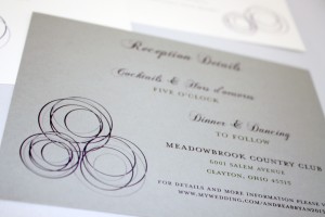
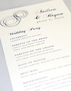
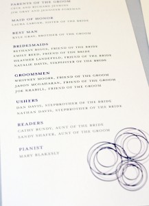
Concentric overlapping circles in shades of periwinkle, navy, and grey balance well with the traditional script.
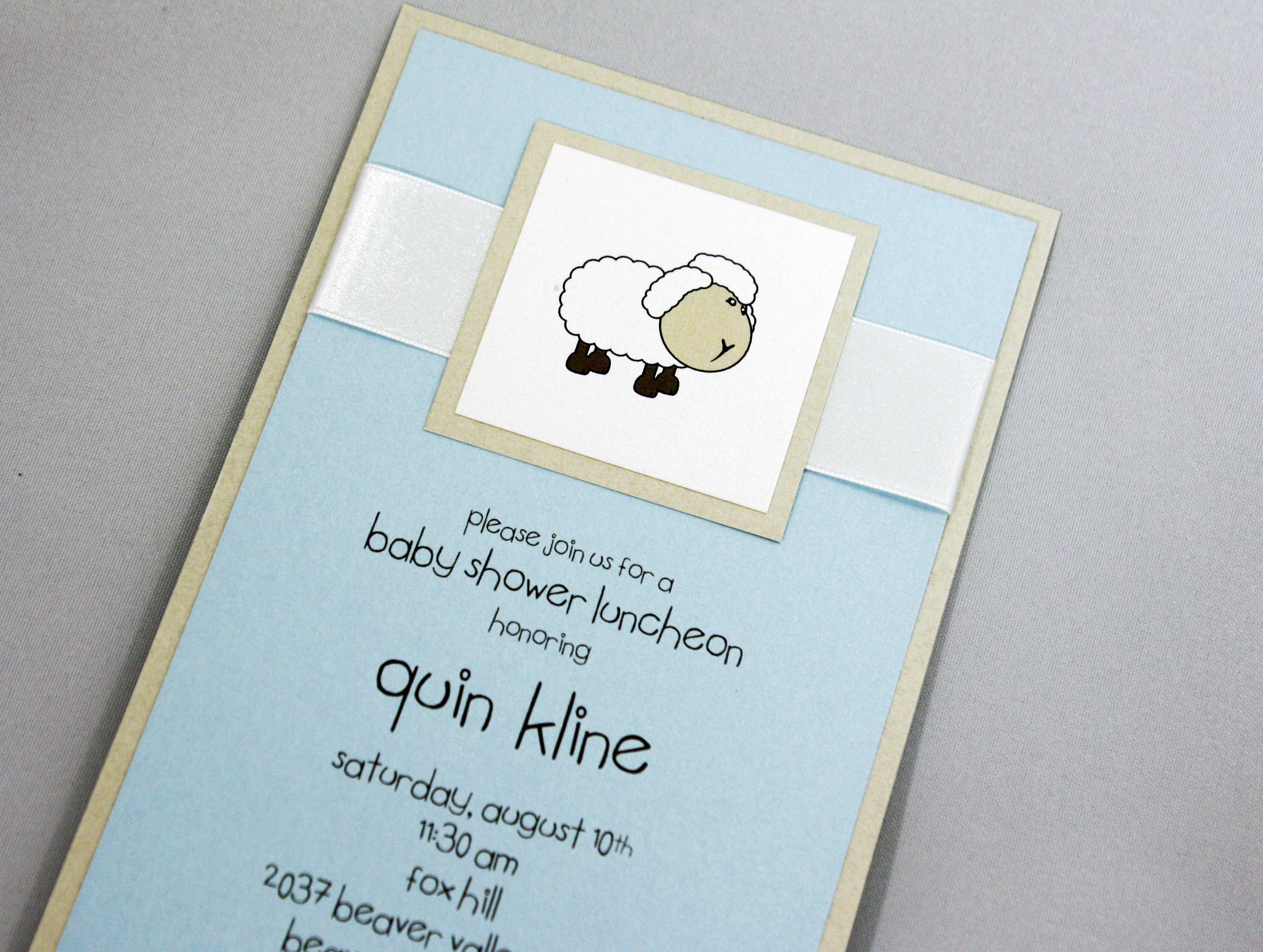
Oh baby! We loved putting together this sweet little lamb baby shower invitation with white satin ribbon, a less common tea-length size and a pale blue printed layer… the end result was perfect for the bouncing baby boy and mama-to-be.

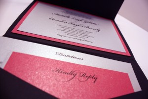
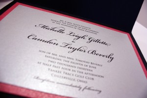
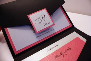
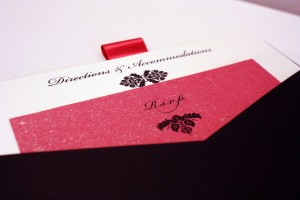
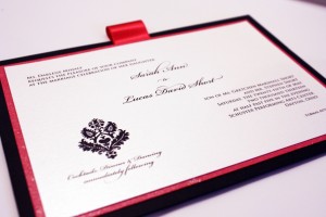
A classic black pocket invitation with a monogram seal in hot pink and silver with black ink.
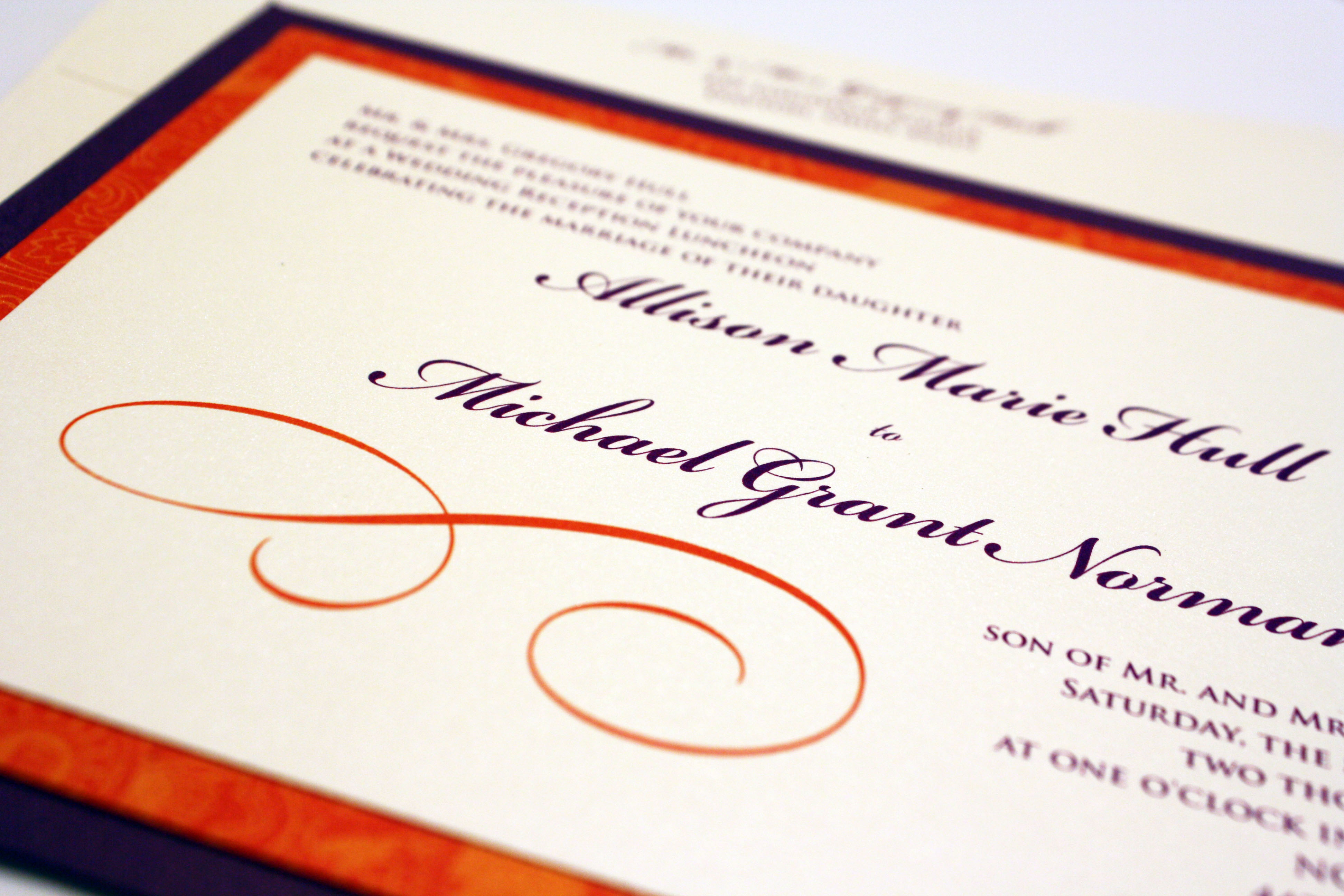
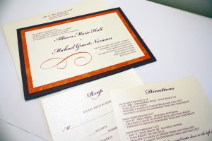
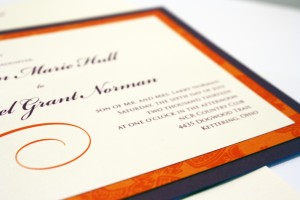
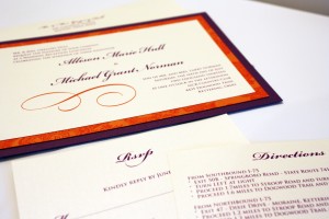
This unique combination incorporated purple and a bright orange pattern, but kept a formal font so as not to downplay the elegance of the occasion.
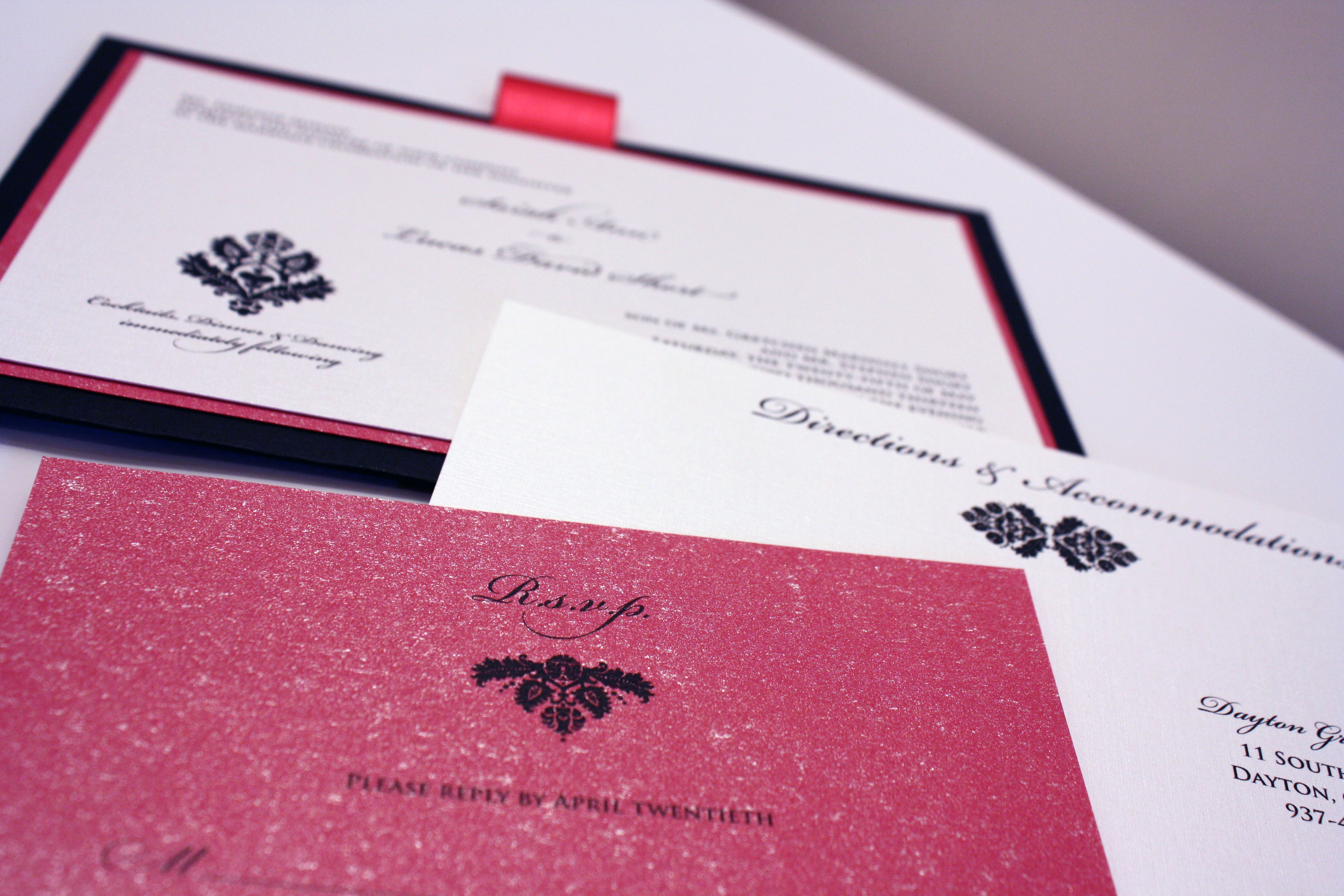
I never get tired of fuchsia and black together, and this pocket invitation didn’t disappoint. This sparkly invitation was for a spunky bride with a flair for style who “didn’t know what she wanted” but as soon as we pieced it together with her, she knew this was it. A few weeks prior to the Big Day we also printed coordinating menu/table cards using the same black damask graphic to restate the theme of the invitation at the event itself.
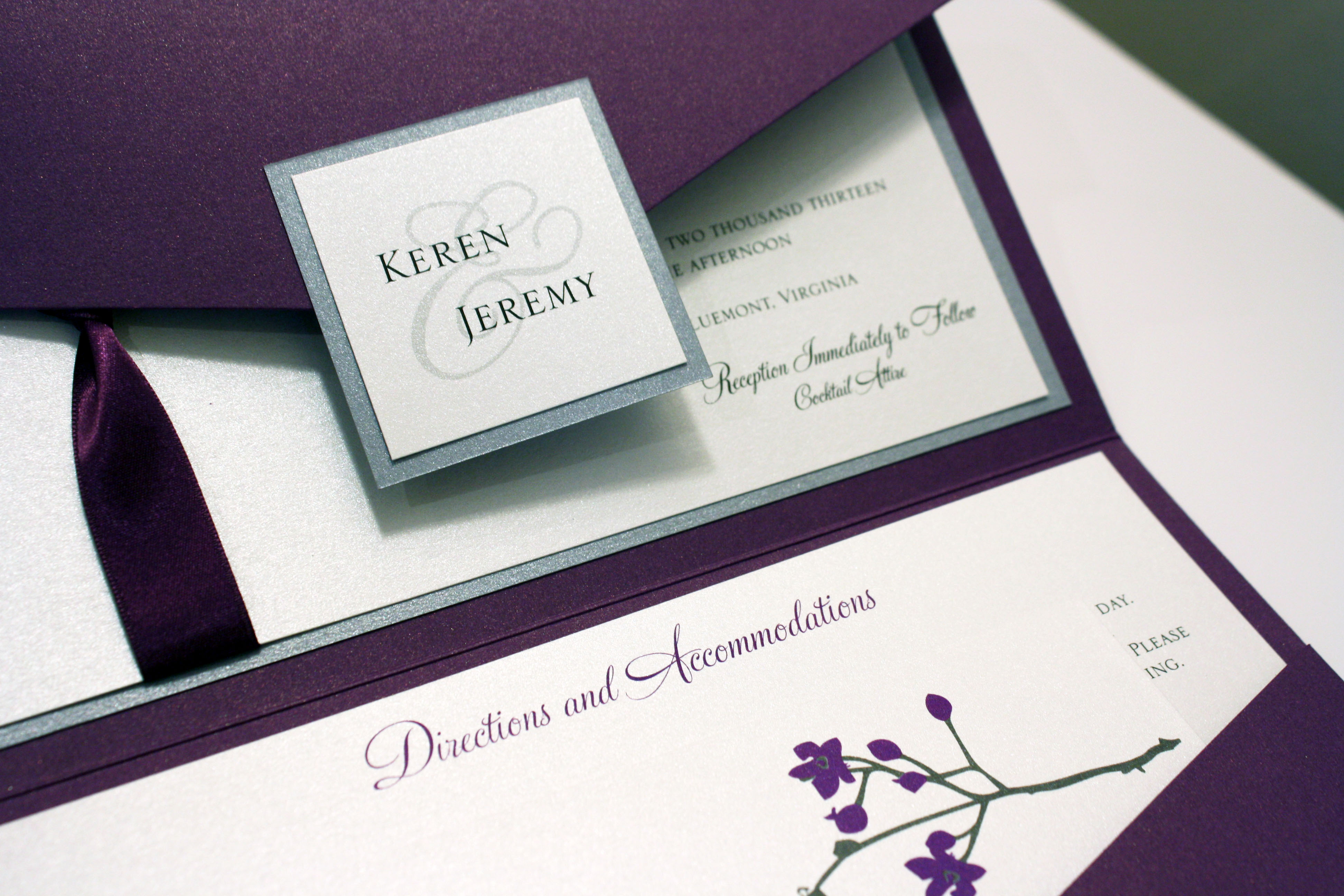
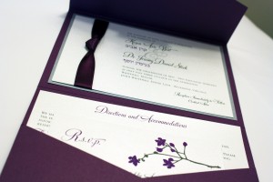
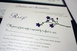
This beautiful invitation incorporated cherry blossoms into the couple’s purple palette, as well as their names in Hebrew for their Spring wedding outside Washington, D.C.

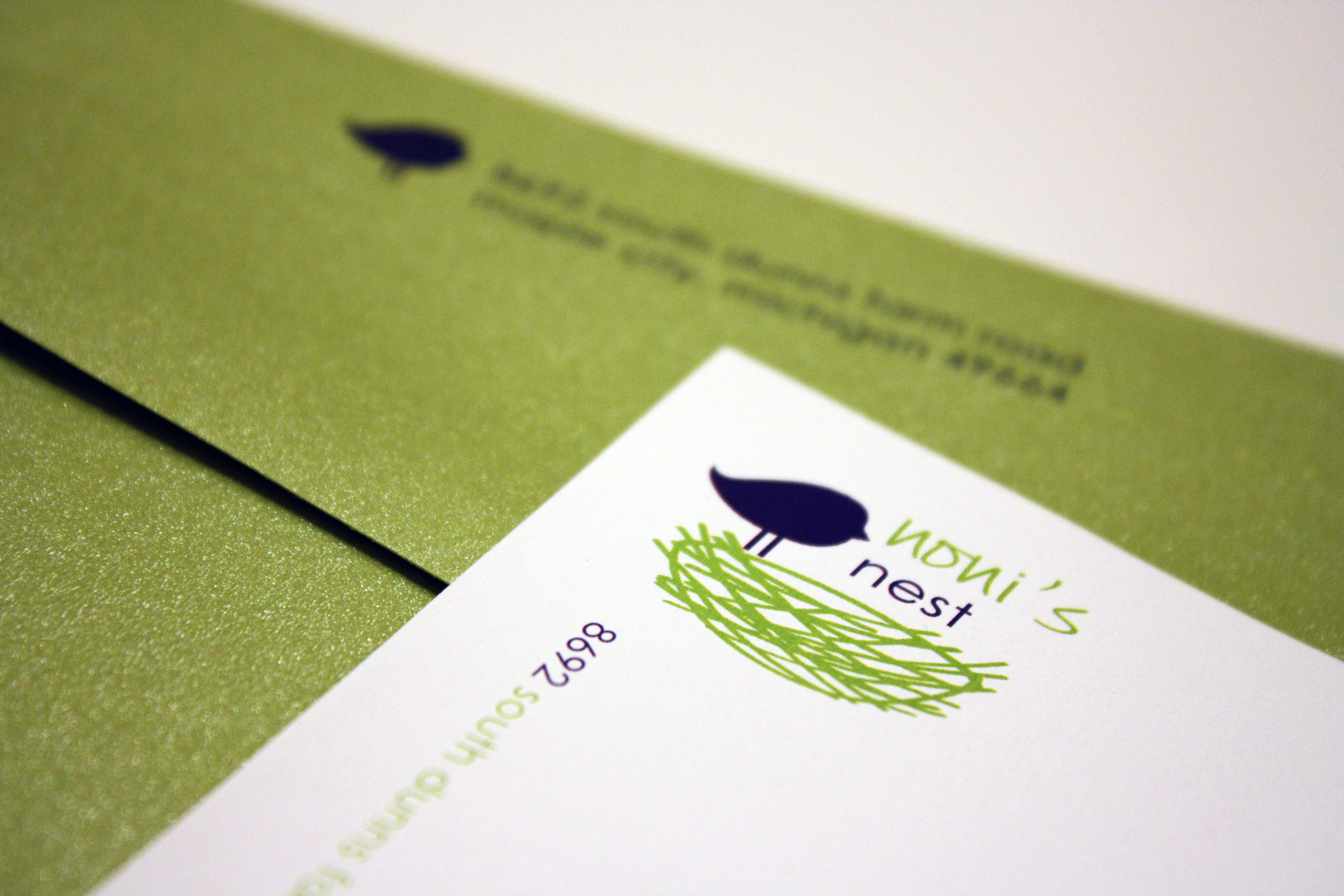
A lovely logo I designed for a private residence in Michigan, fondly named Noni’s Nest after the nickname the owner’s grandkids call her, which we then incorporated into stationery sheets and personal calling cards.
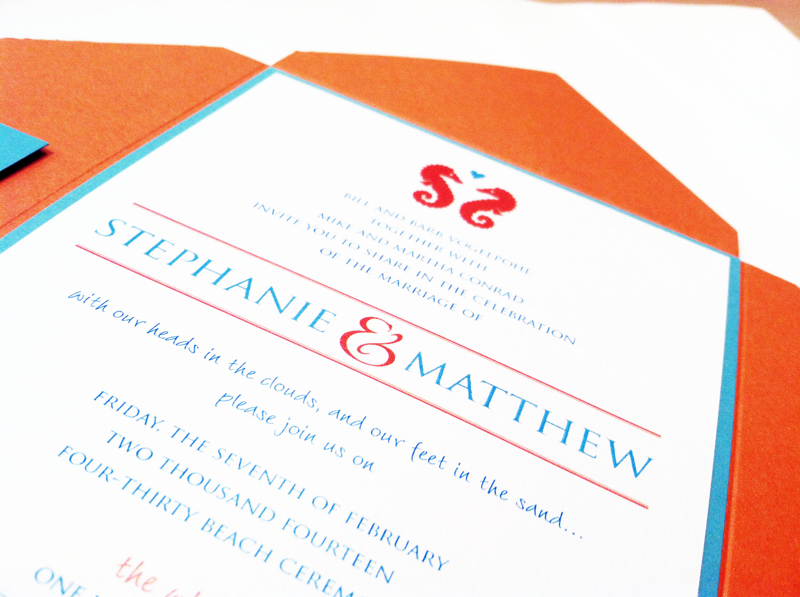
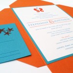
Another destination wedding, woo hoo!! We love the hot and cool colors of the beach, shown here with a seahorse/starfish motif in Tiffany blue and bright coral.
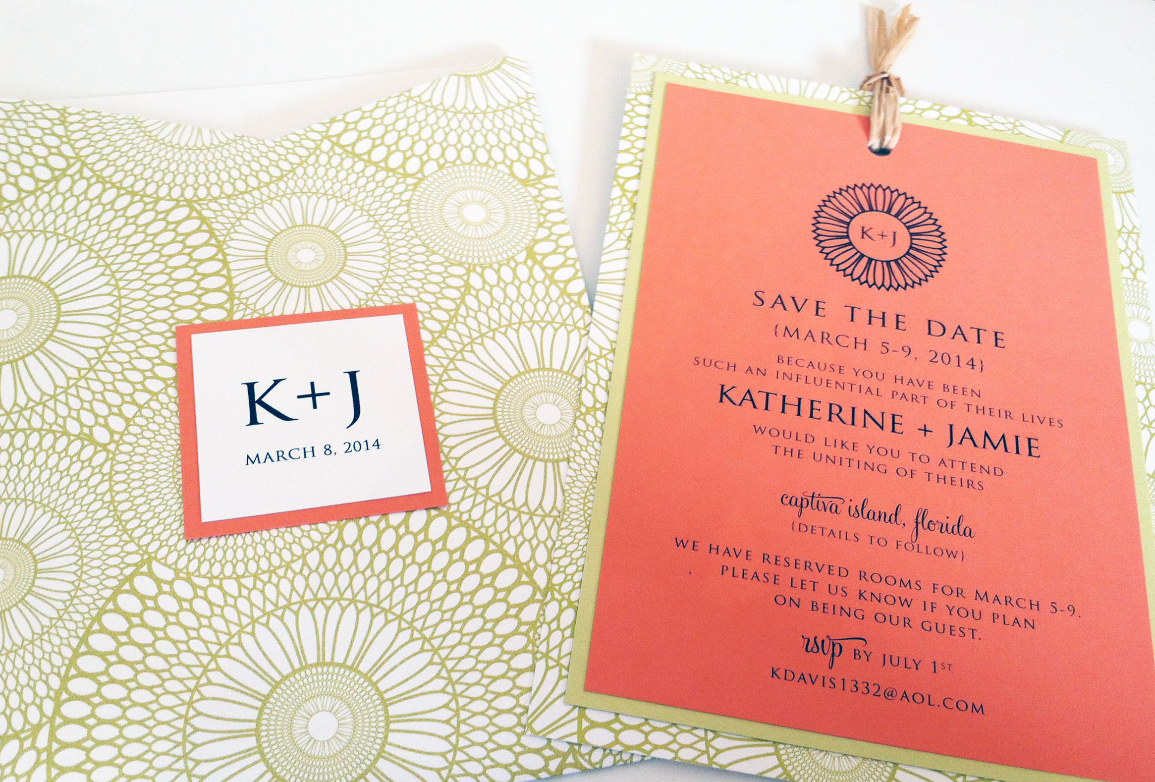
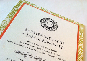
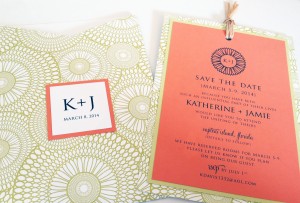
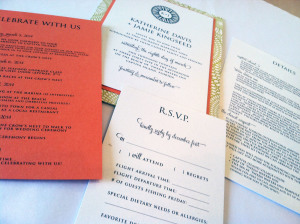
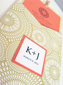
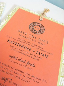
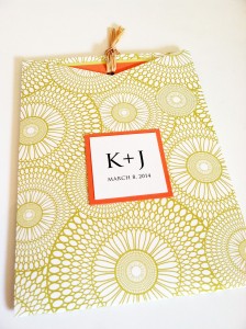
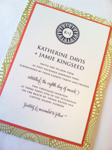
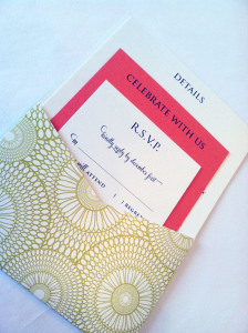
For this Captiva Island wedding, we chose one of this year’s hottest colors, a deep coral, paired it with a funky chartreuse kaleidoscope pocket, and used a blocky roman font to create balance in the design. The simple monogram kept the look modern and clean, while adding a personal touch to the outside of the pocket. This save the date card was the perfect precursor to Katherine and Jamie’s wedding invitation, which incorporated the same colors and overall style, using a pocket card to envelop all four of their enclosure cards: a schedule of weekend events, information about the resort and surrounding area, a reply card, and a hotel card listing accommodations info for their guests.
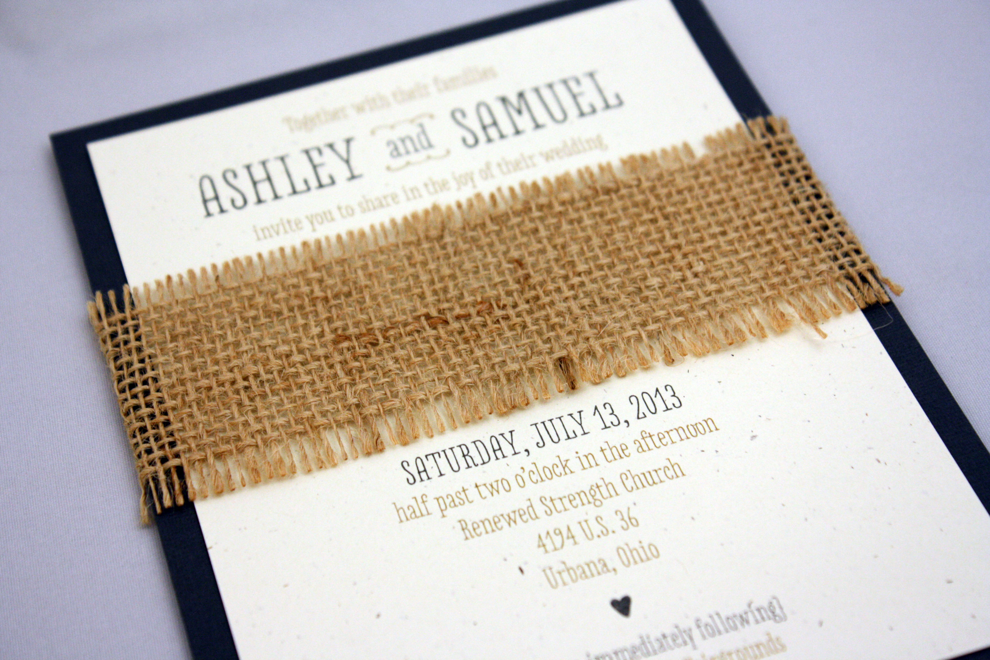
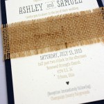
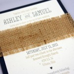
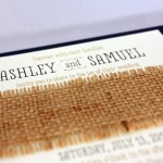
This is one of my 2013 favorites. Burlap makes everything cooler, and we paired it with an oatmeal colored PC 100 recycled stock and a darker charcoal accent layer. The fonts and layout idea were inspired by the work of one of our favorite letterpress lines, and it worked beautifully with these colors and textures.
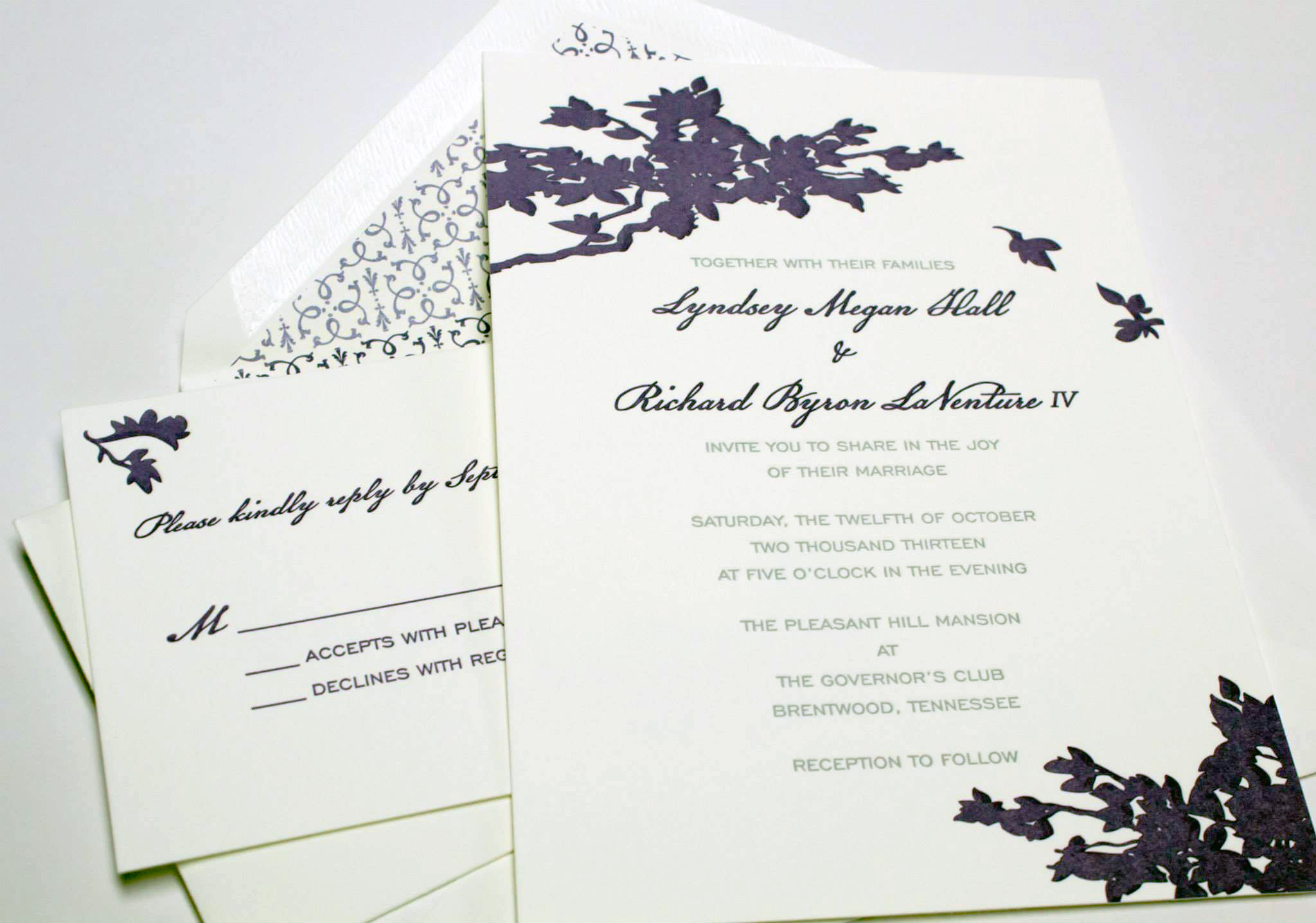
This was the year of the out-of-state wedding, and this fabulous letterpress invitation was the introduction to a Fall wedding in Tennessee for Lyndsey and Richard. They chose a 600 gsm Crane lettra stock, a rich purple ink and a fantastic envelope liner to round out the set.
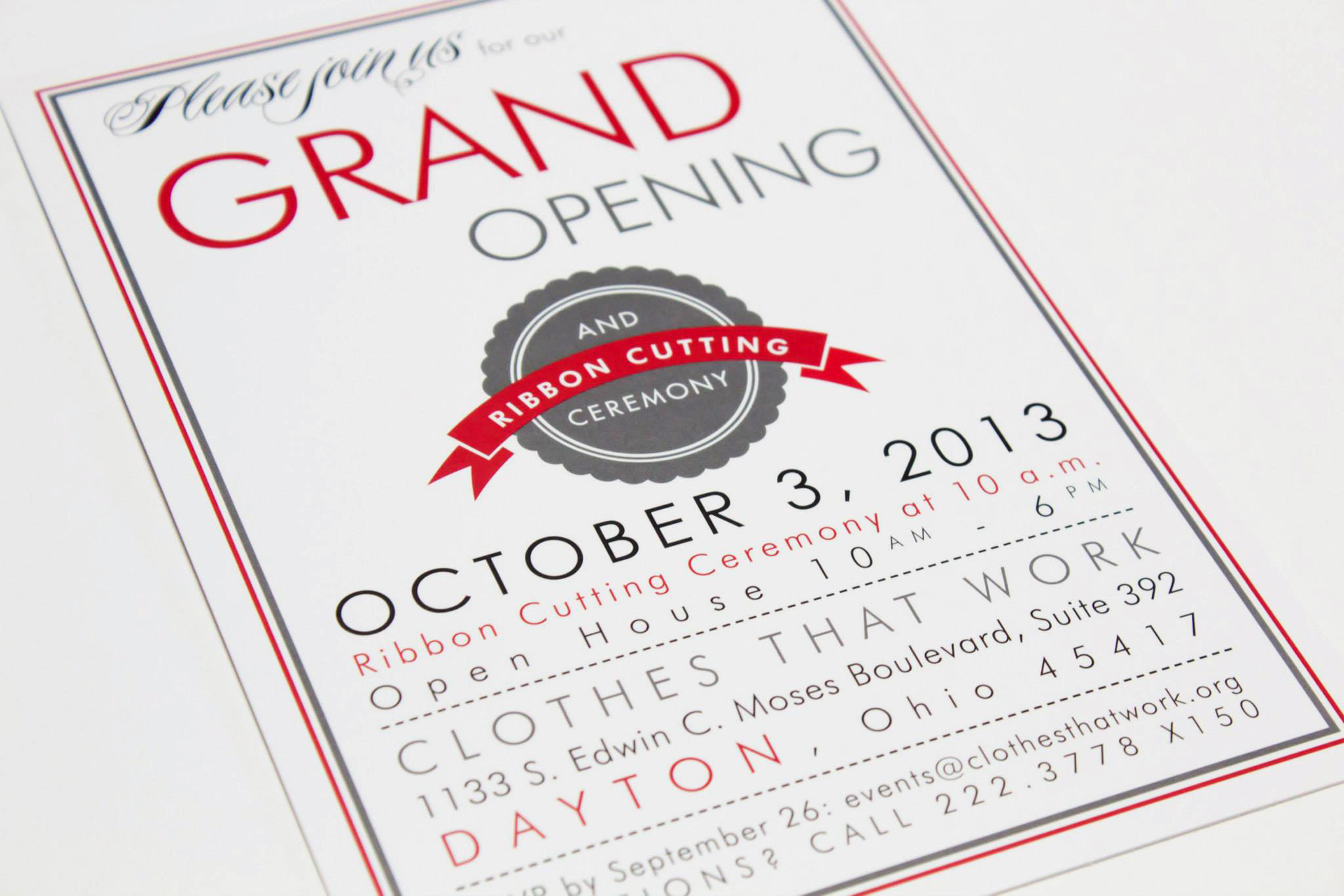
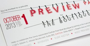
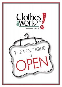
Clothes That Work has kept us busy creating designs for their very exciting boutique expansion, and in the process we have done several open house and preview party invitations, as well as the design for the boutique logo itself, new pledge cards, plaques, and signs.
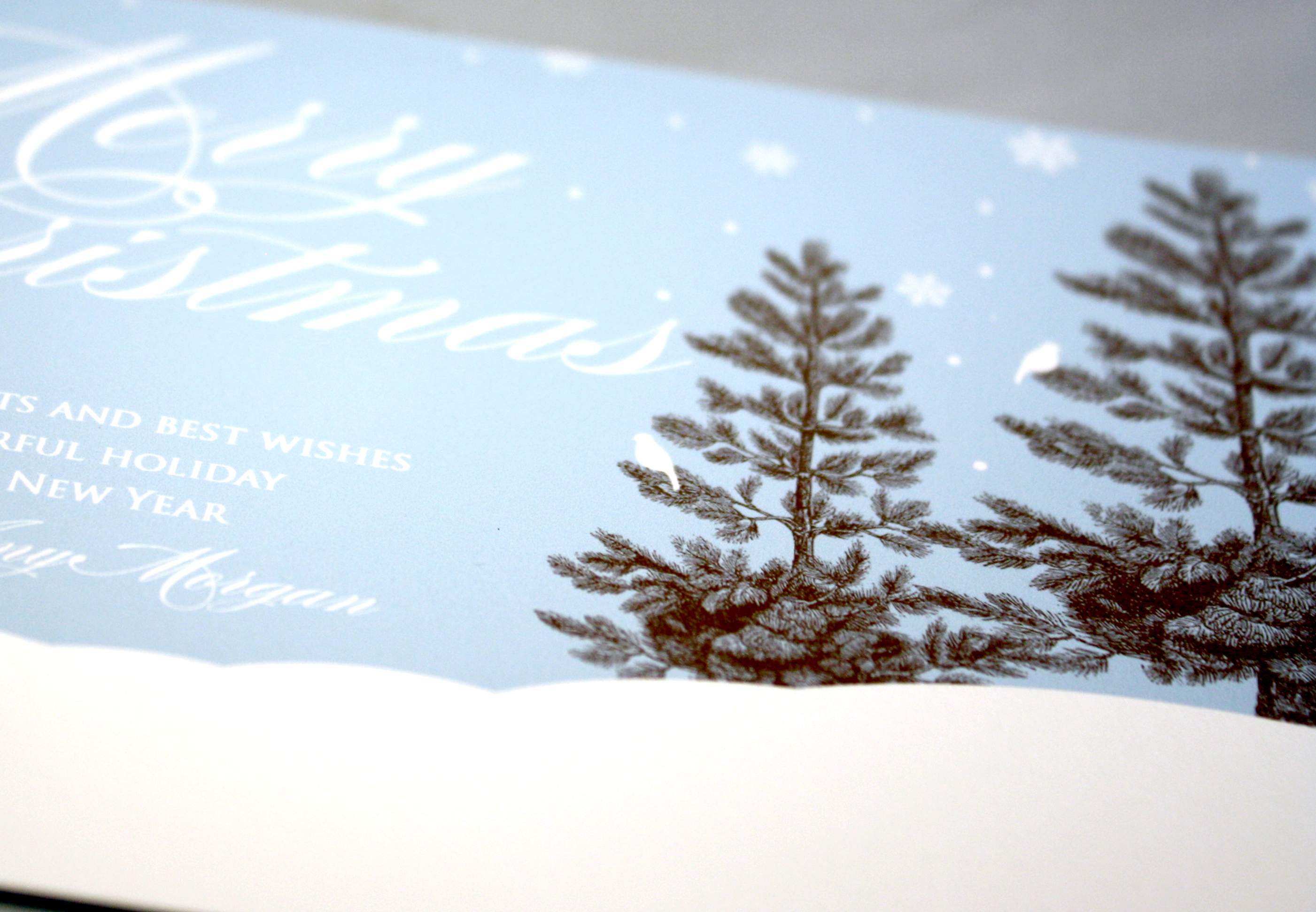
If you’re a little tired of all the red and green at Christmas, a lovely alternative for a holiday greeting is to go with a winter landscape in snowy tones of blue, white and chocolate. This Tag and Co. design boasts a sort of calm tranquility and the elegant, white script at the top is a perfect complement to the rich color of the evergreen trees.
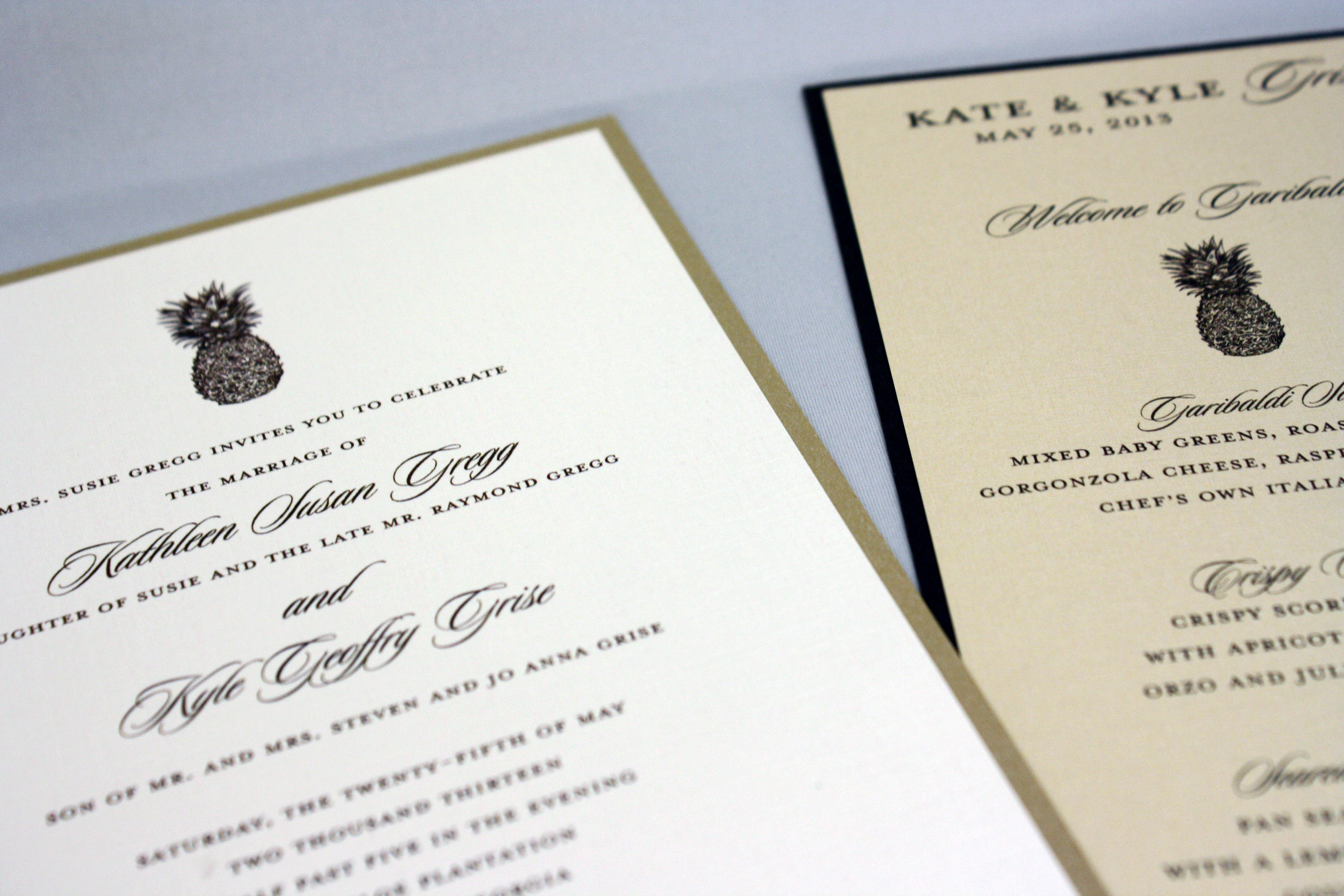
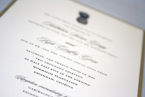
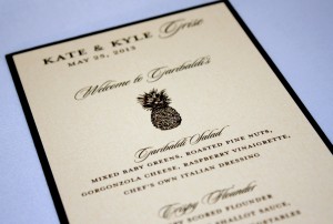
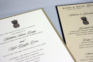
The pineapple is a well-recognized symbol of Southern hospitality; I learned once during a visit to an old plantation outside of New Orleans, Louisiana that the tradition of leaving a pineapple in a guest’s room during their stay was a polite way of informing them that they had overstayed their welcome, i.e., “Here’s a lovely pineapple, kindly be on your way…” This Georgia wedding played up the Southern theme by incorporating tidbits of nostalgic charm- a pineapple and a palm tree- on their various printed pieces.
This little pink and grey floral pocket program was fitting for the garden wedding it accompanied, and the sleeve ended up protecting the programs when it started to rain. They say rain on your wedding day is supposed to be good luck…