Spotlight: Designers’ Fine Press

Lush letterpress you can afford to love

…without scrimping on the materials you love. Choose from a variety of papers, including Crane’s 100% recycled cotton tree-free Lettra paper. Customize your selection with your choice of inks and typestyles. Designers’ Fine Press was born with the idea that impeccable designs impressed into fine papers (aka letterpress) should be available at a more affordable price, without sacrificing the materials and quality that set letterpress apart from the rest.

Designers’ Fine Press offers lush invitation canvases which include 100% cotton Crane Lettra, Arturo Fine Italian Papers and Wood. Their average letterpress wedding suite is $7.59 each (suggested retail for 100 sets of invitations, reply cards and printed envelopes). Their delightful collection reflects the range of styles and letterpress inspiration of the four designers who share their same vision – Cat Seto, Margot Madison, Emily Gallardo and Alice Jacobs.

Green is the new black

Designers’ Fine Press uses Crane’s 300 gsm and ultra-thick 600 gsm Lettra papers to provide touchable, luxurious invitations that are made from 100% cotton, tree-free paper. Lettra is made with cotton that is 100% recovered from the textile and garment industry which would otherwise find its way into a landfill. Letterpress lovers and environmentalists alike will enjoy this stunning and environmentally responsible canvas.

Schedule a consultation with Annie to view this lovely collection, including the new Weddings 10 album and a completely refreshed creative library, boasting hundreds of ways to create a totally custom, totally YOU, letterpress invitation.

Spotlight: Midori

Decadent. That’s the one word I would use to describe Midori ribbon. With French double-faced satins, organdy, dupioni silk, gros grain, velvet, velvet satin, custom tidings ribbon and more, you’ll never be without the perfect ribbon ever again. Midori also offers gorgeous handmade gift wrap and boxes.

Midori started on a kitchen table in 1989, created by its founder coincidentally sharing the same name. Having grown up in Japan, where gift giving is both an art form and an important social obligation, Midori had a simple idea: to bring the beautiful fabric ribbon she knew as a girl to the United States. The beginnings were very modest and anything but certain: Midori recalls thinking that if the ribbon idea didn’t work out; she would just have a big garage sale. The company thrived, and quickly outgrew her little house.

Aya, her then 8-year-old daughter, while growing up along side the prospering company, went on to blaze her own path as a successful dancer and actress. Mother and daughter travelled parallel paths for years until fate guided them to a convergence, and an opportunity arose. In 2010 Aya Sumika and Trevor John bought MIDORI Inc.

The creative husband and wife duo, inseparable since 15 years old, had a vision that flooded their minds on how to build on top of the 22-year old foundation of extraordinary quality, precise color palette, and superb customer service: to organically grow in the direction of a completely unique lifestyle brand. While passionately pouring their hearts into this experience they are on a mission to continue to make the world a place to celebrate difference, and encourage creativity.

Midori = Green. Midori is aware of all aspects of their company’s environmental impact, including product safety. They routinely test their product, inspect production facilities, and follow a policy of respect for humanity, respect for animals, and respect for the environment. Their handmade Gift Wrap, made in India is a great example. Each sheet is created from 100% recycled cotton using skilled hand labor and techniques practiced for hundreds of years. Not only does their Gift Wrap reduce waste; sustaining our planet, it also employs the community while preserving an age-old craft. Midori and their partnering retailers look forward to continuing in the pursuit of introducing products that are beautiful and environmentally friendly that customers will love and feel good about.

Becky + Mark

Becky planned a gorgeous, black tie optional wedding at the Dayton Art Institute and this traditional letterpress invitation in black and ivory was absolutely perfect for the occasion.


wedding invitation

Katie + Danny

Simple yet elegant, this invitation in pale gold and blush pink uses a prominent script as the only graphic element, which we used throughout the ensemble as a recognizable element. This soft and feminine set includes a rehearsal dinner invitation, wedding suite, and program.

Sarah + Luke

I never get tired of fuchsia and black together, and this pocket invitation didn’t disappoint. This sparkly invitation was for a spunky bride with a flair for style who “didn’t know what she wanted” but as soon as we pieced it together with her, she knew this was it. A few weeks prior to the Big Day we also printed coordinating menu/table cards using the same black damask graphic to restate the theme of the invitation at the event itself.


bird and nest stationery

Noni’s Nest

A lovely logo I designed for a private residence in Michigan, fondly named Noni’s Nest after the nickname the owner’s grandkids call her, which we then incorporated into stationery sheets and personal calling cards.


Katherine + Jamie

For this Captiva Island wedding, we chose one of this year’s hottest colors, a deep coral, paired it with a funky chartreuse kaleidoscope pocket, and used a blocky roman font to create balance in the design. The simple monogram kept the look modern and clean, while adding a personal touch to the outside of the pocket. This save the date card was the perfect precursor to Katherine and Jamie’s wedding invitation, which incorporated the same colors and overall style, using a pocket card to envelop all four of their enclosure cards: a schedule of weekend events, information about the resort and surrounding area, a reply card, and a hotel card listing accommodations info for their guests.


burlap invitation

Ashley + Sam

This is one of my 2013 favorites. Burlap makes everything cooler, and we paired it with an oatmeal colored PC 100 recycled stock and a darker charcoal accent layer. The fonts and layout idea were inspired by the work of one of our favorite letterpress lines, and it worked beautifully with these colors and textures.


letterpress purple invitation

Lyndsey + Richard

This was the year of the out-of-state wedding, and this fabulous letterpress invitation was the introduction to a Fall wedding in Tennessee for Lyndsey and Richard. They chose a 600 gsm Crane lettra stock, a rich purple ink and a fantastic envelope liner to round out the set.

Kate + Kyle

The pineapple is a well-recognized symbol of Southern hospitality; I learned once during a visit to an old plantation outside of New Orleans, Louisiana that the tradition of leaving a pineapple in a guest’s room during their stay was a polite way of informing them that they had overstayed their welcome, i.e., “Here’s a lovely pineapple, kindly be on your way…” This Georgia wedding played up the Southern theme by incorporating tidbits of nostalgic charm- a pineapple and a palm tree- on their various printed pieces.


Spotlight: Curly Girl Design

It’s hard to find adequate words to describe Curly Girl Design…they are consistently a favorite among our customers due to their witty and heartfelt expressions that seem to find the perfect words for every occasion. When I first met Leigh, the designer, and stumbled upon this line of cards at the 2008 National Stationery Show, I literally started crying (just a little bit) in her booth because I was so happy to find such an awesome company that was exactly what we needed to compliment our already-awesome collection of greetings. They stand out in a crowd, make you laugh and cry at the same time, and are perfect for every occasion. Her colorful designs and perfectly-phrased messages deliver not just a card but a keepsake. I actually have three of them framed and hanging on my wall at home.

To get a sense of how cool Leigh and Curly Girl Design are, check out her blog. Trust me, you’ll love them as much as we do!

Not There Yet

Eight years under my belt. Today marks the beginning of my ninth year as an entrepreneur. Somehow when I wasn’t looking I turned into a grownup. This definitely warrants a cupcake. Let me try to describe the feeling I had driving to the shop today, as one of my favorite songs came on and my emotions bounced around from accomplishment and nostalgia, to humility and grace; I have to say the overwhelming feeling in my heart was one of unparalleled thankfulness. The road we independent business owners travel is a long one, and it’s one not often understood by those who haven’t walked every terrifying-yet-eternally-optimistic step of it. Regardless, this is a road paved with stones laid by those who have believed in, challenged, supported, and worked with us, pushed us to grow, and who have given us high fives when we’ve surpassed critical milestones. We’ve all heard the statistics- only 44% of small businesses survive the first four years (according to the SBA), and a mere 34% are still up and running after 8 years. Yikes. How the hell did I make it this far? I’m either doing something right or I’m extremely lucky (no doubt, it’s a bit of both).

So today, I couldn’t help but smile as I listened to Eric Hutchinson sing:

I don’t wanna work anymore

I just wanna live instead

Everyone is sayin’ I’m all grown up

I’ve come a long way but I’m not there yet

And while “I don’t wanna work anymore” isn’t exactly true per se, I don’t feel like what I do is work most of the time- because I LOVE IT. This is my version of “living instead”. Every day that I come to the shop is a day that I choose my path. Don’t get me wrong, owning a business isn’t exactly Rainbow Hour all day every day (there’s an hour every morning at home when Ryan’s solar-powered prism in his bedroom window dances rainbows across our upstairs walls- and obviously nothing can go wrong during Rainbow Hour).

As I reflect today on where we’ve been, I think back to the dark days of 2007-2008 when we were still so new, the economy tanked, and we went into unimaginable debt just to keep our heads above water (debt that became solely my responsibility when both of my business partners bailed by 2010). Our financials were terrible but I couldn’t bear the thought of leaving my baby- the entity I had created from the ground up- the store I put so much of myself into, from the name, to the logo design, to the interior of the shop itself (everything from lighting to flooring to countertops to the “Biscotti” color of the walls), to the product lines I hand-picked, to the customer relationships I cultivated and nurtured, to the interns and employees I trained…and the list goes on.

Against my instincts, but because I was completely broke and had to figure out how to pay the bills during those tough times, I interviewed for jobs elsewhere. I lost sleep. When I did sleep, I had these weird recurring dreams where I was working late at the shop but the lightbulbs were all burnt out. I heart-wrenchingly debated selling the business. But I stayed. I amassed large amounts of credit card debt. I didn’t take vacations. I didn’t take sick days. I worked Saturdays and Mondays. I filled one sparse order after another; I hoped and prayed that somehow we would survive. And somehow we did. Slowly but surely, the economy started to recover and sales began climbing again. In early 2011, I forced myself to get out into the world and connect with other fellow business owners, young professionals, and community members. I did some free design work just to build community liaisons and get my work out there. I participated in events, joined committees, and supported organizations I believed in. I stopped fighting against upgrading my software and finally learned the Adobe Creative Suite (how did I go so long without doing that?!) I slowly made my way back into the black.

And here I am, on September 3, 2013, so thrilled that I stuck it out long enough to experience the past two years of exponential growth. And now, eight years after The Envelope was born I’m thinking of creative ways to expand and reinvent myself (do I hear a re-brand in my future? Hmmm…) I want to express my heartfelt thanks to all of you out there who have traveled this road with me. You continue to inspire me. You are the life blood of this business, and you allow me to do what I love by believing in me. Namaste. I’m in it for the long haul, and I can’t wait to see what’s next. As Eric says, “I’ve come a long way, but I’m not there yet…

*Special thanks to Charity at Charity K Photography for this image

Good Steaks Don’t Require A1

With the societal trend toward whatever is better, faster, and smarter, I’ve noticed (and I’m sure I’m not the only one) a decline in the overall quality of goods and services in the marketplace. It’s become evident that as big box retailers work themselves into a frenzy trying to keep up with the curve while keeping their prices down, many of them aren’t able to maintain the overall quality that consumers are used to, and– on the heels of one of the worst economic times in decades– have come to demand. Consumers are more discerning than ever, and you’d better believe they’re choosy about where to spend their hard-earned dollars. This is where the “shop local” movement comes into play. If people are going to spend money, they want to feel confident in the places they choose to spend it.

Fortunately for the Dayton market, if there’s one thing we do well it’s produce quality local businesses that are run by people who believe in a hands-on work ethic and know what it means to stand behind their brand. They simply have to in order to survive in a marketplace that is more demanding than ever. A handful of local companies with which I’m familiar have managed to do exactly that: Esther Price (family owned and operated), South Park Tavern (best pizza in Dayton), the Oakwood Club (the owner still hand cuts the meat), and Dorothy Lane Market (best customer service policy pretty much anywhere) are a few shining examples of local spots that consistently get it right.

And when you get it right repeatedly and treat your valued customers as though they are in fact valuable, you will earn customers for life. When you deliver incredible products and service, you will not only earn repeat business but free promotion (this is what’s known as a win-win). On the flip side, if you promise something outstanding and you fall flat, you’re worse off than if you hadn’t promised anything in the first place. Marketing rule #87: happy customers will tell their friends; unhappy people will tell everyone.

I recently visited a privately-owned steak house in Chicago that is one of the oldest and most esteemed of its kind in the city. I like to check out independent restaurants whenever possible, and if there’s one thing I love to indulge in, it’s a decent steak, so I was pretty excited about this place after hearing all the hype and reading rave reviews. I should have taken it as a bad sign when the waiter brought A1 with my steak…and I *sheepishly* had to use it because the steak was completely tasteless. I had never before been to a prime steakhouse that even had A1 on the premises, much less delivered it with the meal. Fail.

Just like a great steak doesn’t need A1 to make it taste “good”, quality shops and restaurants don’t need anything fancy to make them look good- if they actually are good, it’s evident. Businesses that deliver something awesome know it; they put themselves out there for the world to see and what you see is what you get. And just like with a perfectly-prepared steak, even if you have to pay a little more for it, what you get time and time again with your local favorites is amazing service, exceptional products and a guarantee that you’ll leave happy- that’s precisely why they’re your favorites in the first place.

As the entrepreneur of a local niche boutique, I’m proud to say The Envelope has been referred to as “the only place to go for invitations” in Dayton by many of our loyal customers (I know because they tell me). When you shop with us, you know exactly what you’re going to get. The one thing I’ve stood behind, no matter what, is that we will go above and beyond to make sure our customers want to keep coming back to us. I take pride in what I do, in the people who represent my business, and in our reputation in the Dayton market. I’m fully invested. On the rare occasion when a customer has been unhappy, I have literally lost sleep trying to figure out a way to make it right for them.

I believe that exceptional quality speaks for itself, and I know that we don’t need to add any bells and whistles or special promotions to make it look like we’re a cut above the rest. I offer unique designs and products, personal (sometimes quirky) customer service, and a promise that you’ll leave happy. I don’t offer A1. It’s simply not necessary.


Like Chivalry, Paper Is Not Dead

It’s been a long time since I cried over paper. And before you go thinking I’m a big ninny, I can assure you that it doesn’t happen very often, but when it DOES, there’s a pretty good reason for it. In fact, the last time was in New York City at the National Stationery Show when I first discovered what’s become one of our best-selling greeting card lines Curly Girl Design. I was slightly embarrassed to be on the verge of tears standing in the middle of a total stranger’s booth, but I was so in love with the creativity and beauty of her designs, coupled with the unique sentiments expressed on Leigh’s cards that I couldn’t help myself and I got a little misty. That was in 2008.

So today when I opened the mail and saw a thick hand-addressed envelope and several bundles of invitations tied up with string, it was so different than anything I had received in so long…and again, I couldn’t help myself. I thought, “THIS is why I keep doing this. Because sometimes people take the time to actually pick up a pen.”* I know, I know, you want to know what it was, right? It was a beautiful sampling of invitations from a company called Borrowed & Blue (there was even an invitation that looked almost identical to the telegram invitation I did a few months ago)…see, we’re even on the same wavelength! This wonderful bundle of goodies was all the things I like: natural kraft paper, unique designs (i.e. envelope liners that were maps or pages out of books), and gorgeous packaging. It was exquisitely marketed. I mean, the wedding “album” she was promoting is actually an unfinished oak wooden box with chip-board pages boasting 22 different wedding invitation designs. The paper swatches come in a muslin bag, for goodness sake. My heart was racing. I couldn’t wait to order it.

I’ve been asking myself lately if paper is dead, or potentially dying…and it’s a valid question. Look around. With the prevalence of Facebook and Evites, most people find it difficult to muster up the energy to even think about going to the store to pick out a printed invitation, then address and mail them. In fact, I’d bet most of you don’t even know your friends’ mailing addresses, hmmmm? That’s what I thought. But I also think people are somewhat blind to the fabulous paper creations that are available. Take a look at these samples and then tell me you would rather get (yet another) Facebook invite. They’re breathtaking.

So as long as paper still makes my heart go pitter patter, I’m going to keep doing this. Because as evidenced by the fact that I’m still here doing what I love seven years after I opened this place, it seems I’m not the only one who feels that way. #paperlove 🙂

For more information on how to get your hands on these and other fun printed creations, here’s where to find us.

*My skeptical friend Nick stopped by right after I received said package and was so UN-convinced that this was indeed a handwritten note that he went and got a magnifying glass to look more closely for discrepancies in the text, claiming that this was a printed font, not someone’s handwriting. He finally admitted he was wrong when we found there to be slight differences in the “o’s” and “e’s”, not to mention she ran a little close to the edge in a couple of spots. (And then I made him apologize for trying to rain on my parade.)

Knuckling Up

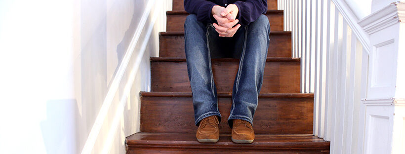
When was the last time you challenged yourself? I mean really challenged yourself. Have you ever reached for something that wasn’t even on your radar six months ago? Have you ever pushed yourself to do something that you didn’t think was possible? When was the last time you put yourself into a situation you weren’t comfortable with, to challenge yourself, to “do good” for some other cause, or maybe just to prove that you could? Innately, as humans, we tend to play it safe. We typically roam freely within the confines of our comfort zones and stick with what we know…because it’s safer that way. When we don’t take risks, we don’t have as much to lose. Or do we? I have a friend who once said he didn’t want to get to the end of his life and realize he had only lived the length of it…he wanted to live the WIDTH of it, too. Now I don’t know if that was his own quote or borrowed from some other wise soul, but think about it- that’s a valid point, isn’t it? Don’t just live your life the same way, one foot in front of the other, day in and day out. DO SOMETHING. Challenge yourself. Even if it’s scary, even if it’s new, even if it might be uncomfortable at first. Because if we aren’t challenging ourselves to reach our fullest potential, we’re missing out on so much. When we play it safe, we lose.

Sometimes we have to knuckle up.

Boxing at Drake's Downtown GymI believe that in addition to personally challenging ourselves, we all have a social responsibility to each other, and to the city we call home. What that responsibility looks like varies depending on a lot of things: frame of mind, ability, desire to instigate positive change and growth… From where I sit, I believe that part of being a local entrepreneur is the inherent duty to be an active (and proactive) member of my community. I knew that by starting a business in this city I was making myself vulnerable. I was putting my livelihood solely in the hands of the people who live here, work here, play here…they got to decide whether or not to support me, and I humbly turned over the reigns to them, saying, “Here’s what I have to offer…you decide what it’s worth.” In that vein, I realized that as much as I rely on others for my continued growth and success, I wanted to give whatever I could back to the community that supports me.

I have viewed myself as a team player ever since I opened my doors in 2005, and over the past two years my desire to work toward the common good of the city and surrounding areas has only grown by leaps and bounds. I’ve gotten involved in numerous efforts, events and activities to show my support, and I’ve tried to bring to the table whatever time, energy, resources and talents I can possibly muster up.

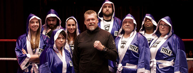
Through those efforts, I’ve learned a lot about myself; I’ve pushed myself way beyond the limits of my wildest dreams… and I’ve just done it again. For the last three weeks, I’ve found myself a couple days a week at Drake’s Downtown Gym, taking boxing classes to prepare for what I’m sure will be one of the most challenging events of my life, both physically and emotionally. I have signed up to be part of the Knockout 2013 team, as a fighter in the second annual event put on by Dayton History and Drake’s Downtown Gym. The event will take place on March 2, 2013 at Memorial Hall, and is comprised of 9 match-ups. Is this crazy? Maybe. But it’s a challenge. I want to support Dayton History, Memorial Hall, Drake’s Gym (a fellow entrepreneur), the City of Dayton, and my teammates- in essence, I want to be part of something bigger than myself.

While I’ve been “knuckling up” the last few weeks, I’ve learned that nothing is impossible. And I’m just getting started. Once you push yourself outsides the limits of your comfort zone, you realize that you can do anything you put your mind to. Am I terrified of boxing one of my friends on March 2 in front of thousands of people? You bet. But just like rappelling down a 27-story building for Big Brothers Big Sisters last Fall, I’ve put my mind to it and I’m doing it. There’s no turning back. And I know that the next three months of training for this event will be an experience I will never forget. I’ll learn about myself, I’ll be doing something for a worthy cause, and I’ll be better for it.

Knuckle up. Challenge yourself. Give back. You might be surprised how good it feels to stretch your limits and start living the width of your life.

Utopia Salon & Spa

In addition to designing business cards for many of the stylists at Utopia Salon, I recently put together some new gift certificates for the salon. The tea length ivory card slides into a black portable pocket sleeve, which is then paired with an ivory envelope bearing the Utopia logo. The certificate is intentionally worded so it would work for many potential services or dollar amounts.

Spotlight: Old Tom Foolery

I borrowed the following excerpt from Joel and Lauren’s website because when it comes to the written word and witty expression, they simply can’t be outdone. These two are truly awesome people with such fun personalities, which I think is obvious from the poster of “typestaches” they created. We’ve been carrying their greeting cards in our shop since we met them several years back at the National Stationery Show and laughed so hard we cried. With that said, I leave you with a little background on the master minds behind Old Tom Foolery.

Old Tom Foolery is the brainchild of Joel Gryniewski and Lauren Weinblatt—two ad-industry vets who also happen to be married.

Back when Joel was wooing Lauren, he had a tough time finding cards that were: a) funny, b) letterpressed (they’re both suckers for a deep impression), and c) not so dainty as to make her question his masculinity. So they set out to make their own witty letterpress cards that would appeal to both sexes.

Old Tom Foolery launched its first line of “unsappy, uncrappy” greeting cards, The Footnotes Collection, at the National Stationery Show in 2008. Two years later, the company expanded its catalog with a premium, offset-printed line called The Headlines Collection.

Adrianna’s Telegram

What goes better with a vintage wedding at the Packard Museum than a telegram invitation? Answer: Nothing. Adrianna’s invitation topped the creativity charts and didn’t miss a single detail, from the full stops after each piece of information to the fun text frames we peppered throughout the natural kraft pocket-fold style invitation. We had a hard time finding the perfect shade of periwinkle that wasn’t too purple and wasn’t too blue, but Adi pulled through and provided some scrap booking stock she found for us to cut and use as her accent layer. Once we had the perfect accent color, we then matched small parts of the text to her color to tie everything together. Special delivery, indeed!

Her save the date was a single card with the infamous pointing hand graphic, pointing at a tiny envelope which housed a card bearing the date of the wedding. She mailed them in paper bag style envelopes, giving guests a glimpse of what to expect: a classic wedding at a truly unique venue.

Adelyn’s 1st Birthday

The baby daughter of a photographer friend of mine turned one, and they gave me the privilege of working on her birthday party invitations. This simple 5×7 card incorporated a photo of Adelyn wearing a bright pink tutu, sitting next to a chalkboard with the number one drawn on it (she’s very advanced for her age…). We added a hot pink metallic envelope to make it extra special.

palm leaf rehearsal dinner

Jessie and Joe’s Rehearsal Dinner

Jessie and Joe’s wedding had an orange and silver theme, but Joe’s mom decided to lend a totally different feel to their rehearsal dinner invitation. The rehearsal was to be held at the Springfield Country Club, and we created a green and pale gold invitation with a modern leaf graphic entwined into the background layer.


Midwest to the Mountains

Five years after we did a birth announcement for this family, they moved to Colorado and asked us to find a truly unique moving announcement that would include a photo of their new digs. After looking through some ideas, we landed on a cool tri-fold announcement patterned after a design featured on the Envelopments website. It worked beautifully with the photo of their house and the fact that they moved from here to there (love the zig zag line.)

Kate + Pete

Kate had one heck of a wedding planner in her corner for this fabulous October wedding- her wonderful mom, Monica. Together, we planned every printed detail of this wedding from start to finish: the invitations, programs, rehearsal dinner invitations, place cards, menus, thank you notes…the whole kit and kaboodle. Kate’s invitations were from Checkerboard, and she wanted a traditional elegance theme- ivory and black with touches of gold and silver. Featured here are her programs, place cards and menus.

Wedding Guest Libs

This was an entertaining way to get Angela’s guests involved in providing a fun keepsake for the couple after their Big Day. Angela came to me with this incredibly fun idea- Wedding Guest Libs- into which we easily incorporated her wedding colors of turquoise and mocha. We used the turquoise as a color pop on a crisp white background. Angela’s invitations were from Checkerboard and she had several custom projects she asked us to do to coordinate with that look. Angela felt strongly that her wedding needed to be fun and reflect her and Bill’s personalities, so the Guest Libs idea was perfect because it engaged her guests and gave them something interactive and fun to do at their tables, while providing amusing anecdotes for the couple to read after the festivities were over.


Britt + Kirk

Love, love, love this couple! Britt came in with her mom, looked through some books and just wasn’t sure what direction she wanted to go. A few albums and a little flutter of disappointment later, Britt saw the “Christina” style invitation hanging on the wall and said, “That one. That’s the one I want.” It was awesome- that moment of clarity when something all of a sudden clicks into place was almost palpable. Britt did something unusual that ended up being completely gorgeous- she blended shades of gold and silver into the same invitation and tied them together with a warm diamond-colored card stock. She chose a traditional script, an elegant flourish and a soft charcoal ink to complete the look of the graphite pocket card, patterned accent layer and pale gold ribbon pull tab. Britt was the sweetest bride to work with, right from the start, and put her trust into us to create the perfect invitation she visualized when she said, “That’s the one I want.” Her genuine excitement to marry Kirk was adorable, and after her mom picked up her invitations and sent her a picture of the finished product, Britt sent me a message saying she cried in front of her first graders because she loved the invitations so much. I couldn’t possibly receive a higher compliment, and it’s brides like Britt that make me love what I do.

Eat, Drink & Make Merry

My famous annual pig roast customers wanted a Christmas celebration invitation that would generate a lot of excitement for the second of their yearly shindigs, having set the bar high with their summer pig roast. Phyllis and I looked at a lot of ideas and this festive gatefold style invitation won out. We used a graphite plume pattern for the bottom layer, a crisp red for the accent layer, and a shimmery white top layer reminiscent of a snowy day. To close the gatefold and add a piece of flair to the outside, we added a two-layer square seal with the return address, allowing the outer folding piece to become the “envelope.”

Lyndsay’s Vegas Wedding

I have never been as excited about an invitation as I was to work on this design for a small Las Vegas wedding. The bride-to-be came in knowing she wanted to send invitations in a box with poker chips and dice, so I knew we had to raise the bar- we had to create something really special. The best moment in our brainstorming session came when we were trying to think of an appropriate title for the events card, and Melissa said, “What about, ‘What happens in Vegas…?” We all instantly fell in love with the idea, and I followed through with the next logical step- the accommodations card title: “Stays in Vegas…” At this point, we all started high-fiving. It was one of those awesome moments when you’re convinced no one has EVER had an idea as good as this one. The finished product came together like a straight flush, and I couldn’t wait to post photos of it as soon as Lyndsay picked up her invitations.

gender reveal party

Gender Reveal Party

Heather and Matt got married at the Dayton Art Institute in November 2010 and are expecting their first bundle of joy. They decided to find out the sex of the baby at a “Gender Reveal Party” that included all of their closest friends and family members. The Gender Reveal is a new trend that just recently started making headlines across the country as couples started coming up with unique ways to find out the sex of their baby at a celebration with family and friends. Heather scheduled their Gender Reveal Party for the day after her 20-week ultrasound…she and Matt shielded their eyes at the appointment and had the ultrasound technician put the determining photo into a sealed envelope, which was then delivered to the bakery that was responsible for creating the shower cake. The bakery was instructed to use pink filling for a girl and blue for a boy, and to carefully frost the cake to conceal its contents so it wouldn’t ruin the surprise before the big moment. Heather cut into the cake at the shower to reveal……blueberries! They’re expecting a little boy in early 2013, and couldn’t be more thrilled. Congrats to the parents-to-be! (To see Heather and Matt’s beautiful winter wedding invitation, click here.)


Spotlight: Envelopments

We do custom.

This is where it all begins…Consistently over the past decade, I haven’t seen any one company rival the popularity of this custom design invitation line. Envelopments offers the ability to create your own one-of-a-kind invitation using layers of gorgeous card stock, original artwork, pocket folds, ribbon and more. Meet with one of our consultants to design the perfect invitation to represent the theme and colors of your wedding. Once you experience Envelopments, we’re pretty sure you won’t turn back!

Envelopments was recognized as America’s favorite Invitation (2000) on the Today Show “Ties the Knot” – the first reality TV wedding where the audience could go online to vote first for the couple then the honeymoon, dress, cake and the invitation. Today, the Envelopments brand is recognized as a leader in premium, quality, custom communiqués and their products are used by thousands of designers in all 50 states and 32 countries around the world. With more than 230 card stocks, papers, liners and envelopes and more than 90 shapes and sizes with signature names like Envelofolds®, Portable Pockets®, Pocket Folds® and more, the Envelopments products are a constantly changing collection of fresh ideas and innovative designs you can tailor to fit your event.

Check out the Envelopments blog for fresh inspiration!

Baby, it’s cold outside

This is my baby (who isn’t a baby anymore) staying warm on a chilly Fall morning in 2007. The morning I snapped this pic he had gotten into my closet and dug out my pink slipper socks and some striped hot pink fuzzy gloves. Still in his pj’s, he brought them out into the living room, took all the cushions off the couch, put on the socks and slippers and proceeded to sit in his cushion fort watching Bob the Builder, oblivious to me taking about a dozen photos of this precious morning moment that I might not have remembered had it not been for the camera (another reason I love photography so much).

I’m one of those people who prefers candid shots over staged photos, and as soon as I started planning my Christmas card in 2007 I kept thinking of this picture of him with the fuzzy gloves, and the expression “Baby, it’s cold outside….” In the end I opted for a different sentiment and decided to tone down the hot pink by converting the photo to sepia, but this was the most elaborate holiday card I’d done to date. There were about nine layers of paper and ribbon, including a 5×7 Envelofold from Envelopments, layered with a light blue polka dot paper and rich chocolate brown accents. I went with a lustrous silver printed card and matching envelope; most of the layers were handcut from larger pieces of card stock in order to create the framed look around the photo, the “Peace” seal on the back, and the greeting itself. It was worth it- every time I look at this custom creation I remember what the holidays mean to me- embracing love and family, and appreciating those moments in life that sometimes you’re just lucky enough to capture on film.

Holiday Splendor

All year I look forward to my annual October-ish visit from Mary Ann…She’s one of these awesome fiery ladies with a personality that keeps me laughing almost constantly. And every year when she and her friend stop in to work on Mary Ann’s holiday cards, we are tasked with coming up with something “even better than last year’s” (which is no small accomplishment since we’ve been designing her holiday cards since we opened in 2005.) Last year’s card was a beautiful creation from Tag & Co.  but in 2010, we created this whimsical dancing reindeer card. Mary Ann loves bright colors, particularly red, so that was an obvious choice as the top layer, and the tiny dot pattern adds a sweet and simple touch. The most important decision each year with her cards is the sentiment- always unique, heartfelt and sincere, it can’t be something we’ve ever used before. Mary Ann challenges me to keep reinventing her cards, and keeps me giggling well into the New Year.

Stephanie + Travis

This was a classic case of a “color matching challenge”- there was a very specific shade of coral that Stephanie was trying to match and we couldn’t seem to find the right color in our custom line so she ended up bringing us 12×12 sheets of scrap-booking paper that we cut and used as her accent layer, then we matched the ink color of her headings and accent boxes to that shade as well. She went with a grey portrait pocket card for the base of the invitation, and we made sure the cards in the pocket lined up so the headings were stacked on top of one another for a seamless look.

Pig Roast Extravaganza

The Van Overs roast a pig every year and I adore that even though they live in Indiana, they call me every summer and ask for new ideas for their annual shindig. (That just gave me an idea for next year’s invitations….hmmm, “Pig Shindig”!) This year’s invitations blew the others out of the water- this was by far, the prize hog at the county fair. We used an indigo bottom layer of cardstock and a nice deep blue ink to match, coupled with a rusty red envelope and accent ink to coordinate, and printed everything on a pale grey stock called London Fog that gave it just the right amount of grit. I particularly like the “seal of approval” we used as a design element- this is one of those invitations that makes me happy just looking at it because it’s such a happy marriage of things I love…fonts, graphics, stocks, colors… it’s bacon-tacular (much like this clever site, which meat-lover computer nerds will appreciate).

Mandy’s Good Humor Shower

Mandy, the bride-to-be, was a Good Humor ice cream girl once upon a time, and the ladies throwing her shower thought it would be fun to have an ice cream themed shower. They mentioned that humor was also an important part of Mandy’s relationship with her fiance, so the “good humor” theme was doubly appropriate. The hostesses also wanted to incorporate a photo they had gotten from Mandy’s dad (from her ice cream days) into the design. I thought it would be fun to make it look like she was back in the ice cream truck, so I put together some “cool” graphics and voila- a shower invitation unlike any other, custom made just for Mandy.


Adios Amigos Fiesta

Hot tamale! Fiery red and tangerine make this fiesta invitation stand out in a crowded room…when we paired the hot colors with a detailed pattern and a cool font, the end result was muy caliente (super hot). I personally love printing on bright colors- it’s a nice change from ivory and white, and really makes a statement. Molly, one of my favorite people and former employees, was throwing a going away party for dear friends and wanted the invitation to be really special. Mission: Accomplished.

IMG_6679-e1353892388115


Stephanie + Paul

Sometimes customers bring us ideas they have seen online and ask if we can create something similar…almost always the answer is, “Yes!” Usually it’s a font or graphic that draws their attention, and there was something about the typography of a certain invitation she saw online that really grabbed Stephanie’s attention, so we made sure to incorporate that look. The most noticeable feature of the invitation is the bride and groom’s names, which are set apart in an oversized script encompassed in swashes and flourishes- in this way, the type actually becomes a graphic element, and no other graphics are needed to complete the look. We kept the overall design simple and chose a light pink for the bottom layer, topped with a light grey color called London Fog to give it a hint of romance.

Something blue

As you may have noticed, we do a lot of pocket-style wedding invitations; the two main reasons they are so popular is that they are highly customizable while also being practical. The pocket provides a neat and tidy place to keep the enclosure cards for the reception, directions and reply, and everything can be done in whatever the color palette of the wedding happens to be. Amanda’s wedding involved hues of a luxurious deep teal blue; the shade was so rich that we decided to only use punches of it as a rich accent. The double-faced Midori satin ribbon, the 1/8″ border underneath the printed layer and their names and headings were all done in her teal, which was just enough to add a pop of color while the rest of the invitation stayed classic and sophisticated.


Christina + Nick

This pocket invitation has become known as the “Christina” because it became a hit almost the instant we designed it for Christina and Nick earlier this year, and at least half a dozen brides since then have seen it and said, “That’s the one.” For Christina, we chose a graphite pocket card, with shades of silver and white silk, and used a hint of blush pink as an accent layer- and since we wanted to sneak a teeny bit more pink in there to make it feel even more feminine, we added a blush satin pull tab at the top edge. This style of “pull” tab doesn’t serve a function, it merely adds another pop of color to tie in with the accent layer, and gives the invitation another dimension (and a girlish flair to boot). The front of the invitation appears traditional, but the back of the card has a hidden pocket that holds the enclosure cards. The presentation is neat and compact, without a lot of fuss.

I first met Christina and her mom several years back when we created custom invitations for her older sister Julie’s wedding, and I’ve gotten to know the ladies in this wonderful family, including their absolutely awesome mom, Patricia. The thing I noticed right away with both girls’ weddings is that the spirit of what it means to plan a wedding was not lost on them- Patricia and her daughters seemed to enjoy the process more than most of the brides I encounter. They seemed rooted in the important things (i.e. love, commitment, values) and the fun they had along the way was just an added perk.

Working with Christina was easy- she knew what she wanted and placed complete confidence in us to build her perfect wedding stationery, not just for the wedding invitations but for her bridesmaids’ luncheon invites, shower and wedding thank you notes, programs and menu cards. The end result was a perfectly coordinated look that paid attention to every detail.

Chris + Michael

There was a short period of time in 2007 when I was really tired of Tiffany blue, however I got over it and I couldn’t be more pleased with how this invitation turned out. I really love printing on vibrant colors rather than neutral hues, mostly because I feel like it makes a huge impact. I always find that the invitations printed on bright card stock are the ones I remember the most, whether they are part of our custom studio or in an album. Color packs a punch. This invitation used Tiffany blue and a pale serpentine green, both metallic for plenty of sparkle, and added a crisp white satin ribbon and a really cool script. Bellissimo.

Spotlight: Waste Not Paper


Over 15 years ago, the founder of Paper Source was on a mission to buy natural raffia ribbon. Only available in large quantities, she purchased the bulk ribbon and set out to sell smaller portions of this natural product to other retailers. And thus, waste not paper was born.

Over the years, their focus expanded to include more environmentally friendly products. They may have been ahead of their time, but today Waste Not Paper is renewing their commitment to provide access to beautiful products without excess cost or waste.

BEAUTIFUL | Inspiring Merchandise In 2011, WNP introduced hundreds of new products. They launched heir Mid-Century Modern line, designed by their parent company, Paper Source. Featuring a strong aesthetic and color palette, this new collection is a throw-back to the classic, bold style of the 1950s.

FRIENDLY | Environmental Stewardship The majority of WNP products have always come from mills that have a commitment to the environment. It’s part of their core values (and ours!) to make choices and provide options to our customers that honor the world around us. Beauty and environmental responsibility can go hand-in-hand.

The foundation for WNP’s great products is paper. Their paper – the base for wrap, notes, stickers and more – is created domestically, which means it didn’t travel the world to get to you!

This paper comes from mills that practice responsible, sustainable forestry as certified by objective 3rd parties. Much of their product is created using renewable energy sources, such as hydro power or wind power.

The entire line of solid cards, envelopes and paper is produced without elemental chlorine (PCF). Their printers operate with reduced volatile organic compound (VOC) emission and recycle their ink waste. Many of their note sets are handmade from renewable content, usually cotton or bark fiber.

Eco-White, made of 100% recycled content with 30% PCW, is the base for their printed notes, wrap and bags. They also donate, reuse, and recycle all of our scrap paper. In addition, they have added new labels to their note sets and wrap which feature information about their recycled content.

Pretty cool, eh?

Spotlight: Tag & Co.


Simply put, this is one of our favorites.

From the first time I met the owner, Tom, at the National Stationery Show in 2006, we were sold on the quality and integrity of this company’s designs, finished products and unsurpassed customer service.

If you’re looking for beautiful card stock, unbelievable photo quality and gorgeous designs, Tag & Co. is the only designer to consider- they are absolutely flawless in their quality, and they will bend over backwards to create the perfect invitation or announcement for their customers. And Tom is a heck of a nice guy, to boot.

Having worked with Tag & Co. for over five years now, I knew I could count on them to come up with exactly what I was looking for last Fall when a loyal customer of ours (who had moved to Miami several years ago) called up and said, “Ok, Annie, I’m going to need stationery, birth announcements, and Christmas cards…I trust your judgment and I know you’ll come up with something amazing.” My first thought before I even hung up the phone was Tag & Co. In five years, I’ve never been disappointed in the quality of their stunning cards or their friendly willingness to help us create gorgeous announcements to fit any occasion. I sent them the photos for the birth announcements and holiday cards and asked Tom to come up with some options, and within a few days we had several of each to choose from.

I can’t stress enough how awesome these folks are to work with – they’re my first choice for my own correspondence, and I know you’ll be thrilled with them!

Ginger’s Baby Shower

There are two things I love most about this baby shower invitation: the cool pink and brown polka dot ribbon from Midori, and the adorable font. Those two elements, combined with a metallic pink bottom layer and white micah printed invitation piece make this a simple yet fun invitation, perfect for a baby shower announcing the upcoming arrival of a sweet baby girl.

Jennifer + Jon

Purple and silver were HOT in 2011- I can’t count how many weddings we did in this color palette! Jennifer and Jon liked the custom line because it allowed them to choose exactly the perfect shade of purple, pair it with a silver and purple plume pattern to add formality, and finish it with a satin ribbon and two-layer seal as the icing on the cake.

Jennifer added a nice touch on their accommodations card by adding “Jenn and Jon’s Favorite Things in Dayton,” a list of their favorite spots in town including restaurants, hangouts, museums and hot spots every visitor to the Gem City must see. I often remind brides that the wedding invitation isn’t just a representation of the couple but a source of valuable information for their friends and family, so they can ensure that their wedding day is as memorable for their guests as it is for the happy couple themselves.

Emily + Scott

A wedding weekend schedule is a wonderful way to provide tons of helpful information for your guests regarding what to expect the weekend of the wedding. It’s a great place to include a schedule of weekend events, including a “meet and greet”, golf outing or post-wedding brunch, as well as other area information such as local restaurants, favorite coffee shops, museums and other area attractions. Keep in mind that a lot of your guests may be traveling from out of town or out of state and won’t be as familiar with the Dayton area, so giving them tips about what to see while they’re in town- even a suggestion for where to get a good cup o’ joe- will help them feel well taken care of and right at home. The wedding weekend schedule is also a convenient place to list the contact information of the wedding coordinator, or parents of the bride and groom- whoever needs to be available to answer logistical questions during the weekend of festivities. These schedules are typically put in guest bags at the hotel, or left with the concierge under the name of the wedding block so guests are presented with one upon checkin.

Emily and Scott included a heartfelt personal note to their guests, welcoming them to their wedding weekend, as well as a schedule of the weekend’s events and a list of their own personal Dayton favorites. Their guests appreciated the effort Emily and Scott and their families put in to make them feel welcome, and the wedding weekend went smoothly, down to the last detail (which even included Hershey kisses with personalized tags from the happy couple).

Lisa + Matt

Lisa’s 5×7 pocket fold invitation is one of the most popular styles we design for brides, due to its versatile size and overall design that allows up to four cards to be tucked into the pocket. Lisa’s invitation was clean and classic with a more modern twist since we used nearly all Roman fonts- she didn’t want any frills – no ribbon, no swirly scripts, nothing fancy. The one thing she knew she wanted was a watermark of the Carillon Park Bell Tower on the seal on the outside…but no matter what we tried it just didn’t look right, so I came up with another layout idea for the seal instead, using her and Matt’s initials and a decorative ampersand…and she loved it. This is still one of my favorites to this day because of its simple yet classic look that is dressed up ever-so-cooly with the patterned pocket.

Stephanie + Kyle

Silver. Black. A script with lots of swashes. Double-faced Midori satin ribbon. Add those ingredients together and you have the recipe for an elegant formal wedding invitation. Stephanie chose a silver metallic pocket invitation in a classic 5×7 size for her Hilton Head destination wedding because she wanted to make sure people knew it would still be a relatively formal event despite it being at the beach at sunset. We work with a lot of destination brides, and most of the time we go with something in tropical colors, or perhaps use a palm tree graphic. This invitation was stunning and let her guests know what to expect (so they wouldn’t show up to the wedding in shorts).

Courtney + Dennis

The Chateau Elan in Atlanta was the perfect setting for Courtney’s “rustic elegance” wedding, and she needed an invitation that fit the feel of the wine cellar where the reception would be held. Courtney also wanted to make sure to include plenty of resort and leisure information about the Chateau for her guests who would spending a long weekend there, so we chose a gold and raw silk ecru pocket fold invitation with a vintage plume pattern that held an in-depth accommodations card, reply card and weekend celebration events card. We printed the invitations on a combination of raw silk ecru and pale gold cards, and for Courtney’s seal on the outer flap of the pocket, we used a simple watermark of the Chateau paired with a monogram and the wedding date. This invitation set a gold standard, literally, for many invitations to follow with its formal scripts, neutral gold and ecru color palette and classic elegance.

Eat, Drink and Be Married

The rehearsal dinner is an important part of the wedding weekend and as such, should have its own invitation to coordinate with the look and feel of the rehearsal dinner venue. Melisa and Michael’s dinner was to be held at C’est Tout, a French bistro in Oakwood that uses a lot of yellow in their French country decor. The mustard yellow in this eclectic pattern was a perfect way to tie in the colors of the restaurant with the overall feel of the event and the style of the couple. Melisa and Michael also opted to use large 12×12 sheets of the yellow patterned card stock as chargers at the place settings that evening, and we did menus to coordinate.


Mary Colleen Birth Announcement

To announce Mary’s post-Valentine’s Day arrival her parents wanted to include a 4×6 photo with the announcement so family and friends could have a momento to keep, so we chose a portable pocket that was large enough to accommodate a full-size photo mounted onto a pink and white paisley card. The alabaster satin ribbon pull tab at the top of the photo card serves as a cute way to pull the photo out of the pocket and adds a little bit of shine at the same time. Mary’s stats from her arrival day are printed in a pale pink ink on the white linen card that we adhered to the front of the pocket, and finishing off the ensemble is a lower case “m” graphic which makes this announcement distinctly hers and gives it a little modern flair.

Courtney’s Bridal Shower

Oh La La! Before her Chateau Elan wedding in Georgia, Courtney’s friends and family threw her a French-themed bridal shower. We wanted to go ultra feminine with the invitations so we used a vintage damask black and white portable pocket with a brocade pattern, as well as a black chandelier graphic that was designed to sit at the top of the invitation so it would be seen while the insert was still in the pocket. We printed the French-English verbiage onto a tourmaline metallic card, mounted it onto a black backing and voila- c’est magnifique!

Courtney’s Princess Birthday

Courtney is one of my favorite 6-year olds because she loves paper so much. She even came in to order her own stationery before she started school! This special invitation was for her sixth birthday party, and since it was a princess party we had to make it extra sparkly. We used two layers of metallic card stock and finished it off with a glitter tiara at the top.

Land and Sea birthday

Mason and Ryan are best friends with birthdays four days apart, and they both happen to love the same two things: dinosaurs and sharks. To compromise, we decided a “Land and Sea” theme would be fun, and created an invitation with a reptile texture wrap, and an accent layer in ice blue that had a wrinkled texture (that I was convinced represented shark skin). The party was held at the Boonshoft Museum of Discovery, and their cake was done by Dorothy Lane Market to match the shark and dinosaur theme and was absolutely INCREDIBLE. We cringed when we finally cut into it, but made sure to take plenty of pictures beforehand to capture it’s awesomeness.

Stacey + John

Eggplant and taupe are a warm and inviting combination in this colorful yet classic pocket invitation. Lots of metallic layers, including an understated lavender layer and a gorgeous taupe ribbon complete this pocket package perfectly. Their wedding program was a coordinating booklet using the same papers, fonts and colors.


Ryan + Mike

My good friends got married at Carillon Park and had a glamorous wedding bathed in pink and silver, complete with a swanky lounge area and outdoor chandeliers. They paid attention to all the details and provided an incredible event that left their guests talking about it afterward. Their programs were simple 4×9 white micah cards with a monogram “L” at the top, and their place cards and cocktail napkins were hot pink to match.

Sarah’s Bat Mitzvah

This was the most elaborate Bat Mitzvah invitation we have done to date, with three colors layered inside a pocket, a delicate satin ribbon, a Star of David punch and plenty of purple. The pocket worked well because there were plenty of family members coming in from out of town to celebrate with Sarah, and her mom wanted to make sure we included a directions card for the guests as well as a celebration card detailing the events of the weekend. We frequently use this format for wedding invitations and it worked beautifully to incorporate all of the elements of Sarah’s Bat Mitzvah celebration.

Laurie + David

Laurie and David had fun with the process from the first day… they were planning a Spring wedding in Las Vegas and wanted the invitations to feel formal and elegant, yet still “like Vegas” and not like a traditional wedding invitation because they still wanted to have fun with it.

The ceremony took place on the bridge at the Venetian, with a reception to follow at Caesar’s Palace. We used a more compact pocket invitation in a 5×5 size, with several different shades of silver to make it pop. Laurie was so happy with her invitations that she brought a friend in to see us in 2012 for their wedding invitations, as a gift to the couple.

Scavenger Hunt Birthday Party

Disclaimer: the first major thing to note about this invitation is that due to licensing laws I was only able to use the Scooby Doo graphics because it was for private use- these invitations were for Ryan’s 5th Birthday. I’m not legally allowed to sell invitations with licensed or protected graphics, however I wanted to post this invitation because it would be easy to do a more general scavenger hunt or mystery-themed birthday invitation. The best thing about this invitation was that I included the first clue for the scavenger hunt in the invitation and instructed guests to bring it to the party to receive their next clue. We played on the idea of a “birthday bandit” stealing the party favors, and the kids had to read the clues and follow the trail to eventually lead to the party favors and balloons, which the kids got to take home with them. It was a really fun activity and kept them busy and running around outside as they tried to figure out where the next clue was hidden and work as a team to find it.

Whitney’s Graduation

Whitney, oh Whitney, where do I start…..Whitney bounced into the store one day applying for our internship position, and even though the first time I met her she reminded me of a bubbly, red-headed Hannah Montana, she quickly found a niche at the shop and was a complete joy to work alongside. Whitney became one of our legendary interns at the shop, and this energetic, Texas-bred girl taught me a lot in her time at The Envelope: she explained the ways of Cotillion and hair weaves, taught me how much pugs love to “dress up,” and discovered that it’s never a good idea to use a shrink-wrap gun as a blow dryer (she ended up burning a hole in her shirt).

When she graduated from the University of Dayton she moved to London to study design, and like most things Whitney did, she wanted to announce her commencement in her own unique style. We designed a 4×5 portable pocket in hot metallic pink, and incorporated a lime green paisley accent stock and a swirly, handwritten font. Simply put, her announcement was *almost* as much fun as she is.

Nina and Bill’s 50th Anniversary

Occasionally we have the honor of creating invitations for milestone events- this 50th Wedding Anniversary was on the contemporary side, as reflected in the chocolate and turquoise kaleidoscope patterned backing. We kept in the 50th Anniversary tradition of gold by printing the top layer on a pyrite stock.

Megan + Greg

The daughter of one of my favorite customers got married to the love of her life, and they made every effort to make sure the invitations (and the wedding) were a perfect example of who they are as a couple, right down to the surprise after-hours hot wing bar that the mother of the bride planned as a surprise for the groom. I like that they kept the invitation colors duo-tone, using only Tiffany blue and white to keep it feeling crisp and clean.

One of the reasons pocket fold invitations are so popular is that they allow several enclosure cards to be neatly stacked in the pocket, which creates not only a handy packet of information for the guests, but a visually pleasing invitation as the headings sit evenly-spaced above one another, announcing details of the reply, reception, and directions and accommodations.

Grace’s First Communion

Grace is one of three lovely sisters for whom I’ve had the pleasure of creating some pretty special announcements and invitations, ranging from birth announcements to First Communion invitations. We took a more traditional feminine approach with this particular invitation, using the palest of pinks and ivory to create a softer feel, and paired it against a chocolate brown backing to coordinate with the mocha ink, adding a delicate, simple cross at the top. This invitation would also make a lovely baptism announcement.


Andrew’s 1st Birthday

I love this hippo. This was the very first thing I ever attempted to draw in Illustrator and I can’t tell you how proud I am of the way he turned out (not bad for being self-taught in CS!) Andrew’s mom came to us looking for a cute hippo invitation and she had found a few online that she liked but like most of our customers, she was nervous about ordering online (understandably so…you just never know what you’re going to get). None of our invitation lines carried a hippo invite, and since I’m one of those people who doesn’t understand the phrase, “Sorry, we can’t do that,” I sat down and decided to draw it myself – and he came out pretty darn cute, if I do say so. 🙂

Ashley + Christopher

Winter Wonderland: Ashley and Christopher were planning a winter wedding in Wintersville, Ohio and chose this 5×7 z-card design, a unique design that shows off plenty of the black and gold pattern surrounding the invitation. What makes this invitation different than most is the band wrap on the right panel that houses three 3.5×5 cards: a reply card, reception card and directions card. The finishing touch is the monogram “M” on the seal, accompanied by their wedding date. The result? Gold and black winter wedded bliss.

Porter Wright Holiday Party

The holidays always come faster than we’re ready for, and Porter Wright Morris & Arthur asked us to help them prepare for their annual holiday party by putting together an invitation that was festive yet professional to send to their extensive client base. This 5×7 folding invitation had a rich red paisley design on one side and a solid pale gold metallic color on the other. We printed on the same pale gold paper as the back of the folding piece, and kept the fonts basic and professional with a script accent for holiday spirit.

Truman’s Puppy Party

Truman is the adorable son of one of my favorite former employees, and I have to say that Molly throws the best kids’ birthday parties I have ever seen. She spares no detail, and makes everything come together like something out of a magazine (or Pinterest). Truman’s second birthday was a puppy party, so we wanted to use plenty of shades of brown, but what makes this invitation so distinct are the paw-print ribbon, the 3-dimensional puppy embellishment and the playful font.

Julie’s 35th at Thai Nine

Julie was turning 35 and decided it was time to get the girls together to celebrate with a night on the town. She liked the compact size of the portable pocket card, but we jazzed it up a bit by adding a cool patterned black and white accent layer which made it feel a little bit more sophisticated. The seal on the front announced the event and gave a sneak peak at the layers we used for the invitation inside the pocket. The hot pink and Tiffany blue were just the right combination of city style and girlish fun (which was exactly what her birthday turned out to be!)

Annie’s 30th

Yep, this one belongs to me…One of the perks of owning an invitation business is that you get to have the coolest invitations (and tend to have more parties just so you can send out fun invites). The thing that makes me laugh about this invitation is how I made a (failed) attempt at making it look as though the invitations were from my then husband. Like anyone who received one wouldn’t know that I sent my own invites, ha….

This design says it all…turning 30 means “kissing goodbye” to a lot of things – that it turns out you won’t actually miss (and for the record, tequila hasn’t been completely banned). Now at 34, I can actually say I have enjoyed my 30’s way more than my 20’s….I’m more settled, I have some amazing people in my life, and I feel like I finally know myself and my niche in this world.

This invitation was so much fun to design…the multiple fonts, layers, and graphics blend beautifully, and the bright green and orange create just the right statement to go with a gathering of friends at El Meson. The only downside was that they were $1/invitation to mail but I have to say…it was worth it. The overall feel wouldn’t have been the same without the square detail. I particularly love the oversized seal on the front featuring a chandelier and a reminder that “29 is so last year…”

If you’re turning 30, I recommend you do it in style with a portable pocket invitation like this one, complete with a list of all of the things you’ll be saying goodbye to….I have a hunch that even if 30 seems old now, you’ll be pleasantly surprised with this new chapter in your life, just like I have been. Welcome to the club. 🙂

Emily + Brendan

An oldie but goodie, this purple and black 5×5 z-card from a 2008 wedding still hangs on the wall of fame today because a) it’s purple color continues to draw the eye and b) it’s a great example of a different way to combine many pieces of information into one design. The invitation is printed on a purple card that is mounted to a white backing on the top panel of the z-card, while the reception information and directions follow suit on the second and third panels. We placed a RSVP post card in the center of the packet prior to stuffing into the mailing envelopes so when the guests mailed back their one loose card, they were left with an all-in-one invitation that got them where they were going, and let them know what to expect for Emily and Brendan’s wedding.

Maureen + Charles

Maureen’s pink and black invitation was a pocket-style with three enclosure cards. We kept the invitation fairly simple, with a modest monogram watermark screened behind the invitation text. She wanted to use primarily black and white with punches of hot pink for style.

Caroline’s Graduation

Small pockets are perfect for graduation because they give all the details in a tiny, succinct package, and let’s face it- by the time we graduate, sometimes less reading is better! Caroline decided she was up to the task of additional reading and went on to law school, which she announced on a petite bright green and metallic brown textured announcement, with just enough sophisticated patterned border to make it interesting.

Ashley + Bryan

This was the era of the 5×7 pocket fold, which is why you see several of them in our gallery, such as Stephanie and Kyle, Amanda and Matt or Jessica and John. This type of folding invitation became the go-to style for a while because brides would see one on display in the shop, love the beauty and practicality of it, learn they could customize the colors, and voila! Their custom wedding invitation is lovely and practical, large enough yet compact when folded, and is tailored to the colors of their wedding. Having a lot of samples for customers to look through in the shop has been both a blessing and a curse: it allows the creative process to be streamlined for those brides who have a difficult time starting completely from scratch, but it can also create “style ruts” from a design standpoint where we seem to keep creating the same invitation repeatedly. Regardless, Ashley’s invitation was pretty in pink and perfect for her Spring wedding set in a cathedral in Covington, Kentucky.

Morgan + Christopher

Morgan was one of those brides who amazed me because she made planning a destination wedding seem like a breeze, on top of all of the other responsibilities she was tackling in her life (not the least of which were the twins she nannied, who accompanied her on several trips to the shop). Morgan liked the modest size of the 4×5 pocket fold because all she needed to include was a small directions card and a reply post card. The palm tree graphic and orange and yellow color palette made this invitation a southern beauty.

joy & love

Another lovely creation for Molly, who did the going away fiesta for her friends, was her holiday card from 2007. There are three things that stand out to me about this holiday card: first, the gorgeous photo of Molly, Chris and Truman (who now has a little sister, Tenley); the generous dupioni silk ribbon; and the words “joy & love” that express their Christmas wishes to friends and family in a bold yet simple fashion. This card was a perfect blend of texture, color, and expression.

Kathryn’s 1st Birthday

Sweet things come in small packages, and this lovely lollipop of an invitation was the perfect way to invite close family and friends to Kathryn’s first birthday party. Bubblegum pink and lime green were cheerful colors to use for a first birthday and the square size made it a little bit more unique. We added glitter on top of the lollipop swirls and used a whimsical curly font to make it as girly as possible.


Bode Jackson

This little guy has kept me company on the shop’s “wall of fame” ever since he arrived in November 2007- it’s hard to believe he’s turning five this year! This announcement includes a 3.5×5 z-card with three panels, metallic white printed cards, and a satin ribbon that ties it all together. On the first panel we used sweet verbiage that Bode’s dad came up with; the center panel features his photo (by Mark Garber) and the third panel lists his birthdate, weight and length. The bottom layer z-card is a pale blue polka dot stock, with three white micah metallic cards layered on top and a 5/8″ ribbon from Midori with “le bebe” written in a repeating pattern.


Shannon + Charles

A school-themed invitation is a unique way for two teachers to announce their upcoming nuptials… We created college-ruled card stock, school days verbiage (check out the RSVP card with a “due date”) and a cool red date stamp, and tied it all together with red gros grain ribbon. The invitation and reply post card were slipped into a simple portable pocket and an outer manila envelope and mailed to their guests. This invitation is an oldie but goodie for sure, as it was one of the first really creative invitations we did back in 2007 for a fun couple who wanted to take a risk with their invitations and express their personalities by choosing an invitation that truly represented who they are.


Somer + Ben

Somer and Ben chose a soft and feminine invitation with an Anna Griffin pink floral matte, paired with a rich chocolate shimmery brown and a dusty rose satin ribbon. The invitation design incorporated traditional fonts to keep with the traditional wording and feel of this classic and simple invitation.


Ryan’s Adventure Golf Birthday

Fore! I don’t recommend taking a bunch of 3 year olds putt-putting…however, if you do, and it happens to be for a birthday party, I highly recommend this custom invitation complete with a faux suede putting green. Ryan is now 8 and doesn’t get into birthday parties as much anymore (this year he just wants to “hang out” at home with us) but when he was younger there was ALWAYS a theme. His first birthday was a monkey safari, his second had a cars and trucks theme, fourth was Hot Wheels, fifth we had a Scooby Doo scavenger hunt complete with clues, sixth at the Boonshoft Museum was a “Land and Sea” party (think dinosaurs and sharks), seventh was all about Angry Birds….whew! And I got a little crazier every year with his invitations- check the links- but the golf theme was one of the best. I designed the insert card to look like a score card that fit inside a green square pocket, used popsicle sticks for the flag poles and found an awesome green faux suede for the putting green.

IMG_4998-e1353889086428

Jessica + John

Every once in a while we end up with an invitation that carries widespread appeal and once the finished product is hanging on our “wall of fame” we get multiple requests to duplicate it. Jessica and John’s invitation is one such example: they picked out this Anna Griffin ivory floral patterned pocket and used plenty of sage green as an accent for their summer wedding and the final design received so many compliments we duplicated it exactly at least twice that year. The soft sage and feminine floral pattern make this style the perfect Spring or Summer invitation.

IMG_7256

Lynn + Jeremy

Mocha-licious is the word to describe this pale lime and chocolate pocket fold invitation. Just a hint of pale green, a beautiful ivory satin ribbon and a cool script make this a perfect blend of contemporary and traditional.


Christine + Eric

Play it safe? Not always. Sometimes with invitations you should take a risk: use a palette of citrus green, crisp tangerine and hot fuchsia; print on a bright color instead of white or ivory, and use a modern floral graphic and a non-traditional font. I love this invitation because it incorporates fresh colors into a cool folding design and draws the eye with the two-tone ribbon loop at the top of the card. The mocha ink works beautifully with these colors, and the heavy brush stroke of the script makes me actually not hate the other font, Papyrus as much.


Erin Elizabeth

Erin was welcomed into the world by her big sister, Lena whose birth announcements I did while I was still at Ink back in 2004. We kept a similar floral style, using Anna Griffin patterned paper, this time in a textured blush pink. The ribbon is Midori’s double-faced satin. These two little girls have been a joy to watch grow up over the last several years through various birthday party invitations, including a cowgirl-themed party we did a few years ago.


Safari Birthday Table Tents

I went overboard on Ryan’s first birthday, and I’ll be the first to admit it. I thought it would be fun to have table cards for the food and make them coordinate with the party invitations. I kept with the color scheme of orange, yellow and green, and had enough animal embellishments leftover to adorn the table tents. We served everything family style, from mini burgers (“Slammin’ Safari Sandwiches”) to hot wings (“Ragin’ Rhino Wings”).